flex를 이용한 layout 만들기
display : flex,display : inline-flex속성을 갖는 Html 요소를 flex-container라고 함- flex-container안에 있는 자식 요소를 flex-item이라고 함
flex-item은 한 축을 기준으로 정렬된다.
<div style="display:flex;"> <!--flex-container-->
  <span></span> <!--flex-item-->
</div>- flex속성은
주축과교차축을 기준으로 정렬하고 각각 정렬해줘야해서 일차원 레이아웃이라고도 함- 기본 주축은 x축
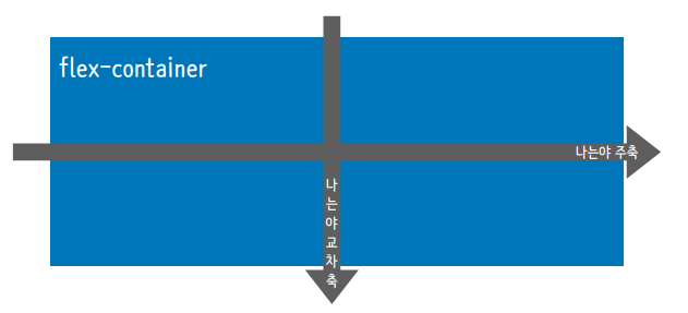
- 기본 주축은 x축
flex-container
- flex 레이아웃을 만들려면 해당 요소를 flex-container로 만들어야 한다.
- css | style에
display=flex또는display=inline-flex를 통해 선언
flex-direction
- flex 속성의 주축 방향을 지정, 기본값은
rowcolumn,row,column-reverse,row-reverse,inherit로 구성
column열을 주축으로 위->아래로 정렬row행을 주축으로 왼->오른쪽으로 정렬column-reverse열을 주축으로 아래->위로 정렬row-reverse행을 주축으로 오른->왼쪽으로 정렬
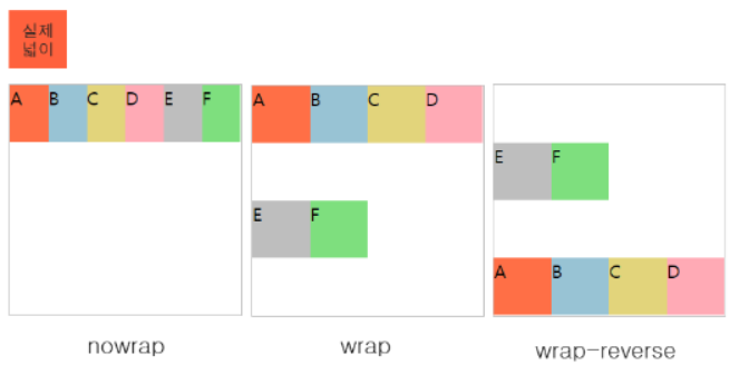
flex-wrap
- flex 요소들은 정렬, 기본값은
nowrapnowrap,wrap,wrap-reverse로 구성
wrap속성은 정렬된 요소들의 총 넓이가 부모 넓이 보다 클 때, 이 요소들을 다음 줄에 이어서 정렬 해주는 기능.nowrap은 정렬된 요소들의 넓이는 부모 넓이에 맞게 모두 자동 축소 됩니다.
사진 출처 : https://chlolisher.tistory.com/33
flex-flow
flex-direction과flex-wrap을 함께 지정div{ display : flex; flex-direction : row; flex-wrap : wrap; /*또는*/ display : flex; flex-flow : row wrap; }
flex-item
- 내부의 아이템을 어떻게 배치할 것인가?
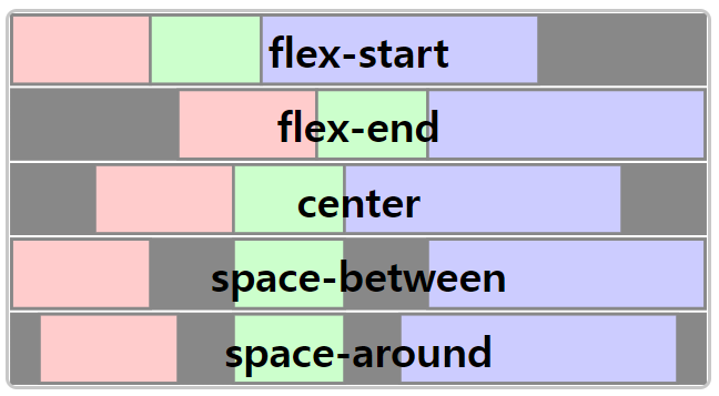
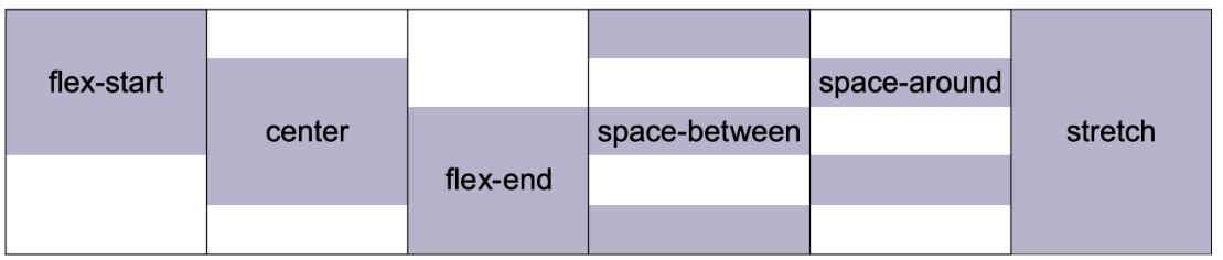
justify-content
- 주축의 아이템 사이의 공간을 분배하는 방식을 결정
flex-start,flex-end,center,space-between,space-around,space-evenly등이 있다.
- space-between은 맨 앞과 뒤에 item을 넣고 나머지 item들의 간격을 동일하게
- space-around는 모든 item들의 좌우 여백을 동일하게 유지
- 처음과 끝의 여백이 1이면 item들 사이는 1+1이라 2의 간격을 가진다.
- space-evenly는 처음과 끝은 포함한 모든 여백을 같게 유지
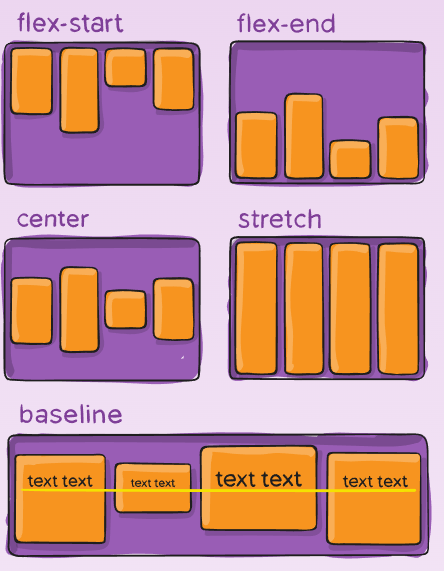
align-items
- 교차 축에 대해 item을 어떻게 배치?
- direction : column;이면 주축의 수직선인 왼쪽 -> 오른쪽이 교차 축
flex-start,flex-end,center,stretch등이 있다.
stretch는 width, height가 우선
align-content
justify-content의 교차축 버전flex-wrap : wrap으로 지정되어야 사용가능- item을 배치하기 위해 필요한 공간보다
flex-container가 클 때 가능 -> 여백이 존재해야 한다.- 교차 축과 아이템 간 공간이 있으며 공간을 어떻게 배치할까?
align-self
flex-item이 교차축에서 어떤 식으로 정렬될 것인지를 스스로 결정 -> item에 각각 적용- 값과 동작은 align-items와 동일
기타
flex-grow
- flex-item이 기본 크키보다 더 커질 수 있는지 결정
- 여분의 공간을 채움
- 아이템이 차지하는 비율
- 음수 불가능, 기본값 = 0
<head>
    <style>
        .flex{
            display: flex;
            flex-direction: row;
        }
        div{
            border : 1px solid #000;
        }
        .a3{
            flex-grow : 3;
        }
        .a2{
            flex-grow : 2;
        }
        .a1{
            flex-grow : 1;
        }
    </style>
</head>
<body>
    <div class="flex">
        <div class="a3">3</div>
        <div class="a1">1</div>
        <div class="a2">2</div>
    </div>
</body>

flex-shirink
- flex-item이 기본 크키보다 더 작아질 수 있는지 결정 -> 화면이 줄어들 때 상대적인 크기를 지정
- 아이템이 차지하는 비율
- 음수 불가능, 기본값 = 1
<head>
    <style>
        .flex{
            display: flex;
            flex-direction: row;
        }
        div{
            border : 1px solid #000;
        }
        .a3{
            flex-shirink : 3;
        }
        .a2{
            flex-shirink : 2;
        }
        .a1{
            flex-shirink : 1;
        }
    </style>
</head>
<body>
    <div class="flex">
        <div class="a3">3</div>
        <div class="a1">1</div>
        <div class="a2">2</div>
    </div>
</body>
flex-basis
flex-item의 초기 크기를 지정, 기본값=auto
flex
flex-grow,flex-shrink,flex-basis세 가지 속성을 한번에 정의.items{ /*100px보다 작아지지도 커지지도 않음*/ flex : 0 0 100px; /*flex-grow flex-shrink flex-basis*/ /*100px이 최소 크기이고 여백이 있으면 100px보다 커짐*/ flex-grow:1; flex-shirink :0; flex-basis : 100px /*100px보다 작아지기는 함*/ flex-grow:0; flex-shirink :1; flex-basis : 100px }
order
- 순서 지정
- 화면에 보이는 순서만 변경되는 것 -> 다른 css, js 같은 값은 변경 x
- 기본값은 0, 값이 작은 요소부터 정렬, 음수도 가능
<head>
    <style>
        .flex{
            display: flex;
            flex-direction: row;
        }
        .a3{
            order : 3;
        }
        .a2{
            order: 2;
        }
        .a1{
            order: 1;
        }
    </style>
</head>
<body>
    <div class="flex">
        <div class="a3">3</div>
        <div class="a1">1</div>
        <div class="a2">2</div>
    </div>
</body>
123
