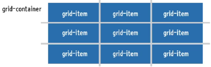
grid-layout
- 격자 형태의 레이아웃을 만드는 2차원 레이아웃 방식
- 행과 열의 상화작용을 통해 배치를 결정
grid-container과grid-item으로 구분- 기본적으로
block속성임 - 크기를
stretch시켜줌
<!DOCTYPE html>
<html lang="ko">

<head>
    <meta charset="UTF-8">
    <meta http-equiv="X-UA-Compatible" content="IE=edge">
    <meta name="viewport" content="width=device-width, initial-scale=1.0">
    <title>Document</title>

    <style>
        *{
            box-sizing: border-box;
        }
        body{
            margin: 0;
        }
        ul{
            padding: 0;
            list-style: none;
            border: 5px solid teal;
        }
        li{
            display: flex;
            border: 5px solid tomato;
            border-radius: 8px;
            background-color: beige;
            justify-content: center;
            align-items: center;
        }
        .container{ <!-- grid-continer -->
            display: grid;
            height: 1000px; <!-- 이걸 제외하면 크기는 자동조정 -->
        }
    </style>

</head>

<body>
    <ul class="container">
        <li class="item">1</li>
        <li class="item">2</li>
        <li class="item">3</li>
        <li class="item">4</li>
        <li class="item">5</li>
    </ul>
</body>

</html>
grid-container
grid-template-columns
grid-container내부의 열 트랙 item들의 크기를 지정- 기본값 = none
- 음수값은 불가능
frfraction = 사용할 수 있는 공간에서 비율로 나누겠다.
grid-template-rows
grid-container내부의 행 트랙 item들의 크기를 지정- 기본값 = none
- 음수값은 불가능
gap(grid-gap)
grid-item사이의 간격을 지정- 기본값=normal
row-gap,column-gap을 통해 행, 열을 따로 지정할 수도 있다.
        .container{
            display: grid;
            height: 500px;
            grid-template-columns: 100px 1fr 1fr; /*100px과 100px을 제외한 공간을 1로 나눈 공간 총 3개의 열로 구성*/
            grid-template-rows: 2fr 1fr; /*행의 수에 따라 각각 크기를 지정해야한다.*/
            /* 3열 -> 행이 최대 2개임 === 3개의 행 크기를 지정*/
            /*gap: 10px; /*grid-gap : 10px*/*/
            gap : 10px 20px: /*행과 열을 각각 gap 지정*/
        }
grid 트랙관련 함수들
- repeat(반복횟수, 크기)
- 반복되는 값을 자동을 처리할 수 있는 함수
grid-template-columns: repeat(2, 100px); /*100px 2열로 구성*/- minmax(최소길이, 최대길이)
- 최솟값과 최댓값을 각각 지정할 수 있는 함수
- repeat의 크기에 들어감
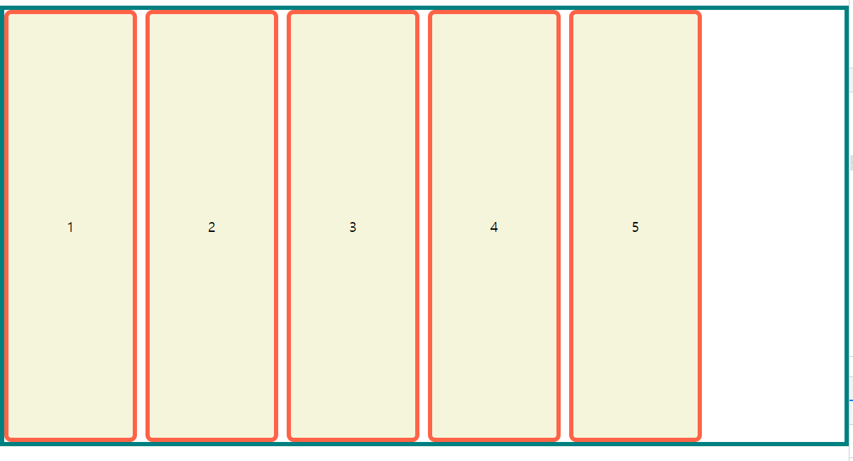
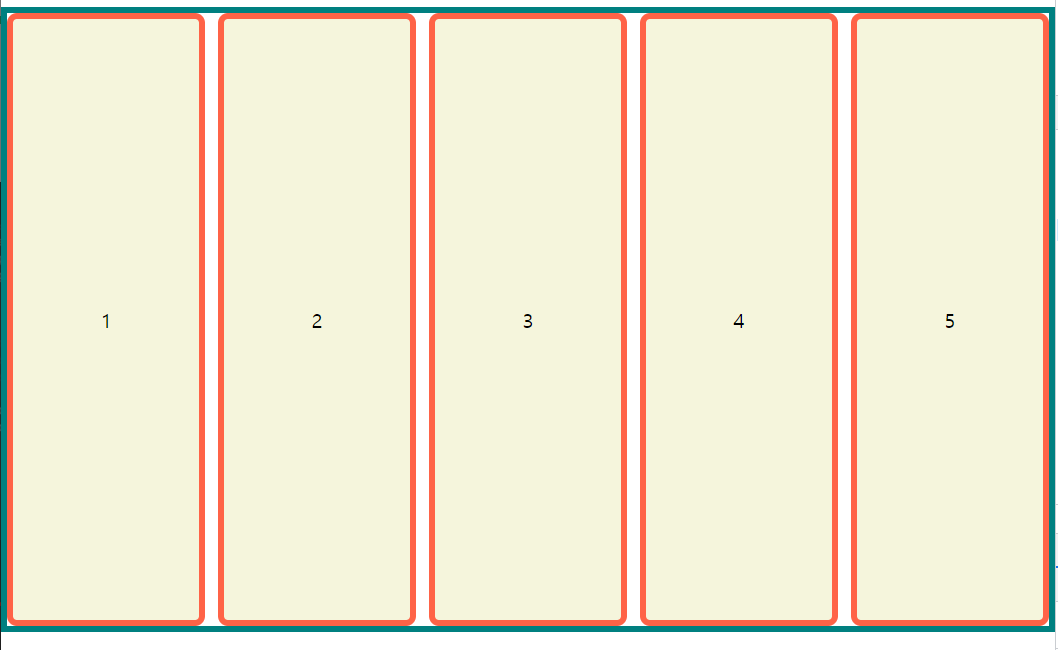
grid-template-columns: repeat(2, minmax(100px, 1fr));- auto-fill, auto fit
- 함수x, 반복 횟수 자리에 들어갈 수 있는
keyword임auto-fill
- 트랙의 최소길이의 합보다 container의 길이가 긴 경우 빈 공간을 남긴다.```css .container{ display: grid; height: 500px; grid-template-columns: repeat(auto-fill, minmax(100px, 1fr)); gap: 10px; } ```auto-fit
- item이 continer의 길이에 맞춰서 늘어남
.container{ display: grid; height: 500px; grid-template-columns: repeat(auto-fit, minmax(100px, 1fr)); /*만약 최대값이 200px처럼 절대값이면 200px이상으로 늘어나진 않는다.*/ gap: 10px; }- grid-auto-rows
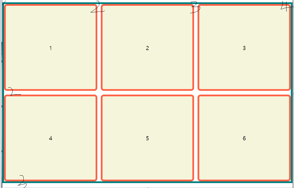
- 설정한 rows보다 그리드 item수가 많은 경우 row의 크기를 지정
grid-item
grid-item의 줄번호는 1부터 시작
grid-row
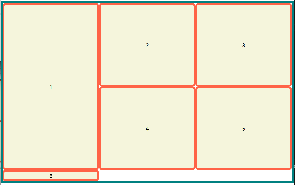
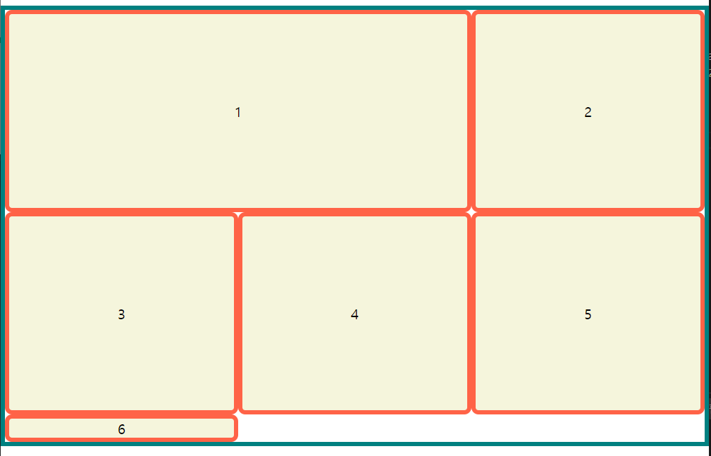
li:nth-child(1){
	/*1번 요소*/
    grid-row : 1/3; /*1~3번 행까지 차지하겠다. */
}
grid-column
li:nth-child(1){
	/*1번 요소*/
    grid-clumn : 1/3; /*1~3번 열까지 차지하겠다. */
}
- 나머지는 밀린다.
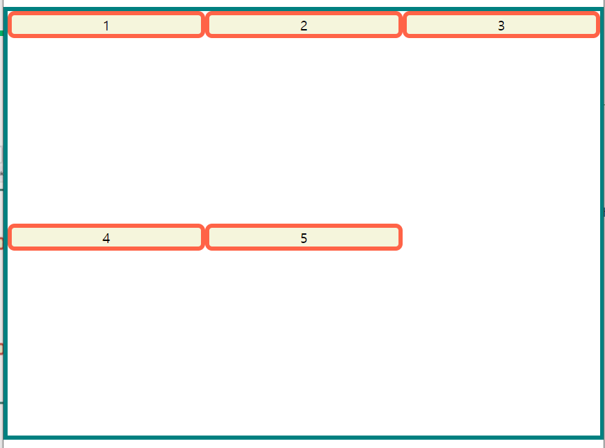
grid-template-areas
grid-item의 이름을 이용해 레이아웃의 형태를 정의- 같은 이름만큼 공간을 차지
.을 찍으면 빈 공간으로 인식
<!DOCTYPE html>
<html lang="ko">

<head>
    <meta charset="UTF-8">
    <meta http-equiv="X-UA-Compatible" content="IE=edge">
    <meta name="viewport" content="width=device-width, initial-scale=1.0">
    <title>Document</title>

    <style>
        *{
            box-sizing: border-box;
        }
        body{
            margin: 0;
        }
        ul{
            padding: 0;
            list-style: none;
            border: 5px solid teal;
        }
        li{
            display: flex;
            border: 5px solid tomato;
            border-radius: 8px;
            background-color: beige;
            justify-content: center;
            align-items: center;
        }
        .container{
            display: grid;
            height: 500px;
    		grid-template-cloumns : repeat(3, 1fr);
            grid-template-areas:
                "거 거 거"
                "호 호 고"
                "다 청 고"
            ;
        }
        li:nth-child(1){
            grid-area: 거;
        }
        li:nth-child(2){
            grid-area: 호;
        }
        li:nth-child(3){
            grid-area: 다;
        }
        li:nth-child(4){
            grid-area: 청;
        }
        li:nth-child(5){
            grid-area: 고;
        }
    </style>

</head>

<body>
    <ul class="container">
        <li class="item">1</li>
        <li class="item">2</li>
        <li class="item">3</li>
        <li class="item">4</li>
        <li class="item">5</li>
    </ul>
</body>

</html>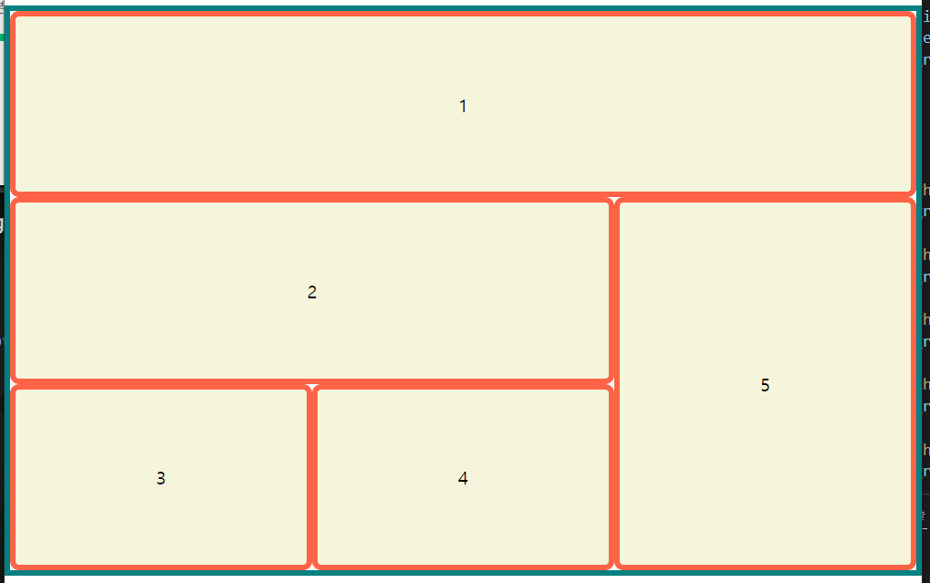
기타
grid-auto-flow
그리드 item의 진행 방향
coulumn, row, (+dense)가 있다.
dnese = 빈 칸을 다음 item이 땡겨서 채운다.
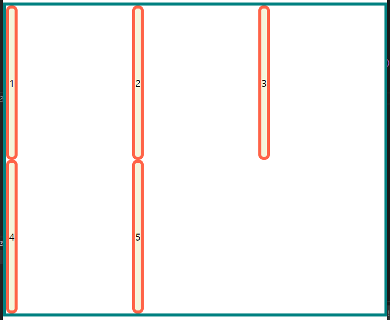
align-items
grid-container의 행 트랙의 높이를 기준으로 배치, 기본값 = stretchstretch,start,end,center등이 있다..container{ display: grid; height: 500px; grid-template-columns: repeat(3, 1fr); grid-template-rows: repeat(2, 1fr); align-items: start; }
align-self
- 각각의
grid-item을 어떻게 배치할까?grid-item에 지정stretch,start,end,center등이 있다.
align-content
grid-container의 수직축(열)으로 정렬을 지정- 여유 공간이 있을 때 사용가능
justify-items
grid-container의 행 트랙의 너비를 기준으로 배치, 기본값 = stretch- item에 할당된 열 방향 너비가 기준이 됩니다.
stretch,start,end,center등이 있다..container{ display: grid; height: 500px; grid-template-columns: repeat(3, 1fr); grid-template-rows: repeat(2, 1fr); justify-items:tart; }
justify-self
- 각각의
grid-item을 어떻게 배치할까?grid-item에 지정stretch,start,end,center등이 있다.
justify-content
grid-container의 수평축(행)으로 정렬을 지정- 여유 공간이 있을 때 사용가능
min, max-content
min = 단어를 기준으로 잘라서 가장 긴 단어에 길이를 맞춤
max = 문장에 길이를 맞춤
- items VS content
- items는 각 item크기에서
- content는 container를 기준으로
