CSS
선택자
/* css 주석 */
선택자 { 속성: 속성값; 속성: 속성값 }
html 문서 내부에 css 적용하는 것을 내부 스타일 시트라고 부름
<head>
    <meta charset="UTF-8">
    <meta name="viewport" content="width=device-width, initial-scale=1.0">
    <style>
        /* css 주석 */
        p {color: blue; font-size: 38px;}
    </style>
    <title>Document</title>
</head>
html 내부에 css를 바로 적용시키는 방법을 인라인 스타일 시트라고 부름
<p style="color: blue; font-size: 38px;">일반 텍스트</p>외부 스타일 시트 적용
- href 속성으로 파일을 명시
- rel 속성으로 css 파일임을 명시
- type 속성으로 개발자들에게 css 파일임을 명시(필수 X)
<head>
    <meta charset="UTF-8">
    <meta name="viewport" content="width=device-width, initial-scale=1.0">
    **<link href="style.css" rel="stylesheet" type="text/css">**
    <title>Document</title>
</head>
- 전체 선택자 : 웹 문서 내부의 전체 태그에 스타일 적용
<style> * { color: green; } </style> - 태그 선택자 : 웹 문서 내부의 특정 태그에 스타일 적용
<style> p { color: green; } </style><style> /* 태그 선택자 */ /* 1. 부모 태그 2. 자식 태그 3. 부모와 자식 태그 */ ul li { color: green; } </style> - 클래스 선택자 : 자주 사용하는 css 속성들을 묶은 집합
.클래스명 { 속성: 속성값;}<style> .green { color: green; } </style>태그명.클래스명 { 속성: 속성값;}<style> p.green { color: green; } </style> - 아이디 선택자 : 자주 사용하는 css 속성들을 묶은 집합 아이디는 고유성을 가짐
#아이디명 { 속성: 속성값;}<style> #green { color: green; } </style>태그명#아이디명 { 속성: 속성값;}<style> h1#green { color: green; } </style>
우선 순위
우선 순위는 규모와 반비례
아이디 -> 클래스 -> 태그 -> 전체
인라인 스타일 시트도 우선 순위에 반영
우선 순위를 직접 지정하고 싶은 경우
!important
<style>
    * {
        color: green;
    }
    p {
        color: red !important;
    }
    .blue {
        color: blue;
    }
    #brown {
        color: brown;
    }
</style>
!important 가 중복 적용된 경우는 우선 순위 적용
<style>
    * {
        color: green;
    }
    p {
        color: red !important;
    }
    .blue {
        color: blue !important;
    }
    #brown {
        color: brown;
    }
</style>
폰트
폰트 지정 방식
font-family
: 글꼴 지정
: 글꼴 지정 시 여러 글꼴 등록 가능
: 앞의 글꼴부터 적용, 없으면 다음 글꼴 적용
클라이언트에 해당 폰트가 존재해야 적용이 됨
<style>
    p {
        font-family: 굴림, 돋움, "맑은 고딕";
    }
</style>
web-font
웹 폰트는 웹에서 제공해주는 공통 글꼴들
클라이언트에 글꼴 설치되어 있지 않아도 됨
원하는 글꼴이 없을 수 있음
<!DOCTYPE html>
<html lang="en">
<head>
    <meta charset="UTF-8">
    <meta name="viewport" content="width=device-width, initial-scale=1.0">
    <style>
        @import url('https://fonts.googleapis.com/css2?family=Noto+Sans+KR:wght@100..900&display=swap');
        .noto {
            font-family: "Noto Sans KR";
        }
    </style>
    <title>Document</title>
</head>
<body>
    <h1 class="noto">글꼴 적용</h1>
</body>
</html>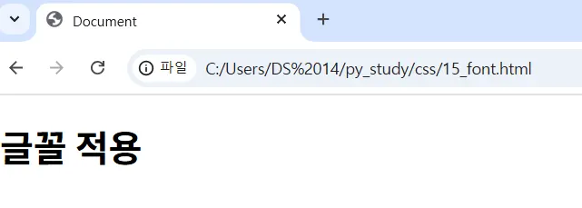
글꼴을 클라이언트에게 설치하는 것을 강요할 수 없음
웹 폰트에 원하는 글꼴이 없을 수 있음
대신 서버 측에 글꼴이 존재한다면?
서버의 글꼴을 웹에 적용
글꼴 종류
- eot : 마이크로소프트에서 만든 글씨 파일 확장자
- ttf : 대중적으로 많이 사용하는 글꼴, 무거움
- woff : 웹이나 애플리케이션에서 자주 사용하는 글씨 파일 확장자
<!DOCTYPE html>
<html lang="en">
<head>
    <meta charset="UTF-8">
    <meta name="viewport" content="width=device-width, initial-scale=1.0">
    <style>
        @font-face {
            font-family: "trana";
            src: local("trana"),
                url("trana.eot"),
                url("trana.woff") format("woff"),
                url("trana.ttf") format("truetype");
        }
        .trana {
            font-family: trana;
        }
    </style>
    <title>Document</title>
</head>
<body>
    <h1 class="trana">trana</h1>
</body>
</html>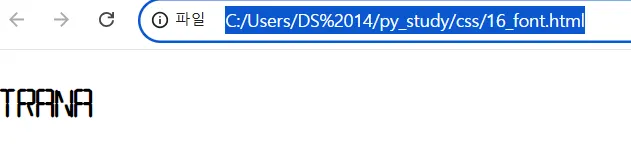
글꼴 크기
: px, em 단위 존재
px: 절대 단위 : 보는 화면의 사이즈를 고려하지 않고 전부 동일한 글자 크기 적용
em: 상대 단위 : 보는 화면의 대문자 M을 기준으로 글자 크기를 적용
font-size
<!DOCTYPE html>
<html lang="en">
<head>
    <meta charset="UTF-8">
    <meta name="viewport" content="width=device-width, initial-scale=1.0">
    <style>
        .px {
            font-size: 50px;
        }
        .em {
            font-size: 3em;
        }
    </style>
    <title>Document</title>
</head>
<body>
    <p class="px">픽셀</p>
    <p class="em">이엠</p>
</body>
</html>
글자 굵기
font-weight
- 숫자를 이용해 0~999
- 스타일 지정
normal(400)bold(700)
<!DOCTYPE html>
<html lang="en">
<head>
    <meta charset="UTF-8">
    <meta name="viewport" content="width=device-width, initial-scale=1.0">
    <style>
        .thin {
            font-weight: 100;
        }
        .bold {
            font-weight: 700;
        }
    </style>
    <title>Document</title>
</head>
<body>
    <p class="thin">글자 얇게</p>
    <p>일반 두께</p>
    <p class="bold">글자 두껍게</p>
</body>
</html>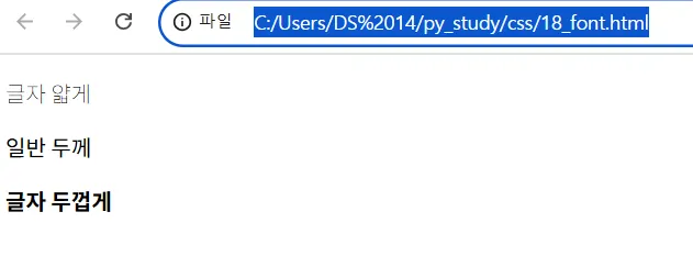

새싹 개발자