
전환이란 기존 속성값이 다른 값으로 변경하는 것을 말함
ex)
<style>
	.red-box{
    	width:100px;
        height:100px;
        background-color:red;
    }
    .red-box:hover{
    	background-color:blue;
    }
</style>
<body>
	<div class="red-box"></div>
</body>
위 코드의 경우 빨간색 박스에 마우스를 올릴 시 파란색으로 값이 변경됨
transition-property 속성
전환 효과를 적용할 대상 속성 지정
| 속성 값 | 설명 |
|---|---|
| none | 전환 효과 속성을 지정하지 않습니다 |
| all | 모든 속성을 전환 효과 대상으로 지정함 |
ex)
/* background-color에 전환 효과를 주고 싶은 경우 */
transition-property:background-color;

transition-property:background-color, color, width;

/* 모든 속성에 전환 효과 넣고 싶을 시 */
transition-property:all;
transition-duration 속성
전환 효과의 지속 시간을 설정하는데 사용
transition-duration:1s; /* 전호나 효과가 1초 동안 발생 */여러 속성을 쉼표로 구분해 전환효과를 지정 시 property와 duration 속성을 각각 지정 가능
-> 전환 효과를 지정하려면 이 두 속성은 반드시 사용 해야 함
transition-property:background-color, color, width;
transition-duration:1s, 500ms, 2s;
transition-delay 속성
전환 효과의 발생을 지연시킬 수 있음
.red-box{
	...
    transition-delay:1s;
}
위 경우 빨간색 요소에 마우스를 올릴 때 파란색으로 바로 안바뀌고, 1초뒤 바뀜
transition-timing-function 속성
전환 효과의 진행 속도 지정
| 속성 값 | 설명 |
|---|---|
| linear | 처음 속도와 마지막 속도가 일정 |
| ease | 처음에는 속도가 점점 빨라지다가 중간부터 느려짐 |
| ease-in | 처음에는 속도가 느리지만 완료될 때까지 점점 빨라짐 |
| ease-out | 처음에는 속도가 빠르지만 완료될 때까지 점점 느려짐 |
| ease-in-out | 처음에는 속도가 느리지만 점점빨라지다 다시 느려짐 |
| cubic-bezier(p1, p2, p3, p4) | 사용자가 정의한 속도대로 진행 |
.container .bar{
	width:10px;
    transition-property:width;
    transition-duration:5s;
}
.container:hover .bar{
	width:110px;
}
bar클래스가 있는 태그의 너비는 처음에 10px이지만, 5초 뒤 110px가 됨
-> 이론상 1초당 20px씩 증가하면 됨
-> 이때 증가하는 값의 속도를 transition-timing-function 속성으로 제어
<style>
    .container{
      padding:10px;
      color:white;
      border:1px solid black;
    }
    .bar{
      width:100px;
      background-color:red;
      transition-property:width;
      transition-duration:1s;
      margin-bottom:10px;
    }
    .container:hover .bar{
      width:200px;
    }
    .bar:nth-child(1){
      transition-timing-function:linear;
    }
    .bar:nth-child(2){
      transition-timing-function:ease;
    }
    .bar:nth-child(3){
      transition-timing-function:ease-in
    }
    .bar:nth-child(4){
      transition-timing-function:ease-out;
    }
    .bar:nth-child(5){
      transition-timing-function:ease-in-out;
    }
</style>
<body>
  <div class="container">
    <div class="bar">linear</div>
    <div class="bar">ease</div>
    <div class="bar">ease-in</div>
    <div class="bar">ease-out</div>
    <div class="bar">ease-in-out</div>
  </div>
</body>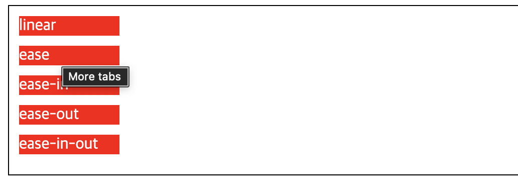
마우스를 올렸을 때 각 요소마다 전환 속도가 달라짐
-> 기본으로 제공된 속도가 마음에 안들시 cubic-bezier() 함수로 직접 지정가능
-> 직접 정하는 것은 복잡하므로 크롬의 개발자 도구나 별도의 외부 사이트에서 계산
크롬 개발자 도구에서 속도 조절
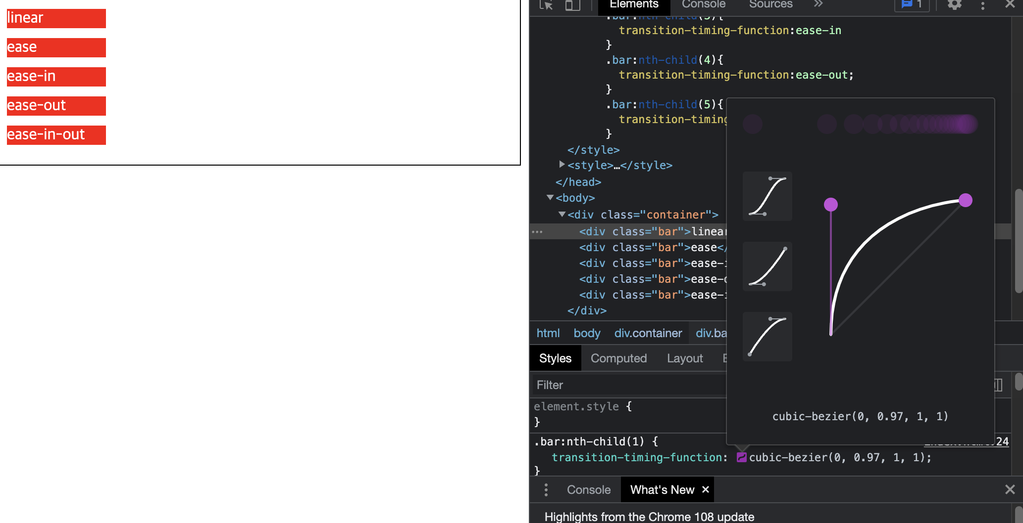
특정 요소를 클릭 해 원하는 대로 곡선을 조정하고 나서 cubic-bezier() 값을 속성값으로 넣으면 됨
외부 사이트는 https://cubic-bezier.com
transition 속성으로 한번에 지정
transition:<property>, <duration>, <timing-function>, <delay>;transition-property:width;
transition-duration:1s
transition-timing-function:ease-in;
transition-delay:1s;
transition:width, 1s, ease-in, 1s;CSS 모든 속성이 전환효과를 사용할 수 있는 것은 아니라는 점 유의!

Journey for Backend Developer