오늘의 강의 내용
* 네이버뉴스 TV/연예 부분 카피캣
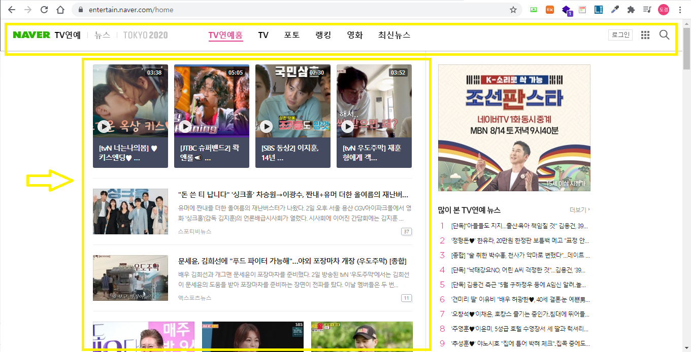
- 네이버뉴스 TV/연예 왼쪽부분 카피캣
.png)
카피캣 영역인 왼쪽 부분
.png)
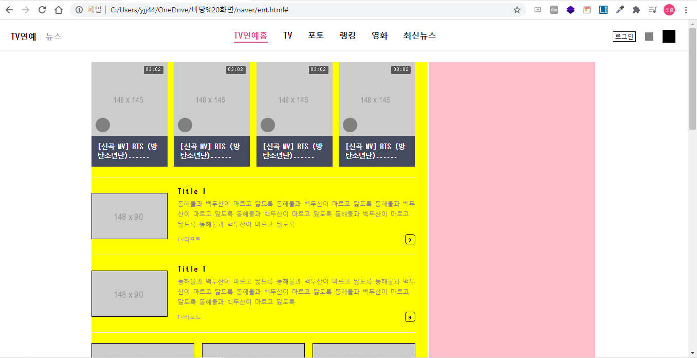
왼쪽부분 카피캣 완료된 모습
<!-- ent.html언어 -->
<!DOCTYPE html>
<html>
<head>
	<meta charset="utf-8">
	<title>네이버</title>

	<link rel="stylesheet" type="text/css" href="css/style.css">
</head>
<body>


	<header id="ent_header">
		<div class="ent_flex_between">

			<div class="ent_header_left">
				<ul class="ent_flex_start">
					<li><a href="#">TV연예</a></li>
					<li><a href="news.html">뉴스</a></li>
				</ul>
			</div>

			<div class="ent_header_center">
				<ul class="ent_flex_center">
					<li class="on"><a href="#">TV연예홈</a></li>
					<li><a href="#">TV</a></li>
					<li><a href="#">포토</a></li>
					<li><a href="#">랭킹</a></li>
					<li><a href="#">영화</a></li>
					<li><a href="#">최신뉴스</a></li>
				</ul>
			</div>

			<div class="ent_header_right ent_flex_end">
				<a href="#" class="btn_login">로그인</a>
				<button type="button" class="btn_menu"></button>
				<button type="button" class="btn_search"></button>
			</div>

		</div>
	</header>


	<main role="main" id="ent_main">

		<div class="ent_container">

			<div class="ent_left">


				<div id="ent_media_headline">

					<ul class="ent_flex_between">
						<li>
							<a href="#">
								<div class="media_top">
									<img src="https://via.placeholder.com/148x145">
									<span class="time">03:02</span>
									<i class="icon_play"></i>
								</div>
								<div class="media_bottom">
									<p>[신곡 MV] BTS (방탄소년단)......</p>
								</div>
							</a>
						</li>

						<li>
							<a href="#">
								<div class="media_top">
									<img src="https://via.placeholder.com/148x145">
									<span class="time">03:02</span>
									<i class="icon_play"></i>
								</div>
								<div class="media_bottom">
									<p>[신곡 MV] BTS (방탄소년단)......</p>
								</div>
							</a>
						</li>

						<li>
							<a href="#">
								<div class="media_top">
									<img src="https://via.placeholder.com/148x145">
									<span class="time">03:02</span>
									<i class="icon_play"></i>
								</div>
								<div class="media_bottom">
									<p>[신곡 MV] BTS (방탄소년단)......</p>
								</div>
							</a>
						</li>

						<li>
							<a href="#">
								<div class="media_top">
									<img src="https://via.placeholder.com/148x145">
									<span class="time">03:02</span>
									<i class="icon_play"></i>
								</div>
								<div class="media_bottom">
									<p>[신곡 MV] BTS (방탄소년단)......</p>
								</div>
							</a>
						</li>
					</ul>

				</div>


				<div id="ent_section_1">
					<ul>
						<li>
							<a href="#" class="ent_flex_between">
								<img src="https://via.placeholder.com/148x90">
								<div class="ent_news_wrap">
									<h3>Title 1</h3>
									<p>동해물과 백두산이 마르고 닳도록 동해물과 백두산이 마르고 닳도록 동해물과 백두산이 마르고 닳도록 동해물과 백두산이 마르고 닳도록 동해물과 백두산이 마르고 닳도록 동해물과 백두산이 마르고 닳도록</p>
									<div class="bottom_wrap ent_flex_between">
										<span class="source">TV리포트</span>
										<span class="count">9</span>
									</div>
								</div>
							</a>
						</li>

						<li>
							<a href="#" class="ent_flex_between">
								<img src="https://via.placeholder.com/148x90">
								<div class="ent_news_wrap">
									<h3>Title 1</h3>
									<p>동해물과 백두산이 마르고 닳도록 동해물과 백두산이 마르고 닳도록 동해물과 백두산이 마르고 닳도록 동해물과 백두산이 마르고 닳도록 동해물과 백두산이 마르고 닳도록 동해물과 백두산이 마르고 닳도록</p>
									<div class="bottom_wrap ent_flex_between">
										<span class="source">TV리포트</span>
										<span class="count">9</span>
									</div>
								</div>
							</a>
						</li>
					</ul>
				</div>


				<div id="ent_section_2">
					<ul class="ent_flex_between">
						<li>
							<a href="#">
								<img src="https://via.placeholder.com/200x122">
								<h3>Title 1 Title 1 Title 1 Title 1 Title 1</h3>
								<div class="ent_bottom ent_flex_between">
									<span class="source">TV리포트</span>
									<span class="count">1</span>
								</div>
							</a>
						</li>

						<li>
							<a href="#">
								<img src="https://via.placeholder.com/200x122">
								<h3>Title 1 Title 1 Title 1 Title 1 Title 1</h3>
								<div class="ent_bottom ent_flex_between">
									<span class="source">TV리포트</span>
									<span class="count">1</span>
								</div>
							</a>
						</li>

						<li>
							<a href="#">
								<img src="https://via.placeholder.com/200x122">
								<h3>Title 1 Title 1 Title 1 Title 1 Title 1</h3>
								<div class="ent_bottom ent_flex_between">
									<span class="source">TV리포트</span>
									<span class="count">1</span>
								</div>
							</a>
						</li>
					</ul>
				</div>


				<div id="ent_section_3">
					<div class="title_wrap ent_flex_between">
						<h3>스타 콘텐츠</h3>

						<div class="right_wrap ent_flex_end">

							<div class="count_wrap">
								<span><em>1</em> / 2</span>
							</div>

							<div class="btn_wrap ent_flex_end">
								<button type="button" class="btn btn_prev"></button>
								<button type="button" class="btn btn_next"></button>
							</div>

						</div>
					</div>

					<ul class="ent_flex_between">
						<li>
							<a href="#">
								<img src="https://via.placeholder.com/148x148">
								<span>에이치앤드 에이치앤드 에이치앤드 에이치앤드</span>
								<h3>[금새록] 오월의 새록 [금새록] 오월의 새록</h3>
							</a>
						</li>

						<li>
							<a href="#">
								<img src="https://via.placeholder.com/148x148">
								<span>에이치앤드</span>
								<h3>[금새록] 오월의 새록 [금새록] 오월의 새록</h3>
							</a>
						</li>

						<li>
							<a href="#">
								<img src="https://via.placeholder.com/148x148">
								<span>에이치앤드</span>
								<h3>[금새록] 오월의 새록 [금새록] 오월의 새록</h3>
							</a>
						</li>

						<li>
							<a href="#">
								<img src="https://via.placeholder.com/148x148">
								<span>에이치앤드</span>
								<h3>[금새록] 오월의 새록 [금새록] 오월의 새록</h3>
							</a>
						</li>
					</ul>


				</div>


			</div>


			<div class="ent_right"></div>

		</div>

	</main>


</body>
</html>

<!-- style.css언어 -->
/* 네이버뉴스 연예 */
.ent_container {
	width: 980px;
	margin: 0 auto;
}

.ent_flex_start {
	display: flex;
	flex-wrap: wrap;
	align-items: center;
}

.ent_flex_center {
	display: flex;
	flex-wrap: wrap;
	justify-content: center;
	align-items: center;
}

.ent_flex_end {
	display: flex;
	flex-wrap: wrap;
	justify-content: flex-end;
	align-items: center;
}

.ent_flex_between {
	display: flex;
	flex-wrap: wrap;
	justify-content: space-between;
	align-items: center;
}

.ent_border {
	border: solid 1px #000000;
}

#ent_header {
	width: 100%;
	height: 62px;
	background-color: #ffffff;
	border-bottom: solid 2px #f1f1f1;

	padding: 20px 25px 0;
}

#ent_header .ent_header_left ul {

}

#ent_header .ent_header_left ul li {
	font-weight: 700;
}

#ent_header .ent_header_left ul li a {

}

#ent_header .ent_header_left ul li:last-child a {
	color: #9f9f9f;
}

#ent_header .ent_header_left ul li a:before {
	content: '';
	display: inline-block;
	width: 1px;
	height: 12px;
	background-color: #dddddd;

	margin: 0 8px;

	vertical-align: -1px;
}

#ent_header .ent_header_left ul li:first-child a:before {
	content: none;
}

#ent_header .ent_header_center li {
	font-weight: 700;
	font-size: 16px;

	padding: 0 15px;
}

#ent_header .ent_header_center li a {
	display: inline-block;
	border-bottom: solid 2px #ffffff;

	padding-bottom: 2px;
}

#ent_header .ent_header_center li.on {

}

#ent_header .ent_header_center li.on a {
	color: #e24587;
	border-bottom: solid 2px #e24587;
}

#ent_header .ent_header_right .btn_login {
	width: 45px;
	height: 20px;
	border: solid 1px #000000;

	font-size: 12px;
	line-height: 20px;
	text-align: center;
	margin: 0 9px;
}

#ent_header .ent_header_right .btn_menu {
	width: 16px;
	height: 16px;
	background-color: gray;
	margin: 0 9px;
}

#ent_header .ent_header_right .btn_search {
	width: 25px;
	height: 25px;
	background-color: #000000;
	margin-left: 9px;
}

#ent_main {

}

#ent_main .ent_container {
	overflow: hidden;
}

#ent_main .ent_left {
	float: left;
	width: 654px;
	height: 2000px;
	background-color: yellow;

	padding-right: 24px;
}

#ent_main .ent_left #ent_media_headline {
	padding-bottom: 20px;
	border-bottom: solid 1px #f1f1f1;
}

#ent_main .ent_left #ent_media_headline ul {

}

#ent_main .ent_left #ent_media_headline li {
	width: 148px;
	height: 204px;
	border-radius: 10px;
}

#ent_main .ent_left #ent_media_headline a {
	display: block;
	width: 100%;
	height: 100%;
}

#ent_main .ent_left #ent_media_headline .media_top {
	position: relative;
	height: 144px;
}

#ent_main .ent_left #ent_media_headline .media_top img {
	position: absolute;
	width: 100%;
	height: 100%;
}

#ent_main .ent_left #ent_media_headline .media_top .time {
	position: absolute;
	display: block;
	height: 16px;
	border-radius: 2px;
	background-color: rgba(0, 0, 0, 0.56);

	padding: 0 4px;
	right: 8px;
	top: 8px;

	color: #ffffff;
	font-size: 11px;
	line-height: 16px;
}

#ent_main .ent_left #ent_media_headline .media_top .icon_play {
	position: absolute;
	display: block;

	width: 28px;
	height: 28px;
	background-color: gray;
	border-radius: 50%;

	left: 8px;
	bottom: 7px;
}

#ent_main .ent_left #ent_media_headline .media_bottom {
	height: 60px;
	background-color: #444a60;
}

#ent_main .ent_left #ent_media_headline .media_bottom p {
	font-size: 14px;
	font-weight: 700;
	letter-spacing: -1px;

	padding: 11px 12px 0;

	color: #ffffff;
}

#ent_main .ent_left #ent_section_1 {

}

#ent_main .ent_left #ent_section_1 li {
	border-bottom: solid 1px #f1f1f1;
	padding: 20px 0;
}

#ent_main .ent_left #ent_section_1 li a {

}

#ent_main .ent_left #ent_section_1 li img {
	width: 148px;
	height: 90px;
	border: solid 1px #000000;
}

#ent_main .ent_left #ent_section_1 li .ent_news_wrap {
	width: 462px;
}

#ent_main .ent_left #ent_section_1 li .ent_news_wrap h3 {
	margin-bottom: 8px;

	font-size: 14px;
	font-weight: 700;
}

#ent_main .ent_left #ent_section_1 li .ent_news_wrap p {
	margin-bottom: 8px;

	font-size: 12px;
	color: #898989;
	font-weight: 400;
	line-height: 20px;
}

#ent_main .ent_left #ent_section_1 li .ent_news_wrap .bottom_wrap {

}

#ent_main .ent_left #ent_section_1 li .ent_news_wrap .bottom_wrap .source,
#ent_main .ent_left #ent_section_2 .ent_bottom .source {
	font-size: 11px;
	font-weight: 400;
	color: #a7a7a7;
}

#ent_main .ent_left #ent_section_1 li .ent_news_wrap .bottom_wrap .count,
#ent_main .ent_left #ent_section_2 .ent_bottom .count {
	display: inline-block;

	width: 20px;
	height: 20px;
	border: solid 1px #000000;
	border-radius: 5px;

	text-align: center;
	line-height: 20px;

	font-size: 10px;
}


#ent_main .ent_left #ent_section_2 {
	border-bottom: solid 1px #f1f1f1;
	padding: 20px 0;
}

#ent_main .ent_left #ent_section_2 ul {

}

#ent_main .ent_left #ent_section_2 li {
	width: 200px;
}

#ent_main .ent_left #ent_section_2 a {

}

#ent_main .ent_left #ent_section_2 img {
	width: 200px;
	height: 122px;
	border: solid 1px #000000;

	margin-bottom: 15px;
}

#ent_main .ent_left #ent_section_2 h3 {
	font-size: 13px;
	line-height: 20px;

	margin-bottom: 9px;
}

#ent_main .ent_left #ent_section_2 .ent_bottom {

}

#ent_main .ent_left #ent_section_2 .ent_bottom .source {

}

#ent_main .ent_left #ent_section_2 .ent_bottom .count {

}


#ent_main .ent_left #ent_section_3 {
	padding: 24px 0;
	border-bottom: solid 1px #e4e4e4;
}

#ent_main .ent_left #ent_section_3 .title_wrap {
	margin-bottom: 18px;
}

#ent_main .ent_left #ent_section_3 .title_wrap h3 {
	font-size: 16px;
}

#ent_main .ent_left #ent_section_3 .right_wrap {

}

#ent_main .ent_left #ent_section_3 .right_wrap .count_wrap {

}

#ent_main .ent_left #ent_section_3 .right_wrap .count_wrap span {
	font-size: 12px;
	color: #666;
}

#ent_main .ent_left #ent_section_3 .right_wrap .count_wrap span em {
	font-style: normal;
	color: #ff0080;
}

#ent_main .ent_left #ent_section_3 .right_wrap .btn_wrap {
	margin-left: 8px;
}

#ent_main .ent_left #ent_section_3 .right_wrap .btn_wrap .btn {
	width: 24px;
	height: 24px;
	border: solid 1px #000000;
}

#ent_main .ent_left #ent_section_3 .right_wrap .btn_wrap .btn_prev {
	border-right: none;
	background-color: blue;
}

#ent_main .ent_left #ent_section_3 .right_wrap .btn_wrap .btn_next {
	background-color: green;
}

#ent_main .ent_left #ent_section_3 ul {

}

#ent_main .ent_left #ent_section_3 li {
	width: 148px;
	height: 148px;
	border: solid 1px #000000;
}

#ent_main .ent_left #ent_section_3 li a {
	position: relative;
	display: block;
	width: 100%;
	height: 100%;
}

#ent_main .ent_left #ent_section_3 li img {
	position: absolute;

	width: 100%;
	height: 100%;
}

#ent_main .ent_left #ent_section_3 li span {
	position: absolute;
	display: block;
	max-width: 100%;
	background-color: #f40080;

	padding: 0 5px;

	left: 0;
	top: 0;

	font-size: 11px;
	font-weight: 700;
	color: #ffffff;

	overflow: hidden;
	text-overflow: ellipsis;
	white-space: nowrap;
}

#ent_main .ent_left #ent_section_3 li h3 {
	position: absolute;
	width: 100%;
	min-height: 32px;
	background-color: rgba(0, 0, 0, 0.3);
	padding: 9px 10px 8px;

	left: 0;
	bottom: 0;

	color: #ffffff;
	font-size: 12px;
	font-weight: 700;
}


#ent_main .ent_right {
	float: right;
	width: 324px;
	height: 2000px;
	background-color: pink;
}-
형제관계에서 margin병합현상은 공통된 공백이 있을시 큰값이 작은값을 병합시키는것
-
형제관계에서의 margin병합현상은 margin-bottom, margin-top에서만 일어나고 margin-left, margin-right에서는 병합현상이 일어나지 않는다.
-
letter-spacing 글자간 좌우 간격 조정하는 css속성
-
min-width, max-width 를 잘활용하면 내가 원하는 위치에 말줄임표시를 할수있다.(실무에서 많이 사용)
* 강의를 끝난후 소감
계속된 강의로 어느정도 큰그림이 보이기 시작하였다. 아직은 많이 부족하지만ㅎㅎ
* 힘든점, 문제점
이번 강의에서는 크게 힘든점은 없었던것 같다. 타이핑 할때 오타주의 정도?
* 개선방안
소스코드를 작성하면서 느낀것은 집중력이 제일 중요하다고 생각하여, 집중력을 높이는데 힘써야겠다

i will be the best