UI Shape
- 코드를 직접 실행시켜 속성을 다양하게 변경 해가며 공부 했습니다.
import android.os.Bundle
import androidx.activity.ComponentActivity
import androidx.activity.compose.setContent
import androidx.compose.foundation.background
import androidx.compose.foundation.layout.*
import androidx.compose.foundation.rememberScrollState
import androidx.compose.foundation.shape.CircleShape
import androidx.compose.foundation.shape.CutCornerShape
import androidx.compose.foundation.shape.RoundedCornerShape
import androidx.compose.foundation.verticalScroll
import androidx.compose.material3.Button
import androidx.compose.material3.MaterialTheme
import androidx.compose.material3.Surface
import androidx.compose.material3.Text
import androidx.compose.runtime.*
import androidx.compose.ui.Alignment
import androidx.compose.ui.Modifier
import androidx.compose.ui.draw.clip
import androidx.compose.ui.geometry.Offset
import androidx.compose.ui.geometry.Size
import androidx.compose.ui.geometry.center
import androidx.compose.ui.graphics.*
import androidx.compose.ui.tooling.preview.Preview
import androidx.compose.ui.unit.Density
import androidx.compose.ui.unit.LayoutDirection
import androidx.compose.ui.unit.dp
import com.dong.study.ui.theme.MyComposeStudyTheme
import java.util.*
import kotlin.math.cos
import kotlin.math.sin
class UiShapeActivity : ComponentActivity() {
override fun onCreate(savedInstanceState: Bundle?) {
super.onCreate(savedInstanceState)
setContent{
MyComposeStudyTheme{
Surface(
modifier = Modifier.fillMaxSize(),
color = MaterialTheme.colorScheme.background
){
ShapeContainer()
}
}
}
}
}
@Composable
fun shapeBox(modifier: Modifier = Modifier, color : Color? = null){
val random = Random()
val red = random.nextInt(256)
val green = random.nextInt(256)
val blue = random.nextInt(256)
val randomColor = color?.let{ it }?:Color(red, green, blue)
Box(modifier = modifier
.size(100.dp)
.background(randomColor))
}
@Composable
fun ShapeContainer() {
val scrollState =rememberScrollState()
var polySides byremember{
mutableStateOf(5)
}
Column(
modifier = Modifier
.background(Color.White)
.fillMaxSize()
.verticalScroll(scrollState)
, verticalArrangement = Arrangement.SpaceEvenly
, horizontalAlignment = Alignment.CenterHorizontally
){
shapeBox(modifier = Modifier.clip(RectangleShape))
shapeBox(modifier = Modifier.clip(CircleShape))
shapeBox(modifier = Modifier.clip(RoundedCornerShape(10.dp)))
shapeBox(modifier = Modifier.clip(CutCornerShape(10.dp)))
shapeBox(modifier = Modifier.clip(TriangleShape()))
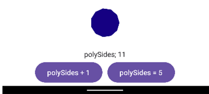
shapeBox(modifier = Modifier.clip(PolyShape(polySides, 100f)))
Text(text = "polySides; ${polySides}")
Row(
modifier = Modifier.fillMaxWidth()
, horizontalArrangement = Arrangement.Center
){
Button(onClick ={
polySides++
}){
Text(text = "polySides + 1")
}
Spacer(modifier = Modifier.width(10.dp))
Button(onClick ={
polySides = 5
}){
Text(text = "polySides = 5")
}
}
}
}
class TriangleShape() : Shape {
override fun createOutline(
size: Size,
layoutDirection: LayoutDirection,
density: Density
): Outline {
val path =Path().apply{
moveTo(size.width / 2f, 0f)
lineTo(size.width, size.height)
lineTo(0f, size.height)
close()
}
return Outline.Generic(path = path)
}
}
class PolyShape(private val sides: Int, private val radius: Float) : Shape {
override fun createOutline(
size: Size,
layoutDirection: LayoutDirection,
density: Density
): Outline {
return Outline.Generic(path =Path().apply{this.polygon(sides, radius, size.center)})
}
}
fun Path.polygon(sides: Int, radius: Float, center: Offset) {
val angle = 2.0 * Math.PI/ sides
moveTo(
x = center.x + (radius *cos(0.0)).toFloat(),
y = center.y + (radius *sin(0.0)).toFloat()
)
for (i in 1untilsides) {
lineTo(
x = center.x + (radius *cos(angle * i)).toFloat(),
y = center.y + (radius *sin(angle * i)).toFloat()
)
}
close()
}
@Preview(showBackground = true)
@Composable
fun DefaultPreview3() {
MyComposeStudyTheme{
ShapeContainer()
}
}
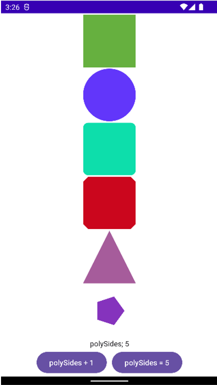
- polySides+1 버튼을 클릭할 때마다 도형의 각도가 증가하여 화면에 다시 그려지는 것을 확인할 수 있습니다.