
css 부분은 가장 중요한(내가 잘 모르는) position과 width, height를 중점으로 설명할 것이다!
css
.header {
display: flex;
justify-content: space-between;
align-items: center;
padding: 20px 50px;
position: fixed;
top: 0;
left: 0;
width: 100%;
z-index: 1000;
}
.logo {
text-decoration: none;
font-size: 45px;
text-transform: uppercase;
letter-spacing: 2px;
color: white;
font-weight: 700;
}
ul {
display: flex;
justify-content: center;
align-items: center;
}
li {
text-decoration: none;
list-style: none;
}
.nav__bar {
margin: 0 20px;
color: white;
text-decoration: none;
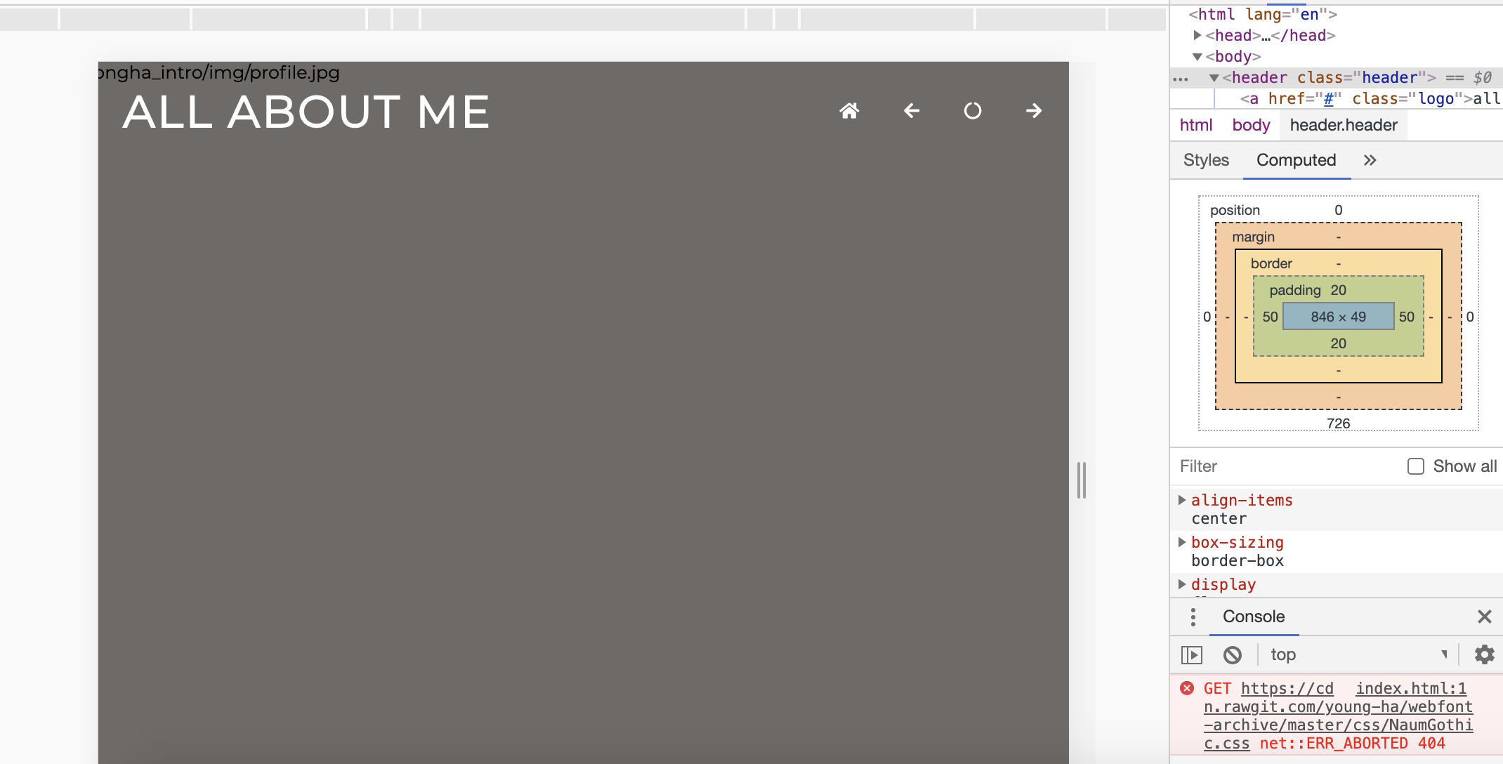
} 이제 막 html 작업이 끝난 element들은 낯선 세상에 나온 것이 부끄러운지 딱딱하게 굳어있다. 우선 header 에 flex를 주어 친구들의 긴장을 풀어주자.
.header {

    display: flex;

}
한결 편해 보인다.
나의 목표는 logo와 navation bar 그리고 toggle을 가로로 늘어서게 만드는 것이니 justify-content: space-between 와 align-items: center 을 아낌없이 준다.
.header {

    display: flex;
    justify-content: space-between;
    align-items: center;

}
오늘 아침 찬 바람에 잠에서 깼다. 가을이 오고 있다. 따뜻한 패딩이 필요하다.
.header {

    display: flex;
    justify-content: space-between;
    align-items: center;
    padding: 20px 50px;
}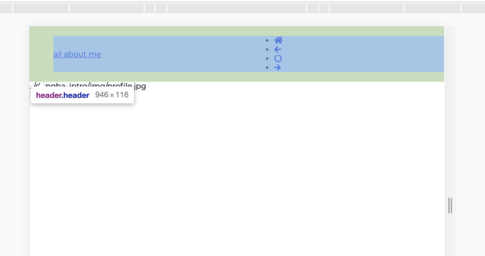
한결 보기 좋아졌다. header 는 스크롤이 내려가더라도 항상 위에 있어야 한다. 과감하게 position: fixed 를 해준다.
무언가 엉망이 되어버린 것 같다. flex도 주고 padding도 주고 이것저것 열심히 한 것 같은데 한순간에 엉망진창이 되었다. 마치 우리네 인생처럼.
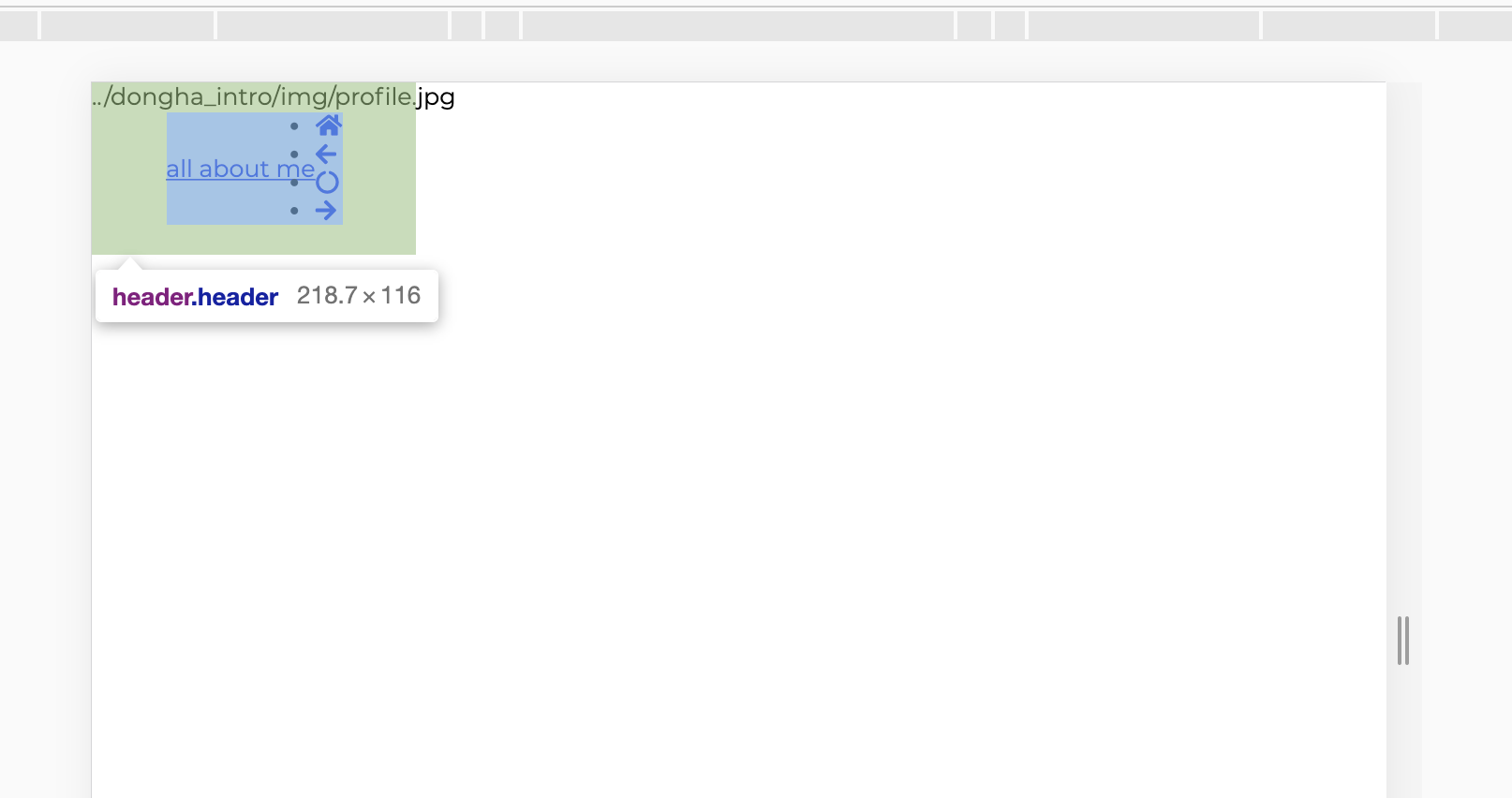
position: fixed를 하면width: 100%를 해줘야 한다.
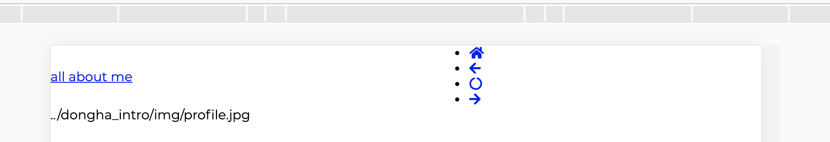
header에 width: 100% 를 주고 ul 에 flex를 하면 이런 모습이 된다.

프론트엔드 개발