
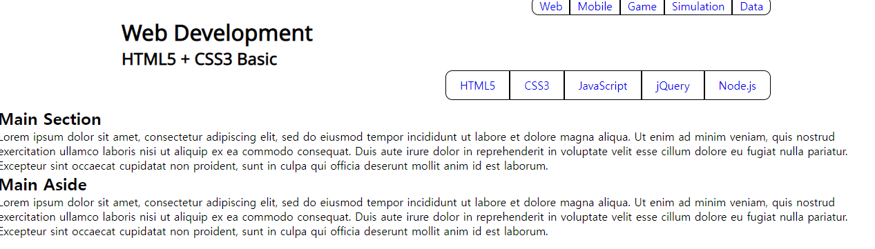
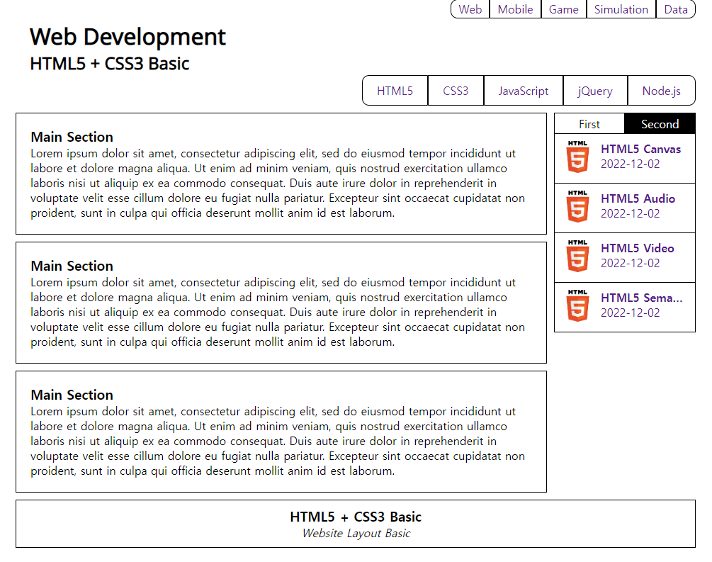
📃콘텐츠 구성
<body>
    <header id="main_header">
	<!-- 생략 -->
    </header>
    <div id="content">
        <section id="main_section">
            <h1>Main Section</h1>
            <p>Lorem ipsum dolor sit amet,</p>
        </section>
        <section id="main_aside">
            <h1>Main Aside</h1>
            <p>Lorem ipsum dolor sit amet,</p>
        </section>
    </div>
</body>
출력
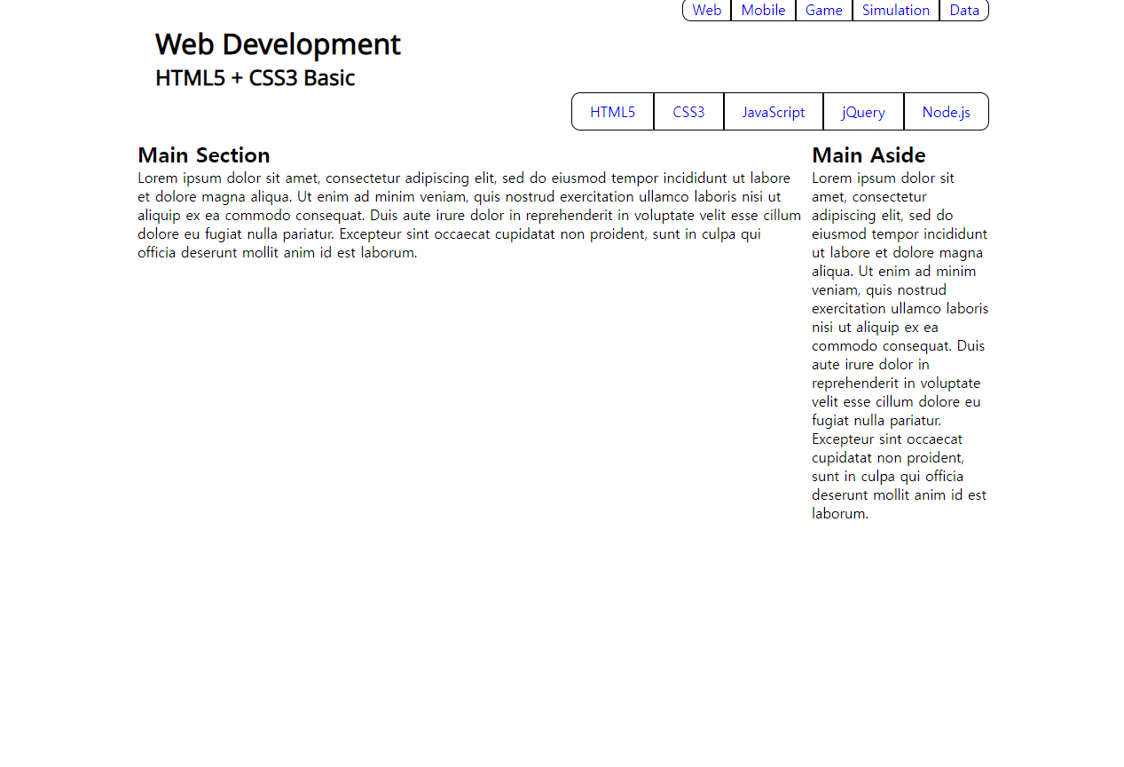
#content 스타일 추가
    <!-- 콘텐츠 -->
    <style>
        #content {
            /* 중앙정렬 */
            width: 960px; margin: 0 auto;

            /* 수평 레이아웃 구성 */
            overflow: hidden;
        }

        #content > #main_section {
            width: 750px;
            float: left;
        }

        #content > #main_aside {
            width: 200px;
            float: right;
        }
    </style>
출력
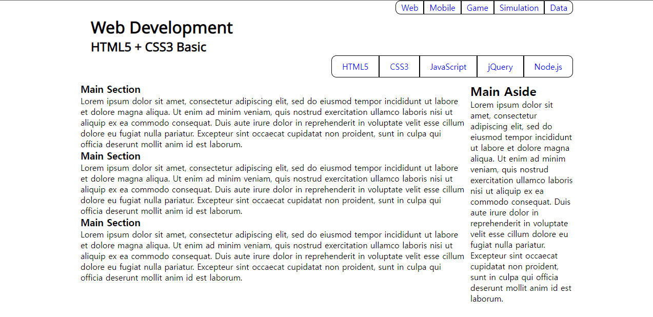
📃본문 구성
		<section id="main_section">
            <article class="main_article">
                <h1>Main Section</h1>
                <p>Lorem ipsum dolor sit amet,</p>
            </article>
            <article class="main_article">
                <h1>Main Section</h1>
                <p>Lorem ipsum dolor sit amet,</p>
            </article>
            <article class="main_article">
                <h1>Main Section</h1>
                <p>Lorem ipsum dolor sit amet,</p>
            </article>
        </section>
출력
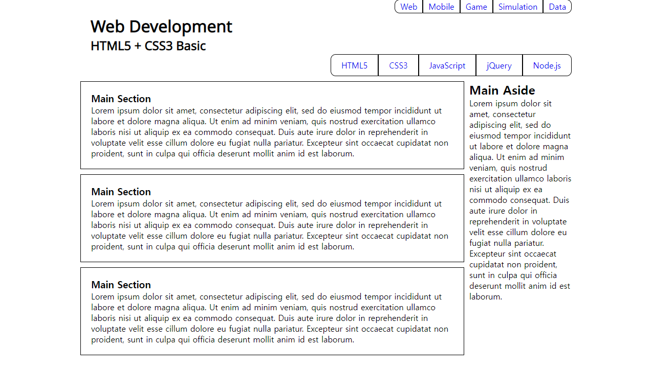
#main_section 스타일 추가
    <!-- 본문 -->
    <style>
        #main_section > article.main_article {
            margin-bottom: 10px;
            padding: 20px;
            border: 1px solid black;
        }
    </style>
출력
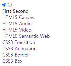
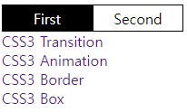
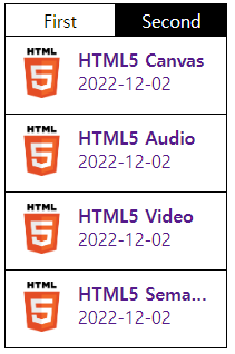
📃사이드 탭바 구성
		<section id="main_aside">
            <input id="first" type="radio" name="tab" checked="checked" />
            <input id="second" type="radio" name="tab" />
            <section class="buttons">
                <label for="first">First</label>
                <label for="second">Second</label>
            </section>
            <div class="tab_item">
                <ul>
                    <li><a href="#">HTML5 Canvas</a></li>
                    <li><a href="#">HTML5 Audio</a></li>
                    <li><a href="#">HTML5 Video</a></li>
                    <li><a href="#">HTML5 Semantic Web</a></li>
                </ul>
            </div>
            <div class="tab_item">
                <ul>
                    <li><a href="#">CSS3 Transition</a></li>
                    <li><a href="#">CSS3 Animation</a></li>
                    <li><a href="#">CSS3 Border</a></li>
                    <li><a href="#">CSS3 Box</a></li>
                </ul>
            </div>
        </section>
출력
탭바 스타일 적용
<!-- 사이드 -->
    <style>
        첫번째 탭
        input:nth-of-type(1) { display: none; }
        input:nth-of-type(1) ~ div:nth-of-type(1) {display: none;}
        input:nth-of-type(1):checked ~ div:nth-of-type(1) {display: block;}

        /* 두번째 탭*/
        input:nth-of-type(2) { display: none; }
        input:nth-of-type(2) ~ div:nth-of-type(2) {display: none;}
        input:nth-of-type(2):checked ~ div:nth-of-type(2) {display: block;}

        /* 탭 모양 구성 */
        section.buttons { overflow: hidden; }
        section.buttons > label {
            /* 수평 정렬 */
            display: block; float: left;

            /* 크기 및 글자 위치 지정 */
            width: 100px; height: 30px;
            line-height: 30px;
            text-align: center;

            /* 테두리 지정 */
            box-sizing: border-box;
            border: 1px solid black;

            /* 색상 지정 */
            background-color: black;
            color: white;
        }

        input:nth-of-type(1):checked ~ section.buttons > label:nth-of-type(1) {
            background-color: white;
            color: black;
        }

        input:nth-of-type(2):checked ~ section.buttons > label:nth-of-type(2) {
            background-color: white;
            color: black;
        }
    </style>
출력
📃목록 구성
tab_item class의 목록 요소들을 이렇게 바꾼다
  <li class="item">
    <a href="#">
      <div class="thumbnail">
        <img src="/img/html .png" />
      </div>
      <div class="description">
        <strong>HTML5 Canvas</strong>
        <p>2022-12-02</p>
      </div>
    </a>
  </li>
출력
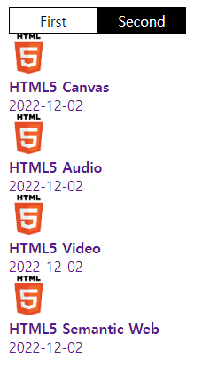
목록 스타일 적용
<!-- 목록 -->
    <style>
        .item {
            overflow: hidden;
            padding: 10px;
            border: 1px solid black;
            border-top: none;
        }

        .thumbnail {
            float: left;
        }

        .description {
            float: left;
            margin-left: 10px;
        }

        .description > strong {
            display: block;
            width: 120px;
            white-space: nowrap;
            overflow: hidden;
            text-overflow: ellipsis;
        }
    </style>
출력
📃푸터 구성
	<footer id="main_footer">
        <h3>HTML5 + CSS3 Basic</h3>
        <address>Website Layout Basic</address>
    </footer>
출력
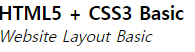
#main_footer 스타일 적용
<!-- 푸터 -->
    <style>
        #main_footer {
            /* 중앙 정렬 */
            width: 960px; margin: 0 auto;
            margin-bottom: 10px;

            /* 테두리 */
            box-sizing: border-box;
            padding: 10px;
            border: 1px solid black;

            /* 글자 정렬 */
            text-align: center;
        }
    </style>
출력

📖완성
이게 왜 안되지? 이게 왜 되지?