
position
요소의 위치 특성을 지정하는 속성
위치를 정한다기 보다 위치의 특성을 지정해서 top, bottom, left, right로 위치를 지정한다.
absolute
- 조상 요소에 position 값을 지정해주지 않았다면 viewport를 기준으로 배치가 된다.
- 부모 요소에 위치의 기준이 될 수 있도록 position 값을 넣어줘야 한다.
- 기본값인 static을 제외한 relative, absolute, fixed, sticky가 이에 해당한다. (보통 relative를 기본적으로 많이 사용)
- 가장 가까운 조상들부터 탐색하여 position이 있으면 그 부모를 기준으로 배치한다.
- 실제로 구현할 때는 구조적으로 가장 가까운 부모 요소에 posttion 값을 주는 것이 관리하기도, 만들기도 쉬워서 추천한다. (아래 경우에는 parent1)
  <div class="parent3">
  	<div class="parent2">
    	<div class="parent1">
        	<div class="child"></div>
        </div>
 	</div>
 </div>
.parent3 {
width: 350px;
height: 250px;
background-color: tomato;
position: relative;
}
.parent2 {
width: 300px;
height: 200px;
background-color: skyblue;
position: relative; /* position이 지정된 가장 가까운 조상 */
}
.parent1 {
width: 250px;
height: 150px;
background-color: orange;
}
.child {
width: 100px;
height: 100px;
background-color: royalblue;
position: absolute;
right: 0;
bottom: 0;
}

fixed
fixed로 지정하면 상위 요소에 position 속성이 지정되어 있어도 영향을 주지 않아 기본적으로 viewport를 기준으로 배치하게 된다.
.parent3 {
  width: 350px;
  height: 250px;
  background-color: tomato;
}

.parent2 {
  width: 300px;
  height: 200px;
  background-color: skyblue;
  position: relative;
}

.parent1 {
  width: 250px;
  height: 150px;
  background-color: orange;
}

.child {
  width: 100px;
  height: 100px;
  background-color: royalblue;
  position: fixed;
  right: 0;
  bottom: 0;
}
단 transform, perspective, filter 속성 중 어느 하나라도 none이 아니라면 뷰포트 대신 그 조상을 기준으로 삼는다.
.parent3 {
  width: 350px;
  height: 250px;
  background-color: tomato;
}

.parent2 {
  width: 300px;
  height: 200px;
  background-color: skyblue;
  transform: scale(1);
}

.parent1 {
  width: 250px;
  height: 150px;
  background-color: orange;
}

.child {
  width: 100px;
  height: 100px;
  background-color: royalblue;
  position: fixed;
  right: 0;
  bottom: 0;
}
쌓임 맥락 (stacking context)
요소가 쌓이는 순서를 말한다.
z-index를 통해 설정할 수 있다.
기본값으로는 0을 가진다.
하지만 z-index를 사용할 수 있는 조건이 있다.
- position이 relative, absolute, fixed, sticky인 요소
- flex 컨테이너의 자식 요소
- grid 컨테이너의 자식 요소
- opacity가 1보다 작은 요소 등이 있다.
<body>
    <div class="item">1</div>
    <div class="item">2</div>
    <div class="item">3</div>
  </body>
.item {
width: 100px;
height: 100px;
font-size: 40px;
}
.item:nth-child(1) {
background-color: royalblue;
}
.item:nth-child(2) {
background-color: orange;
transform: scale(1.5);
z-index: 1; /* z-index 적용이 안됨 */
}
.item:nth-child(3) {
background-color: tomato;
opacity: 0.5;
}
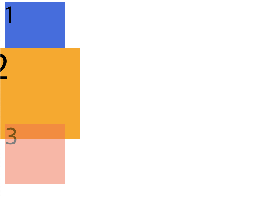
z-index를 사용할 수 있는 조건에 부합하지 않아 z-index가 적용되지 않고 있다.
position 속성 추가
.item {
  width: 100px;
  height: 100px;
  font-size: 40px;
}

.item:nth-child(1) {
  background-color: royalblue;
}

.item:nth-child(2) {
  background-color: orange;
  transform: scale(1.5);
  position: relative;
  z-index: 1; /* position 속성이 적용되었기 때문에 z-index가 적용됨 */
}

.item:nth-child(3) {
  background-color: tomato;
  opacity: 0.5;
}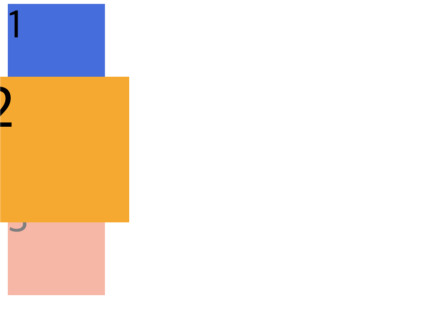
z-index가 올바르게 적용된 것을 알 수 있다.
또한 float속성과 마찬가지로 position의 값으로 absolute와 fixed를 사용하면 자동적으로 display의 속성이 block으로 변경된다.
<div class="item">Hello</div>.item {
width: 200px;
height: 150px;
background-color: orange;
display: inline;
position: absolute;
}


프론트엔드 개발자