bg를 넣을 div 넣기
<div>
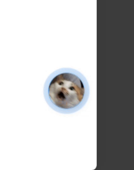
<div class="photo-container" style="--direction:normal;">
...
</div>
<div class="bg-animation"></div>
</div>css 적용하기
@keyframes animloader {
	0% {
    	transform: scale(0.65);
        opacity: 0.9;
    }
    100% {
        transform: scale(1);
        opacity: 0;
    }
}
.bg-animation {
	bottom: 166px;
    right: 88px;
    position: fixed;
    z-index: 1;
}
.bg-animation::after,
.bg-animation::before {
    content: '';
    box-sizing: border-box;
    width: 80px;
    height: 80px;
    border-radius: 50%;
    background-color: rgba(56, 155, 247);
    position: absolute;
    left: 0;
    top: 0;
    opacity: 0;
    animation: animloader 1.8s linear infinite;
}
.bg-animation::after {
	animation-delay: 0.8s;
}- ::before, ::after 이것은 CSS에서 사용하는 가상 요소로서, 이 가상 요소들은 주로 추가적인 디자인 요소를 추가하거나, 스타일링을 위해 사용된다.
- 필자는 ::after 가상 요소에 0.8초 딜레이를 주어서 두겹으로 보여지게 하는(?) 효과를 주었다.

기록남기기