사람이 겪고 있는 질병에 대한 간단한 분석(표, 그림 활용)
라이브러리 불러오기
import numpy as np
import pandas as pd
도수분포표
데이터
death = np.array([2, 1, 2, 4, 2, 5, 3, 3, 5, 6, 3, 8, 3,
                 3, 6, 3, 6, 5, 3, 5, 2, 6, 2, 3, 4, 3,
                 2, 9, 2, 2, 3, 2, 7, 3, 2, 10, 6, 2, 3,
                 1, 2, 3, 3, 4, 3, 2, 6, 2, 2, 3, 2, 3,
                 4, 3, 2, 3, 5, 2, 5, 5, 3, 4, 3, 6, 2,
                 1, 2, 3, 2, 6, 3, 3, 6, 3, 2, 3, 6, 4,
                 6, 5, 3, 5, 6, 2, 6, 3, 2, 3, 2, 6, 2,
                 6, 3, 3, 2, 6, 9, 6, 3, 6, 6, 2, 3, 2,
                 3, 5, 3, 5, 2, 3, 2, 3, 3, 1, 3, 3, 2,
                 3, 3, 4, 3, 6, 6, 3, 3, 3, 2, 3, 3, 6,])
도수분포표 만들기
# table.index = ['감염', '각종암', '순환기', '호흡기', '소화기', '사고사', '비뇨기', '정신병', '노환', '신경계']
table = pd.crosstab(index = death, colnames = ['질병'], columns = '도수')table| 질병 | 도수 |
|---|---|
| row_0 | |
| 1 | 4 |
| 2 | 33 |
| 3 | 48 |
| 4 | 7 |
| 5 | 11 |
| 6 | 22 |
| 7 | 1 |
| 8 | 1 |
| 9 | 2 |
| 10 | 1 |
<svg xmlns="http://www.w3.org/2000/svg" height="24px"viewBox="0 0 24 24"
width="24px">
상대 도수분포표 만들기 (normalize 활용)
table_prob = pd.crosstab(index = death, colnames = ['질병'], columns = '상대도수', normalize = True)
table_prob| 질병 | 상대도수 |
|---|---|
| row_0 | |
| 1 | 0.030769 |
| 2 | 0.253846 |
| 3 | 0.369231 |
| 4 | 0.053846 |
| 5 | 0.084615 |
| 6 | 0.169231 |
| 7 | 0.007692 |
| 8 | 0.007692 |
| 9 | 0.015385 |
| 10 | 0.007692 |
table_data = pd.concat([table, table_prob], axis = 1)
table_data.loc['합계'] = [len(death), 1]
table_data| 질병 | 도수 | 상대도수 |
|---|---|---|
| row_0 | ||
| 1 | 4 | 0.030769 |
| 2 | 33 | 0.253846 |
| 3 | 48 | 0.369231 |
| 4 | 7 | 0.053846 |
| 5 | 11 | 0.084615 |
| 6 | 22 | 0.169231 |
| 7 | 1 | 0.007692 |
| 8 | 1 | 0.007692 |
| 9 | 2 | 0.015385 |
| 10 | 1 | 0.007692 |
| 합계 | 130 | 1.000000 |
<svg xmlns="http://www.w3.org/2000/svg" height="24px"viewBox="0 0 24 24"
width="24px">
# table.index = ['Infection', 'Cancer', 'circulatory system', 'respiratory system', 'digestive system', 'accidental death', 'urinary system', 'mental illness', 'old age', 'nervous system']
table_data.index = ['감염', '각종암', '순환기', '호흡기', '소화기', '사고사', '비뇨기', '정신병', '노환', '신경계', '합계']
print(table_data)
질병 도수 상대도수
감염 4 0.030769
각종암 33 0.253846
순환기 48 0.369231
호흡기 7 0.053846
소화기 11 0.084615
사고사 22 0.169231
비뇨기 1 0.007692
정신병 1 0.007692
노환 2 0.015385
신경계 1 0.007692
합계 130 1.000000table_data.drop(['합계'], axis = 0, inplace = True)막대그래프
한글글꼴 설치
!sudo apt-get install -y fonts-nanum
!sudo fc-cache -fv
!rm ~/.cache/matplotlib -rf
import matplotlib.pyplot as plt
from matplotlib import rc
font_name = 'NanumBarunGothic'
#rc('font', family =font_name)table_data| 질병 | 도수 | 상대도수 |
|---|---|---|
| 감염 | 4 | 0.030769 |
| 각종암 | 33 | 0.253846 |
| 순환기 | 48 | 0.369231 |
| 호흡기 | 7 | 0.053846 |
| 소화기 | 11 | 0.084615 |
| 사고사 | 22 | 0.169231 |
| 비뇨기 | 1 | 0.007692 |
| 정신병 | 1 | 0.007692 |
| 노환 | 2 | 0.015385 |
| 신경계 | 1 | 0.007692 |
<svg xmlns="http://www.w3.org/2000/svg" height="24px"viewBox="0 0 24 24"
width="24px">
plt.rc('font', family = font_name)
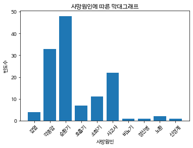
plt.bar(x = table_data.index, height = table_data['도수'])
# table.plot(kind = 'bar', color = 'blue', legend = False)
plt.xlabel('사망원인')
plt.ylabel('빈도수')
plt.title('사망원인에 따른 막대그래프')
plt.xticks(rotation = 45)
plt.show()
원형그래프
plt.pie(table_data['도수'], labels = table_data.index)
plt.rc('font', size = 10, family = font_name)
plt.show()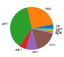
히스토그램
import numpy as npdrink = np.array([101.8, 101.5, 101.8, 102.6, 101, 96.8, 102.4, 100, 98.8, 98.1,
98.8, 98, 99.4, 95.5, 100.1, 100.5, 97.4, 100.2, 101.4, 98.7,
101.4, 99.4, 101.7, 99, 99.7, 98.9, 99.5, 100, 99.7, 100.9,
99.7, 99, 98.8, 99.7, 100.9, 99.9, 97.5, 101.5, 98.2, 99.2,
98.6, 101.4, 102.1, 102.9, 100.8, 99.4, 103.7, 100.3, 100.2, 101.1,
101.8, 100, 101.2, 100.5, 101.2, 101.6, 99.9, 100.5, 100.4, 98.1,
100.1, 101.6, 99.3, 96.1, 100, 99.7, 99.7, 99.4, 101.5, 100.9,
101.3, 99.9, 99.1, 100.7, 100.8, 100.8, 101.4, 100.3, 98.4, 97.2])#plt.figure()
n, bins, _ = plt.hist(drink, bins = 10, facecolor = 'blue', alpha = 0.3)
center = []
for i in range(len(bins)):
if i+1 == len(bins):
break
new = (bins[i] + bins[i+1]) / 2
center.append(new)
plt.xlabel('drink')
plt.ylabel('Frequency')
plt.title('Histogram of drink')
plt.plot(center, n, marker = 'o')
plt.show()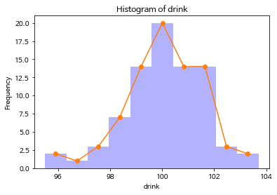
Deep Learning, Multi-Agent RL, Large Language Model, Statistics