[TIL] Bottom Navigation 커스텀

Bottom Navigation
Bottom Navigation View를 사용하다보면 커스텀이 어려워 애를 먹게되는 경우가 많았다.
그동안에는 Icon사이즈나 Text의 크기, 표시여부같은 아이템을 이용한 커스텀이나, Bottom Navigation View내부의 Padding값을 조절하는 방법을 통해 커스텀을 해왔었다.
그래서 큰 틀을 벗어나지 못하는 방법으로 활용했었는데, 이번에 새로운 팀 프로젝트를 진행하며 기존의 밋밋한 Bottom Navigation을 좀 더 활기찬 방법으로 커스텀 해보기 위해 알아보다가 가장 간단하면서도 효과적인 Fab Button을 통해 커스텀 하는 방법을 알아봤다.
Bottom Appbar
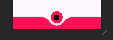
coodinator layout과 Bottom Appbar를 사용해 중앙에 Fab을 위치시킨 형태의 Bottom Navigation을 만들 수 있다.
(Fab: Floating Action Button)
우선 최상단에 coodinator layout을 선해준 뒤, 안쪽에 Bottom Appbar를 선언한다.
이때 Bottom Appbar에 속성으로 fabCradleMargin과 fabCradleRoundedCornerRadius를 선언해 Fab이 Bottom Appbar에 겹쳐졌을때 위와같이 margin이 생기도록 만들어준다.
- fabCradleMargin :
Fab이Bottom Appbar와 겹쳐졌을때 얼만큼 공간을 띄워줄지 결정
- fabCradleRoundedCornerRadius :
Fab이 제외된 나머지 부분의 둥글기를 결정
Bottom Appbar안쪽으로 사용할 Bottom Navigation View를 선언해준다.
Fab은 Bottom Appbar와 겹쳐져야 하기때문에 Bottom Appbar의 밖에 선언해주며, 이때 layout_anchor속성을 사용해 Bottom Appbar에 고정해준다.
 <androidx.coordinatorlayout.widget.CoordinatorLayout
	android:layout_width="match_parent"
    android:layout_height="wrap_content"
    app:layout_constraintBottom_toBottomOf="parent">

	<com.google.android.material.bottomappbar.BottomAppBar
		android:id="@+id/bottom_app_bar"
    	android:layout_width="match_parent"
    	android:layout_height="wrap_content"
        app:fabCradleMargin="9dp"
        app:fabCradleRoundedCornerRadius="52dp">

		<com.google.android.material.bottomnavigation.BottomNavigationView
    		android:id="@+id/bottom_navi"
        	android:layout_width="wrap_content"
        	android:layout_height="56dp"
    	    app:menu="@menu/bottom_navi_menu" />

	</com.google.android.material.bottomappbar.BottomAppBar>

	<!-- 플로팅 버튼은 BottomAppBar외부, Coordinator Layout안 에 선언해줘야한다. -->
	<com.google.android.material.floatingactionbutton.FloatingActionButton
    	android:layout_width="wrap_content"
        android:layout_height="wrap_content"
        android:backgroundTint="#ff1255"
        android:src="@drawable/ic_launcher_background"
        android:tint="@color/white"
        app:layout_anchor="@id/bottom_app_bar" />

</androidx.coordinatorlayout.widget.CoordinatorLayout>
※ Why Coodinator?
어차피 Bottom Appbar의 속성을 사용하는거라면 Coodinator Layout이 아니라 다른 레이아웃으로 가능하지 않을까? 라고 생각했지만 Bottom Appbar는 반드시 Coodinator Layout으로 감싸져야만 하기떄문에 Coodinator Layout을 사용할 수 밖에 없다.
주의사항
급한마음에 튜토리얼 영상들을 스킵하며 따라하다가 계속 안되는 경우가 생겼다. 그래서 천천히 영상을 보다보니 이 방식으로 Bottom Navigation을 커스텀 하려면 MaterialComponents 테마를 사용해야했다.
만약 앱의 전체 테마가 MaterialComponents가 아닐경우 해당 기능으로 커스텀이 불가능 할 수 있다.
그때는 Bottom Appbar를 사용하는 Coodinator Layout에 theme속성으로 MaterialComponents테마를 지정해주면 된다.
<!-- theme속성값으로 MaterialComponents를 지정 -->
<androidx.coordinatorlayout.widget.CoordinatorLayout
	android:layout_width="match_parent"
    android:theme="@style/Theme.MaterialComponents"
    android:layout_height="100dp">

	...

</androidx.coordinatorlayout.widget.CoordinatorLayout>
주의사항 2
Bottom Navigation에 배경을 반드시 투명하게 지정해줘야만 위의 모양이 구성된다.
만약 배경색상이 들어있다면 Bottom Navigation이 Bottom Appbar를 가려 모양이 안나오는것처럼 보이게된다.
오늘은 어땠나요

어...? 내가... 뭐하고 있었더라...?
잠을... 잤던가...?