1. 붓꽃(Iris) 품종 분류 머신러닝 모델 만들기
<머신러닝 모델 만들기 절차>
- 문제정의
- 데이터 준비하기
- 데이터 확인하기
- 데이터 셋을 훈련 및 테스트 데이터로 분리하기
- 머신러닝 모델 설정(k-최근접 이웃 알고리즘)
- 학습하기
- 예측하기
- 모델 평가하기
1) 문제정의
- 붓꽃의 품종을 분류하고 싶다 > 3개 품종 중 하나를 예측하는 다중 분류 문제로 정의
- 문제집 -> 데이터, 특성(feature), 독립변수(x): 꽃잎, 꽃받침의 길이와 너비(cm) 4개 종류
- 정답 -> 클래스(class), 레이블(label), 타깃(Target), 종속변수(y): 붓꽃의 품종(setosa, versicolor, virginica)
2) 데이터 준비하기
- 싸이킷 런 라이브러리에서 제공하는 붓꽃 데이터 활용
from sklearn.datasets import load_iris
iris_dataset = load_iris()
3) 데이터 확인하기
iris_dataset # 중괄호: key와 value로 이루어져 있는 딕셔너리 타입
#0: setosa, 1:versicolor, 2: virginica
iris_dataset['target'] # 정답, label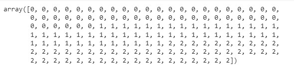
iris_dataset['data'] # 문제집, feature 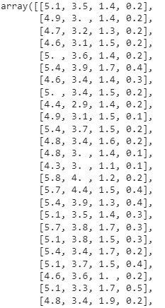
- 위와 같이 data와 target이 잘 분리되어 있는 경우는 없다. 일반적으로는 데이터셋을 가져와서 x와 y가 될 값들을 지정해서 분리해줘야 한다.
type(iris_dataset['data']) # 데이터 형태를 확인하고 싶을 때 사용- 위와 같이 데이터 형태를 확인해보면, 'numpy.ndarray'로 나오는데 numpy에서 제공하는 다차원 계열의 리스트(수학적 계산; '차원을 줄여주거나 백터 계산이 가능' 을 용이하게 해주는 라이브러리이다.
iris_dataset['target'].shape # 150건의 줄로 되어있다(feature가 없는 1차원 데이터)- 결과값 = (150,)
iris_dataset['data'].shape # 150건의 feature가 4개인(4차원; 파이썬으로 말하면 column) 데이터- 결과값 = (150,4)
import matplotlib.pyplot as plt
import pandas as pd # 헷갈리면 판다스로 바꿔서 확인 가능
# 데이터프레임을 사용하여 데이터 분석(시각화) -> feature와 label의 연관성을 확인
iris_df = pd.DataFrame(iris_dataset['data'], columns=iris_dataset.feature_names)
iris_df.head(150)
iris_df.info()
# 각 feature들의 산점도 행렬 4 X 4

pd.plotting.scatter_matrix(iris_df, c= iris_dataset['target'], figsize=(15,15),
                           marker='o', hist_kwds={'bins':20}, s=60, alpha=.8)

                           # marker: 동그라미
                           # his_kwds: 히스토그램 키워드
                           # s: 마커 사이즈
                           # c: 마커 컬러
                           # alpha: 투명도
plt.show()
- 각 프레임마다 각각의 요소들을 비교해 산점도를 그리는 것
- 산점도를 보고 어떤 특징으로 품종을 분류할 수 있을지 선택한다
- 위 산점도에서는 petal width와 petal length를 비교한 값이 효과적일 것으로 보인다
- 산점도를 그렸는데 너무 산재해있으면 feature 내에서 공유하고 있는 특징이 없어 연관성이 없다고 볼 수 있다.
import numpy as np

plt.imshow([np.unique(iris_dataset['target'])])
#그린 차트의 타겟들이 어떻게 구성되어 있는지 확인가능 근데 이름은 모름... 어떻게 하면 될까?
_=plt.xticks(ticks=np.unique(iris_dataset['target']), labels=iris_dataset['target_names'])-
언더스코어: 값을 사용하지 않을 거면(출력하지는 않을 거면) 변수에 담아서 사용만 안 함
-
즉, return받는 값을 사용하지는 않음, 변수 이름이 '_'이다.
-
명명을 특징있게 적으면 변수 사용하는 것처럼 보이니까...(코딩 약속)
-
언더스코어 적용 전

-
언더스코어 적용 후

iris_dfp = iris_df[['petal width (cm)','petal length (cm)']]- 산점도 확인 결과에 따라 필요한 정보만을 담아 새로운 df를 선언한다.
# 각 feature들의 산점도 행렬 2 X 2

pd.plotting.scatter_matrix(iris_dfp, c= iris_dataset['target'], figsize=(15,15),
                           marker='o', hist_kwds={'bins':20}, s=60, alpha=.8)
plt.show()
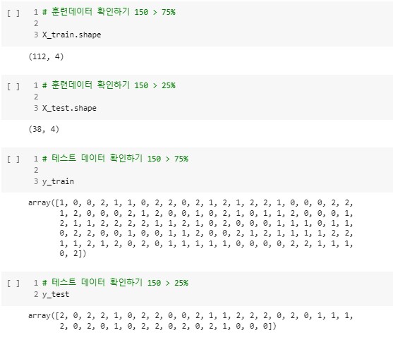
4) 데이터 셋을 훈련 및 테스트 데이터로 분리하기
# <분류에 필요한 변수>
# (문제지) data > x_train/x_test
# (정답지) target > y_train/y_test

iris_dataset['target']
- 5:5가 좋으나, 양질의 데이터 셋 10000개 이하면 7:3, 75:25, 8:2, 9:1 로 분류하여 진행
- 150개 중 100개 학습, 50개 테스트
- 훈련 셋과 테스트 셋을 섞어서 진행해야 한다.
- 위 데이터를 보면...순서대로 셋을 자를 경우 일부 품종은 학습하지 못할 수도 있기 때문
from sklearn.model_selection import train_test_split
# 아래와 같이 변수를 분리해서 줌

# <분류에 필요한 변수>
# (문제지) data > x_train/x_test
# (정답지) target > y_train/y_test

X_train, X_test, y_train, y_test = train_test_split(iris_dataset['data'], iris_dataset['target'],
test_size=0.25, random_state=777)- random_state: 777,0,1 다 가능; 스플릿할 때 숫자를 넣어줌으로써...랜덤 seed를 고정시키는 역할
- 랜덤 스플릿할 때마다 동일한 스플릿 결과가 나옴, 즉 데이터 고정
- X 대문자로 쓴 이유는 값이 1개 이상의 변수가 담긴 것
- y 소문자로 쓴 이유는 결과 값이 1개의 변수가 담겨 있음
- 위와 같이 데이터를 나눠주면 아래와 같이 그 결과를 확인할 수 있다.
5) 머신러닝 모델 설정(k-최근접 이웃 알고리즘)
from sklearn.neighbors import KNeighborsClassifier

knn = KNeighborsClassifier(n_neighbors=1)
# 가장 가깝게 있는 데이터 셋 1개를 보고 예측해볼게
6) 학습하기
knn.fit(X_train, y_train)- 해당 코드를 실행하면 'KNeighborsClassifier(n_neighbors=1)'라는 결과가 나온다.
7) 예측하기
y_pred = knn.predict(X_test)
y_pred
8) 모델 평가하기
#정확도 확인
# 1) mean() 함수를 사용해서 정확도 확인
np.mean(y_pred == y_test)- 결과값: 0.9736842105263158
# 2) score() 함수를 사용해서 정확도 확인 -> 테스트 셋으로 예측한 후 정확도 출력
knn.score(X_test, y_test)- 결과값: 0.9736842105263158
# 평가지표 계산(precison과 recall, f1-score를 활용)

from sklearn import metrics

knn_report = metrics.classification_report(y_test, y_pred)
print(knn_report)
- '0'은 산점도에서 보랏빛 target을 말한다(setosa)
- 평가지표 결과를 높이기 위해 1,2에 대한 품종 데이터를 수집해서 개선
2. 지도학습 분류와 회귀 데이터 셋 확인
1) 예제에 사용할 이진분류 데이터셋(forge) 확인하기
#라이브러리 임포트
import mglearn
import matplotlib.pyplot as plt
import warnings
warnings.filterwarnings('ignore') #오류 빨강색, 워닝 노란색

# 데이터셋 다운로드
X , y = mglearn.datasets.make_forge()
1-1) 데이터 확인하기
print("X.shape : ", X.shape)
print("y.shape : ", y.shape)- 결과값: X.shape : (26, 2)
y.shape : (26,)
y- 결과값: array([1, 0, 1, 0, 0, 1, 1, 0, 1, 1, 1, 1, 0, 0, 1, 1, 1, 0, 0, 1, 0, 0, 0, 0, 1, 0])
plt.figure(dpi=150)
plt.rc('font', family='NanumBarunGothic')

# 산점도 그리기
mglearn.discrete_scatter(X[:,0], X[:,1], y)
#이진분류이기 때문에 class 값은 두개임

plt.legend(['클래스0','클래스1'], loc=4)
plt.xlabel("첫 번째 특성")
plt.ylabel("두 번째 특성")
plt.show()
- 위 차트 내용에 따르면 모델이 두번째 특성을 선택하게 된다.
- 그 사항은 차트를 보고 알 수 있는데 첫번째 특성보다는 두번째 특성으로 두 클래스를 구분지을 수 있기 때문이다.
2) 회귀 데이터 셋(wave) 확인하기
#데이터 셋 다운로드
X, y = mglearn.datasets.make_wave(n_samples=40)
print("X.shape : ", X.shape) #하나의 feature로 이루어져 있음
print("y.shape : ", y.shape)- 결과값: X.shape : (40, 1), y.shape : (40,)
y
# 산점도 X, y
plt.figure(dpi=100)
plt.rc('font', family='NanumBarunGothic')
plt.rcParams['axes.unicode_minus'] = False #음수 오류 방지

plt.plot(X,y,'o')
plt.ylim(-3,3)

plt.xlabel("특성")
plt.ylabel("타깃")
plt.show()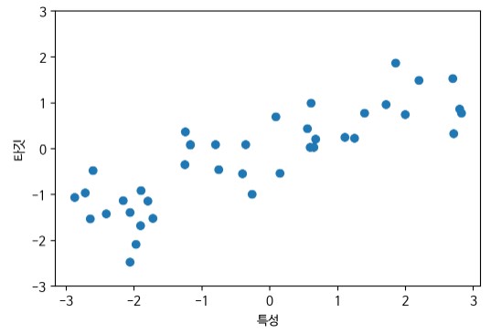
3) 분류 문제 정의
- 위스콘신 유방암 데이터 셋을 사용한 악성 종양(label 1) 예측하기
- 원본데이터: https://archive.ics.uci.edu/ml/datasets/Breast+Cancer+Wisconsin+%28Diagnostic%29
from sklearn.datasets import load_breast_cancer
cancer = load_breast_cancer()cancer['target_names']- 결과값: array(['malignant', 'benign'], dtype='<U9')
cancer['target'] 
cancer['data'].shape - 결과값: (569, 30)
- 30개의 feature를 가지고 있다. 569건의 데이터 수를 가지고 있다.
cancer['DESCR']- ...생략...Missing Attribute Values: None\n\n :Class Distribution: 212 - Malignant, 357 - Benign\n\n ...생략
import matplotlib.pyplot as plt
import pandas as pd # 헷갈리면 판다스로 바꿔서 확인 가능

# 데이터프레임을 사용하여 데이터 분석 -> feature와 label의 연관성을 확인
c_df = pd.DataFrame(cancer['data'], columns=cancer.feature_names)


import numpy as np

plt.imshow([np.unique(cancer['target'])])
#그린 차트의 타겟들이 어떻게 구성되어 있는지 확인가능 근데 이름은 모름... 어떻게 하면 될까?

_=plt.xticks(ticks=np.unique(cancer['target']), labels=cancer['target_names'])

pd.plotting.scatter_matrix(c_df, c= cancer['target'], figsize=(15,15),
                           marker='o', hist_kwds={'bins':20}, s=10, alpha=.8)

plt.show()
4) 회귀 문제 정의
- 보스톤 주택 가격 데이터셋을 사용한 평균 주택 가격 예측(자료 기준 1970's)
- 원본 자료1: https://scikit-learn.org/stable/modules/generated/sklearn.datasets.load_boston.html#sklearn.datasets.load_boston
- 원본 자료2: http://lib.stat.cmu.edu/datasets/boston
from sklearn.datasets import load_boston
boston = load_boston()- 싸이킷 런에서 제공하는 보스턴 주택가격 데이터 셋을 불러오고 변수로 저장
boston.data.shape- 결과값: (506,13)
- 506개의 데이터(행)을 가지고 있고 13개의 특징(feature, 컬럼)을 가지고 있다.
boston.target
- 보스턴 주택가격 데이터 셋의 특징 종류를 알아보자.
boston.feature_names- array(['CRIM', 'ZN', 'INDUS', 'CHAS', 'NOX', 'RM', 'AGE', 'DIS', 'RAD', 'TAX', 'PTRATIO', 'B', 'LSTAT'], dtype='<U7')
<참고. 보스턴 집값 데이터의 feature 정보>
CRIM per capita crime rate by town
ZN proportion of residential land zoned for lots over 25,000 sq.ft.
INDUS proportion of non-retail business acres per town
CHAS Charles River dummy variable (= 1 if tract bounds river; 0 otherwise)
NOX nitrogen oxides concentration (parts per 10 million)
RM average number of rooms per dwelling
AGE proportion of owner-occupied units built prior to 1940
DIS weighted mean distances to five Boston employment centres
RAD index of accessibility to radial highways
TAX full-value property-tax rate per $10,000
PTRATIO pupil-teacher ratio by town
B 1000(Bk - 0.63)^2 where Bk is the proportion of blacks by town
LSTAT lower status of the population (%)
MEDV Median value of owner-occupied homes in $1000's
CRIM: 지역별 범죄발생률
ZN: 25,000평방피트를 넘는 거주 지역의 비율
INDUS: 도시별 비상업 지역의 넓이 비율
CHAS: 찰스강에 대한 더미 변수(1 = 강의 경계, 0 = 나머지)
NOX: 일산화질소 농도
RM: 거주할 수 있는 평균 방의 개수
AGE: 1940년 이전에 지어진 소유 주택의 비율
DIS: 5개의 주요 고용센터까지의 가중치가 고려된 거리
RAD: 고속도로의 접근 용이도
TAX: 10,000달러당 재산세 비율
PTRATIO: 지역의 교사와 학생 수 비율
B: 지역의 흑인 거주 비유
LSTAT: 하위 계층의 비율
MEDV: 본인 소유 주택 가격의 중앙값
3. 지도학습 알고리즘_KNN(분류)
- 최근접 알고리즘은 훈련 데이터 셋에서 가장 가까운 데이터 포인트를 찾아 분류 또는 회귀하는 알고리즘이다.
- 이웃의 수를 정할 수 있으며 수가 적으면 데이터를 편협하게 보아 과대적합될 가능성이 높다.
1) KNN 알고리즘 아이디어 확인 위한 forge 데이터셋 분류
pip install mglearn

import mglearn
import matplotlib.pyplot as plt

import warnings
warnings. filterwarnings('ignore')- mglearn 라이브러리를 설치하고 임포트
- 도표를 그리기 위해 matplob라이브러리를 임포트
- 경고 알람 무시 설정
1-1) forge 데이터셋 분류 예 1-최근접
- 이웃의 수를 '1'로 설정해서 머신러닝이 분류하는 로직 확인
plt.figure(dpi=100)
mglearn.plots.plot_knn_classification(n_neighbors = 1) 
- 이웃의 수가 1일 때는 가장 근접한 훈련 데이터 한 개만 보고 분류하기 때문에 과
대적합 문제가 발생한다.
1-2) forge 데이터셋 분류 예 3-최근접
- 이웃의 수를 '3'으로 설정해서 머신러닝이 분류하는 로직 확인
plt.figure(dpi=100)
mglearn.plots.plot_knn_classification(n_neighbors = 3) 
1-3) forge 데이터셋 분류 예 5-최근접
- 이웃의 수를 '5'로 설정해서 머신러닝이 분류하는 로직 확인
plt.figure(dpi=100)
mglearn.plots.plot_knn_classification(n_neighbors = 5)
2) 문제 정의(KNN 분류)
Forge 데이터 셋을 활용한 이진 분류 문제로 정의
2-1) 데이터 준비하기
X, y = mglearn.datasets.make_forge()- X: 데이터(feature, 특성, 문제집, data), y: 레이블(label, 정답지, target)
- X: 데이터는 대문자 X로 표현(입력) 2차원 배열 = 대문자
- y: 레이블은 소문자 y로 표현(출력) 1차원 배열(백터) = 소문자
2-2) 일반화 성능 평가 위한 데이터 분리 -> 훈련 및 테스트 셋
from sklearn.model_selection import train_test_split
X_train, X_test, y_train, y_test = train_test_split(X, y, random_state=7)- random_state는 데이터 셋을 분리하는 기준으로서 매번 셀을 실행시킬 때마다 분리된 세팅이 동일하게 유지시켜 준다.
- 분리 비율을 설정하지 않으면 기본적으로 75:25로 나눈다.
- 위와 같이 데이터를 분리한 후에 아래와 같이 그 수를 확인해본다.
X_train.shape- 결과값:(19, 2)
- 데이터가 가진 feature의 종류가 2개임
X_test.shape- 결과값:(7, 2)
y_train.shape- 결과값:(19, )
y_test.shape- 결과값:(7, )
2-3) K-최근접 이웃 분류 모델 설정하기
From sklearn.neighbors import KNeighborsClassfier
clf =KNeighborsClassifier(n_neighbors=3)
2-4) 모델 학습하기
clf.fit(X_train,y_train)- 결과값: KNeighborsClassifier(n_neighbors=3)
2-5) score()함수를 활용하여 예측 정확도 확인
#테스트 정확도
clf.score(X_test, y_test)- 결과값: 0.8571428571428571
#훈련 정확도
clf.score(X_train, y_train)- 결과값: 0.9473684210526315
- 테스트 정확도보다 훈련 정확도가 더 높은 것을 보면 모델이 훈련 데이터에 과대적합되어 있고 일반화 정도가 부족함을 알 수 있다.
2-6) KNeighborsClassifier 이웃의 수에 따른 성능평가
- 1) 이웃의 수를 1-10까지 증가시켜서 학습 진행
- 2) score()함수를 이용하여 예측 정확도 저장
- 3) 시각화 차트로 최적점을 찾는다.
#이웃의 수에 따른 정확도를 저장할 리스트 변수 선언
train_scores = []
test_scores = []

num_settings = range(1,16) # 유지 보수 용이성을 위해 변수로 선언

for num_neighbor in num_settings:
  #모델 생성
  clf = KNeighborsClassifier(n_neighbors=num_neighbor)
  clf.fit(X_train, y_train)

  #훈련 세트 정확도 저장
  train_scores.append(clf.score(X_train, y_train))
  #테스트 세트 정확도 저장
  test_scores.append(clf.score(X_test, y_test))

#예측 정확도 비교 그래프 그리기
plt.figure(dpi=100)

plt.plot(num_settings, train_scores, label='훈련 정확도')
plt.plot(num_settings, test_scores, label='테스트 정확도')

plt.ylabel('정확도')
plt.xlabel('이웃의 수')
plt.legend()
plt.show() #sweet spot = 3 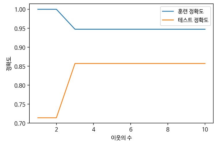
- 1~15까지 n_neighbors의 수를 증가시켜서 학습 후 정확도 저장
- 이웃을 적게 사용하면 모델의 복잡도 상승(이웃 하나하나 자세히 봄, 결정경계가 급격한 라인을 그림)
- 이웃의 수가 하나일 때는 훈련 데이터에 대한 예측이 완벽하나 테스트 세트의 정확도는 매우 낮아짐
- 이웃을 많이 사용하면 모델의 복잡도 하락(결정경계가 부드러운 라인을 그림)
- 테스트 정확도가 가장 높으면서 훈련 정확도와 차이가 적은 모델이 일반화된 모델이므로
이 그래프에서는 이웃의 수가 3인 경우가 sweetspot이라고 할 수 있음
3) 유방암 데이터셋 분류
3-1) 데이터 준비하기
from sklearn.datasets import load_breast_cancer
cancer = load_breast_cancer()
3-2) 데이터 분리하기
from sklearn.model_Selection import train_test_split
X_train, X_test, y_train, y_test = train_test_slplit(cancer.data, cancer.target, random_state =7)- 아래와 같이 데이터를 확인할 수 있다.
cancer.data.shape- 결과값: (569, 30)
X_train.shape #75% 훈련 데이터- 결과값: (426, 30)
X_test.shape # 25% 훈련 데이터- 결과값: (143, 30)
3-3) 이웃의 수(결정경계)에 따른 성능평가
#이웃에 수에 따른 정확도를 저장할 리스트 변수 선언
train_scores = []
test_scores = []

num_settings = range(1,11) # 유지 보수 용이성을 위해 변수로 선언

#1~10까지 n_neighbors의 수를 증가시켜서 학습 후 정확도 저장
for num_neighbor in num_settings:
  #모델 생성
  clf = KNeighborsClassifier(n_neighbors=num_neighbor)
  clf.fit(X_train, y_train)

  #훈련 세트 정확도 저장
  train_scores.append(clf.score(X_train, y_train))
  #테스트 세트 정확도 저장
  test_scores.append(clf.score(X_test, y_test))

#예측 정확도 비교 그래프 그리기
plt.figure(dpi=100)

plt.plot(num_settings, train_scores, label='훈련 정확도')
plt.plot(num_settings, test_scores, label='테스트 정확도')

plt.ylabel('정확도')
plt.xlabel('이웃의 수')
plt.legend()
plt.show() 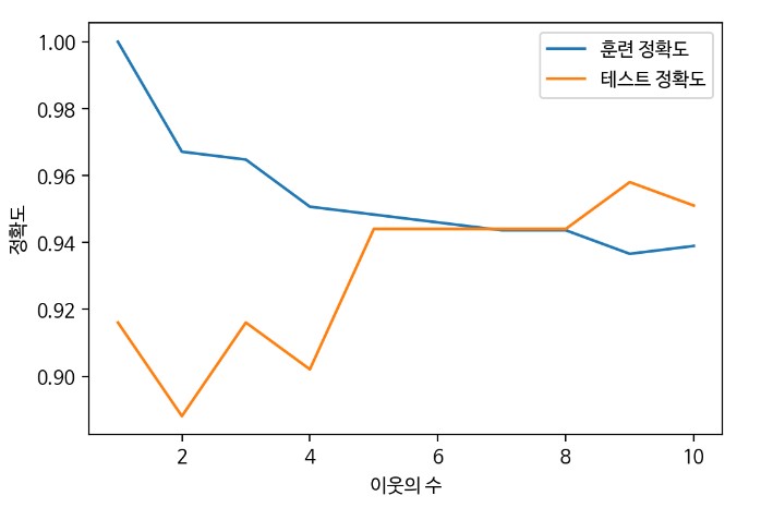
- sweet spot = 7,8
- 테스트 정확도가 높은 이웃의 수는 9로 보이지만 훈련 정확도는 오히려 떨어지고 있기 때문에 새로운 테스트 데이터가 들어왔을 때 정확도가 저렇게 높을 것이라고 확신할 수 없다. 따라서 가장 좋은 지점은 훈련과 테스트의 정확도 차이가 크지 않으면서도 테스트 정확도가 높은 지점을 선택해야 한다.
- 이웃의 수가 많아지면 결국 모든 이웃을 보게 되고 평균 값을 예측하기 때문에 배가 산으로 갈 가능성이 크다.