1. MNIST 다중분류
- 단층 퍼셉트론으로 해결할 수 없는 문제를 다층 퍼셉트론으로 구현한다. 다층 퍼셉트론은 여러 층의 레이어를 적정하게 쌓아 정확도를 높이는 것이 목표이다.
- 또한 이 데이터는 다중분류해야 하는 데이터임을 염두에 두자.
1) 문제 정의
- 0부터 9까지 손글씨로 쓰인 숫자를 예측하는 다중 분류 문제
2) MNIST 데이터 준비하기
from keras.datasets.mnist import load_data

# keras 저장소에서 데이터 다운로드
(X_train, y_train), (X_test, y_test) = load_data(path='mnist.npz')
- 이 학습에서는 훈련과 테스트 데이터를 분리해서 가져온다.
- 다른 상황에서도 사용할 수 있는 코드인지 확인해야 할 것 같다.
3) 데이터 형태 확인하기
X_train.shape
- 결과값: (60000, 28, 28)
- feature가 2차원의 형태인 28*28로 있음
X_train
# 훈련 데이터
print(X_train.shape, y_train.shape)
print(y_train)

# 테스트 데이터
print(X_test.shape, y_test.shape)
print(y_test)
- 결과값: (60000, 28, 28) (60000,)
[5 0 4 ... 5 6 8]
(10000, 28, 28) (10000,)
[7 2 1 ... 4 5 6]
- 28*28 벡터 배열 x 하나당 숫자 결과 y 하나씩 존재
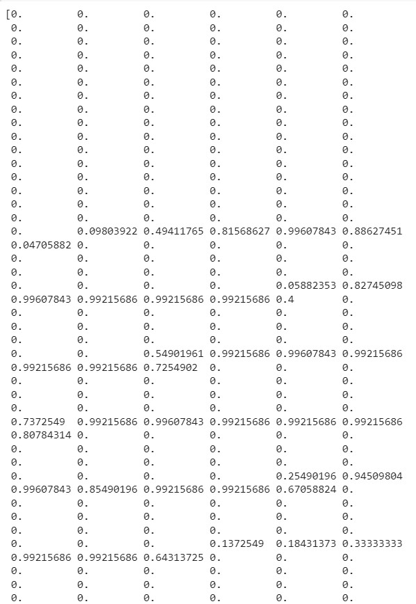
print(X_train[0])
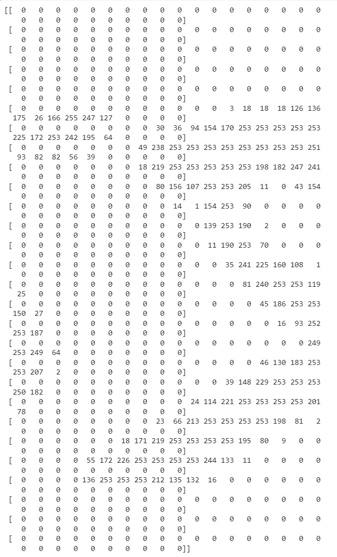
- 0번째 데이터는 숫자 5를 표현하고 있다.
- 픽셀값이 0-255로 정해져있어 진한 정도를 조정한다.
4) 데이터 그려보기
import matplotlib.pyplot as plt
import numpy as np

idx = 0
img = X_train[idx,:] # 0번째 행의 모든 열을 그려줘
label = y_train[idx] # 0번째 정답지
plt.figure()
plt.imshow(img)
plt.title('%d-th data, label is %d' % (idx, label))
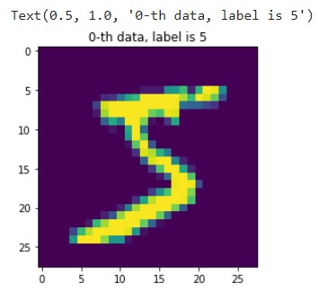
- 숫자 5라는 것을 어레이 형태가 아닌 이미지로 확인해볼 수도 있다.
5) 검증 데이터 만들기
- 훈련 데이터 중 30%를 validation 값으로 분리
from sklearn.model_selection import train_test_split

# 훈련 데이터를 훈련/검증 데이터로 7:3 비율로 분리
X_train, X_val, y_train, y_val = train_test_split(X_train, y_train, test_size=0.3,
                                                  random_state=777)

print(X_train.shape) # 훈련데이터 42000건
print(X_val.shape) # 검증데이터 18000건
- 결과값:
(42000, 28, 28)
(18000, 28, 28)
6) 모델 입력을 위한 학습데이터(손글씨 이미지 벡터) 전처리
- 2차원 배열 -> input_dim -> 1차원 배열(28*28 = 784)
- 정규화 -> 0-225 -> 0-1 구간으로 스케일링
num_x_train = X_train.shape[0] # num_x_train = 42000
# 괄호 안 데이터 중(42000,28,28) 첫번째 인덱스인 "42000"를 가져와 담는 것
num_x_val = X_val.shape[0] # (18000,28,28) 중 "18000" 담기
num_x_test = X_test.shape[0] # (10000,28,28) 중 "10000" 담기

# 1) 28,28 -> 1차원 배열 처리
X_train = (X_train.reshape(num_x_train, 28*28))
X_val = (X_val.reshape(num_x_val, 28*28))
X_test = (X_test.reshape(num_x_test, 28*28))
# 1차원으로 변경해도 패턴을 사라지지 않을 것이라는 전제로 진행
- input_dim은 1차원 배열로만 받기 때문에 28*28 과 같은 2차원을 우겨넣어야 함
- 28*28로 입력하면 -> 1차원 배열로 처리 가능
- 28 28 대신 사용 가능한 방법
num_dim1_x_train = X_train.shape[1]
num_dim2_x_train = X_train.shape[2]
X_train = (X_train.reshape(num_x_train, num_dim1_x_trainnum_dim2_x_train))
# 2) 정규화 -> 스케일링
X_train = X_train / 255
X_val = X_val / 255
X_test = X_test / 255
print(X_train[0])
- 0-255 구간이 0-1구간으로 변경되었다.
- 구간이 정해져 있다면(예시.이미지는 0-255라서 정해져 있음) 정규화 중 Normalizaion(MinMax)를 사용하는 것이 좋고,
- 범위를 모른다면 Standardization(MEAN)으로 스케일링
7) 모델 입력을 위한 레이블(정답) 전처리
y_train
- 결과값: array([2, 7, 6, ..., 3, 4, 5], dtype=uint8)
- 컴퓨터는 0-9를 구분할 수가 없기 때문에 값을 찾을 수 있게 전처리 해줘야 함(1이라면 [0,1,0,0,0,0,0,0,0,0])
from tensorflow.keras.utils import to_categorical

# 수치 훈련, 검증, 테스트의 정답 데이터를 범주형 데이터로 변경
y_train = to_categorical(y_train)
y_test = to_categorical(y_test)
y_val = to_categorical(y_val)
y_train
- 원핫인코딩을 이렇게나 쉽게 할 수 있다니...
8) 모델 구성하기
from keras.models import Sequential
from keras.layers import Dense

model = Sequential()
model.add(Dense(64, activation='relu', input_dim=784))
model.add(Dense(32, activation='relu'))
model.add(Dense(10, activation='softmax'))
- 이진 분류 때는 sigmoid 다중분류 때는 softmax사용
- softmax = 제로섬, 비율 싸움하는 함수로서 출력값이 큰 결과값에(확률적으로 선택받을 것 같은 애) 힘을 줌으로써(가중치?) 해석이 용이하도록 한다.
- 수치형을 범주형으로 변경해줬기 때문에 10개 값을 출력해준다.(10개의 출력을 가진 신경망으로서 정답의 shape과 동일)
9) 모델 설정하기
model.compile(optimizer='adam', loss='categorical_crossentropy',
              metrics=['acc'])
- 다중분류일 경우, 손실함수는 'categoricla_crossentropy'를 사용
10) 모델 학습하기
history = model.fit(X_train, y_train, epochs=15, batch_size=128,
                    validation_data=(X_val, y_val))
- 검증 데이터가 존재할 경우, 검증할 수 있게 입력
- 훈련과 검증 데이터 정확도의 차이가 크지 않은 것이 중요
- 검증 데이터는 단 한 번도 학습하지 않은 데이터이기 때문에 테스트 데이터도 유사한 정확도를 낼 것이라고 가정
11) 학습결과 그리기
import matplotlib.pyplot as plt

his_dict = history.history
loss = his_dict['loss']
val_loss = his_dict['val_loss'] # 추가

epochs = range(1, len(loss) + 1)
fig = plt.figure(figsize = (10, 5))

# 훈련 및 검증 손실 그리기
ax1 = fig.add_subplot(1, 2, 1)
ax1.plot(epochs, loss, color = 'blue', label = 'train_loss')
ax1.plot(epochs, val_loss, color = 'orange', label = 'val_loss') # 추가
ax1.set_title('train and val loss')
ax1.set_xlabel('epochs')
ax1.set_ylabel('loss')
ax1.legend()

acc = his_dict['acc']
val_acc = his_dict['val_acc'] # 추가

# 훈련 및 검증 정확도 그리기
ax2 = fig.add_subplot(1, 2, 2)
ax2.plot(epochs, acc, color = 'blue', label = 'train_acc')
ax2.plot(epochs, val_acc, color = 'orange', label = 'val_acc') # 추가
ax2.set_title('train and val acc')
ax2.set_xlabel('epochs')
ax2.set_ylabel('loss')
ax2.legend()

plt.show()
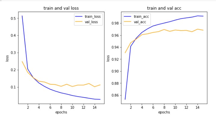
- 횟수를 늘려도 검증 정확도가 높아지지 않는 것을 확인할 수 있다.
- 학습 횟수를 줄여보고 정확도를 다시 확인해보자.
12) 모델 평가하기
model.evaluate(X_test,y_test)
- 결과값: 313/313 - 0s 2ms/step - loss: 0.1059 - acc: 0.9707
[0.10590563714504242, 0.9707000255584717]
13) 예측값 그려서 확인하기
results = model.predict(X_test)
print(results.shape)
print(results[5]) # 5번째 숫자는 '1'이라고 확인(array 형태)
np.argmax(results[5], axis=-1) # 가장 큰 값의 인덱스를 돌려줌(argmax)
- 결과값
(10000, 10)
[1.4217942e-05 9.9903643e-01 3.7014947e-06 4.9572001e-05 1.3281060e-07
1.6081174e-08 1.2836965e-07 8.7191240e-04 1.0295009e-05 1.3648365e-05]
1
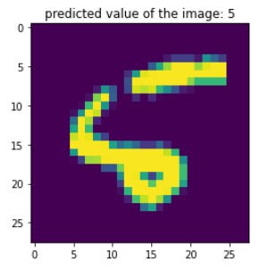
idx = 8
arg_results = np.argmax(results, axis=-1)
plt.imshow(X_test[idx].reshape(28,28))
plt.title('predicted value of the image: '+str(arg_results[idx]))
plt.show()
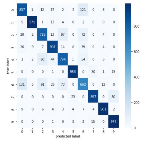
14) 모델 평가하기(성능평가): 1) 혼동 행렬 confusion matrix
from sklearn.metrics import classification_report, confusion_matrix
import seaborn as sns

plt.figure(figsize=(7,7))
cm = confusion_matrix(np.argmax(y_test, axis=-1), np.argmax(results, axis=-1))
sns.heatmap(cm, annot=True, fmt='d', cmap='Blues')
plt.xlabel('predicted label')
plt.ylabel('true label')
plt.show()
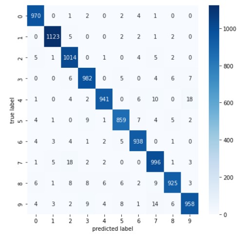
- 헷갈려하는 데이터 셋 중 숫자 5의 이미지를 좀 더 다양하게 수집해서 정확도를 높이자(보완하자)는 인사이트 얻을 수 있음
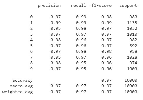
15) 모델 평가하기(성능평가): 2) 분류 보고서
print(classification_report(np.argmax(y_test, axis=-1), np.argmax(results, axis=-1)))
2. Fashion_MNIST 다중분류
- 다층 퍼셉트론을 활용하여 분석할 때, 과연 층을 많이 쌓을수록 정확도가 높아지는지 확인하기 위해 두개의 모델을 설정하여 비교해보고자 한다.
1) 문제 정의
- 10가지 의류를 예측하는 다중 분류 문제
- 데이터: 케라스에서 제공하는 Fashion MNIST
2) 데이터 준비하기
from keras.datasets.fashion_mnist import load_data
# keras 저장소에서 데이터 다운로드
(X_train, y_train), (X_test, y_test) = load_data()
print(X_train.shape, X_test.shape)
- 결과값: (60000, 28, 28) (10000, 28, 28)
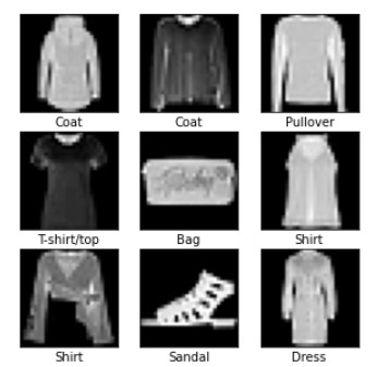
3) 데이터 그려보기
import matplotlib.pyplot as plt
import numpy as np

#랜덤시드 고정
np.random.seed(777)

class_names = ['T-shirt/top', 'Trouser', 'Pullover', 'Dress', 'Coat',
               'Sandal', 'Shirt', 'Sneakers', 'Bag', 'Ankle boots']

sample_size = 9  # 9개 추출해줘
random_idx = np.random.randint(60000, size=sample_size)
# 6만개 중 9개만 랜덤하게 보여줘

plt.figure(figsize=(5,5))
for i, idx in enumerate(random_idx):
  plt.subplot(3,3,i+1)
  plt.xticks([]) # 안 그릴거라 비우기
  plt.yticks([])
  plt.imshow(X_train[idx], cmap ='gray')
  plt.xlabel(class_names[y_train[idx]])
plt.show()
4) 전처리 및 검증 데이터셋 만들기
# 1) 데이터의 범위를 0-255 -> 0-1 구간으로 스케일링(MinMax 알고리즘 사용)
X_train = X_train / 255
X_test = X_test / 255
- 손글씨 분석과 동일하게 벡터이미지로서 0-225구간으로 되어 있던 데이터를 0-1구간의 데이터로 변경
# 2) 실제 정답을 비교할 수 있도록(다중분류) -> 수치형(레이블)을 범주형으로 변경

# 원본 데이터 백업해놓기(정답지 0-9 값)
origin_y_test = y_test

# 수치 정답(레이블) 데이터를 범주형 데이터로 변경
from tensorflow.keras.utils import to_categorical
y_train = to_categorical(y_train)
y_test = to_categorical(y_test)

# 3) 훈련/검증 데이터 7:3 비율로 분리

from sklearn.model_selection import train_test_split

X_train, X_val, y_train, y_val = train_test_split(X_train, y_train, test_size=0.3, random_state=777)

print(X_train.shape) # 훈련데이터 42000건
print(X_val.shape) # 검증데이터 18000건
5) 첫번째 모델 구성, 설정 및 학습하기
from keras.models import Sequential
from keras.layers import Dense, Flatten

# 3개의 레이어로 모델 구성하기
first_model = Sequential()
first_model.add(Flatten(input_shape=(28,28)))
first_model.add(Dense(64, activation ='relu'))
first_model.add(Dense(32, activation ='relu'))
first_model.add(Dense(10, activation ='softmax'))

# 모델 설정하기
first_model.compile(optimizer='adam', loss='categorical_crossentropy',
              metrics=['acc'])

# 모델 학습하기
first_history =first_model.fit(X_train, y_train, epochs=30, batch_size=128, validation_data=(X_val, y_val))
- 기존과 다르게 입력창을 첫번째 층에 분리해서 만들어줌
- input_shape를 flatten으로 감싸면 (28,28) -> 1차원의 (784)로 변환(reshape대신)
- 검증 데이터 포함: 학습할 때마다 검증해줘
- 히스토리 저장하지 않으면 학습한 결과(loss, acc, val_loss, val_acc)를 재현하지 못하기 때문에 변수에 담아 놓아야 함
6) 두번째 모델 구성, 설정 및 학습하기
# 4개의 레이어로 만들어진 모델
second_model = Sequential()
second_model.add(Flatten(input_shape=(28,28)))
second_model.add(Dense(128, activation ='relu'))
second_model.add(Dense(64, activation ='relu'))
second_model.add(Dense(32, activation ='relu'))
second_model.add(Dense(10, activation ='softmax'))

second_model.compile(optimizer='adam', loss='categorical_crossentropy',
                     metrics=['acc'])

second_history = second_model.fit(X_train, y_train, epochs=30, batch_size=128, validation_data=(X_val, y_val))
7) 학습결과 그리기
import numpy as np
import matplotlib.pyplot as plt

def draw_loss_acc(history_1, history_2, epochs):
    his_dict_1 = history_1.history
    his_dict_2 = history_2.history
    keys = list(his_dict_1.keys())

    epochs = range(1, epochs)
    fig = plt.figure(figsize = (10, 10))
    ax = fig.add_subplot(1, 1, 1)
    # axis 선과 ax의 축 레이블을 제거합니다.
    ax.spines['top'].set_color('none')
    ax.spines['bottom'].set_color('none')
    ax.spines['left'].set_color('none')
    ax.spines['right'].set_color('none')
    ax.tick_params(labelcolor='w', top=False, bottom=False, left=False, right=False)

    for i in range(len(his_dict_1)):
        temp_ax = fig.add_subplot(2, 2, i + 1)
        temp = keys[i%2]
        val_temp = keys[(i + 2)%2 + 2]
        temp_history = his_dict_1 if i < 2 else his_dict_2
        temp_ax.plot(epochs, temp_history[temp][1:], color = 'blue', label = 'train_' + temp)
        temp_ax.plot(epochs, temp_history[val_temp][1:], color = 'orange', label = val_temp)
        if(i == 1 or i == 3):
            start, end = temp_ax.get_ylim()
            temp_ax.yaxis.set_ticks(np.arange(np.round(start, 2), end, 0.01))
        temp_ax.legend()
    ax.set_ylabel('loss', size = 20)
    ax.set_xlabel('Epochs', size = 20)
    plt.tight_layout()
    plt.show()

draw_loss_acc(first_history, second_history, 30)
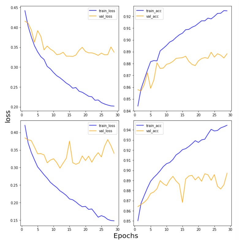
- 손실함수가 점점 떨어지고 정확도는 점점 올라가야 하는데... 결과를 보면, 검증 데이터는 그렇지 못하다는 것을 알 수 있음
- 손실값이 높아진다는 것은 정답과 멀어진다는 의미
- 일반화되지 못하고 과대적합되는 것을 알 수 있다.
- 방법: epoch 수를 줄여본다.
- 복잡한 이미지면 복잡한 모델을 만들어줘야 어려운 문제를 해석할 수 있지 않을까 해서 레이어를 한 층 더 쌓아본 것인데 훈련 데이터와 달리 검증 데이터를 보면 단순한 모델(층을 적게 쌓은 모델)과 대동소이하다.
- 결국 레이어 깊이가 깊어도 실효가 없기 때문에 이 경우 레이어 층이 얕은 모델이 더 낫다고 판단함
- 결론 데이터가 생각보다 복잡하기 않았기 때문에 단순한 모델을 채택함
8) 모델 평가하기
first_model.evaluate(X_test, y_test)
second_model.evaluate(X_test, y_test)
- 결과값
313/313 - 1s 4ms/step - loss: 0.3889 - acc: 0.8749
313/313 - 1s 3ms/step - loss: 0.3843 - acc: 0.8838
- 레이어를 한 층 더 쌓은 것에 비해 손실값이 오히려 높아졌고 정확도도 큰 차이가 나지 않는다.
- 레이어를 깊게 파는 것이 중요한 게 아니라 데이터에 맞는 모델을 n번의 실험을 통해 최적의 수준으로 맞춰야 한다.
- 프로젝트 진행할 때 loss와 acc의 성능지표 기준을 설정해 모델이 이를 달성하는 방향으로 진행하여야 한다.(test set 정확도 80%이상, 생명 관련일 경우 recall 높도록)
9) 예측 결과 그려보기
import numpy as np

results = first_model.predict(X_test) #범주형 결과
arg_results = np.argmax(results, axis = -1) #수치형 결과

random_idx = np.random.randint(10000)

plt.figure(figsize=(5,5))
plt.imshow(X_test[random_idx], cmap='gray')
plt.title('Predicted value of the image: ' + class_names[arg_results[random_idx]]+
          ',Real value of the image: '+class_names[origin_y_test[random_idx]])
plt.show()
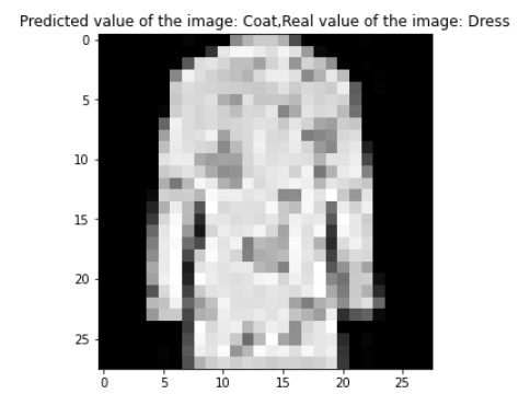
- 드레스를 코트로 잘못 예측한 것을 확인할 수 있다..ㅠ
- 숫자 손글씨보다 정확도가 확연히 떨어짐
from sklearn.metrics import classification_report, confusion_matrix
import seaborn as sns

results = first_model.predict(X_test)

# 혼동행렬 만들기
plt.figure(figsize=(7,7))
cm = confusion_matrix(np.argmax(y_test, axis=-1), np.argmax(results, axis=-1))
sns.heatmap(cm, annot=True, fmt='d', cmap='Blues')
plt.xlabel('predicted label')
plt.ylabel('true label')
plt.show()