1. 타이타닉 생존자 분석 및 주인공의 생존 확률 예측
#하나의 셀로 정리한 코드

# 1) 라이브러리 임포트
import pandas as pd
import numpy as np
import matplotlib.pyplot as plt
import seaborn as sns

import tensorflow as tf
import keras
from keras.models import Sequential
from keras.layers import Dense
from tensorflow.keras.optimizers import RMSprop

import warnings
warnings.filterwarnings('ignore')

#랜덤씨드 고정
np.random.seed(7)

# 2) 데이터 읽어오기
df = pd.read_excel('/content/drive/MyDrive/(220929) 다중분류 및 회귀 문제,
                   이진분류 실습/titanic.xlsx', header = 0, engine ='openpyxl')
# 엑셀 자료가 읽히지 않는 경우 활용하면 좋은 코드

# 3) 데이터 전처리
# 필요없는 컬럼 삭제(열기준)
df.drop(['name','ticket','cabin','embarked','body','home.dest'],
        axis = 1, inplace =True)

# NaN 데이터 포함한 행 삭제
ndf = df.dropna(subset=['age','fare'], axis =0)

# object에서 범주형 데이터로 변경
ndf.loc[ndf['sex'] == 'female', 'sex'] = 1
ndf.loc[ndf['sex'] == 'male', 'sex'] = 0

# 데이터 타입 변경
ndf['sex'] = ndf['sex'].astype('int64')

# 4) 데이터 분리하기
# 문제지와 정답지 분리
X = ndf[['pclass',	'sex',	'age',	'sibsp', 'parch',	'fare']]
y = ndf['survived']

# 정규화 위한 작업
mean=np.mean(X, axis = 0)
std=np.std(X, axis = 0)

# X 정규화
X = (X - mean) / std

# 훈련 및 테스트 데이터 분리
from sklearn.model_selection import train_test_split
X_train, X_test, y_train, y_test = train_test_split(X, y, test_size=0.1,
                                                    random_state = 777)

# 5) 모델 구성하기
model = Sequential()
model.add(Dense(255, activation ='relu',input_shape=(6,)))
model.add(Dense(128, activation ='relu'))
model.add(Dense(64, activation ='relu'))
model.add(Dense(1, activation = 'sigmoid'))

# 6) 모델 설정 및 학습하기
model.compile(optimizer = 'adam', loss='mse', metrics=['acc'])
history = model.fit(X_train, y_train, epochs=300)

# 7) 모델 평가하기
scores = model.evaluate(X_test, y_test)
print('%s: %.2f%%' % (model.metrics_names[1], scores[1]*100))

# 8) 새로운 데이터 생성 후 예측하기
dicaprio = np.array([3., 0., 19., 0., 0., 5.])
winslet = np.array([1., 1., 17., 1., 2., 100.])

dicaprio = (dicaprio - mean) / std
winslet = (winslet - mean) / std

dicaprio = np.array(dicaprio).reshape(1,6)
winslet = np.array(winslet).reshape(1,6)

d_predict = model.predict(dicaprio)
w_predict = model.predict(winslet)

print('디카프리오 생존 예측: %.8f%%' % (d_predict*100))
print('윈슬렛 생존 예측: %.8f%%' % (w_predict*100))
- 결과값: 4/4 - 0s 3ms/step - loss: 0.2065 - acc: 0.7333
acc: 73.33%
디카프리오 생존 예측: 10.09694958%
윈슬렛 생존 예측: 100.00000000%
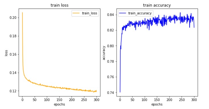
# 9) 학습결과 그려보기
import matplotlib.pyplot as plt

his_dict = history.history
loss = his_dict['loss']

epochs = range(1, len(loss) + 1)
fig = plt.figure(figsize = (10, 5))

# 훈련 및 검증 손실 그리기
ax1 = fig.add_subplot(1, 2, 1)
ax1.plot(epochs, loss, color = 'orange', label = 'train_loss')
ax1.set_title('train loss')
ax1.set_xlabel('epochs')
ax1.set_ylabel('loss')
ax1.legend()

acc = his_dict['acc']

# 훈련 및 검증 정확도 그리기
ax2 = fig.add_subplot(1, 2, 2)
ax2.plot(epochs, acc, color = 'blue', label = 'train_accuracy')
ax2.set_title('train accuracy')
ax2.set_xlabel('epochs')
ax2.set_ylabel('accuracy')
ax2.legend()

plt.show()
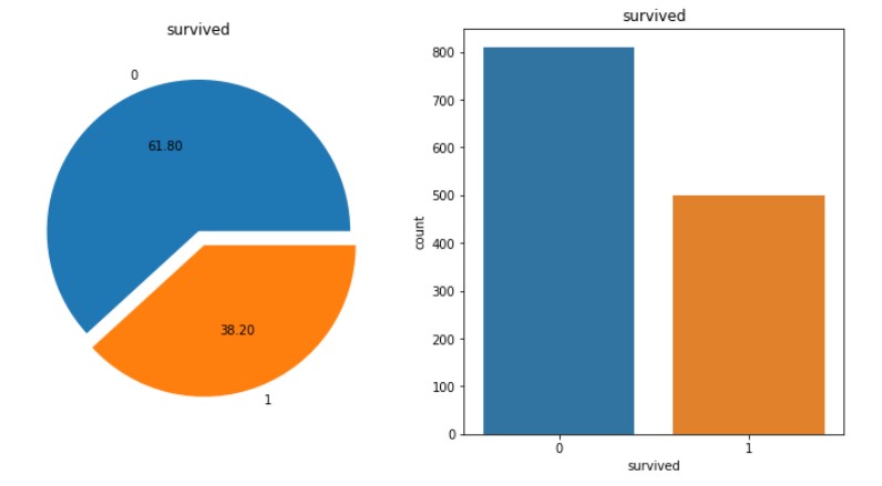
1-1. 데이터 분석 및 시각화하기
# 차트 2개 한 번에 그리기(1)

f, ax = plt.subplots(1,2,figsize=(12,6))

df['survived'].value_counts().plot.pie(autopct='%.2f', explode=(0,0.1), ax=ax[0])
ax[0].set_title('survived')
ax[0].set_ylabel('')

sns.countplot(df.survived, ax=ax[1])
sns.countplot('survived', data=df, ax=ax[1])
ax[1].set_title('survived')

plt.show()
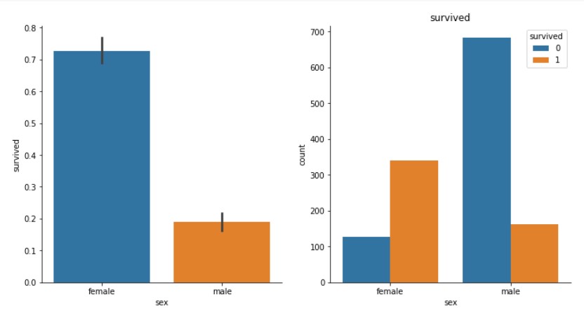
# 차트 2개 한 번에 그리기(2)

f, ax = plt.subplots(1,2,figsize=(12,6))

sns.barplot(x='sex', y='survived', data=df, ax=ax[0])
sns.despine()

sns.countplot('sex', hue='survived', data=df, ax=ax[1])
ax[1].set_title('survived')
plt.show()
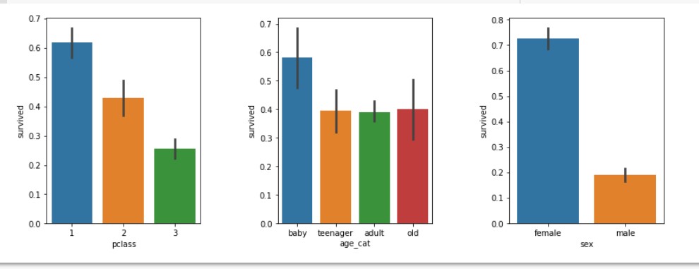
# 연령을 카테고리화 하여 데이터 분석
df['age_cat'] = pd.cut(df['age'], bins = [0,10,20,50,100], include_lowest=True,
                       labels=['baby','teenager', 'adult','old'])

plt.figure(figsize=[12,4])
plt.subplot(131) # 첫번째 행에 세개 주는데 첫번째 들어갈거야
sns.barplot('pclass','survived', data=df)
plt.subplot(132) # 첫번째 행에 세개 주는데 두번째 들어갈거야
sns.barplot('age_cat','survived', data=df)
plt.subplot(133) # 첫번째 행에 세개 주는데 세번째 들어갈거야
sns.barplot('sex','survived', data=df)
plt.subplots_adjust(top=1,bottom=0.1,left=0.1,right=1,hspace=0.5,wspace=0.5)
plt.show()
2. 붓꽃 종류 분석 및 예측하기
# 1) 라이브러리 임포트
import pandas as pd
import numpy as np
import matplotlib.pyplot as plt
import seaborn as sns
import keras
from keras.models import Sequential
from keras.layers import Dense
import tensorflow as tf
from tensorflow.keras.utils import to_categorical
from tensorflow.keras.optimizers import RMSprop
from sklearn.model_selection import train_test_split
from sklearn.metrics import classification_report, confusion_matrix
import warnings
warnings.filterwarnings('ignore')
# 랜덤시드 고정
np.random.seed(5)
# 2) 데이터 읽어오기
dataset_path = tf.keras.utils.get_file("iris.data", "https://archive.ics.uci.edu/ml
/machine-learning-databases/iris/iris.data")
column_names = ['sepal length','sepal width','petal length','petal width','class']
raw_dataset = pd.read_csv(dataset_path, names = column_names, skipinitialspace=True)
df = raw_dataset.copy() # 복사본 만들기
# 3) 데이터 전처리
# (1) 수치형으로 변경
df.loc[df['class'] == 'Iris-setosa', 'class'] = 0
df.loc[df['class'] == 'Iris-versicolor', 'class'] = 1
df.loc[df['class'] == 'Iris-virginica', 'class'] = 2
# (2) 데이터형 변경
df['class'] = df['class'].astype('int64')
# 4) 문제지와 정답지 분리
X = df[['sepal length','sepal width','petal length','petal width']]
y = df['class']
# 5) 훈련, 테스트 데이터 분리하기
X_train, X_test, y_train, y_test = train_test_split(X, y, test_size=0.2,
random_state=7)
# 6) 범주형 데이터로 변경
y_train = to_categorical(y_train)
y_test = to_categorical(y_test)
# 7) 모델 설정, 구성 및 학습하기
model = Sequential()
model.add(Dense(16, activation='relu', input_dim=4))
model.add(Dense(8, activation='relu'))
model.add(Dense(3, activation='softmax'))
model.compile(optimizer='adam', loss='categorical_crossentropy',
metrics=['acc'])
history = model.fit(X_train, y_train, epochs=200, batch_size=10)
# 8) 모델 평가하기
scores = model.evaluate(X_test,y_test)
print('%s: %.2f%%' % (model.metrics_names[1], scores[1]*100))
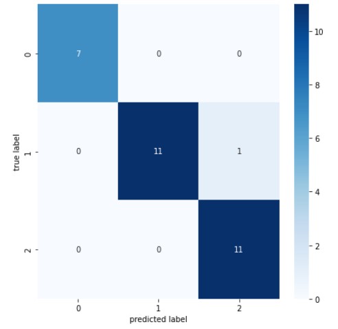
# 9) 혼동행렬 만들기
results = model.predict(X_test)
plt.figure(figsize=(7,7))
cm = confusion_matrix(np.argmax(y_test, axis=-1), np.argmax(results, axis=-1))
sns.heatmap(cm, annot=True, fmt='d', cmap='Blues')
plt.xlabel('predicted label')
plt.ylabel('true label')
plt.show()
- 결과값: 1/1 - 0s 174ms/step - loss: 0.1084 - acc: 0.9667
acc: 96.67%
- 혼동행렬 차트