flexbox 레이아웃
<body>
    <div class="flex-container">
        <div class="flex-item">1</div>
        <div style="flex-grow: 1;"></div> <!-- 가운데 공백 만들기 -->
        <div class="flex-item">2</div>
        <div class="flex-item">3</div>
    </div>
</body>
.flex-container {
display: flex;
justify-content: center;
align-items: center;
flex-direction: column;
flex-wrap: wrap;
}
.flex-item {
width: 100%;
height: 60px;
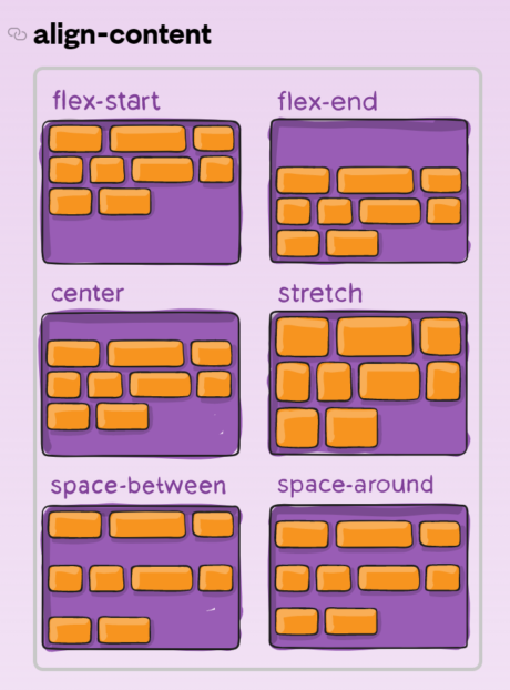
}- 개체를 정렬하기 위한 방법 중 flexbox 가 있는데, 개체를 감싸는 부모 개체에 display: flex 속성을 적용하면 된다(IE11 이상부터 가용 가능)
- justify-content: 자식 개체의 가로 정렬 옵션
- align-items: 자식 개체의 세로 정렬 옵션
- flex-direction: 정렬 방향
- flex-wrap: 자식 개체 크기가 브라우저보다 클 경우 아래로 내려서 정렬할 지 여부(excel text-wrap과 같은 개념) - flex-item 의 width: 100% 일 경우 각 개체가 균등한 너비로 브라우저를 가득 채운다
- flex-grow 는 가로 비율을 배수로 자동 조정해주는 속성인데, flex-grow를 가진 다른 개체와의 상대적 비율로 조정되며 위와 같이 혼자만 flex-grow를 가지고 있는 경우에는 나머지 개체의 너비를 제외한 남은 부분을 채우게 된다 > nav bar의 가운데 공백으로 사용 가능
align-items
eunji yang