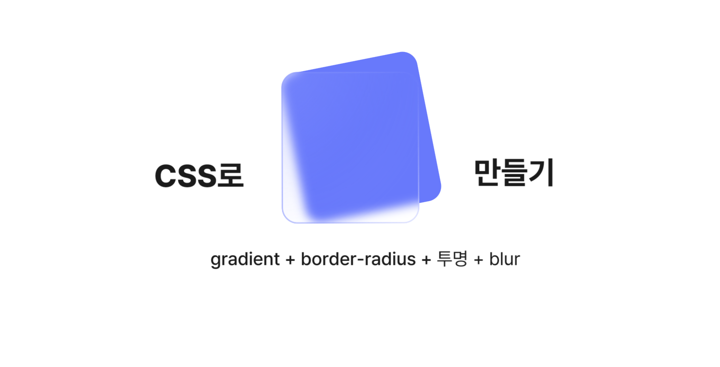
📢 무엇이든 그라데이션 하는법!
그라데이션을 만들면서 있었던 시행착오들을 기록한 글입니다.
CSS 적용 방법이 궁금하신 분들은 가장 하단으로 이동해주세요!
0. 요구사항
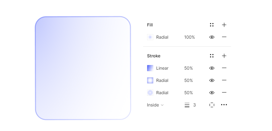
시작은 진행하고 있는 프로젝트에서 디자이너님께서 이렇게 배경도 그라데이션이고, 스트로크에 무려 3개의 그라데이션을 넣어달라는 요청이었다. 그럼 이걸 만들러 가보자!
1. 그라데이션 문법
1-1. linear-gradient
기본적인 선형 그라데이션이다. 방향과 중단점을 지정해줄 수 있다.
.simple-linear {
  background: linear-gradient(blue, pink);
}
.diagonal-gradient {
  background: linear-gradient(to bottom right, blue, pink);
}
.angled-gradient {
  background: linear-gradient(70deg, blue, pink);
}
.multicolor-linear {
  background: linear-gradient(to left, lime 28px, red 77%, cyan);
}
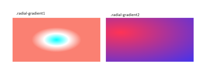
1-2. radial-gradient
radial gradient는 원, 타원모양의 그라데이션을 만들기 위하여 사용된다.
1처럼 하면 중앙에 만들어지고, 2처럼 시작점을 지정해 줄 수도 있다.
.radial-gradient1 {
  background: radial-gradient(cyan 0%, transparent 20%, salmon 40%);
}

.radial-gradient2 {
  background: radial-gradient(
    farthest-corner at 40px 40px,
    #f35 0%,
    #43e 100%
  );
}
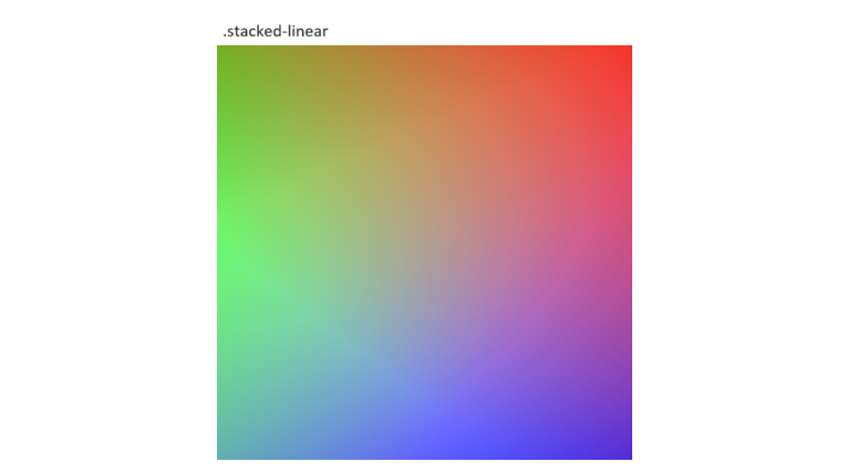
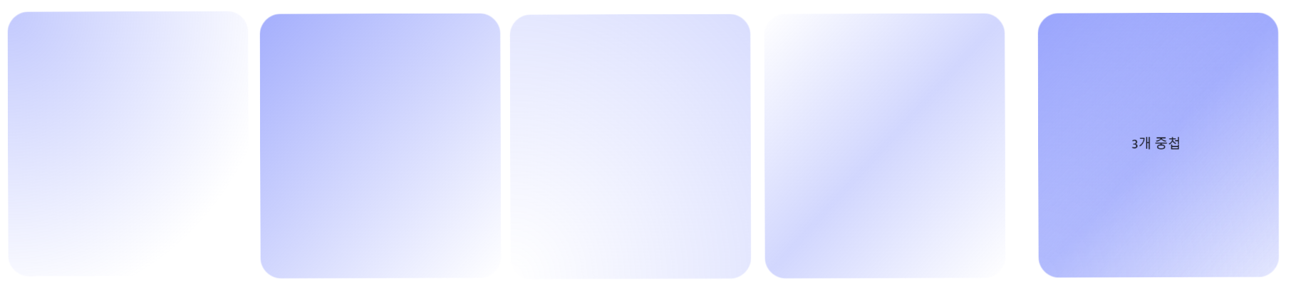
1-3. 그라데이션 중첩하기
기본적으로 gradient는 완전 불투명하지 않은 이상, 아래쪽 gradient도 보이는 상태이다. 이를 위해서는 rgb, rgba를 이용한투명도 조절이 필요하다.
.stacked-linear {
  background: linear-gradient(
      217deg,
      rgb(255 0 0 / 80%),
      rgb(255 0 0 / 0%) 70.71%
    ),
    linear-gradient(127deg, rgb(0 255 0 / 80%), rgb(0 255 0 / 0%) 70.71%),
    linear-gradient(336deg, rgb(0 0 255 / 80%), rgb(0 0 255 / 0%) 70.71%);
}
⌨️ 개발
그럼 이제 문법을 이용해서 피그마를 기반으로 그라데이션을 확인하며 각각 만든다!
.gradient-background {
	background: radial-gradient(farthest-corner at 0 0, rgba(104, 121, 251, 0.4) 0%, rgba(255, 255, 255, 0) 80%);
	background: linear-gradient(to bottom right, rgba(104, 121, 251, 0.6), rgba(104, 121, 251, 0)),
	background: radial-gradient(farthest-corner at 0% 100%, rgba(255, 255, 255, 0) 0%, rgba(104, 121, 251, 0.25) 100%),
	background: linear-gradient(to bottom right, rgba(255, 255, 255, 0.5), rgba(104, 121, 251, 0.3), rgba(255, 255, 255, 0.5));
}
🚨 중간 이슈
원래 마지막 gradient가 원래 radial gradient로 개발해야하는데 파란색 투명도0 → 흰색 그라데이션이 피그마에서는 나오는데, 개발화면에서는 잘 안보였다.
그래서 디자이너분께 허락을 맡고 linear gradient로 개발했다,,
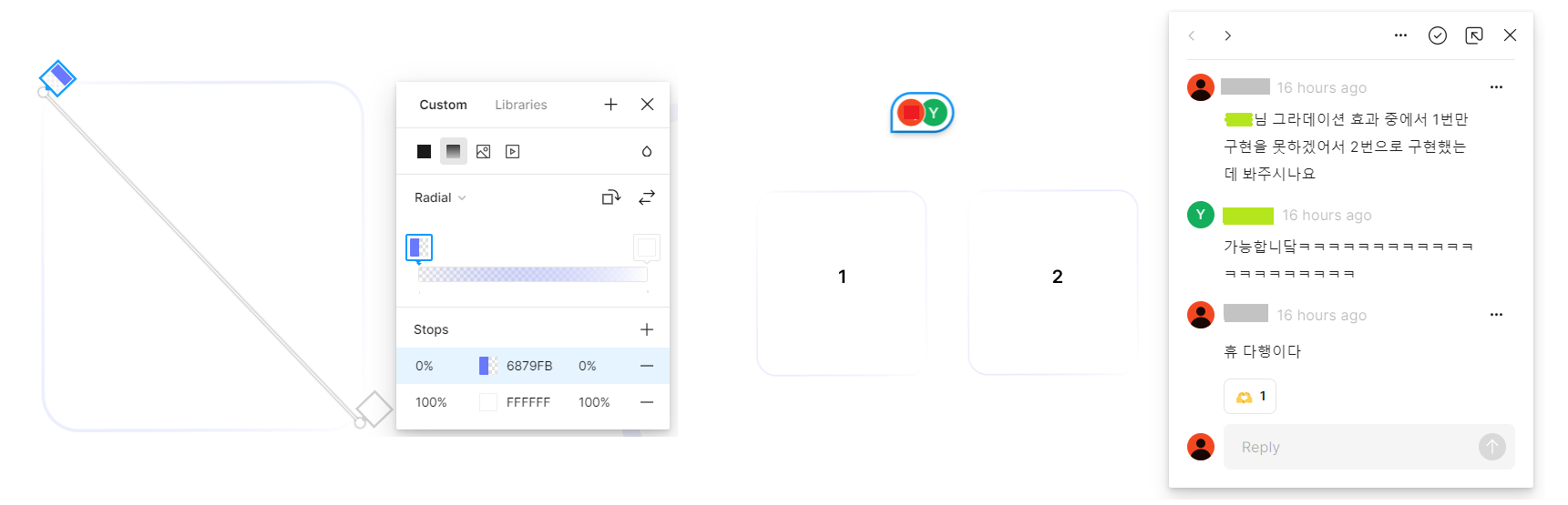
2. border에 gradient 적용하기
1에서는 background를 이용하여 배경에 gradient를 적용했다면, 이제는 border에 적용해볼 차례이다.
2-1. border-image
border-image,border-image-slice를 이용해서 그라데이션을 만드면 고장이난다.
그라데이션 중첩 적용이 안될 뿐더러, border-radius를 적용해도 네모 모양이다.
.border {
  border-radius: 3.3rem;
  border: 10px solid;
  border-image: linear-gradient(to bottom right, rgba(104, 121, 251, 0.6), rgba(104, 121, 251, 0));
  border-image-slice: 1;
}

.border {
  border: 10px solid;
  border-image: linear-gradient(to bottom right, rgba(104, 121, 251, 0.6), rgba(104, 121, 251, 0))
    radial-gradient(farthest-corner at 0% 100%, rgba(255, 255, 255, 0) 0%, rgba(104, 121, 251, 0.25) 100%)
    radial-gradient(farthest-corner at 0% 100%, rgba(255, 255, 255, 0) 0%, rgba(104, 121, 251, 0.25) 100%);
  border-image-slice: 1;
}
알고보니 border-image 속성과 border-radius 속성이 호환이 되지 않는다고 한다.
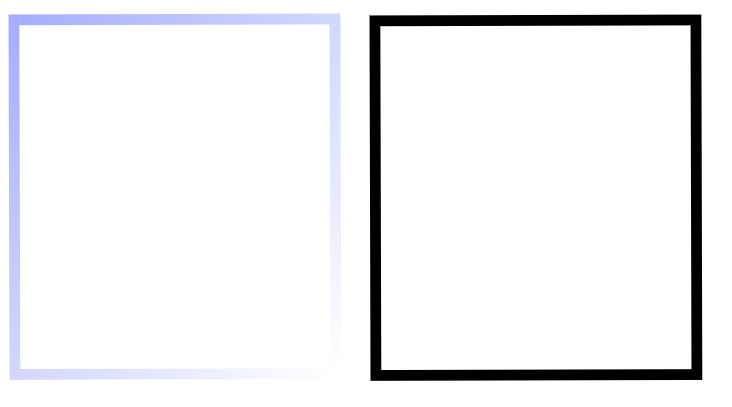
2-2. backgound-image
2번째 방법이다. background-image에 적용하고, background-clip속성을 이용하여 border영역과 content영역을 나누어주는 것이다.
.box {
  border: 10px dashed red;
  padding: 10px;
  background-image: linear-gradient(to bottom right, rgba(104, 121, 251, 0.6), rgba(104, 121, 251, 0.6));
  background-clip: content-box; /* default */
}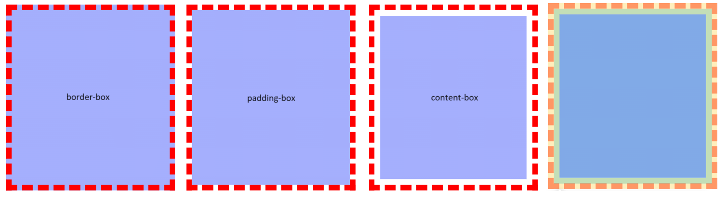
background-clip을 이용하여 원하는 영역에만 background-image를 적용할 수 있다.
각 영역은 개발자도구를 이용하면 더 쉽게 확인할 수 있다.
- 주황색 : margin
- 노란색 : border
- 초록색 : padding
- 파란색 : content
이 기법을 이용해서 border-box에는 border에 적용되기 원하는 그라데이션 3개를 적용하고, content-box에만 배경에 적용될 그라데이션1개를 개발하면 되겠다! 는 내 안일한 생각이었다.
.box {
  border: 20px solid transparent;
  border-radius: 3.5rem;
  background-image: radial-gradient(farthest-corner at 0 0, rgba(104, 121, 251, 0.4) 0%, rgba(255, 255, 255, 0) 80%),
    linear-gradient(to bottom right, rgba(104, 121, 251, 0.6), rgba(104, 121, 251, 0)),
    radial-gradient(farthest-corner at 0% 100%, rgba(255, 255, 255, 0) 0%, rgba(104, 121, 251, 0.25) 100%),
    linear-gradient(to bottom right, rgba(255, 255, 255, 0.5), rgba(104, 121, 251, 0.3), rgba(255, 255, 255, 0.5));
  background-origin: border-box;
  background-clip: content-box, border-box, border-box, border-box;
}
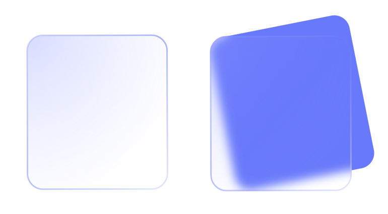
얘 왜이렇죠?? 색깔이 너무 진하다.!!
그래도 다행스러운 점은 border-radius가 적용된다는 것과, border에 그라데이션 3개가 중첩된다는 것이다.. 😂
content영역의 색상이 투명도가 있다보니 아래쪽 border 영역까지 중첩되어서 content영역에는 지금 4개의 그라데이션이 모두 들어가게 된 것이었다.
해결책으로, content영역은 흰색으로 덮어주고, 위에 따로 그라데이션 content를 만들어 주는 것이다.
.Border {
  border: 3px solid transparent;
  border-radius: 3.5rem;
  background-image: linear-gradient(#fff, #fff),
    linear-gradient(to bottom right, rgba(104, 121, 251, 0.6), rgba(104, 121, 251, 0)),
    radial-gradient(farthest-corner at 0% 100%, rgba(255, 255, 255, 0) 0%, rgba(104, 121, 251, 0.25) 100%),
    linear-gradient(to bottom right, rgba(255, 255, 255, 0.5), rgba(104, 121, 251, 0.3), rgba(255, 255, 255, 0.5));
  background-origin: border-box;
  background-clip: content-box, border-box, border-box, border-box;
}

.Background {
  width: 100%;
  height: 100%;
  border-radius: 3.3rem;
  background-image: radial-gradient(farthest-corner at 0 0, rgba(104, 121, 251, 0.4) 0%, rgba(255, 255, 255, 0) 80%);
}
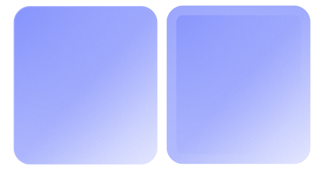
와!! 완성! 인줄 알았는데!!! 화면에 넣으려고 보니 아직이다……
여기서 멈추면, 배경이 흰색이 아닐 때는 쓸 수가 없다…!! 🤣 🥕🥕🥕
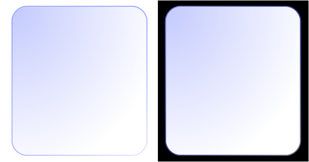
3. 투명한 배경
여기서부터는 뭐라고 검색해야 할 지도 모르겠었다. 서칭을 열심히 하다가 관련해서 블로그에 코드를 올려두신 분이 딱 한 분 계셨다..! 진짜 이 분 아니었으면,,, 포기할 뻔 했다..ㅜㅜ (무한한 감사 인사를..)
mask 를 활용하는 방법이다.
예시 코드에서는 content-box에 흰색을 적용하고, 흰색을 -webkit-mask-composite 과 mask-composite 속성을 이용해서 중복되는 부분은 없애 투명하게 만드는 것이다.
-webkit-mask-composite 과 mask-composite 는 같은 역할을 하는데, -webkit-mask-composite 는 Chrome, Safari브라우저에서 지원하고, mask-composite 는 Firefox에서 지원한다. 따라서 같이 사용해준다.
실제로 -webkit-mask-composite 공식문서를 확인하면, Non-standard 빨간딱지가 붙어있는 것을 볼 수 있다. 모든 사용자에게 적용되지 않을 수 있으니 조심해야 된다는 것이다.
.Border{
  position: relative;
  box-sizing: border-box;
  background-clip: padding-box;

  &:before {
    content: '';
    position: absolute;
    inset: 0;
    border-radius: 3.5rem;
    backdrop-filter: blur(21px);
    padding: 3px;
    background: linear-gradient(to bottom right, rgba(104, 121, 251, 0.6), rgba(104, 121, 251, 0)),
      radial-gradient(farthest-corner at 0% 100%, rgba(255, 255, 255, 0) 0%, rgba(104, 121, 251, 0.25) 100%),
      linear-gradient(to bottom right, rgba(255, 255, 255, 0.5), rgba(104, 121, 251, 0.3), rgba(255, 255, 255, 0.5));
    -webkit-mask:
      linear-gradient(#fff 0 0) content-box,
      linear-gradient(#fff 0 0);
    -webkit-mask-composite: xor;
    mask-composite: exclude;
	  }
  }
::before 는 요소 앞에 가상 요소를 만들어주는데, 주로 기호나 도형 등 꾸미기 위해서 사용한다고 한다.
나는 배치가 더 어려운 것 같아서 우선 ::before 빼고 만들어 주겠다. 배경색까지 넣어주겠다.
그리고 코드를 보면, 이때까지와는 다르게 border-content 박스를 이용한것이 아닌, padding-content로 구분짓는 것이 보인다. border로 하니 그라데이션 테두리가 다 나오지 않는 문제가 있었다. 그래서 padding으로 사용했다.
.Box {
  border-radius: 3.5rem;

  box-sizing: border-box;
  background-clip: padding-box;

  padding: 3px;
  background: linear-gradient(to bottom right, rgba(104, 121, 251, 0.6), rgba(104, 121, 251, 0)),
    radial-gradient(farthest-corner at 0% 100%, rgba(255, 255, 255, 0) 0%, rgba(104, 121, 251, 0.25) 100%),
    linear-gradient(to bottom right, rgba(255, 255, 255, 0.5), rgba(104, 121, 251, 0.3), rgba(255, 255, 255, 0.5));
  -webkit-mask:
    linear-gradient(#fff 0 0) content-box,
    linear-gradient(#fff 0 0),
    radial-gradient(farthest-corner at 0 0, rgba(104, 121, 251, 0.4) 0%, rgba(255, 255, 255, 0) 80%);
  -webkit-mask-composite: xor;
  mask-composite: exclude
}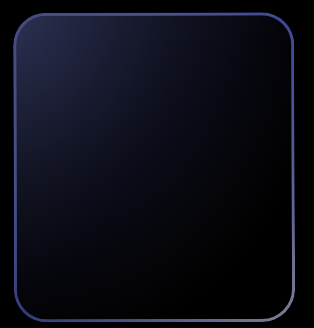
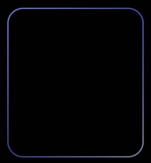
4. blur
이제 진짜 마지막으로 여기에 blur처리까지 해주겠다.
위의 코드에서 그냥 아래 한 줄을 추가하면 선만 연해지고 뒷 배경이 블러처리가 되지는 않았다.
backdrop-filter: blur(5px);블러부분을 따로 빼면 블러가 나오는데, border-radius가 적용되지 않았다. 그래서 상단에서 overflow: hidden을 주었다.
최종적으로 완성된 코드는!
원래 React, Styled-component인데 해당 부분만 뺐다.
//html
<Front>
	  <Blur />
	  <Border />
</Front>

//css
.Front {
  position: absolute;
  width: 100%;
  height: 100%;
  border-radius: 3.5rem;
  overflow: hidden;
  transform: rotate(-0.157deg);
}

.Border {
  width: 100%;
  height: 100%;
  position: absolute;

  border-radius: 3.5rem;

  box-sizing: border-box;
  background-clip: padding-box;

  padding: 3px;
  background-image: linear-gradient(to bottom right, rgba(104, 121, 251, 0.6), rgba(104, 121, 251, 0)),
    radial-gradient(farthest-corner at 0% 100%, rgba(255, 255, 255, 0) 0%, rgba(104, 121, 251, 0.25) 100%),
    linear-gradient(to bottom right, rgba(255, 255, 255, 0.5), rgba(104, 121, 251, 0.3), rgba(255, 255, 255, 0.5));
  -webkit-mask:
    linear-gradient(#fff 0 0) content-box,
    linear-gradient(#fff 0 0),
    radial-gradient(farthest-corner at 0 0, rgba(104, 121, 251, 0.4) 0%, rgba(255, 255, 255, 0) 80%);
  -webkit-mask-composite: xor;
  mask-composite: exclude;
}

.Blur {
  position: absolute;
  width: 100%;
  height: 100%;
  background-color: rgba(255, 255, 255, 0);
  backdrop-filter: blur(10px);
  -webkit-backdrop-filter: blur(5px);
}
완성이다! 🎉
근데 여기서 이제 컴포넌트 state별 색상 변화랑…. 이것저것 남았다..
참고자료
https://developer.mozilla.org/ko/docs/Web/CSS/CSS_images/Using_CSS_gradients
https://codingeverybody.kr/css-background-clip-속성/
https://cheesechaos.tistory.com/45
https://developer.mozilla.org/en-US/docs/Web/CSS/-webkit-mask-composite


프엔다운 섬세함이 느껴지는 글이네요!!
잘 보고 갑니다 :)