음.. 혼자 실습에 실패했다.
그래서 완성 코드 분석으로 가보기로.
# 라이브러리 임포트
import pandas as pd
import numpy as np
import matplotlib.pyplot as plt
import seaborn as sns
# 데이터 불러오기
import openpyxl
df = pd.read_excel('data\\Online Retail.xlsx')
df.head()# CustomerId가 null인 데이터 제거
cond1 = df['CustomerID'].isnull()
# 주문 취소 데이터 제거
cond2 = df['InvoiceNo'].astype('str').str[0] == 'C'
# Quantity가 음수인 데이터 제거
cond3 = df['Quantity'] < 0
# UnitPrice가 음수인 데이터 제거
cond4 = df['UnitPrice'] < 0# 데이터 필터링 및 복사
df = df.loc[~(cond1 | cond2 | cond3 | cond4)].copy()~(cond1 | cond2 | cond3 | cond4): 각 조건에서 True인 데이터를 제외하고 조건에 맞지 않는 데이터를 남긴다.~는 반전 연산자로 조건이True인 데이터를 제외시키는 역할을 한다.
-cond1 | cond2 | cond3 | cond4: 각 조건이 OR 연산으로 결합되어 어느 하나라도 해당하는 데이터가 있으면 그 데이터는 제외된다.df.shape: 전처리 후 남은 데이터프레임의 행(row)과 열(column) 개수를 확인.
df['Country'].value_counts()선택된 열에서 각 값이 몇 번씩 나타나는지 세는 함수
# 대다수를 차지하는 영국 고객을 대상으로 한다.
cond = df['Country'] == 'United Kingdom'
df = df.loc[cond].copy()

df['Country'].value_counts()
df = df.loc[cond].copy(): cond가 True인 행만 선택 후, 선택한 데이터의 복사본을 만든다.
# Code성 데이터는 보통 str
# CustomerID 자료형 : float -> int -> str
df['CustomerID'] = df['CustomerID'].astype('int').astype('str')

df.dtypes
CustomerID 값을 정수(int)로 변환하고, 이 정수를 문자열(str)으로 변환한다.
# 하나의 주문번호에 여러 주문 건수가 포함되어 있음
df['InvoiceNo'].value_counts()

cond = df['InvoiceNo']==576339
df.loc[cond]
데이터 가공
# 주문 금액 데이터 생성 (Quantity * Unitpirce)
df['Amount'] = df['Quantity'] * df['UnitPrice']
df.head()
# R : 고객별 가장 최근 날짜
# F : 고객별 중복 제외한 InvoceNo 갯수
# M : 고객별 Price 합계
aggregation = {
'InvoiceDate' : 'max',
'InvoiceNo' : 'nunique',
'Amount' : 'sum'
}
df_rfm = df.groupby('CustomerID').agg(aggregation)
df_rfm.head(3)aggregation = {}:aggregation딕셔너리 설정
-InvoiceDate: max: 고객별 가장 최근의 거래 날짜를 찾는다. (Recency)InvoiceNo: nunique: 고객별 중복되지 않은 거래 수를 센다. (Frequency)Amount: sum: 고객별 총 지출 금액을 더한다. (Monetary)
df.groupby('CustomerID').agg(aggregation)
-groupby('CustomerID'): 고객별로 데이터를 그룹화.agg(aggregation): 앞서 딕셔너리로 정의한 집계 방식(aggregation) 을 적용해 RFM 값을 계산, 그 값을df_rfm에 적용한다.
# InvoceDate : 현재부터 경과한 날짜
# 2011-12-10일 기준으로 경과한 날짜 계산

# 기준일 : 마지막날짜+1일
today = df_rfm['InvoiceDate'].max()+pd.Timedelta(days=1)

# 기준일시 - 주문일시
df_rfm['Recency'] = today - df_rfm['InvoiceDate']

# 날짜만 추출
df_rfm['Recency'] = df_rfm['Recency'].dt.days

df_rfm.head()
today = df_rfm['InvoiceDate'].max() + pd.Timedelta(days=1) -_df_rfm['InvoiceDate'].max()`: 고객별 가장 최근 거래 날짜 중에서 가장 늦은 날짜를 찾는다.pd.Timedelta(days=1): 그 날짜에 하루를 더해서 기준일을 설정한다.
df_rfm['Recency'] = today - df_rfm['InvoiceDate']: 기준일(today)에서 고객의 가장 최근 거래 날짜(InvoiceDate) 를 빼서 경과한 시간 차이를 계산한다.df_rfm['Recency'] = df_rfm['Recency'].dt.days: 시간 간격에서 일 단위로만 추출하여Recency에 경과 일수만 남긴다.
# 필요한 데이터만 선택
df_rfm = df_rfm.loc[:,['Recency','InvoiceNo','Amount']].copy()
df_rfm.head()loc를 사용하여 데이터프레임에서 특정 열만 선택한다.:: 모든 행 선택['Recency', 'InvoiceNo', 'Amount']: 원하는 열 선택
# 컬럼명 변경
df_rfm = df_rfm.rename(columns={
              'InvoiceNo':'Frequency',
              'Amount':'Monetary'
              })

df_rfm.head()rename: 열 이름 변경 함수columns={}: 바꾸고 싶은 열 이름 지정
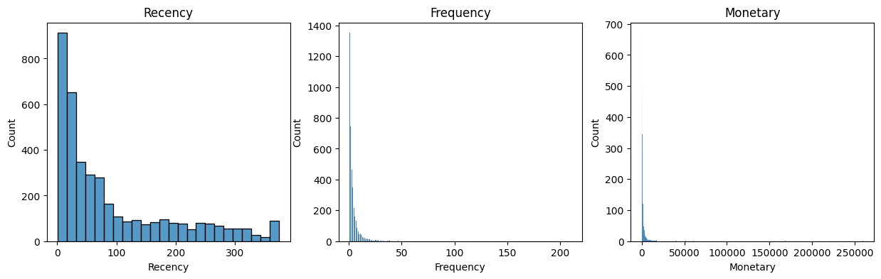
plt.figure(figsize=(15,4))
for i, col in enumerate(df_rfm.columns):
    plt.subplot(1,3,i+1)
    sns.histplot(data=df_rfm, x=col)
    plt.title(col)
for i, col in enumerate(df_rfm.columns):df_rfm의 각 열 이름을 가져오고 동시에 인덱스도 함께 반환한다.sns.histplot(data=df_rfm, x=col): 데이터프레임에서df_rfm데이터를 가져와서col에 담긴 열 데이터를 x축에 그린다.
# 데이터 로그변환
df_rfm['Recency_log'] = np.log1p(df_rfm['Recency'])
df_rfm['Frequency_log'] = np.log1p(df_rfm['Frequency'])
df_rfm['Monetary_log'] = np.log1p(df_rfm['Monetary'])

df_rfm.head()np.log1p(): 로그 변환 함수. 를 계산한다. 이 함수는 0 또는 작은 값을 처리 할 때 안정적이다.
# 스케일링 대상 : 로그변환 한 데이터
X = df_rfm.loc[:,'Recency_log':'Monetary_log']

from sklearn.preprocessing import StandardScaler
scaler = StandardScaler()
X_scaled = scaler.fit_transform(X) # --> 세그먼테이션에 사용할 데이터
X_scaled'Recency_log':'Monetary_log': Recency_log, Frequency_log, Monetary_log 세 열을 선택
고객 세그멘테이션
# 엘보우 기법으로 최적의 k 찾기
from sklearn.cluster import KMeans
inertia = []
for n in range(1,10):
    km = KMeans(n_clusters=n)
    km.fit(X_scaled)
    print(km.inertia_)
    inertia.append(km.inertia_)
inertia = []:inertia리스트를 생성, 각 클러스터 수에 대한 왜곡도(inertia) 값을 저장한다. 왜곡도는 클러스터 내 데이터 포인트와 클러스터 중심 간 거리의 제곱합을 의미하며, 클러스터가 잘 정의되어 있을수록 값이 작아진다.km.fit(X_scaled): 스케일링 된 데이터X_scaled에 대해 KMeans 모델을 학습km.inertia_: 현재 클러스터 수n에 대한 왜곡도 출력.
plt.plot(range(1,10), inertia, marker='o')
plt.xticks(range(1,10))
plt.xlabel('k')
plt.ylabel('inertia')
plt.show()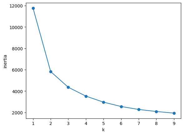
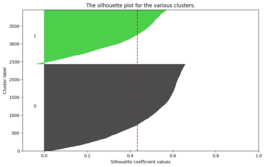
# 최적의 실루엣 찾기
import silhouette_analysis as s
for k in range(2,6):
    s.silhouette_plot(X_scaled, k)
강사님이 주셨던 실루엣 분석 모듈을 사용하는 건데,, 보관해두고 쓰면 될지, 아니면 이 모듈이 없어도 스스로 작업하는 방법을 찾아야할지,,
k = 4
from sklearn.cluster import KMeans
km = KMeans(n_clusters=k)
df_rfm['cluster'] = km.fit_predict(X_scaled)
df_rfm.head()
d = df_rfm[['Recency_log','Frequency_log','Monetary_log','cluster']]
sns.pairplot(d, hue='cluster', palette='muted')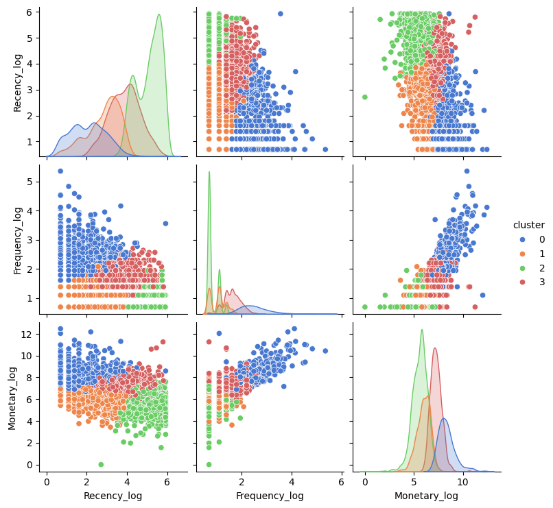
plt.figure(figsize=(10,10))
sns.scatterplot(data=df_rfm, x='Recency_log', y='Monetary_log',
hue='cluster', alpha=0.5, palette='muted')alpha=0.5: 데이터 포인트의 투명도를 50%로 설정하여 겹치는 포인트가 더 잘 보이도록 한다.
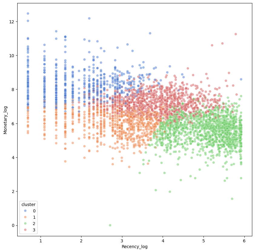
cond0= df_rfm['cluster']==0
cond1= df_rfm['cluster']==1
cond2= df_rfm['cluster']==2
cond3= df_rfm['cluster']==3


df0 = df_rfm.loc[cond0]
df1 = df_rfm.loc[cond1]
df2 = df_rfm.loc[cond2]
df3 = df_rfm.loc[cond3]


dfs = [df0, df1]
dfs = [df0, df1, df2]
dfs = [df0, df1, df2, df3]
condN = df_rfm['cluster']==n: 각 클러스터의 조건을 정의한다.dfN = df_rfm.loc[condN]: 각 클러스터 n에 해당하는 데이터 포인트로 구성된 데이터 프레임을 생성하고,dfN에 저장한다.dfs: 데이터 프레임을 저장할 리스트
plt.figure(figsize=(15,3))
for i, d in enumerate(dfs):
plt.subplot(1,k,i+1)
sns.violinplot(data=d, y='Recency')
plt.ylim(0,400)
plt.tight_layout()
plt.show()
plt.figure(figsize=(15,3))
for i, d in enumerate(dfs):
plt.subplot(1,k,i+1)
sns.violinplot(data=d, y='Frequency')
plt.ylim(0,200)
plt.tight_layout()
plt.show()
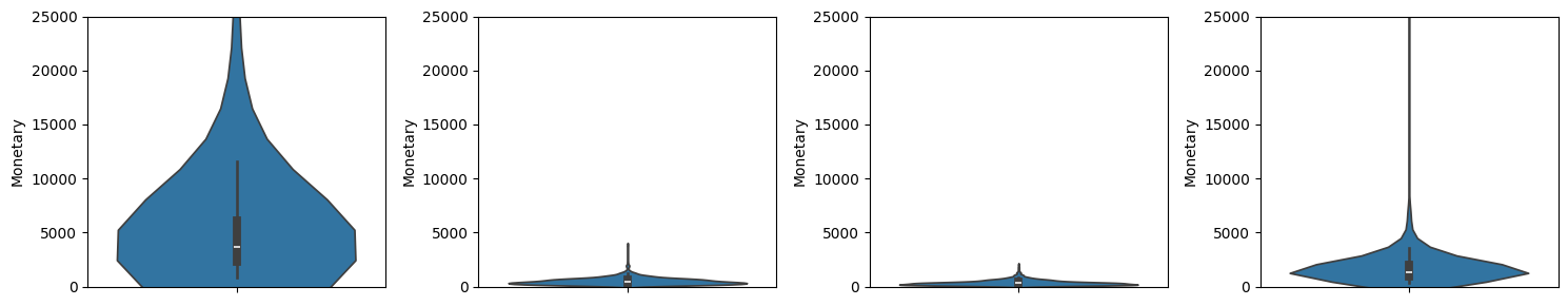
plt.figure(figsize=(15,3))
for i, d in enumerate(dfs):
plt.subplot(1,k,i+1)
sns.violinplot(data=d, y='Monetary')
plt.ylim(0,25000)
plt.tight_layout()
plt.show()plt.ylim(0, 400): y축의 범위를 0에서 400으로 설정한다.plt.tight_layout(): 서브플롯 간의 간격을 조정하여 깔끔하게 표시한다.
plt.figure(figsize=(10,4))

for i, df in enumerate(dfs):
    plt.subplot(1,k,i+1)
    sns.scatterplot(data=df, x='Recency', y='Monetary',
                hue='cluster', alpha=0.5, palette='muted')
    plt.xlim(0,400)
    plt.ylim(0,25000)

plt.tight_layout()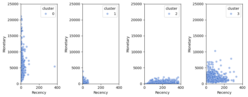
plt.figure(figsize=(10,4))

for i, df in enumerate(dfs):
    plt.subplot(1,k,i+1)
    sns.scatterplot(data=df, x='Frequency', y='Monetary',
                hue='cluster', alpha=0.5, palette='muted')
    plt.xlim(0,150)
    plt.ylim(0,25000)

plt.tight_layout()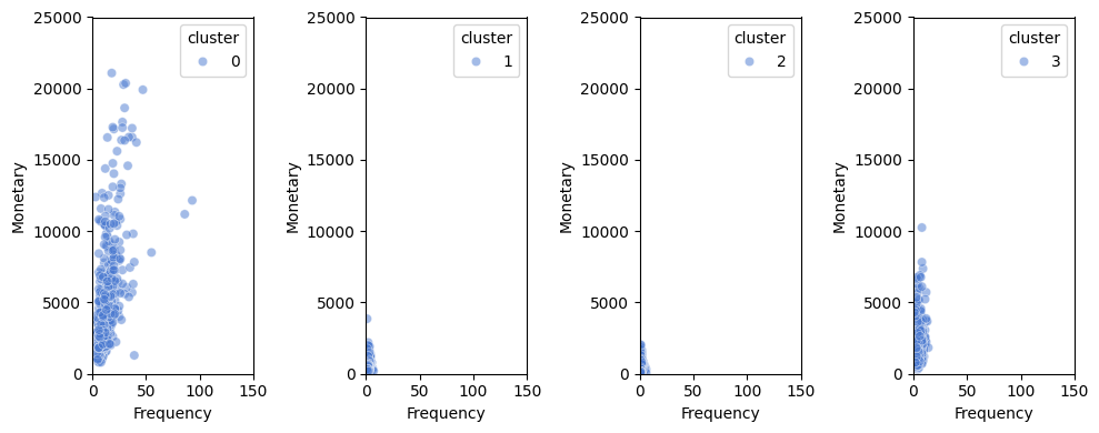
plt.figure(figsize=(10,4))

for i, df in enumerate(dfs):
    plt.subplot(1,k,i+1)
    sns.scatterplot(data=df, x='Recency', y='Frequency',
                hue='cluster', alpha=0.5, palette='muted')
    plt.xlim(0,400)
    plt.ylim(0,200)

plt.tight_layout()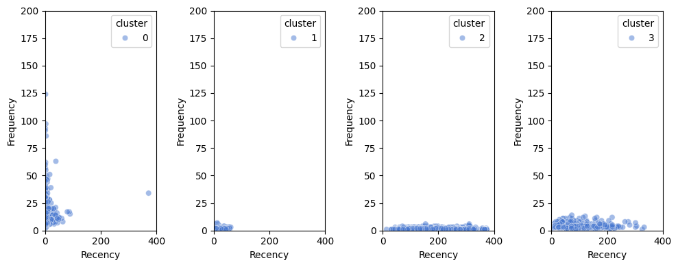

Turning Vision into Reality.