체력바를 만들어 볼건데 체력바 인터페이스는 js파일에서 그려주는것 보다는 html에서 그려주는것이 더 편하다.
<body>
  <div>
      <div></div>
    <canvas></canvas>
  </div>

  <script src="index.js"></script>
</body>
body로 전체를 한번 감싸주고 캔버스 위에 체력바를 그리도록 하나의 div로 묶는다
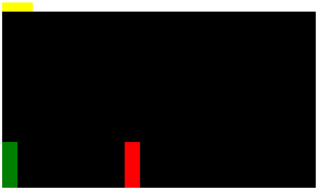
잘 그려지긴 하였으나 의도한 캔버스에 오버레이 된 위가 아니라 진짜 캔버스 위에 그려졌다.
position style을 통해 수정하자
<body>
    <!-- red container -->
  <div style="position: relative;">
    <!-- small red container -->
    <div style="position: absolute;">
      <!-- player health -->
      ...
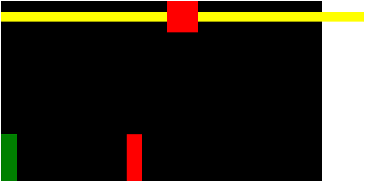
여기서 타이머도 만들어보면
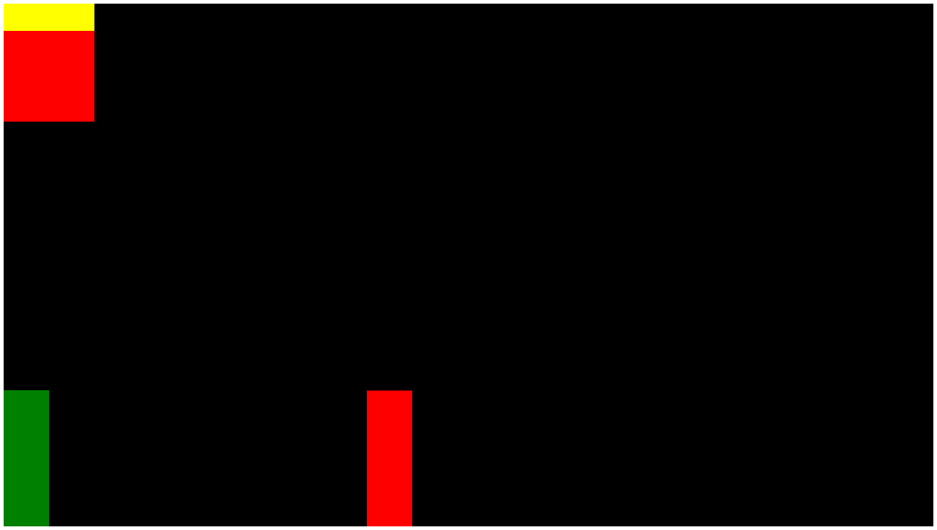
의도와는 다르게 체력바 밑에 나타나는데 부모div의 display를 flex로 주면 된다.
<body>
  <!-- red container -->
  <div style="position: relative">
    <!-- small red container -->
    <div style="position: absolute; display: flex">
      <!-- player health -->
      ...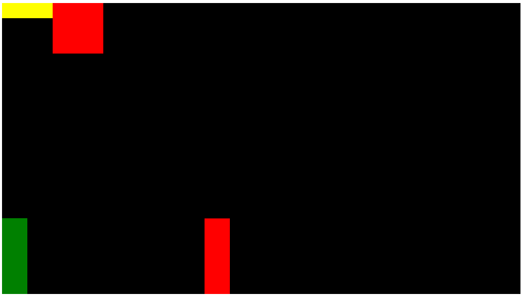
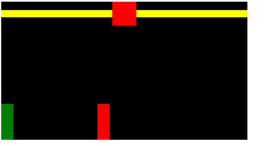
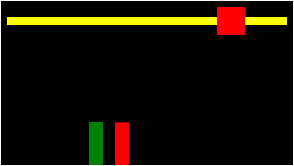
이제 enemy 체력바까지 만들어주면
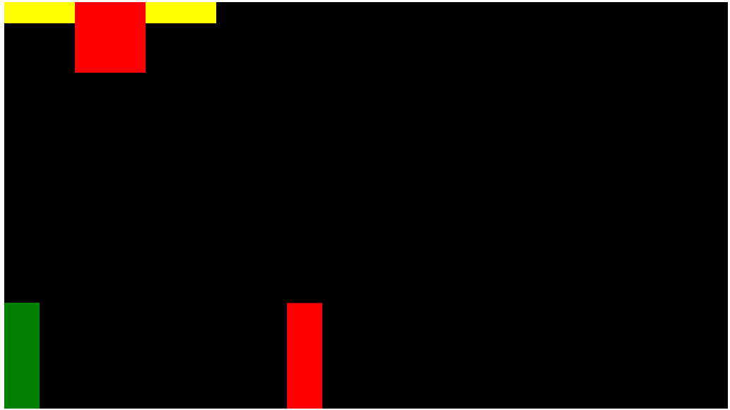
대략의 틀은 잡았다.
<body>
<!-- red container -->
<div style="position: relative">
<!-- small red container -->
<div
style="
position: absolute;
display: flex;
width: 100%;
align-items: center;
"
>
<!-- player health -->
<div style="background-color: yellow; height: 30px; width: 100%"></div>
<!-- timer -->
<div
style="
background-color: red;
width: 100px;
height: 100px;
flex-shrink: 0;
"
></div>
<!-- enemy health -->
<div style="background-color: yellow; height: 30px; width: 100%"></div>
<div></div>
</div>
<canvas></canvas>
</div>
<script src="index.js"></script>
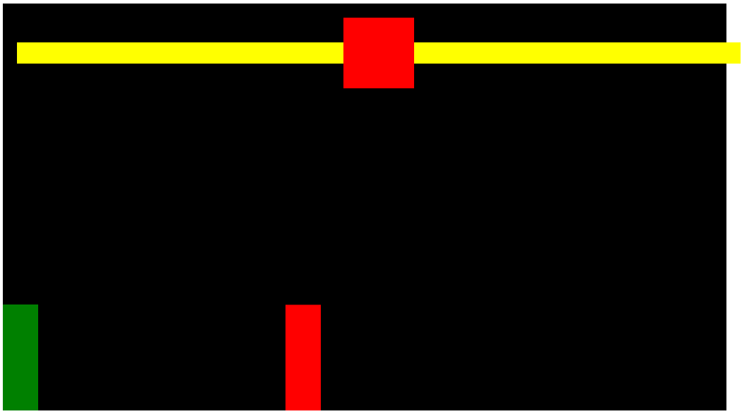
</body>좀 더 세부적으로 width를 수정하고 정렬하면
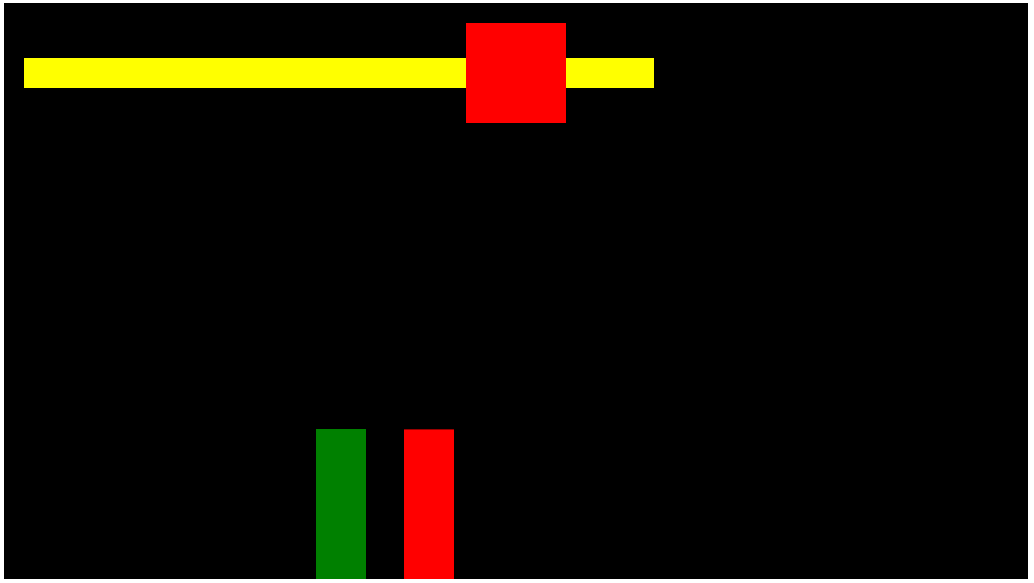
어느정도 스타일은 잡혔지만 width를 100%로 정해줘서 브라우저의 크기가 늘어나면 캔버스를 무시하고 늘어나버린다.
상위 div에 inline-block을 추가하면 되겠다.
<body>
  <!-- red container -->
  <div style="position: relative; display: inline-block">
    <!-- small red container -->
    <div
      style="
        position: absolute;
        ...
너무 캔버스 테두리에 붙어있으니 보기에 안좋아 padding을 좀 줘보자
    <!-- small red container -->
    <div
      style="
        position: absolute;
        display: flex;
        width: 100%;
        align-items: center;
        padding: 20px;
      "
      ...
패딩의 영향으로 체력바가 밀려나갔는데 head태그 내에 box-sizing속성을 추가하여 해결할 수 있다.
<head>
  <style>
    * {
      box-sizing: border-box;
    }
  </style>
</head>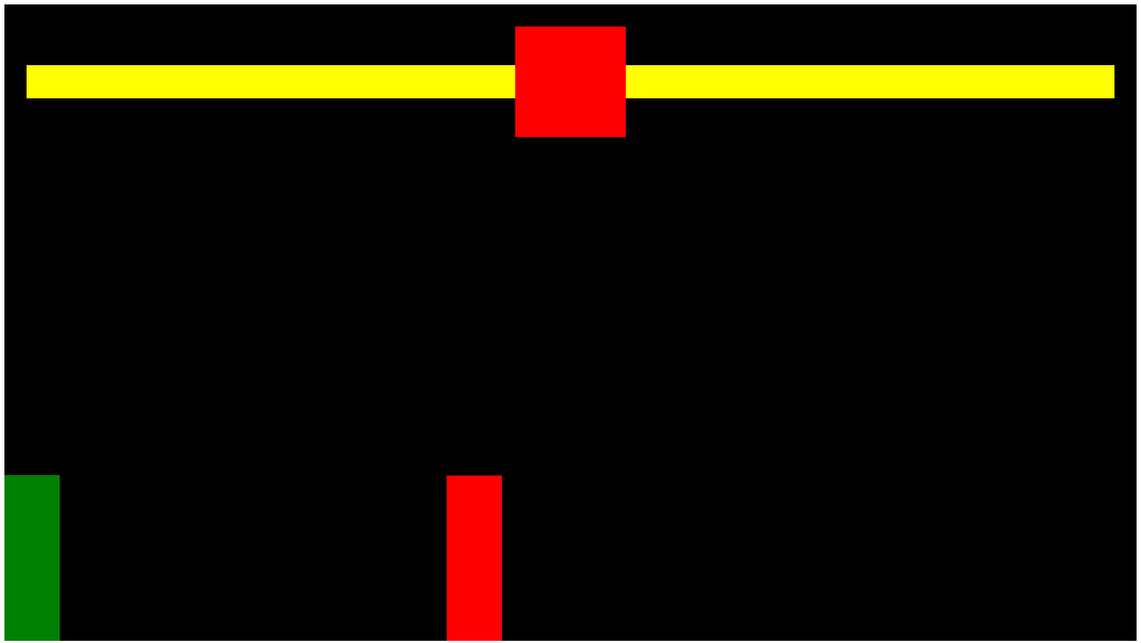
이제 체력바를 피격시 줄이는 동작을 구현하자 enemy health에 id를 주고
      <!-- enemy health -->
      <div
        id="enemyHealth"
        style="background-color: yellow; height: 30px; width: 100%"
      ></div>
js의 충돌을 감지하는 detect collision으로 가서
  //detect collision
  if (
    rectangularCollision({ rectangle1: player, rectangle2: enemy }) &&
    player.isAttacking
  ) {
    player.isAttacking = false;
    document.querySelector("#enemyHealth").style.width = "20%";
    console.log("player attack");
  }
player가 공격하면 enemyHealth를 20%로 줄이도록 해봤다.
20%가 되기는 했지만 의도한 대로 구현이 안되었다.
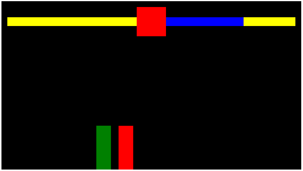
각 체력바를 새div로 감싸고 그 안에 체력바를 넣으면 해결이 될 것 같다.
      <!-- enemy health -->
      <div style="position: relative; height: 30px; width: 100%">
        <div id="enemyHealth" style="background-color: yellow"></div>
        <div style="position: absolute; background: blue"></div>
      </div>
체력바는 사라졌지만 괜찮다 사라진게 아니라 자리는 차지하고 있으나 보이지 않게 된 것이다.
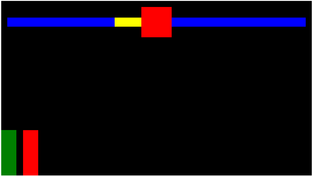
      <!-- enemy health -->
      <div style="position: relative; height: 30px; width: 100%">
        <div id="enemyHealth" style="background-color: yellow; height: 30;"></div>
        <div style="position: absolute; background: blue"></div>
      </div>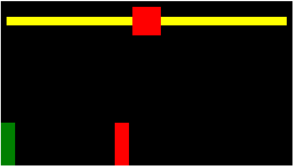
체력바의 높이를 지정해주면 다시 나타난다 다시 아까와 같이 공격해보면
아까와는 다르게 다른 요소에 영향을 주지 않는다.
원래 100%의 체력도 표시하여 체력이 깎인 정도를 알기 쉽게 해보자.
미리 만들어두었던 blue div에 스타일을 좀 주고 yellow에 주었던 id를 넘겨주면
      <!-- enemy health -->
      <div style="position: relative; height: 30px; width: 100%">
        <div style="background-color: yellow; height: 30"></div>
        <div
          id="enemyHealth"
          style="
            position: absolute;
            background: blue;
            top: 0;
            right: 0;
            bottom: 0;
            left: 0;
          "
        ></div>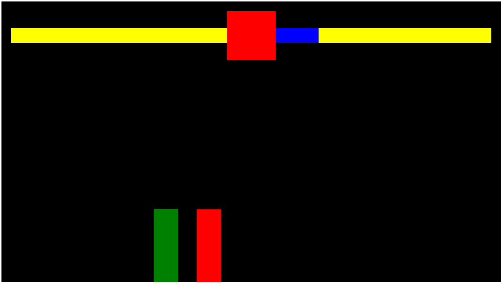
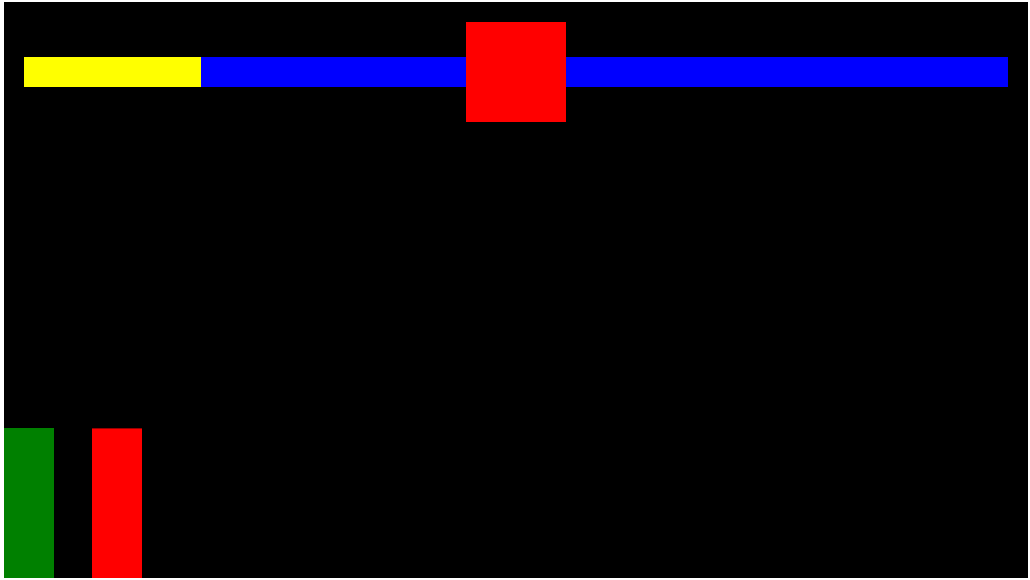
전체 체력바와 현재 남은 체력이 표시된다.
남은 체력이 20%가 되는것이 목적이 아니기에 js파일로 가서 Sprite클래스에 health 프로퍼티를 추가한다.
class Sprite {
  constructor({ position, velocity, color, offset }) {
    ...
    this.color = color;
    this.isAttacking;
    this.health = 100
  }
그리고 아까 20%로 줬던 값을 enemy.health로 바꿔주고 매 히트마다 20%씩 줄어들도록 하자
  if (
    rectangularCollision({ rectangle1: player, rectangle2: enemy }) &&
    player.isAttacking
  ) {
    player.isAttacking = false;
    enemy.health -= 20;
    document.querySelector("#enemyHealth").style.width = enemy.health + "%";
    console.log("player attack");
  }
이제 앞서 한 작업을 반대로 player쪽에도 해주고 테스트해보면
체력바가 똑같이 줄어들기는 하지만 방향이 반대이다.
내부의 체력바 div를 오른쪽으로 정렬되도록 하면 될 것 같다.
      <!-- player health -->
      <div
        style="
          position: relative;
          height: 30px;
          width: 100%;
          display: flex;
          justify-content: flex-end;
        "
      >
        <div style="background-color: yellow; height: 30; width: 100%"></div>
        <div
          id="playerHealth"
          style="
            position: absolute;
            background: blue;
            top: 0;
            right: 0;
            bottom: 0;
            width: 100%;
          "
        ></div>
      </div>
상위 div를 flex로 하고 end로 정렬되게 한 뒤 두 하위 div의 width를 100%로 줬다.
해결완료!
다음 포스팅에선 타이머를 구현해보자