-
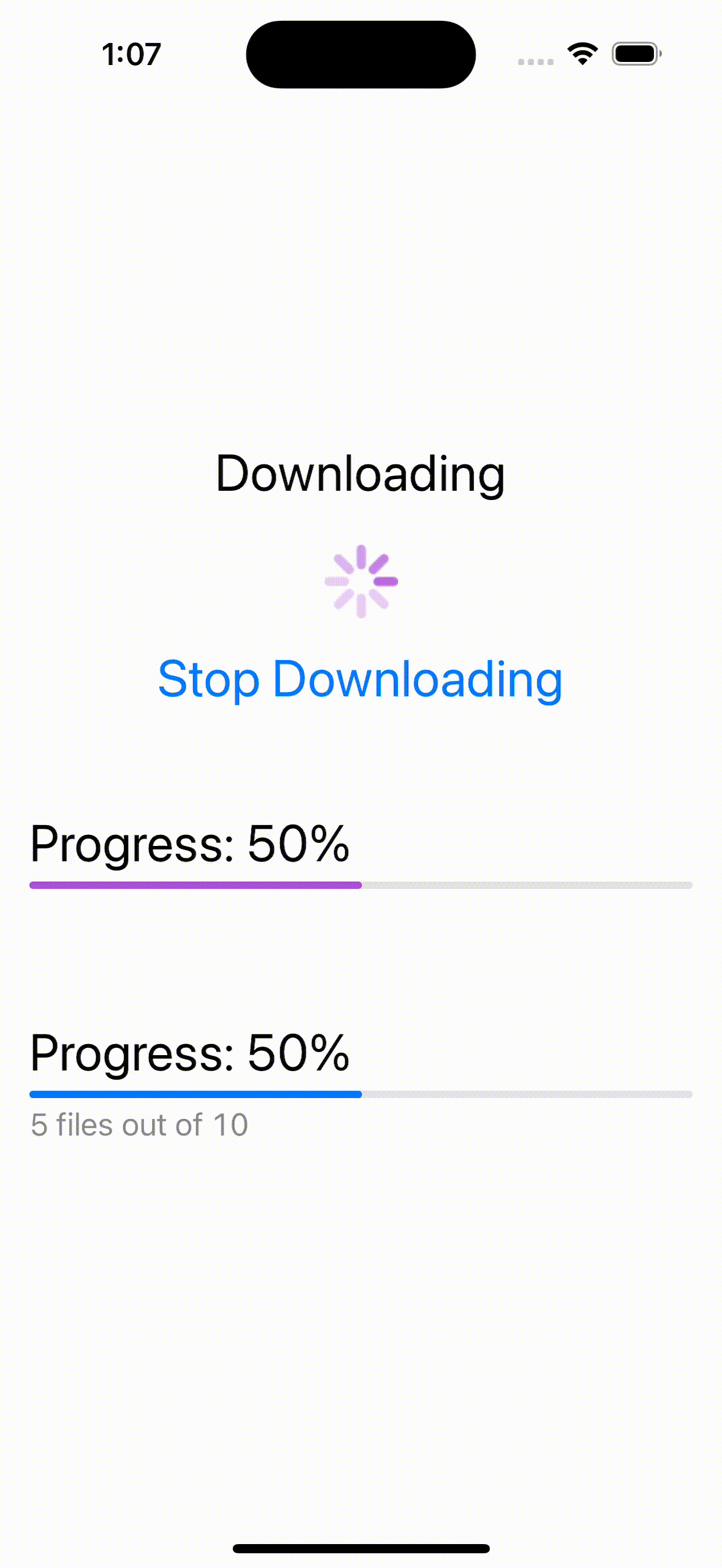
로딩창이나 진행률을 표시할때 사용
-
progressView()의 크기를 키울려면 프레임을 크게해주고 .scaleEffect(2)로 크기를 키워준다
-
progressView()의 색을 바꾸려면 .progressViewStyle(CircularProgressViewStyle(tint: Color.purple)) 으로 붙여주면 된다
-
progressView를 value, label, currentValuelabel의 옵션으로 선택하면 순서대로 진행 퍼센트, 윗쪽 글씨, 아래쪽 같은 글씨로 나타낼수 있다
-
value부분의 색을 바꾸려면 accentColor를 사용하면 된다.
struct ProgressView: View {
    @State private var downloading = true
    var body: some View {
        VStack(spacing: 40.0) {
            VStack {
                Text("Downloading")
                if downloading {
                    ProgressView()
                        .frame(width: 50, height: 50)
                        .scaleEffect(2)
                        .progressViewStyle(CircularProgressViewStyle(tint: Color.purple))
                }
                Button("Stop Downloading", action: { downloading.toggle() })
            }

            ProgressView("Progress: 50%", value: 0.5)
                .accentColor(.purple)
                .padding()
            ProgressView(value: 0.5) {
                Text("Progress: 50%")
            } currentValueLabel: {
                Text("5 files out of 10")
                    .font(.body)
            }
            .padding()

        }
        .font(.title)
    }
}

iOS, Spring developer