
배너 이미지와 문자
문제점
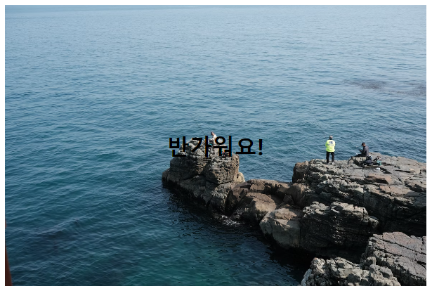
<예시 이미지>
위와 같은 이미지에서는 '반가워요!'라는 문자의 가독성이 떨어집니다.
뒷 배경과 문자색이 같은 어두운 계열이기 때문인데요.
해결 방법들
이 문제를 해결하기 위해서는
1. 문자색을 흰색 계열로
2. 밝은 계열의 이미지를 사용하여서 문자와 배경의 대비를 높이는 것
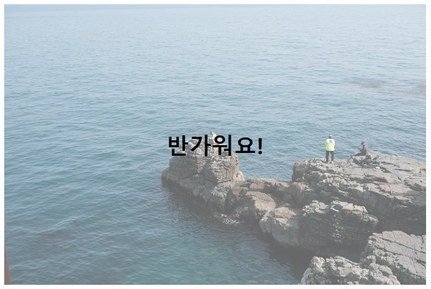
3. 이미지의 opacity를 낮추는 방법
(이 글에서 사용할 방법은 3번)
여러가지 방법들이 있지만, 저는 문자 색을 검정색으로 유지하고 이미지를 유지하는 대신 백그라운드 이미지의 opacity만 조절하는 방법으로 해결하고싶습니다.
Opacity 조절하기
예시 코드
HTML
<div class="hero-container">
  <h1>반가워요!</h1>
<div>
CSS
.hero-container {
  background-image: url("https://images.unsplash.com/photo-1647773319917-f9a98647f6b4?ixlib=rb-1.2.1&ixid=MnwxMjA3fDB8MHxwaG90by1wYWdlfHx8fGVufDB8fHx8&auto=format&fit=crop&w=1170&q=80");
  background-size: cover;
  background-size: center;
  width: 600px;
  min-height: 400px;
  color: black;
  display:flex;
  justify-content: center;
  align-items: center;
}
CSS 변경후
변경된 CSS 코드
.hero-container {
  background-image: url("https://images.unsplash.com/photo-1647773319917-f9a98647f6b4?ixlib=rb-1.2.1&ixid=MnwxMjA3fDB8MHxwaG90by1wYWdlfHx8fGVufDB8fHx8&auto=format&fit=crop&w=1170&q=80");
  background-size: cover;
  background-size: center;
  width: 600px;
  min-height: 400px;
  color: black;
  display:flex;
  justify-content: center;
  align-items: center;

  /* 추가 */
  position: relative;
  isolation: isolate;
}

/* 추가 */
.hero-container::after {
  content: '';
  position: absolute;
  background: white;
  z-index: -1;
  inset: 0;
  opacity: 0.4;
}
여기서 중요한 것은 isolation 속성입니다.
isolation 속성이 없다면 ::after의사 코드로 만들어진 흰색 배경은 이미지 백그라운드 뒤로 사라지게 됩니다.
isolation 사용하게되면 새로운 쌓임 맥락을 생성하게 해주어서 div 내부에 있는 코드들과 분리시켜주게 됩니다.

If I can do it, you can do it.