Overview
The color system handles the variability of dynamically changing color schemes that arise as user inputs change. The logic of tonal relationships and shifts in hue and chroma provide a foundation for flexible color application. Color schemes can be considered a cohesive group of relative tones, rater than a fixed group of constant values.
Key colors
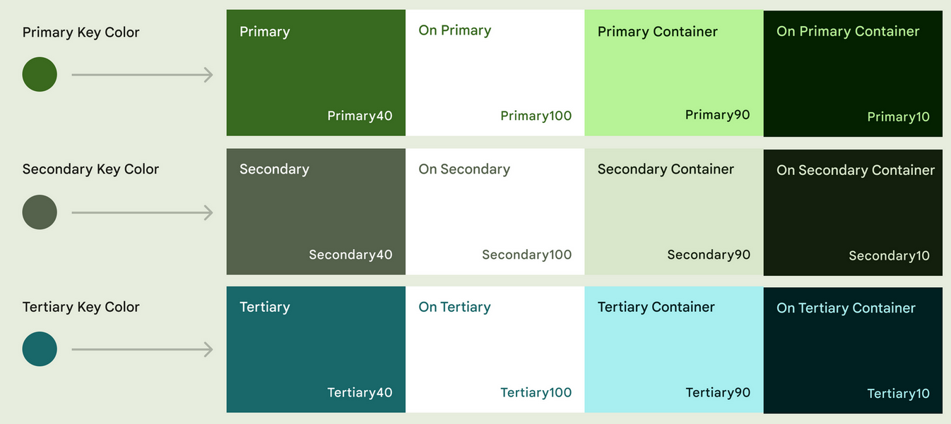
The foundation of a color scheme is the set of five key colors that individually relate to separate tonal palettes with 13 tones. Specific tones from each tonal palette are assgined to color roles across a UI.
Key colors are the foundation for creating any dyanmic color scheme. With key colors established, Material's algorithm specifies the full spectrum of colors needed for expressing interaction states, errors, and accessible contrast.
Custom colors can be added to a scheme as well.
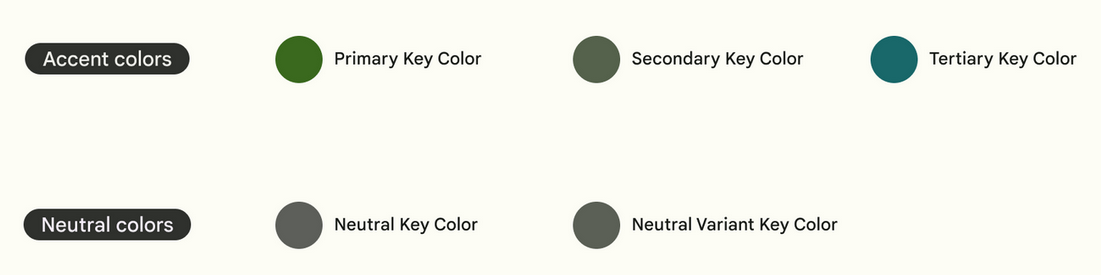
Key colors: accent & neutral
Accent colors
The primary key color is used to derive roles for key components across the UI, such as the FAB, prominent buttons, active states, as well as the tint of elevated surfaces.
The secondary key color is used for less prominent components in the UI such as filter chips, while expanding the opportunity for color expression.
The tertiary key color is used to derive the roles of contrasting accents that can be used to balance primary and secondary colors or bring highlightened attention to an element. The tertiary color role is left for teams to use at their discretion and is intended to support broader color expression in products.
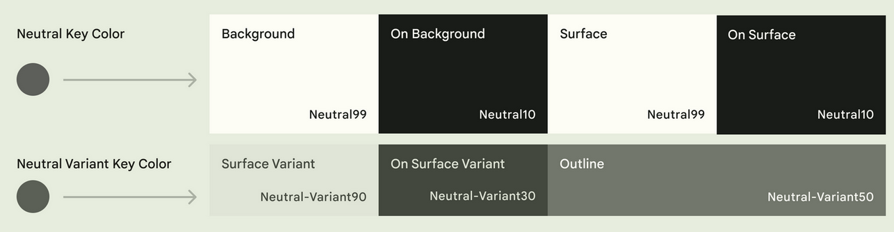
Neutral colors
The neutral key color is used to derive the roles of surface and background, as well as, high emphasis text and icons.
The neutral variant key color is used to derive medium emphasis text and icons, surface variants, and component outlines.
Additional colors
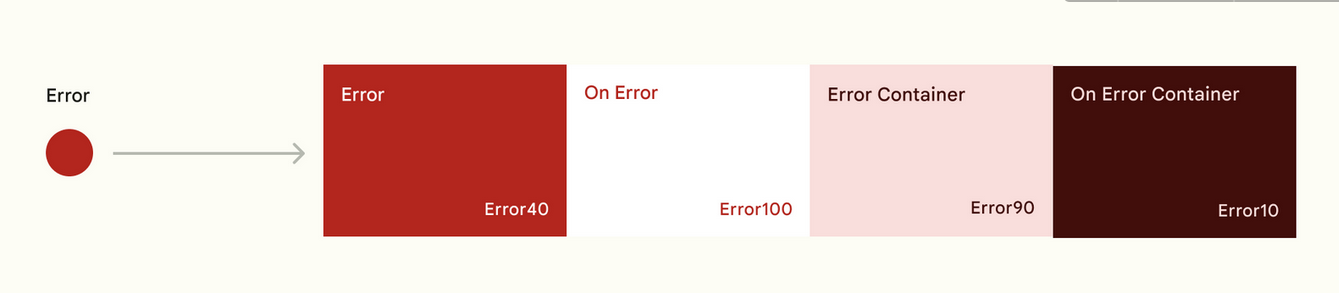
Error colors
In addition to the accent and neutral key color, the color system includes a semantic color role for error, again in the form of the error role itself, plus an on-error, error container, and on-error container role.
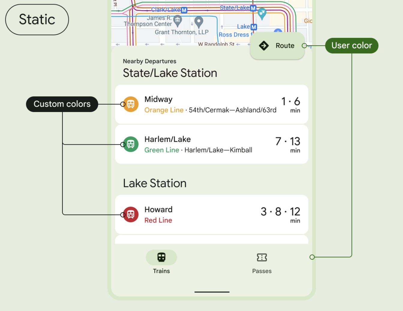
Product-specific custom colors
Custom colors pin specific hues that often are needed alongside expressive colors in UI as a way to communicate conventional meaning, such as errors.
They're also used to give teams more control and customization alongside the variability of a dynamic color environment.
Toanl palettes
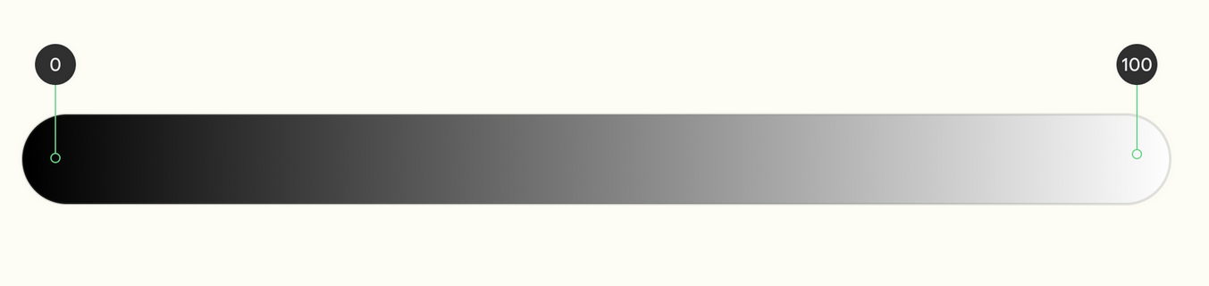
The 100 tone is always 100% white, the lightest tone in the range; the 0 tone is 100% black, the darkest tone in the range.
One key color becomes thirteen tones
A tonal palette consists of thirteen tones, including white and black. A tone value of 100 is equivalent to the idea of light at its maximum and results in white. Every tone value between 0 and 100 expresses the amount of light present in the color.
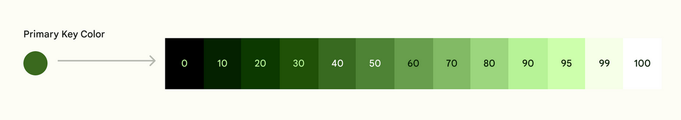
The tonal value of each color is expressed with the number associated with that role, e.g. primary40 is the primary key color at a tone value of 40.
회고
- 포트폴리오 만들어 보려고 계획 중에 도저히 눈뜨고 못봐줄 색감에 Material Design 3 원칙들을 참고(거의 배끼기)하기로 했다.
- 물론 나는 풀스택(backend-tilted)으로 Docker/Swarm 및 Container orchestration 관련 mornitoring tools (FluentD, Kibana, Elastic Search, Prometheus, Grafana 등)을 더 공부해야 되지만, 재미삼아? 디자인 쪽도 보고있는데 역시 별개의 영역으로 존재하는 이유를 알겠다.
- Color
- Key Color (5)
- Accent Key Color (3)
- Primary -> 메인 컴포넌트
- Secondary -> 서브 컴포넌트
- Tertiary -> 컴포넌트 간 조화 및 강조
- Neutral Key Color (2)
- Neutral -> 기본 배경, 글자, 표면
- Neutral Variant -> 서브 배경, 글자, 표면
- Accent Key Color (3)
- Custom Color | Semantic Color(for Error)
- 각각의 Key color는 13 tone으로 구성된 tonal palettes가 있음
- Color는 단지 rgb, hsl 등의 값이 아니라 range이며 role과 mapping되는 관계다(이후 token과 결합)
- Key Color (5)
- 핵심 문장: The foundation of a color scheme is the set of five key colors that individually relate to separate tonal palettes with 13 tones. Specific tones from each tonal palette are assigned to color roles across a UI.
Partial End.