Color schemes
While key colors are the basis for tonal palettes, only a selection of the 13 colors from each tonal palette are used in a UI. A scheme is the group of tones assigned to specific roles that get mapped to components.
A primary color's tonal palette, for example, defines tones for paired roles such as the colors for text and icons that are placed on top of a component (on primary). The tone pairings in color roles provide accessible contrast by default and inform tone adjustments for any additional custom color to work harmoniously with an existing scheme.
Roles in a scheme
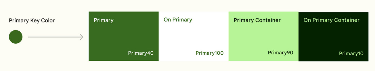
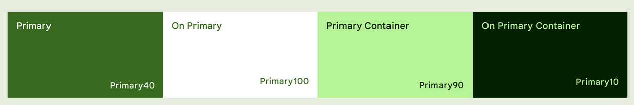
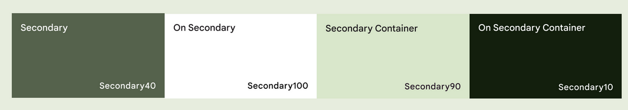
Each accent color (primary, secondary, and tertiary) is provided in a group of four compatible colors of different tones for pairing, defining emphasis, and visual expression.
Accent colors: Primary, secondary, and tertiary roles are formed following the same pattern of a 4-color group.
Primary is used here as an example:
- Primary base color
- On-primary is applied to content (icons, text, etc.) that sits on top of primary
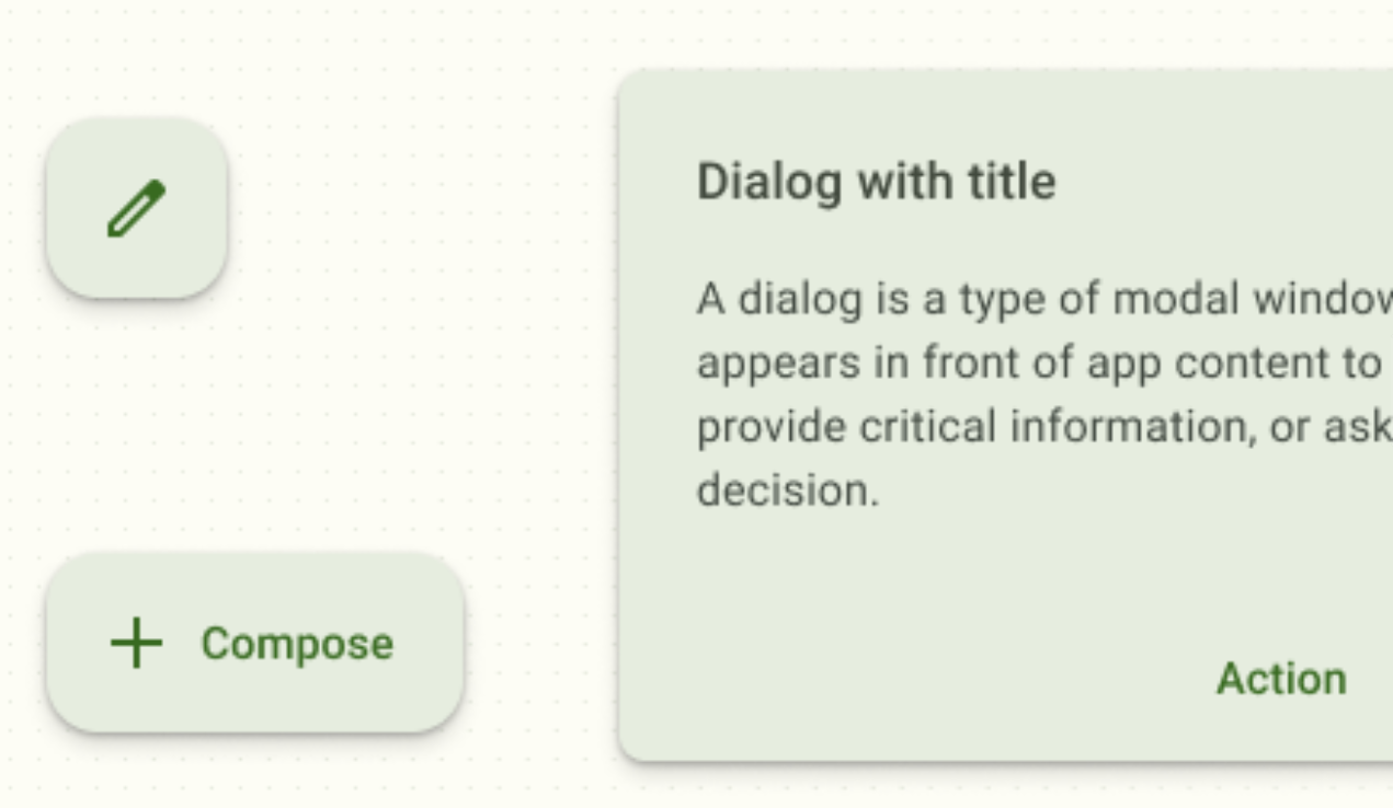
- Primary container is applied to elements needing less emphasis than primary
- On-primary container is applied to content (icons, text, etc.) that sits on top of primary container.
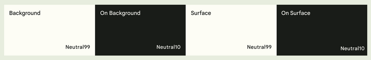
Neutral roles are used for surfaces and backgrounds, as well as high emphasis text and icons.
By mapping and coding roles through tokens, rather than assigning hex values, a color can update systematically if a color palette changes. Tokens enable changes to a role's color value to cascade consistently.
From five key colors, roles are automatically assigned roles that map to light theme components.
When a color scheme is generated, the tonal palettes include mappings for a dark theme as well. Apps receive light and dark tone through a single generated scheme.
Mapping accent roles
The examples below demonstrate how roles are applied.
Primary
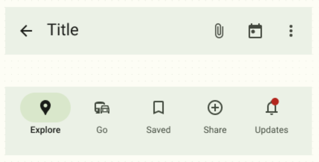
Primary roles are used for key components across the UI, such as the FAB, prominent buttons, active states, as well as the tint of elevated surfaces.
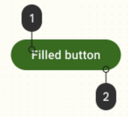
- On-primary 2. Primary
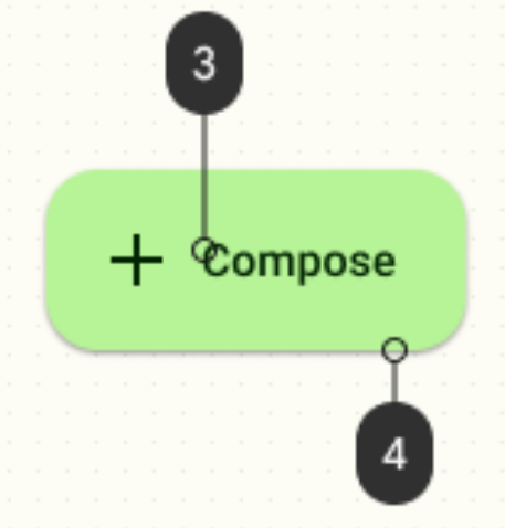
- On-primary container 4. Primary container
Secondary
Secondary roles are used for less prominent components in the UI, such as filter chips, while expanding the opportunity for color expression.
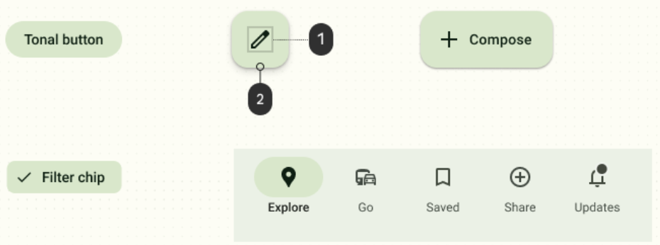
- Icon: On secondary container 2. Secondary container
Tertiary
Tertiary roles are used for contrasting accents that can be used to balance primary and secondary colors or bring heightened attention to an element, such as an input field.
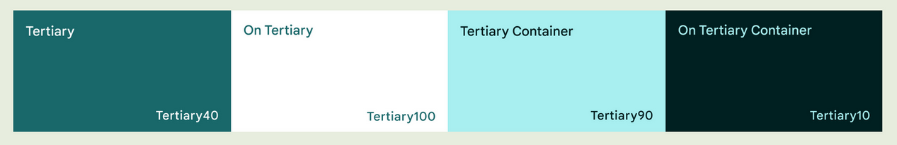
- On tertiary container 2. Tertiary container
Mapping neutral roles: background & surfaces
Neutral
Neutral roles are used for surfaces and backgrounds, as well as high emphasis text and icons.
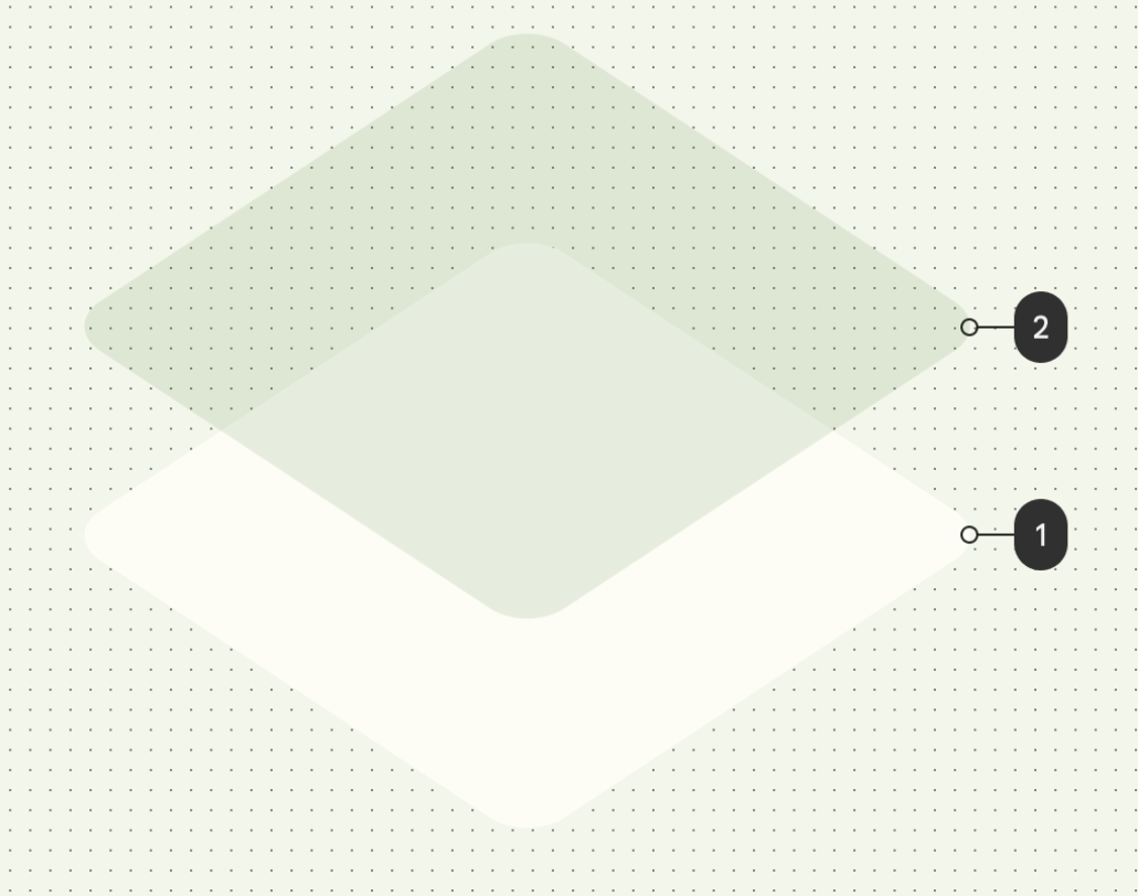
Surface tones
While background color remains consistent, surface color is not static.
Surfaces at elevation levels +1 to +5 are tinted via color overlays based on the primary color, such as app bars or menus. The addition of a grade from +1 to +5 introduces tonal variation to the surface baseline.
Tonal surfaces provide a few benefits:
- Simulate the effect of elevation to create differentiation amongst competing content areas
- Establish contrast for accessibility benefits
- Create visual interest and soften transitions between interactive elements
- Surface 2. Content layer
Surface 1
At elevation +1 components with surface color containers receive a primary color overlay with 5% opacity.
Surface 2
At elevation +2 components with surface color containers receive a primary color overlay with 8% opacity.
Surface 3
At elevation +3 components with surface color containers receive a primary color overlay with 11% opacity.
Surface at 4 and 5
At elevation +4, components with surface color containers receive a primary color overlay with 12% opacity.
Inverse roles
These additional role mappings exist in a scheme and are mapped to components where needed.
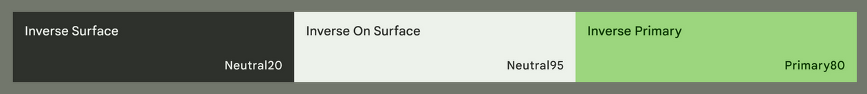
Inverse surface
Inverse surface and inverse on surface are used for displaying the reverse of what’s seen in the surrounding UI.
Neutral variant
Surface variant and on-surface variant can be used for differentiation against a surface
Outline is a utility color that creates boundaries and emphasis to improve usability. It's distinct from the divider component, which uses the surface variant role for low-emphasis content separation that is more decorative than essential.
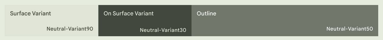
- On surface variant 2. Surface variant
- Outline
회고
-
Color system(scheme)도 어찌됐던 system이니까 체계적이네.. surface 부분은 이해가 잘 안된다. (미적 재능의 문제인가..)
-
핵심문장은...
- While key colors are the basis for tonal palettes, only a selection of the 13 colors from each tonal palette are used in a UI. A scheme is the group of tones assigned to specific roles that get mapped to components.
- Each accent color (primary, secondary, and tertiary) is provided in a group of four compatible colors of different tones for pairing, defining emphasis, and visual expression.
- primary / on-primary / primary container / on-primary container || 40 / 100/ 90 / 10
PARTIAL END.