box의 크기를 결정하는 요소 3가지
width,height: box의 최종 크기가 아닌 콘텐츠의 크기 (주의!)borderpadding
box model
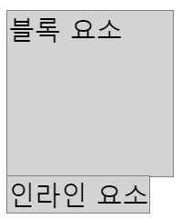
- 블록 요소는
width,height를 지정할 수 있다. - 인라인 요소는
width,height를 지정할 수 없다.
- 부모 / 자식
width,height지정 시- 자식
- 부모 기준으로 % 값을 가질 수 있다.
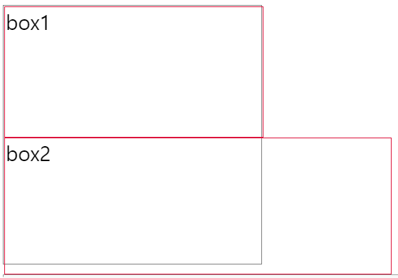
- 부모보다 커지면 부모 영역 밖으로 나간다.
- 자식
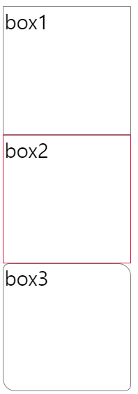
- 부모의 높이(
height)를 지정하지 않으면 자식들에 의해서 높이가 결정이 됨. 자식들이 채워진만큼 자동으로 높아짐.
‣ 모든 테두리 지정하기
border:
예제
border: 1px solid gray;: border-width border-style border-color
‣ 원하는 테두리 지정하기
border-topborder-rightborder-bottomborder-left- 각각의 테두리를 나눠서 지정하여 적용 할 수 있다.
예제
border-top: 1px solid crimson;border-right: 1px solid crimson;border-bottom: 1px solid crimson;border-left: 1px solid crimson;
‣ 모서리 둥글게 다듬기
border-radius- 상단 좌측부터 시작해서 시계 방향을 따라 값을 순차적으로 부여한다.
예제
border-radius: 5px;: 전체 적용border-radius: 5px 10px;border-radius: 5px 10px 5px;border-radius: 5px 10px 5px 10px;
‣ 내부여백
padding- 테두리와 콘텐츠 사이 여백
- 상단 여백부터 시작해서 시계 방향을 따라 값을 순차적으로 부여한다.
예제
padding: 10px;: 전체 적용padding: 10px 20px;padding: 10px 20px 10px;padding: 10px 20px 10px 20px;
‣ 원하는 내부여백 지정하기
padding-toppadding-rightpadding-bottompadding-left
예제
padding-top: 10px;: 위쪽 내부여백padding-right: 20px;: 오른쪽 내부여백padding-bottom: 10px;: 아래쪽 내부여백padding-left: 20px;: 왼쪽 내부여백
box-sizing 속성
content-box
- 디폴트, 생략 가능
width,height는 내용(content)의 크기를 의미한다.box크기는width/height + border + padding으로 계산한다.
border-box
width,height는 테두리(border)까지의 크기를 의미한다.box크기는width/height이다.
‣ 외부여백
marginborder바깥쪽의 여백margin은 동시에 지정할 경우 영역이 겹쳐진다.
예제
margin: 10px;margin: 10px 20px;: 상하:10px 좌우:20pxmargin: 10px 20px 10px;: 위:10px 좌우:20px 아래:10pxmargin: 10px 20px 10px 20px;
‣ 원하는 외부여백 지정하기
margin-topmargin-rightmargin-bottommargin-left
예제
margin-top: 10px;: 위쪽 10pxmargin-right: 20px;: 오른쪽 20pxmargin-bottom: 10px;: 아래쪽 10pxmargin-left: 20px;: 왼쪽 20px
‣ box 가운데 배치
- 좌우
margin을auto로 설정
margin: 0 auto;
auto: 알아서 계산해서 동일한 값이 잡히기 때문에 box가 부모영역 기준 가운데 자리 잡힘
background
- 그림 자체를 넣는 방법 (이미지를 넣는 용도로 주로 사용한다.)
단축속성
background: 위치(position)/크기(size)
blend-mode는 단축속성에 명시하지 않는다.
‣ box 크기와 배경 이미지 크기를 동일하게 맞춤
예제
box-sizing: border-box;
width: 192px;
height: 128px;

/* image 경로를 잡아주기 위해 url() 함수를 이용 */
background-image: url(../../이미지파일경로/이미지파일.jpg);
/* 박스 크기에 맞춰서 배경 크기도 맞춤 너비만 맞추는 경우 높이는 auto값을 자동으로 사용함 */
background-size: 192px 128px;
단축속성 활용 예제
/* 단축속성 : 위치(position)/크기(size) */
background: url(../../이미지파일경로/이미지파일.jpg) center/192px 128px;
‣ box보다 작은 이미지 처리
예제
box-sizing: border-box;
width: 500px;
height: 380px;
border: 1px solid gray;

background-image: url(../../이미지파일경로/이미지파일.png);
background-repeat: no-repeat; /* repeat:반복 no-repeat:반복없음 */
background-size: auto;        /* 이미지 크기를 그대로 사용 */
background-position: right;   /* top/bottom(세로 정렬), left/center/right(가로 정렬) */
    						  /* position:위치 조정(자동 가운데 정렬이 됨) */

background: url(../../이미지파일경로/이미지파일.png) no-repeat right/auto;   /* background 단축속성 */
‣ box보다 큰 이미지 처리
예제
box-sizing: border-box;
width: 300px;
height: 300px;
border: 1px solid gray;

background-image: url(../../이미지파일경로/이미지파일.jpg);
background-repeat: no-repeat;
background-size: cover;  /* contain : 이미지를 늘리거나 자르지 않고(원래 비율 유지) 최대한 크게 조정해서 표현 */
                         /* cover   : 너비/높이 중 작은 부분을 최대한 여백 없이 표시하고 box 밖으로 나간 부분은 자름 */
                         /* 일반적으로 너비가 넓은 이미지 적용에는 cover를 사용하고, contain은 경우에 따라서 적용 */
background-position: center;

/* 단축속성 */
background: url(../../이미지파일경로/이미지파일.jpg) no-repeat center/cover;
‣ 이미지의 일부만 표시하기
예제
box-sizing: border-box;
width: 115px;
height: 115px;

background-image: url(../../이미지파일경로/이미지파일.png);
background-position: -145px -145px;  /* 가로 세로 순으로 이동, -145px: 배경이 왼쪽/아래쪽으로 145px 이동 */

background: url(../../이미지파일경로/이미지파일.png) -145px -145px/auto;

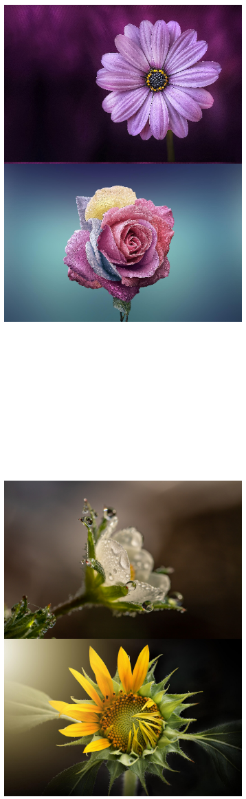
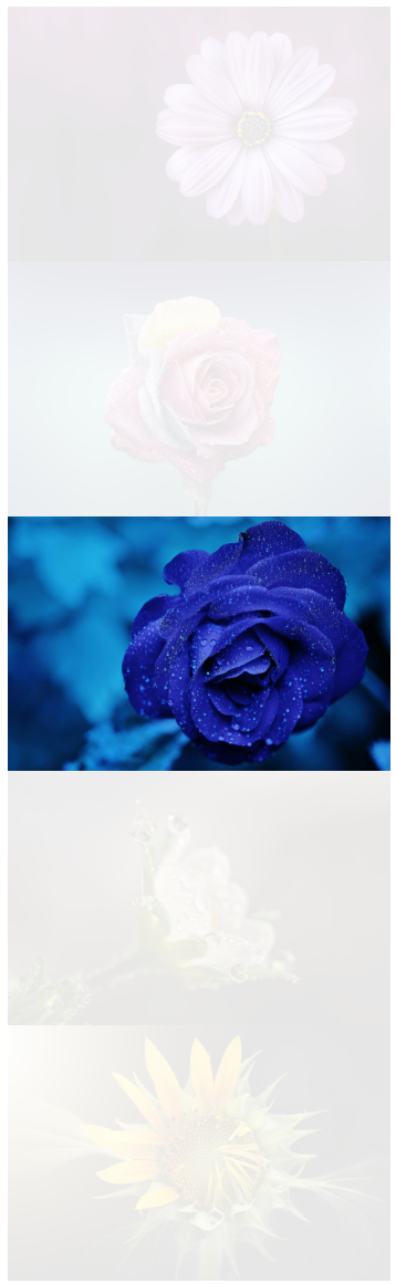
이미지 위에 배경색 덮어쓰기 예제 출력
visibility / opacity
- 블록 영역 or 이미지 숨기기
visibility: hidden;opacity: 0;: 안 보임 (투명도 0은 안 보임, 1은 보임)
table
‣ 테이블 바깥쪽 테두리
border: 1px solid gray;
‣ 테이블 테두리 합치기
border-collapse: collapse;
separate: 테이블 테두리가 분리되어있는 상태collapse: 테두리 합치기
- 테이블 테두리는
<td>태그를 대상으로 처리하는 것이 일반적이다. <td>태그는 가로/세로 정렬이 모두 지원된다.- 가로 방향 정렬 :
left,center,right
text-align: center; - 세로 방향 정렬 :
top,middle,bottom
vertical-align: middle;
- 가로 방향 정렬 :
‣ 개별로 지정 nth-of-type(n)
nth-of-type(1), nth-of-type(2), nth-of-type(3), ...
예제
    .wrap1 > table td:nth-of-type(n) {
      width: 150px;
    }
‣ 마우스 커서 모양 바꾸기
cursor: pointer;

개발이 세상에서 제일 재밌어요