
이번 포스팅에서는 데이터를 직접 시각화하여 처리해주는 matplotlib 라이브러리와 seaborn 라이브러리에 대하여 정리 해 보았습니다.
matplotlib
Tutorial
https://matplotlib.org/tutorials/index.html
작동 형태
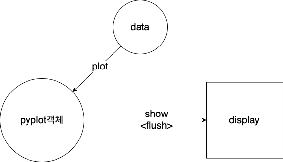
pyplot 객체에 데이터를 쌓은 다음 pyplot데이터를 flush하여(이때, pyplot객체에서의 데이터는 사라짐) 보여주는 형태
기본 사용 방법
X = range(100)
Y = [np.cos(value) for value in X]

plt.plot(X, Y)

plt.show()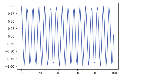
X = range(100)
Y = [np.sin(value) for value in X]

plt.plot(X, Y)
plt.show()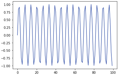
# 여러개의 데이터를 한번에 flush
X1 = range(100)
Y1 = [np.cos(value) for value in X1]

X2 = range(100)
Y2 = [np.sin(value) for value in X2]

#층들을 싸하올림
plt.plot(X1, Y1)
plt.plot(X2, Y2)
plt.plot(range(100), range(100))
plt.show() #층들을 한번에 보여줌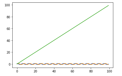
- x,y값을 array형태로 넣어줄 때 x축 정렬 및 x에 대응되는 y의값을 인덱스를 맞춰 넣어주워야 한다.
import random

X_1 = [random.randint(1,100) for _ in range(100)] #x축 정렬 중요
Y_1 = [np.cos(value) for value in X]

plt.plot(X_1, Y_1)
plt.show()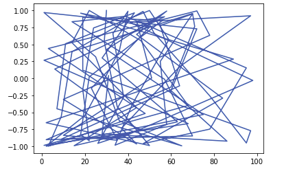
- subplot의 사용 예시
#한개의 figure안에 여러개의 여러개의 subplot그리기
X1 = range(100)
Y1 = [np.cos(value) for value in X1]

X2 = range(100)
Y2 = [np.sin(value) for value in X2]

fig = plt.figure()
fig.set_size_inches(15,5)  #크기 지정 (가로, 세로)

ax1 = fig.add_subplot(1,2,1) # 두개의 plot생성 (row수(전체), column수(전체), 몇번째인지)
ax2 = fig.add_subplot(1,2,2) # 두개의 plot생성

ax1.plot(X1,Y1,c='b') # 색 지정은 색 코드도 가능
ax2.plot(X2,Y2,c='r')
plt.show()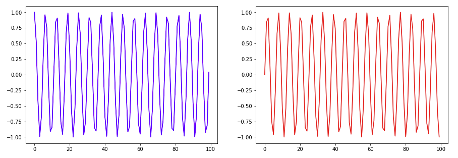
- linestyle
#linestyle
X1 = range(100)
Y1 = [np.cos(value) for value in X1]

X2 = range(100)
Y2 = [np.sin(value) for value in X2]

plt.plot(X1, Y1, c="b", linestyle= 'dashed') #둘다 같은 거(linestyle,ls)
plt.plot(X2, Y2, c="r", ls="dotted")

plt.show()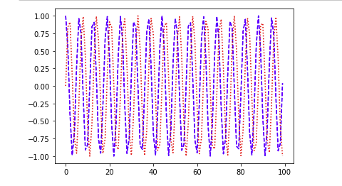
- 레이텍 사용
plt.plot(X1, Y1, color="b", linestyle="dashed")

plt.title("$y = \cos x$") #레이텍
plt.show()
- 축에 대한 라벨 지정
plt.plot(X1, Y1, color="b", linestyle="dashed")

plt.title("$y = \cos x$")
plt.xlabel("$x_line$")
plt.ylabel("$y_line$")

plt.show()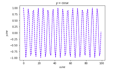
- 범례 표시
plt.plot(X1, Y1, color="b", linestyle="dashed", label = 'line_1')
plt.legend(shadow = True, fancybox = True, loc='lower right') #범례표시

plt.title("$y = \cos x$")
plt.xlabel("$x_line$")
plt.ylabel("$y_line$")

plt.show()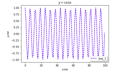
- grid설정 및 표의 크기 설정
plt.grid(True, lw = 1)#그래프 보조선을 그음, lw - 선의 굵기 설정
plt.xlim(-100,200) #x,y축의 한계를 지정 - 지정해 주지 않으면 자동으로 설정
plt.ylim(-200,200)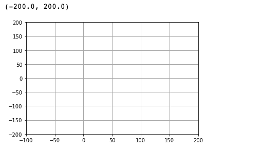
- 스타일 지정
plt.style.use("ggplot") #스타일 지정

plt.plot(X1, Y1, color="b", linestyle="dashed")

plt.title("$y = \cos x$")
plt.show()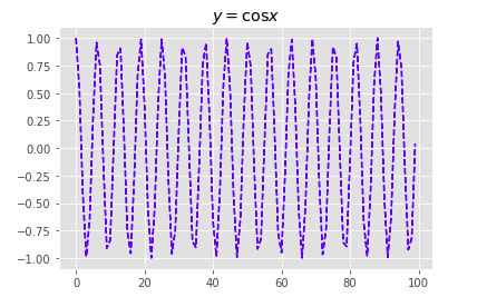
- 선에 대한 표시
X1 = range(100)
Y1 = [value for value in X]

plt.plot(X1, Y1, color="b", linestyle="dashed")

plt.text(30, 70, "Line_1")

plt.title("$y = ax+b$")
plt.xlabel("$x_line$")
plt.ylabel("y_line")
X1 = range(100)
Y1 = [value for value in X]

#plot된 것이 여러개가 있으면 text나 annotate이 순서대로 적용이 됨
plt.plot(X_2, Y_2, color="r", linestyle="dotted")

plt.annotate(
    "line_2",
    xy=(50, 150),
    xytext=(20, 175),
    arrowprops=dict(facecolor="black", shrink=0.05),
)

plt.title("$y = ax+b$")
plt.xlabel("$x_line$")
plt.ylabel("y_line")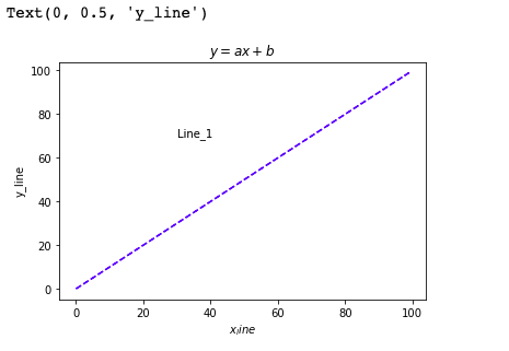
- 파일로 결과 저장
X1 = range(100)
Y1 = [np.cos(value) for value in X1]

X2 = range(100)
Y2 = [np.sin(value) for value in X2]


plt.plot(X1, Y1, color="b", linestyle="dashed", label="line_1")
plt.plot(X2, Y2, color="r", linestyle="dotted", label="line_2")

plt.grid(True, lw=0.4, ls="--", c=".90")
plt.legend(shadow=True, fancybox=True, loc="lower right")
# savefig 다음 show로(show를 한 순간 fiigure가 비기 때문)
plt.savefig("math.png", c="a")
plt.show() 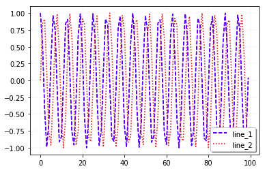
- scatter
data1 = np.random.rand(100, 2)
data2 = np.random.rand(100, 2)

plt.scatter(data1[:, 0], data1[:, 1], c="b", marker="x")
plt.scatter(data2[:, 0], data2[:, 1], c="r", marker="o")

plt.show()
# s 파리미터를 이용하여 영역으로 표시 가능
cnt = 30
#x,y,colors,area sequence 데이터이자 형태가 같아 매치가 됨
x = np.random.rand(cnt)
y = np.random.rand(cnt)
colors = np.random.rand(cnt)
area = np.pi * (10* np.random.rand(cnt)) ** 2
plt.scatter(x, y,alpha=0.5, s=area, c=colors) # s: 데이터의 크기 지정, alpha :투명도
plt.show()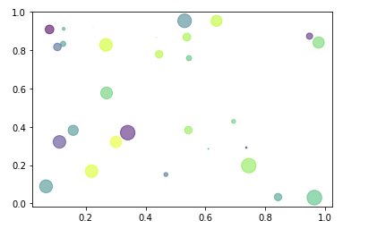
- 히스토그램 및 boxplot만들기
# 히스토그램 생성
X = np.random.normal(0,100,1000)
plt.hist(X, bins=10)  #bins : 몇개의 꺽쇠를 만들거냐
plt.show()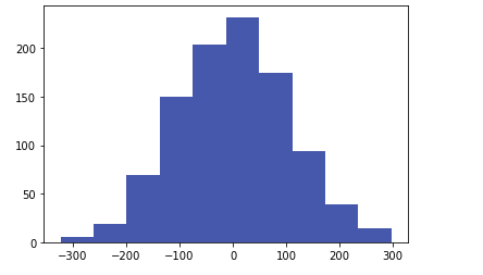
boxplot의 해석
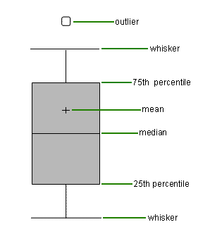
data = np.random.randn(100, 5)
plt.boxplot(data)
plt.show()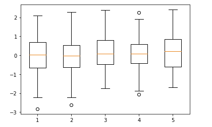
seaborn
Tutorial
https://seaborn.pydata.org/tutorial.html
기본 사용 방법
- 예시 데이터 불러오기
import numpy as np
import pandas as pd
import matplotlib.pyplot as plt
import seaborn as sns

sns.set(style="darkgrid")
tips = sns.load_dataset("tips")
fmri = sns.load_dataset("fmri")- lineplot
sns.lineplot(x="size", y="total_bill", data=tips) # 정렬을 해 준다음 실선은 평균, 흐린 부분은 분포이다.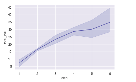
sns.lineplot(x="size", y="total_bill", hue = "time", data=tips)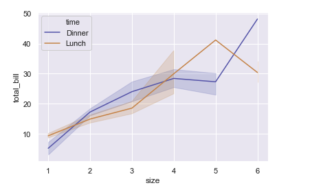
- scatterplot
sns.scatterplot(x="size", y="total_bill", hue = "time", data=tips)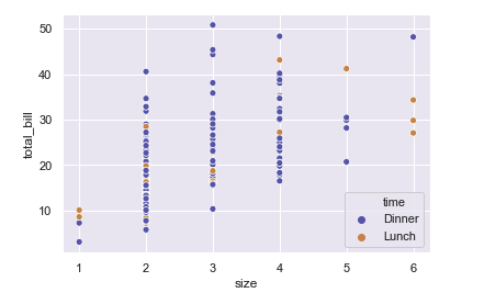
- regplot
sns.regplot(x="size", y="total_bill", data=tips)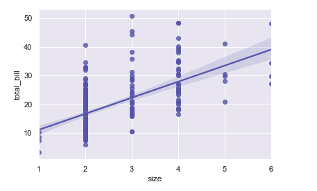
- countplot
sns.countplot(x="sex", data=tips)
sns.countplot(x="sex", hue="time", data=tips)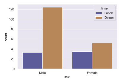
- barplot
# barplot : 위에 막대기는 신뢰구간을 의미
# 높이는 평균값을 의미
sns.barplot(x="timepoint", y ="signal",data= fmri)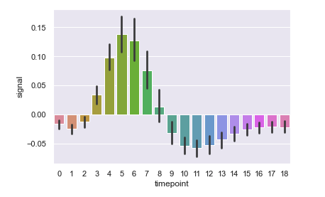
sns.barplot(x="timepoint", y ="signal",data= fmri, estimator = np.std)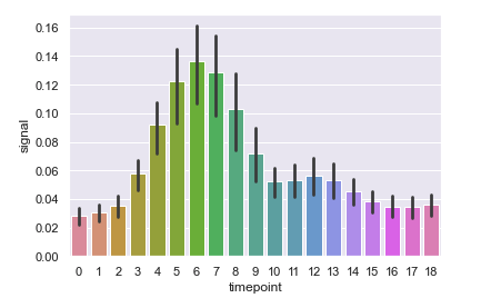
- displot
#관측값의 일 변량 분포를 유연하게 플로팅
sns.distplot(fmri['timepoint'])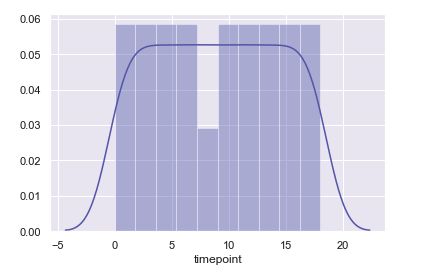
sns.distplot(fmri['timepoint'], kde = False)
sns.distplot(fmri['timepoint'], kde = False, bins = 15)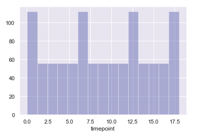
- violinplot
sns.violinplot(x="sex", y ="total_bill",hue = "smoker", data = tips, palette = "muted")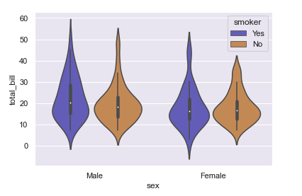
- boxplot
sns.boxplot(x="sex", y ="total_bill",hue = "smoker", data = tips, palette = "muted")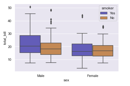
- swarmplot
sns.swarmplot(x="sex", y ="total_bill",hue = "smoker", data = tips, palette = "muted")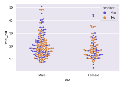
- catplot
#category plot - 파라미터로 조금씩 다르게 보여줌
sns.catplot(x="sex", y ="total_bill",hue = "smoker", data = tips)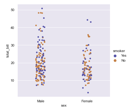
- FacetGrid
g = sns.FacetGrid(tips, col = "smoker", row = "sex") #시간과 성별을 그룹지어
g.map(sns.distplot,"total_bill",kde = False) #데이터의 분포도를 보여줌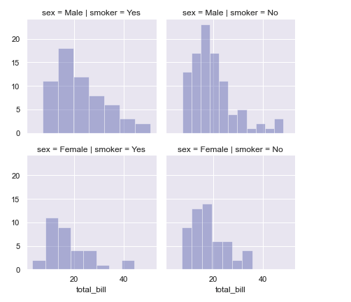
Reference
Naver BoostCamp AI Tech - edwith 강의
https://goodtogreate.tistory.com/entry/%EC%9D%B4%EC%83%81%EC%B9%98-%EC%A0%9C%EA%B1%B0-Boxplot-%ED%95%B4%EC%84%9D%EC%9D%84-%ED%86%B5%ED%95%9C
https://m.blog.naver.com/PostView.nhn?blogId=acornedu&logNo=220934409189&proxyReferer=https:%2F%2Fwww.google.com%2F

한걸음씩 꾸준히