1. CSS 에서의 단위를 예를 들어 설명하시오. (%, vh, vw, em, rem)
- px
픽셀(화소) 단위로, 절대값입니다. 디바이스 해상도에 따라 상대적인 크기를 갖습니다. - %
백분률 단위의 상대 단위로, 요소에 지정된 사이즈에 상대적인 사이즈를 설정합니다. - em
배수 단위의 상대 단위로, 요소에 지정된 사이즈에 상대적인 사이즈를 설정합니다. 폰트 사이즈 설정에 사용하면 편리합니다. - vh
Viewport height의 축약어로, 웹사이트에서 보여지는 영역을 뜻합니다. - vw
Viewport width의 축약어입니다. - rem
최상위 요소(html)의 사이즈를 기준으로 삼습니다. 그리드 시스템에서도 유용하게 사용할 수 있습니다
2. 디스플레이 속성 아래를 설명하시오.
- block
div 태그에서 기본 값으로 설정되어 있고 너비를 100%로 가지는 특징을 갖고 있음.
어떤 영역을 고정으로 지정하기 위해 사용되며, 배경색 혹은 너비 및 높이를 지정할 수 있고 전체 레이아웃 틀을 잡는데 유용 - inline
span태그에서 기본 값으로 설정되며, 유동적으로 영역을 설정할 때 사용 - inline-block
inline과 block의 특징을 합쳐놓은 속성 한 행에 여러 컨텐츠들을 나열할 때 사용 됨.
<!DOCTYPE html>
<html lang="en">
<head>
    <meta charset="UTF-8">
    <meta name="viewport" content="width=device-width, initial-scale=1.0">
    <title>Document</title>
</head>
<style>
    .display_block{
        display:block;
        background-color : #3f86ff
    }

    .display_inline{
        display:inline;
        background-color : yellow
    }

    .display_inline_block{
        display:inline-block;
        background-color : green
    }


    .display_none{
        display:none;
    }
    </style>

    <div class="display_inline">display:block</div> <div class="display_inline">display:block</div>
    <div class="display_block">display:block</div>
    <div class="display_none">display_none</div>
    <div class="display_inline_block">
        <div class="display_inline_block">inline-block1</div>
        <div class="display_inline_block">inline-block2</div>
    </div>
<body>
</body>
</html>
출력시

3.display:none visibility:none 의 차이는?
display:none와 visibility : hidden은 둘 다 요소를 보이지 않게 하는 속성이라는 점에서 같지만, UI적으로 볼 때 둘은 완전히 다릅니다. display:none은 화면 상 어떤 영역을 차지하지 않고 완전히 삭제된 것처럼 보이게 합니다. 그러나 visibility:hidden은 해당 요소가 보이지 않을 뿐 요소가 존재하는 영역은 확실히 보이게 됩니다.
HTML CSS JSResult Skip Results Iframe
EDIT ON
<div class="container">
  <div class="parent">
    <div class="child" id="display">
      dispaly: none;
    </div>
    <div class="child">
      저는 위로 올라갈거에요.
    </div>
  </div>

  <div class="parent">
    <div class="child" id="visibility">
      visibility: hidden;
    </div>
    <div class="child">
      저는 그대로 위치할거에요.
    </div>
  </div>
</div>
<div class="container">
  <div class="btn" onclick="toggleDisplay()">
    <div>Click me</div>
  </div>

  <div class="btn" onclick="toggleVisibility()">
    <div>Click me</div>
  </div>
</div>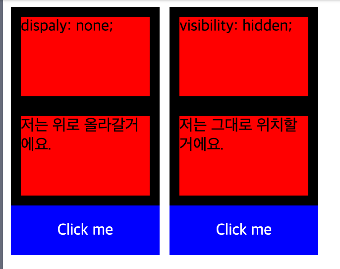
display: none; visibilitiy: hidden; 기입전
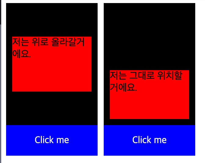
기입 후
4. ul 과 li 를 활용하여 아래를 출력하시오.
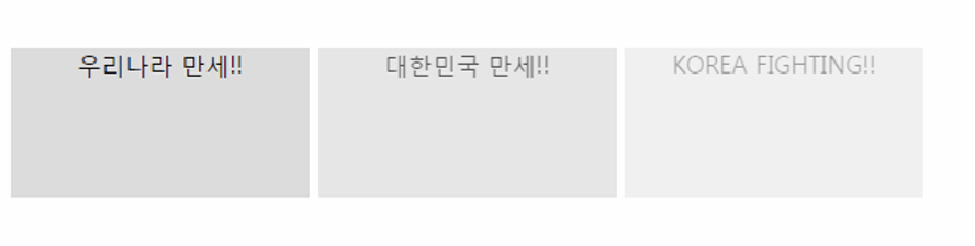
ul 내부 li 요소를 스타일링
display: inline-block; 각 li 요소를 가로로 배치하며, 블록 요소처럼 크기 조정 가능케함.
ul li:nth-child(1,2,3) {} 을 통해서 각
<!DOCTYPE html>
<html lang="en">
    <head>
        <meta charset="UTF-8" />
        <meta name="viewport" content="width=device-width, initial-scale=1.0" />
        <title>Document</title>
        <style>
            ul li{
              display: inline-block;
              width: 200px;
              height: 100px;
              text-align: center;
              background-color: #dddddd;
            }
            ul li:nth-child(1) {
              opacity: 1;
            }
            ul li:nth-child(2) {
              opacity: 0.7;
            }
            ul li:nth-child(3) {
              opacity: 0.4;
            }
        </style>
    </head>
    <body>
      <ul>
        <li>우리나라 만세!!</li>
        <li>대한민국 만세!!</li>
        <li>KOREA FIGHTING!!</li>
    </ul>
    </body>
</html>
5. 아래를 구현하시오.
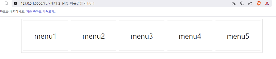
nav로 통합 컨테이너역할을 하는 div 로 전체 크기 및 margin 가운데 정렬
border: 1px solid #ccc; 얇은 회색 테두리
display: flex; justify-content 메뉴 가로로 가운데 정렬
overflow: hidden; 넘치는 콘텐츠 숨김
gap: 10px;
바디
< a > 태그는 anchor(닻)의 약어로, 하나의 페이지에서 다른 페이지를 연결할때 사용하는 하이퍼링크를 정의할때 사용합니다. 따라서 < a >태그에는 링크(link)의 목적지를 가리키는 href 속성이 필요합니다.
<!DOCTYPE html>
<html lang="en">
<head>
    <meta charset="UTF-8">
    <meta name="viewport" content="width=device-width, initial-scale=1.0">
    <title>Document</title>

    <style>
        #nav {
            width: 510px;
            height: 80px;
            margin: auto;
            border: 1px solid #ccc;
            display: flex;
            justify-content: center;
            overflow: hidden;
            gap: 10px;
        }

        div {
            display: inline-block;
            width: 90px;
            height: 70px;

            display: flex;
            align-items: center;
            justify-content: center;

            border-top: 1px solid #ccc;
            border-bottom: 1px solid #ccc;
            border-left: none;
            border-right: none;
        }

        a {
            color: inherit; /* 부모 요소의 색상 그대로 적용 */
            text-decoration: none; /* 밑줄 제거 */
            text-align: center;
        }


    </style>
</head>
<body>
    <div id="nav">
        <div><a href="#">menu1</a></div>
        <div><a href="#">menu2</a></div>
        <div><a href="#">menu3</a></div>
        <div><a href="#">menu4</a></div>
        <div><a href="#">menu5</a></div>
    </div>
</body>
</html>
6. 아래를 구현하시오
<!DOCTYPE html>
<html lang="en">
<head>
<meta charset="UTF-8">
<meta http-equiv="X-UA-Compatible" content="IE=edge">
<meta name="viewport" content="width=device-width, initial-scale=1.0">
<title>Document</title>
<style>
#wrap {
width: 800px;
border: 1px solid #cccccc;
}
div p:nth-child(1) {
font-size: 2rem;
text-decoration: underline;
text-align: center;
}
div p:nth-child(2) {
font-size: 1.2rem;
font-weight: bold;
text-align: left;
}
div p:nth-child(4) {
font-size: 1.2rem;
text-align: right;
}
div p:nth-child(4) span {
background-color: #cccccc;
}
div p:nth-child(6) {
height: 50px;
line-height: 50px;
font-size: 1.5rem;
text-align: center;
color: blue;
}
</style>
</head>
<body>
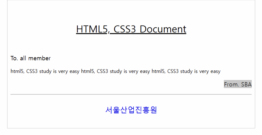
<div id="wrap">
<p>HTML5, CSS3 Document</p>
<p>To. all member</p>
<p>html5, CSS3 study is very easy html5, CSS3 study is very easy html5, CSS3 study is very easy</p>
<p><span>From. SBA</span></p>
<hr />
<p>서울 산업 진흥원</p>
</div>
</body>
</html>7. 마진과 패딩에 대하여 설명하시오.
✅ 마진 (margin): 요소 바깥쪽 여백 (주변 요소와의 간격 조정)
✅ 패딩 (padding): 요소 안쪽 여백 (콘텐츠와 테두리 사이의 간격 조정)
.box {
    margin: 20px;  /* 바깥 여백 */
    padding: 10px; /* 안쪽 여백 */
    border: 1px solid black;
}
8. 박스모델이란?
CSS에서 모든 HTML 요소는 박스 형태의 모델을 가짐.
🔹 구성 요소
1️⃣ Content: 내용이 들어가는 영역
2️⃣ Padding: 콘텐츠와 테두리 사이의 간격
3️⃣ Border: 요소의 테두리
4️⃣ Margin: 요소 바깥 여백
📌 예제 이미지
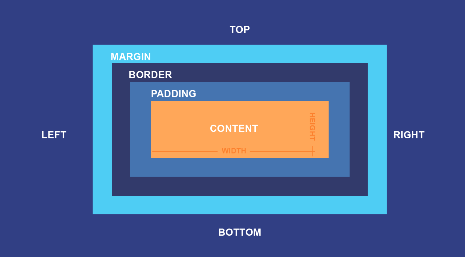
📷 (박스 모델 구조도 이미지 삽입 추천)
9. 아래의 box-sizing 속성을 설명하시오.
CSS에서 box-sizing은 요소 크기를 계산하는 방법을 결정함.1️⃣ content-box (기본값)
width, height는 콘텐츠 크기만 포함
padding, border는 추가됨
2️⃣ border-box
width, height가 padding, border까지 포함한 크기
박스 크기를 쉽게 조절할 수 있어 실무에서 자주 사용됨
.content-box {
    box-sizing: content-box; /* 기본값 */
    width: 200px;
    padding: 20px;
    border: 5px solid black;
    /* 총 크기: 200px + 20px*2 + 5px*2 = 250px */
}

.border-box {
    box-sizing: border-box;
    width: 200px;
    padding: 20px;
    border: 5px solid black;
    /* 총 크기: 200px (이미 padding, border 포함) */
}
10. 아래를 구현하시오.
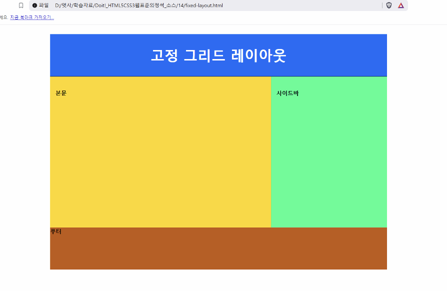
margin: 0 auto; 중앙 정렬
<!DOCTYPE html>
<html lang="en">
<head>
    <meta charset="UTF-8">
    <meta name="viewport" content="width=device-width, initial-scale=1.0">
    <title>Document</title>
    <style>
        div{
            width: 800px;
            margin: 0 auto;
            padding: 0;
            border: 0;
        }

        #head{
            width: 100%;
            height: 120px;
            line-height: 120px;
            background-color: rgb(53, 100, 255);
            text-align: center;
            color: white;
        }

        #main{
            width: 65%;
            height: 360px;
            line-height: 30px;
            background-color: gold;
            font-size: 0.8em;
            font-weight: bold;
            box-sizing: border-box;
            float: left;
            padding: 10px;
        }

        #side{
            width: 35%;
            height: 360px;
            line-height: 30px;
            background-color: cyan;
            font-size: 0.8em;
            font-weight: bold;
            box-sizing: border-box;
            float: right;
            padding: 10px;
        }

        #footer{
            width: 100%;
            height: 120px;
            font-size: 0.8em;
            font-weight: bold;
            clear: both; /* float에 영향을 받지 않게 한다 */
            background-color: chocolate;
        }
    </style>
</head>
<body>
    <div>
        <div id="head"><h1>고정 그리드 레이아웃</h1></div>
        <div id="main">본문</div>
        <div id="side">사이드바</div>
        <div id="footer">푸터</div>
    </div>
</body>
</html>
3줄 요약:
-
Float 은 3차원 개념이고, 집나간 토끼는 부모에서 overflow:hidden 으로 잡아 들인다.
-
Display 속성에는 inline, block, inline-block 속성이 있다.
-
패딩은 내부 여백이고 마진은 외부 여백이다.