저번글에서 주축과 교차축은 디폴트로 수평, 수직이라고 했다. 이 둘을 서로 바꾸기 위해서는 flex-direction을 수정하면 된다. flex-direction의 옵션에는 row와 column이 있다.
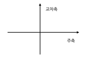
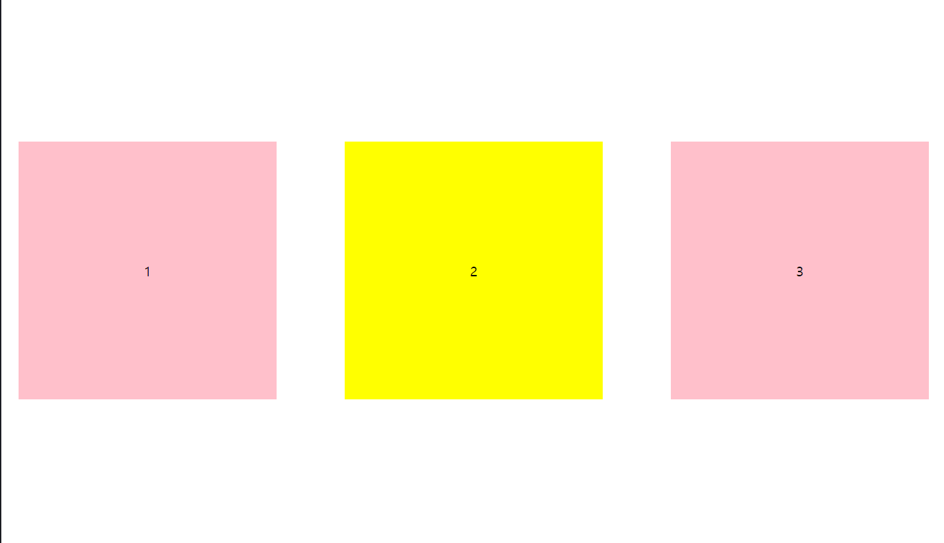
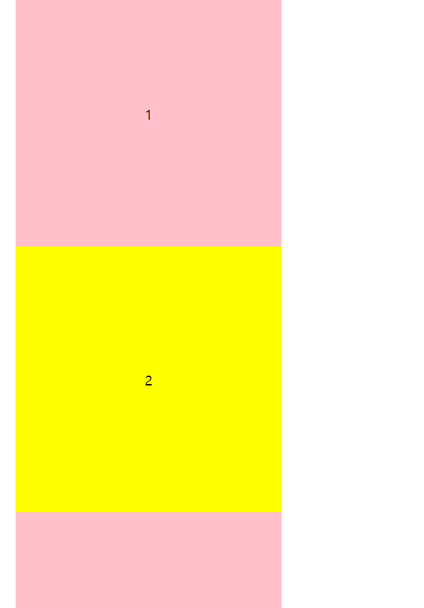
1. display: flex;의 디폴트는 row이다.
수평방향이 주축이 된다.
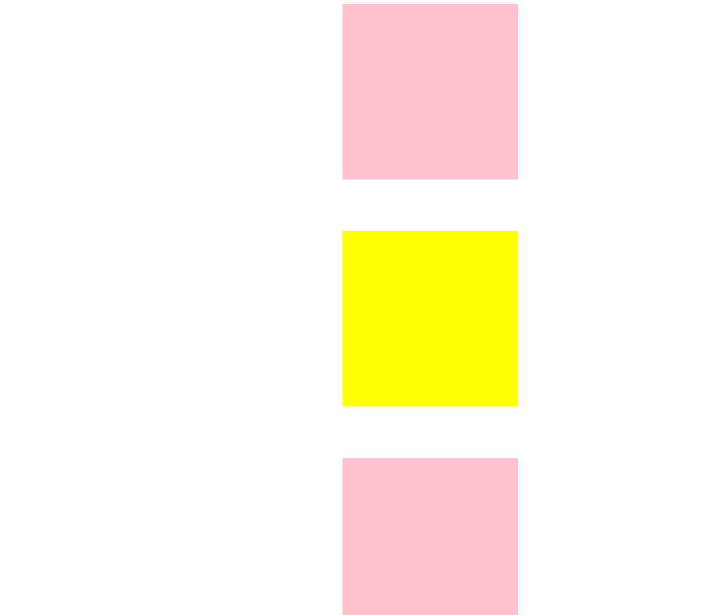
2. flex-direction: column;
flex-direction: column;을 추가하면 주축과 교차축의 방향이 바뀌게 된다. 즉, 주축은 수직이 되고 교차축은 수평이 된다.
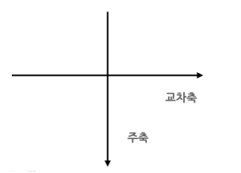
justify-content의 방향이 수평에서 수직으로 바뀐다.
수직방향이 주축이 되더라도 잊지 말아야 할 것은 display:flex;를 써줘야한다는 것이다.
3. 자식도 flex 컨테이너가 될 수 있다.
여태까지는 부모인 body만 flex container였다. 하지만 div 자체가 또다른 flex container가 될 수 있다. flex container 안에 자식이 있고 자식도 flex container인 상태가 될 수 있다는 말이다.
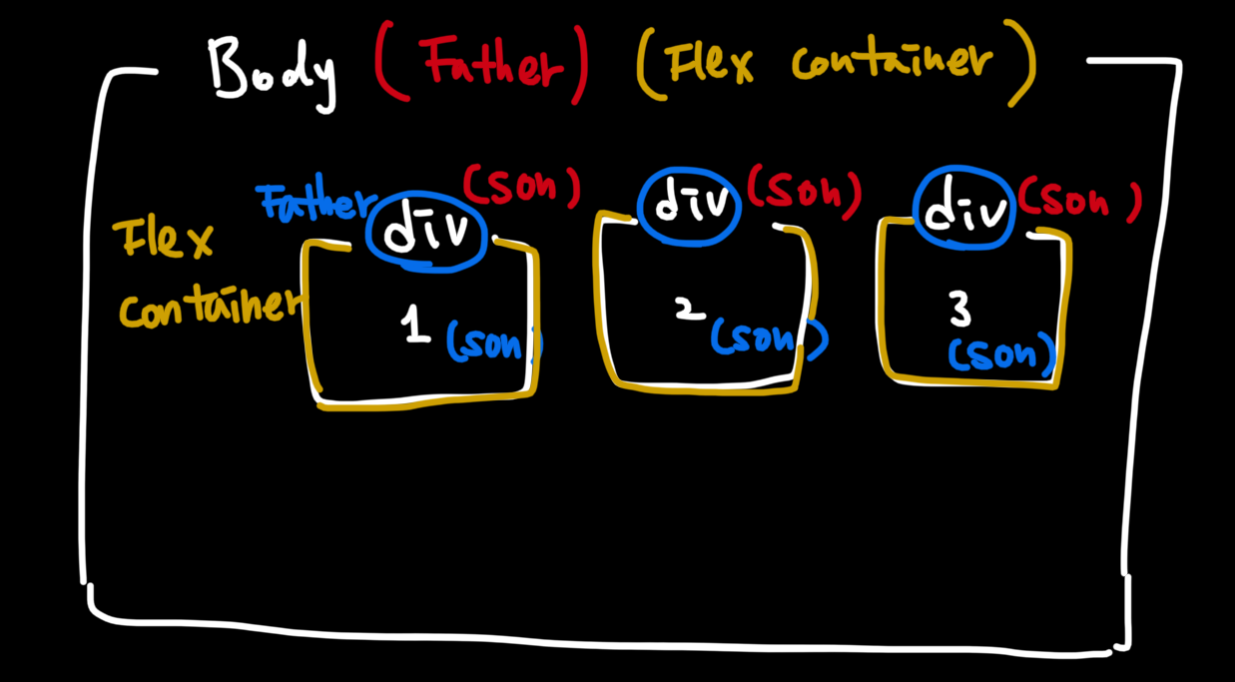
따라서 div안에 justify-content와 align-items를 쓸 수 있다.
4. flex-wrap
flex-wrap은 디폴트가 nowrap이고 모든 요소를 같은 줄에 있게 해준다.
flex-wrap: nowrap
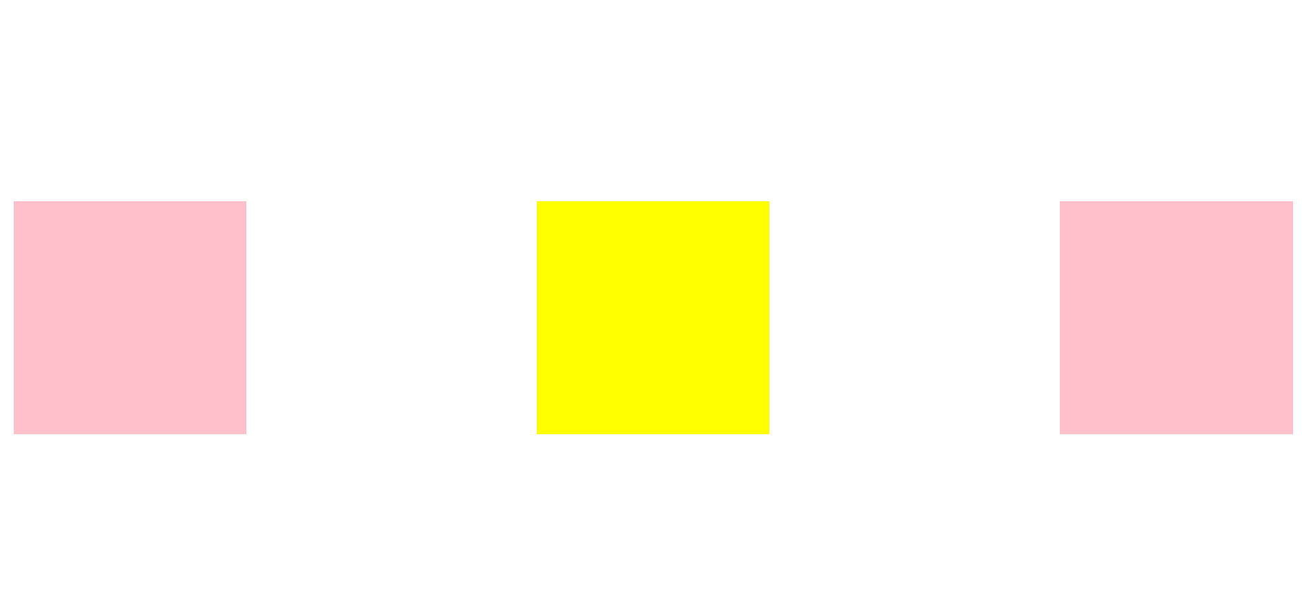
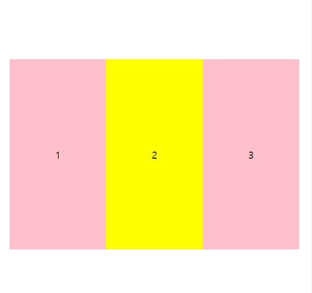
창을 줄이면 박스가 한줄에 있으면서 크기가 유동적으로 줄어든다.
flex-wrap: wrap
flex-wrap: wrap은 한줄에 박스가 들어가는 만큼 최대한 집어넣고 그게 안되면 다음 줄로 옮긴다.

전체 코드
<!DOCTYPE html>
<html lang="en">
<head>
<meta charset="UTF-8">
<meta name="viewport" content="width=device-width, initial-scale=1.0">
<title>Document</title>
<style>
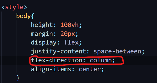
body{
height: 100vh;
margin: 20px;
display: flex;
justify-content: space-between;
align-items: center;
flex-wrap: wrap;
flex-direction: row/column/column-reverse;
}
div{
display: flex;
justify-content: center;
align-items: center;
width: 300px;
height: 300px;
background-color: pink;
}
#second{
background-color: yellow;
}
</style>
</head>
<body>
<div>1</div>
<div id="second">2</div>
<div>3</div>
</body>
</html>
개발은 즐거워🪇
많은 도움이 되었습니다, 감사합니다.