저번 글에서 우리는 사용자의 화면 크기에 구애받지 않고 div 상자들을 같은 간격으로 배치하고 싶었다. 이번 글에서는 inline-block은 해결하지 못했던 것을 Flexbox로 해결해보고자 한다.
Flexbox
- flexbox는 박스들을 자유롭게 어떤 곳이든 둘 수 있다. 2d(2차원)에서 아주 '유연'하다.
- 사용시 꼭 지켜야 할 규칙이 있다.
🌟Rule
1. 자식인 div를 움직이고 싶으면 부모인 body에게 명령한다.
자식 엘리먼트에는 어떤 것도 적지 말아야한다.
body(부모)에 명령을 해서 3개의 div(자식들)을 컨트롤 할 수 있다.
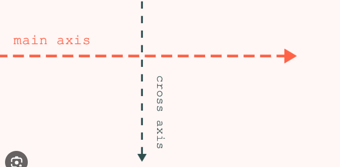
2. 주축과 교차축을 사용하기 위해 부모를 flex container로 만든다.
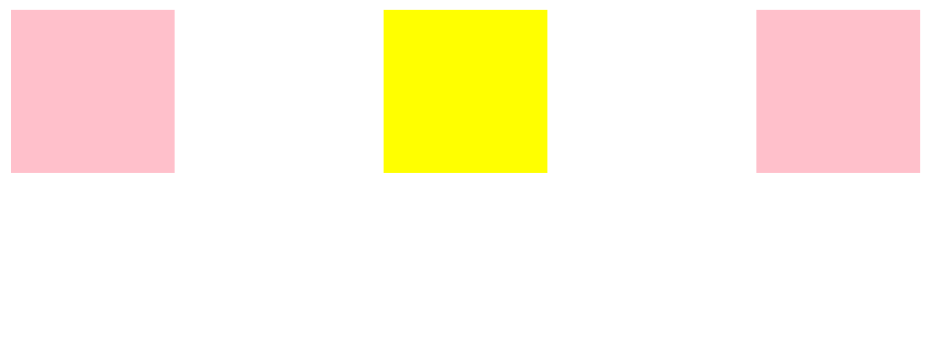
부모인 body를 flex container로 만들기 위해 body에 display: flex를 적는다.
그 다음, flex container가 되면 두 개의 축인 주축(main axis)와 교차축(cross axis)을 가질 수 있다. main axis (justify-content)는 수평으로 디폴트가 설정 되어있고 cross axis (align-items)는 수직으로 디폴트가 설정 되어있다. 디폴트 값은 바뀔 수 있다.
<head>
<style>
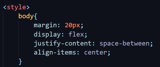
body{
display: flex;
justify-content: flex-start(기본값)/space-evenly/space-between/space;
align-items: flex-start(기본값)/center/flex-end/stretch(div가 height로 고정되어 있을 때는 적용안되기 때문에 height값을 없애줘야 적용된다.) ;
}
div{
width:300px;
height: 300px;
background-color: teal;
}
</style>
</head>
<body>
<div></div>
<div></div>
<div></div>
</body>3. 단위 vh
body의 align-items(수평축)를 center로 설정하면 아무일도 일어나지 않는다. 그 이유는, body는 박스의 크기 만큼 크기 때문에 이미 수직으로 중심이기 때문이다. 즉, 이미 중심에 있는 박스를 중심으로 또 이동하라는 꼴이라서 아무 변화도 일어나지 않는다.
이번에는 body에 height를 줘보자. 단위인 vh는 viewport(screen) height라는 지표다.
예) height: 100vh;
100vh는 화면 높이의 100%를 의미한다.

박스의 높이가 변했다.
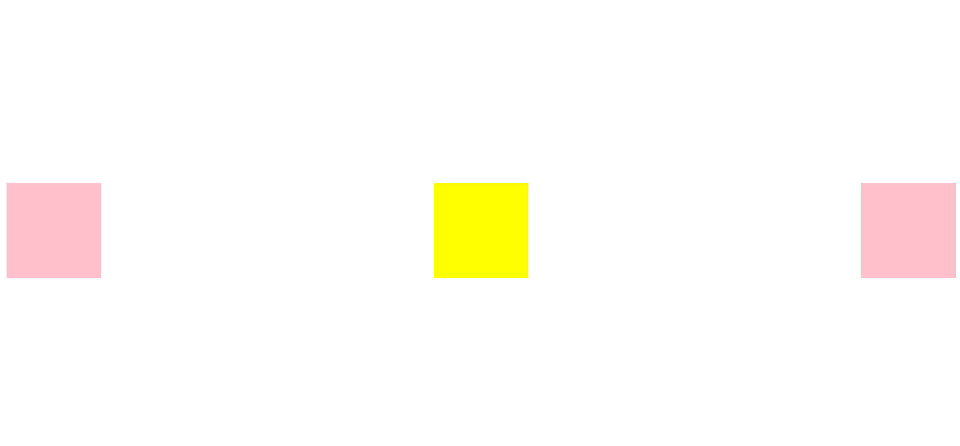
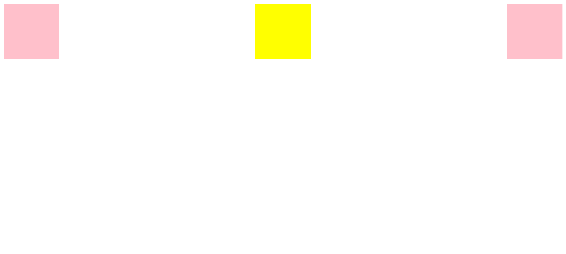
전체 코드
<!DOCTYPE html>
<html lang="en">
<head>
    <meta charset="UTF-8">
    <meta name="viewport" content="width=device-width, initial-scale=1.0">
    <title>Document</title>

    <style>
        body{
            height: 100vh;
            margin: 20px;
            display: flex;
            justify-content: space-between;
            align-items: center;
        }
        div{
            width: 300px;
            height: 300px;
            background-color: pink;
        }
        #second{
            background-color: yellow;
        }
    </style>
</head>
<body>
    <div></div>
    <div id="second"></div>
    <div></div>
</body>
</html>
개발은 즐거워🪇