Animation
- from-to 외에 0% 25% 50% 75% 100% 같이 여러 단계를 나누어 애니메이션을 만들 수 있다.
@keyframes 애니메이션이름 {
        0% {
        }
        50% {
        }
        100% {
        }
}- 0%와 100%인 딱 두 단계만 쓸거면 from-to로 대체 할 수 있다.
@keyframes superSexyCoinFlip{
            from{ /*어디서 부터*/

            }
            to{ /*어디까지*/

            }
}- 꼭 Transform으로만 애니메이션을 만들 수 있는 건 아니지만 Transform을 쓰는 것을 추천한다. 일부 proterty들은 애니메이션이 잘 안되기 때문이다.
opacity: 0;은 잠깐 안보이게 해준다.- 🌐Animista
전체 코드
<!DOCTYPE html>
<html lang="en">
<head>
<meta charset="UTF-8">
<meta name="viewport" content="width=device-width, initial-scale=1.0">
<title>The Gata Times</title>
<style>
body{ /*img의 위치 변경*/
display: flex;
height: 100vh;
align-items: center;
justify-content: center;
}
@keyframes superSexyCoinFlip{
0% {
transform: rotateY(0);
}
25% {
transform: scale(2);
}
50% {
border-radius: 0px;
transform: rotateY(180deg) translateY(100px);
border-color: tomato;
opacity: 0;
}
75% {
transform: scale(5);
}
100% {
transform: rotate(0) translate(0px);
}
}
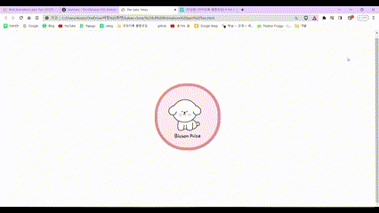
img{
border: 10px solid rgb(225, 148, 148);
border-radius: 50%;
width: 200px; /*img 사이즈 조절*/
animation: superSexyCoinFlip 3s ease-in-out infinite;
}
</style>
</head>
<body>
<img src="img/logo.png" />
</body>
</html>
개발은 즐거워🪇