CSS Media Queries (미디어 쿼리)
Media Queries는 오직 css만을 이용해서 '스크린의 사이즈'를 알 수 있는 방법이다. 여기서 말하는 스크린 사이즈는 내가 만든 웹사이트를 보고 있는 사용자의 스크린 사이즈를 의미한다.
예를 들면, iphone이나 안드로이드 폰의 portrait모드 (세로모드), 혹은 landscape모드 (가로모드), 혹은 큰 desktop 화면 등 사용자의 스크린 화면은 각각 다르다. 각기 다른 사용자의 스크린 화면을 오직 css만으로 감지할 수 있다.
기본 문법
미디어 쿼리는 CSS에서 어떤 스타일을 선택적으로 적용하고 싶을 때 사용한다. if 조건문과 비슷하다.
@media 키워드로 시작하는 미디어 쿼리의 문법 구조는 아래와 같다.
@media (조건) {
	스타일
}
스타일에는 일반적인 css 코드가 들어가고, 조건이 만족되면 스타일이 적용되고 만족되지 않을 때는 스타일이 무시된다. 미디어 쿼리의 조건은 and으로 연결된다.
화면 너비에 따른 스타일링 1
핸드폰처럼 좁은 화면과 TV처럼 넓은 화면 등 화면 너비에 따라 특정 스타일을 적용하고 싶을 때는 화면의 최소 및 최대 너비를 조건으로 하여 미디어 쿼리를 사용할 수 있다.
<body>
<div></div>
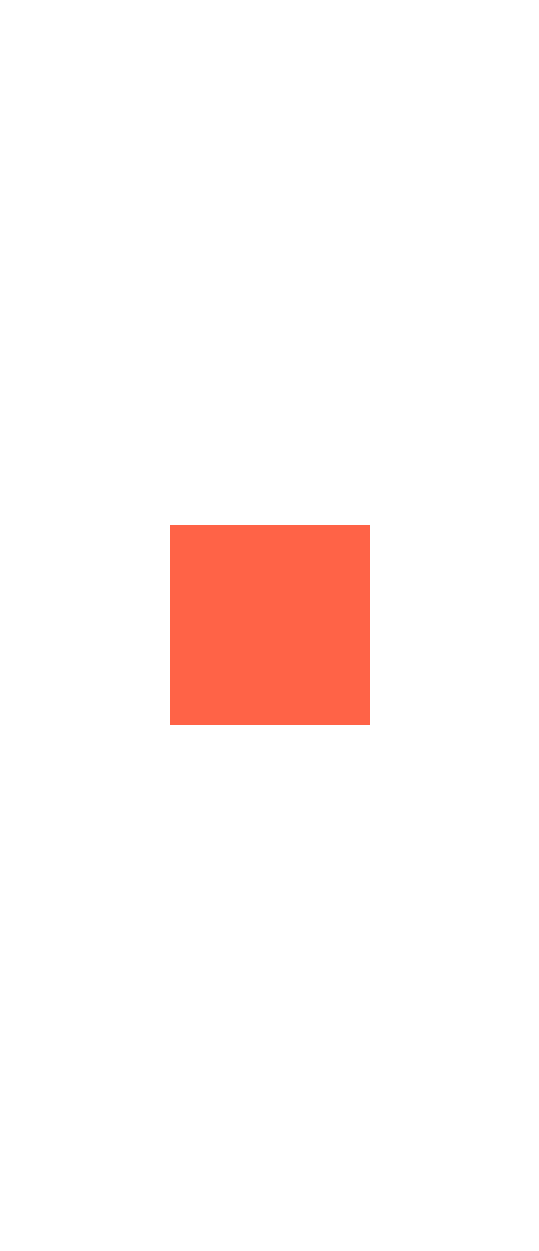
</body>@media screen and (max-width: 600px) {
div {
background-color: tomato;
}
}
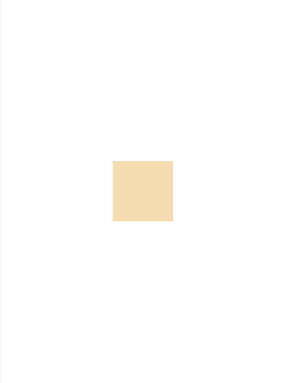
@media screen and (min-width: 601px) and (max-width: 1200px) {
div {
background-color: wheat;
}
}
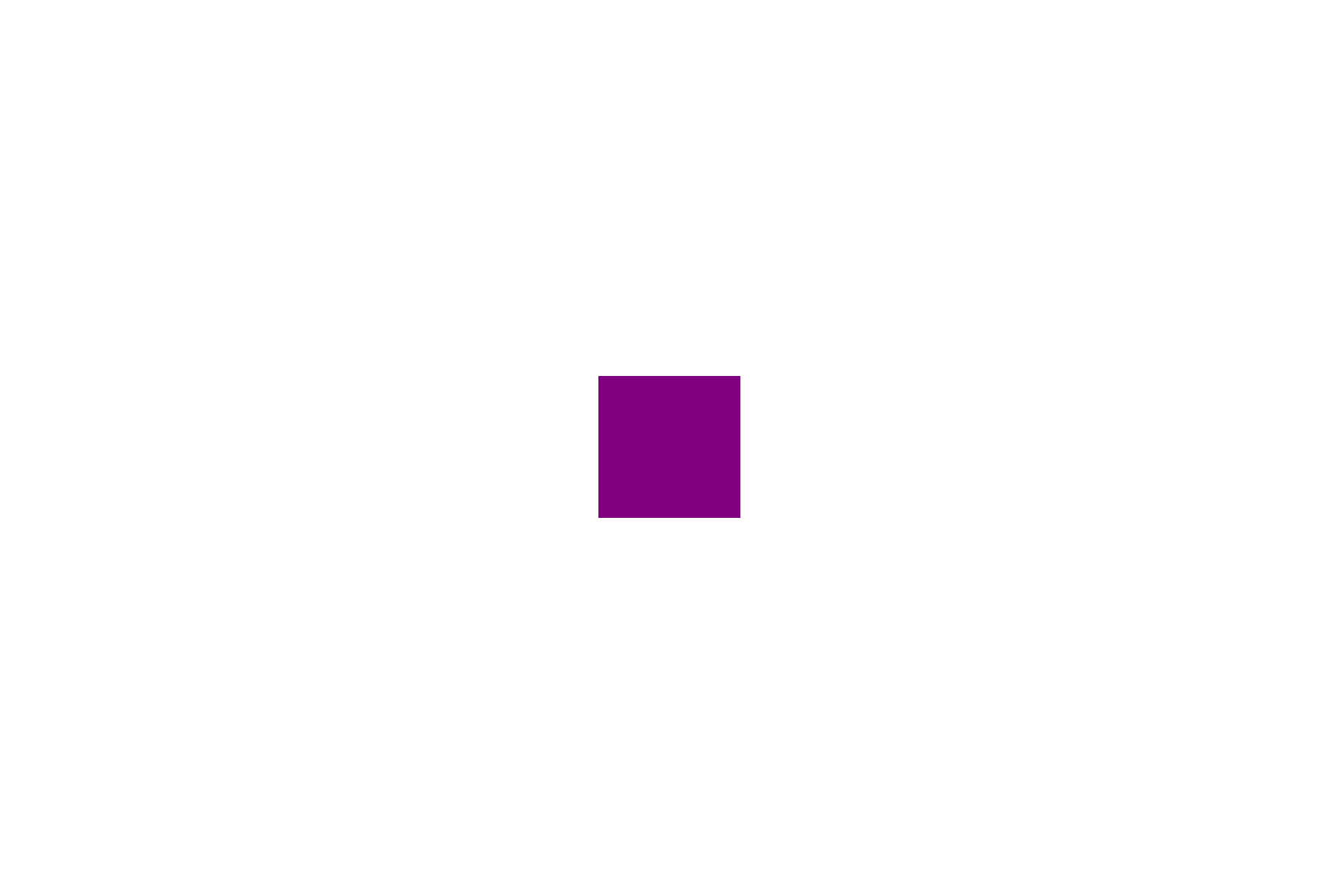
@media screen and (min-width: 1200px) {
div {
background-color: purple;
}
}좁은 화면
중간 화면
그 이상의 넓은 화면
화면 너비에 따른 스타일링 2
div {
            background-color: teal;
            width: 200px;
            height: 200px;
        }

@media screen and (min-width: 601px) and (max-width: 1200px) {
            div {
                background-color: wheat;
            }
화면 넓이가 601px과 1200px 사이에서는 div가 wheat색을 갖고, 그 외에는 teal 색을 갖는다.
Device toolbar
Device toolbar는 모바일 브라우저 개발을 위해 지원하는 기능으로 다양한 기기와 기능을 시뮬레이션 할 수 있다.
즉, 실 단말기에서 테스트를 하는 것이 아니라 PC 크롬 브라우저의 Device Mode를 ON하여 모바일 단말기 없이 모바일 브라우저의 기능을 사용 및 테스트 할 수 있다.
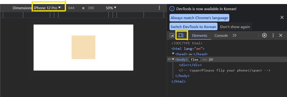
Device toolbar 버튼을 누르면 아이폰, 갤럭시, 아이패드 등 Device 종류를 선택할 수 있다.
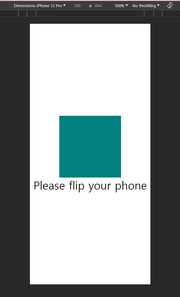
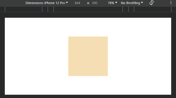
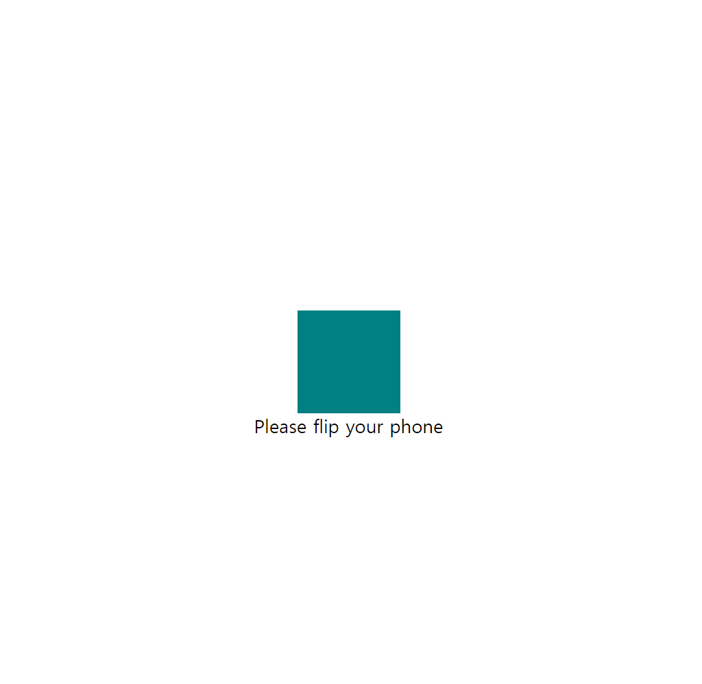
가로모드 일 때 HTML 요소 숨기기
단말기를 가로 모드로 변환할 때만 CSS를 적용하고 싶을 때는 어떻게 해야할까? orientation을 이용한다.
orientation: landscape (가로모드)
orientation: portrait (세로모드)
<body>
    <div></div>
    <span>Please flip your phone</span>
</body>body{
display: flex;
height: 100vh;
align-items: center;
justify-content: center;
flex-direction: column;
}
div {
background-color: teal;
width: 200px;
height: 200px;
}
@media screen and (min-width: 601px) and (max-width: 1200px) {
div {
background-color: wheat;
}
}
span {
font-size: 36px;
}
@media screen and (orientation: landscape) {
span {
display: none;
}
}
세로모드
가로모드
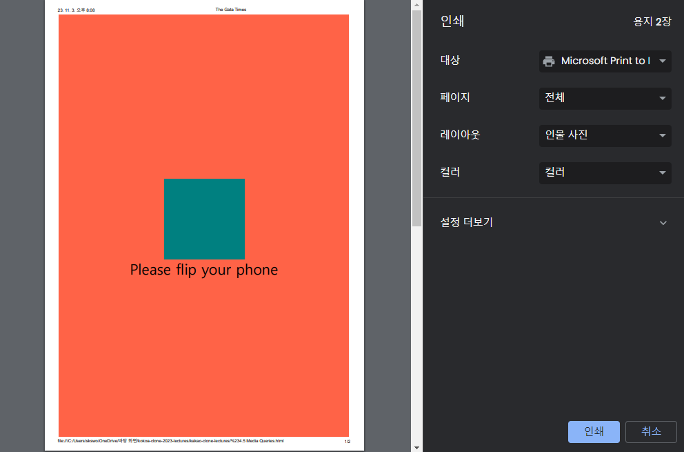
@media print
@media print {
  body {
  background-color: tomato;
}
@media print는 평소 화면은 아무 반응이 없다가 프린트 출력을 할 때 효과가 나타난다.
일반 화면
프린트 하려고 할 때
<참고자료> CSS Media Queries MDN
Media Queries 주요기능
- min-device-width
- max-device-width
- orientation: landscape
- orientation: portrait
- aspect-ration - 레티나 디스플레이 감지가능
- display-mode
- inverted-colors
- lightlevel
- prefers-contrast
- resolution
- monochrome
Media type
- @media screen{}
- @media print{}