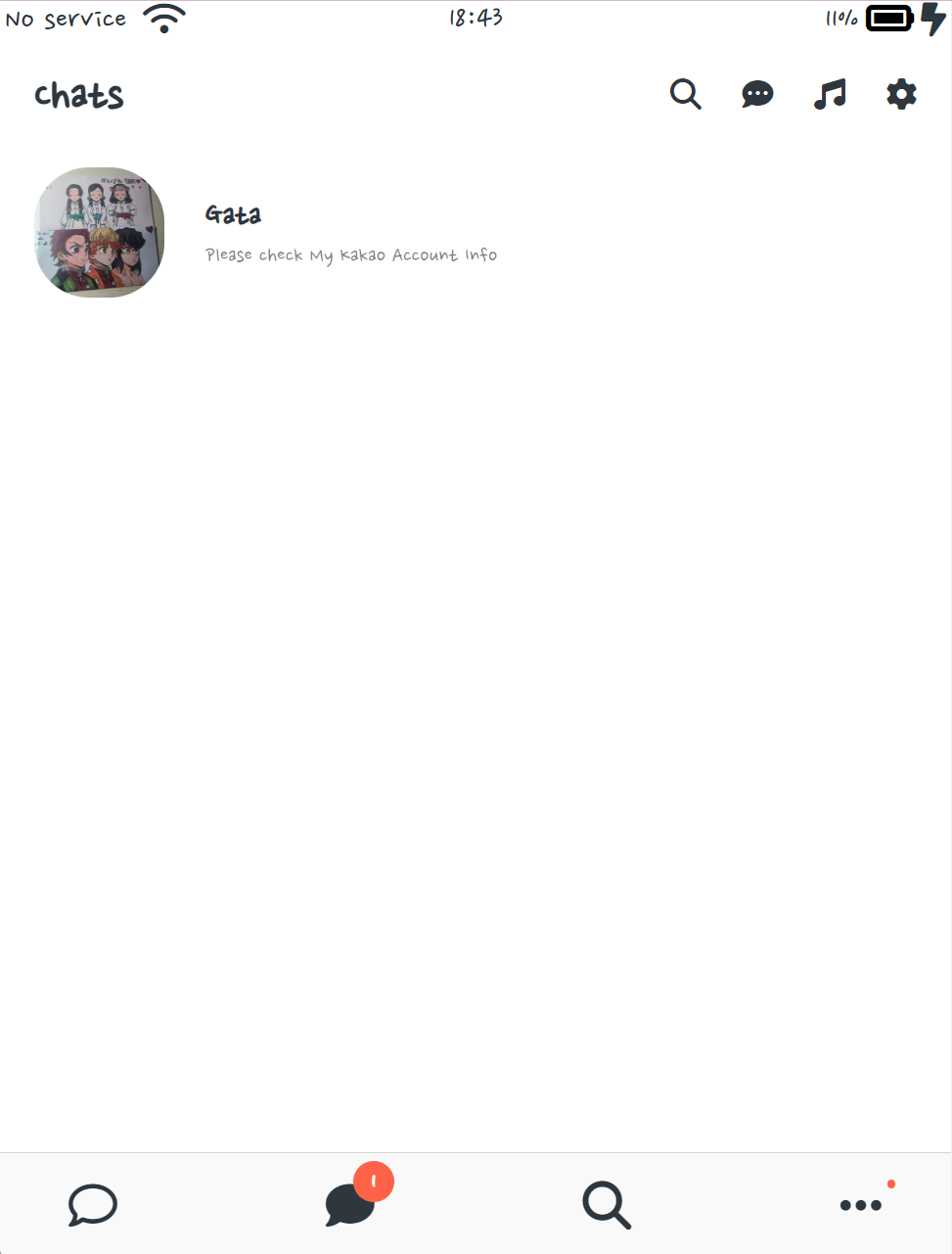
screen-header인 Chats 글씨와 main-screen 사이에 공백이 있다.
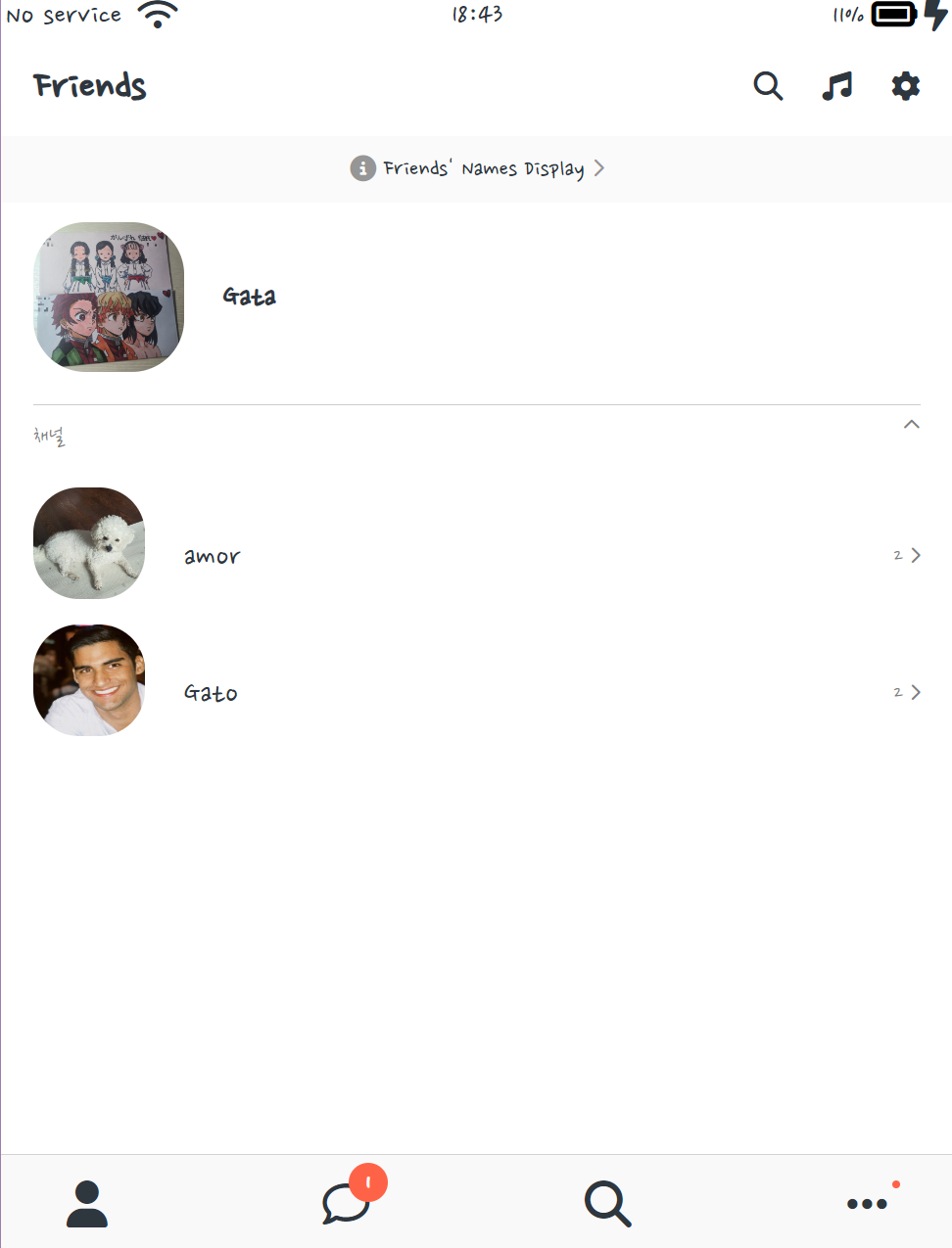
Friends 페이지에서 Friends 글씨와 friends-display-link 사이의 공백을 줄이고 싶은데 Friends screen-header에 margin-bottom을 줄이면 Chats 페이지에도 영향을 주게 된다.
그래서 friends-display-link에 margin-top:마이너스를 준다.
즉, screen-header의 margin-bottom을 수정하는 대신 friends-display-link의 margin-top을 추가한다.
<nav-bar.css>
.nav__notification {
    position: absolute;
    left: 20px;
    bottom: 20px;
    background-color: tomato;
    width: 30px;
    height: 30px;
    border-radius: 15px;
    display: flex;
    justify-content: center;
    align-items: center;
    color: white;
    font-weight: 600;
    }
⬇️
⬇️
Chats 페이지에서 빨간dot이 한번 더 쓰이는데 차이점은 네비게이션의 빨간dot은 position이 absolute라는 것이다. 공통으로 적용되는 css부분은 따로 빼내서 badge.css에 붙여넣고 class를 추가한다.
<nav-bar.css>
    .nav__notification {
    position: absolute;
    left: 20px;
    bottom: 20px;
    }
<badge.css>
    .badge {
    background-color: tomato;
    width: 30px;
    height: 30px;
    border-radius: 15px;
    display: flex;
    justify-content: center;
    align-items: center;
    color: white;
    font-weight: 600;
}<freinds.html>, <chats.html>
<span class="nav__notification badge">1</span>freinds.html과 chats.html에 각각 badge 클래스 추가
<user-component.css>
.user-component__column:last-child {
    color: rgba(0, 0, 0, 0.5);
    display: flex;
    flex-direction: column;
    align-items: flex-end;
    /*display부터 align-items줄까지 빨간dot1을 옆으로 치우치게 해준다.
	이 코드로 인해 상관없는 다른 코드들까지 flex가 적용된다.*/
}
class css설정에 last-child 조건이 붙어있는데 해당 flex를 적용하고 싶지 않은 요소가 last-child라면,
그 요소를 "div"로 씌우면 "부모-자식 관계"가 아닌 "부모-손자 관계"이므로 Flex의 영향권에서 벗어날 수 있다.
부모-자식 관계
<div class="user-component__column">
    <span>2</span>
    <i class="fa-solid fa-chevron-right fa-xs"></i>
</div>
부모-손자 관계
<div class="user-component__column">
  <div>
    <span>2</span>
    <i class="fa-solid fa-chevron-right fa-xs"></i>
  </div>
</div>
개발은 즐거워🪇