Day 14 groupby, matplot
기존 DF를 원하는 속성/컬럼/요소들을 기준으로 다시 세팅하는 방법
: pivottable, groupby ..
Groupby
sql에서 group by 쿼리문을 차용한 방식
특정 기준으로 묶어서 대표값으로 집계 처리
- sql : select avg(zumsu) from data group by class;
- pandas : df.group_by(by="class").agg("집계처리")
.value_counts()
df["~~~"].value_counts()
특정 값이 몇 개가 있는지 세어 주는 기능
loc/iloc 사용
data.loc[:, "col_name"].value_counts()
특정 column의 값들의 종류와 개수를 나타낸다.(내림차순으로) = count+sort
data.loc[:, "col_name"].value_counts(normalize=True)
비율(상댓값)으로 변환
= data.loc[:, "item"].value_counts() / len(data)
필터링
data.loc[data.loc[:,"item"]=="call", "duration" ].sum()
item column에서 값이 call인 경우에, duration의 총 합
↔ data[ data.loc[:,"item"]=="call"]["duration"].sum() 매우 비효율적인 코드임!
groupby
data.groupby(by="month")
개별 데이터 월 별로 묶기
data.groupby(by="month")["duration"].mean()
월 별 duration의 평균값
= pd.pivot_table( data, index=["month"], values=["duration"], aggfunc=["mean"])
data.loc[data.loc[:,"item"]=="call",:].groupby(by="network")["duration"].sum()
item이 call인 경우, network 별 duration의 총합 (filtering+groupby)
data.groupby(by=["month","item"])["date"].count()
여러 개 기준으로 묶기 가능
SQL groupby
data.groupby(by=["month","item"]).agg(
    {   "date":"first",
        "duration":"sum"   }
)
=> sql )
select first(date), sum(duration) from data
                group by month, item;
Matplot
import matplotlib
import matplotlib.pyplot as plt
파이썬에서 그래프를 그리는 패키지. 간단한 시각화.
%matplotlib inline
-> 아래에 바로 그래프가 나타나도록 하는 옵션
그래프 그리기
- Data 설정
x = np.linspace(start = 0, stop = 10, num=11)
y = x ** 2 - 위치 지정
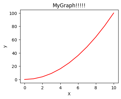
fig = plt.figure()#그릴 준비
axes = fig.add_axes([0.5, 0.5, 0.5, 0.5])#그림 위치 포지션 지정 - 실제 데이터 표기
axes.plot( x,y, "r")#x data, y data, option(색깔 등) - 기타 옵션 표시
axes.set_xlabel("X")#x축 이름
axes.set_ylabel("y")#y축 이름
axes.set_title("MyGraph")#그래프 이름
분할
fig, axes = plt.subplots(nrows=1, ncols=3)
i=0
for ax in axes:
    ax.plot(x, y+(i*10), 'r')
    ax.set_xlabel('x')
    ax.set_ylabel('y')
    ax.set_title('title'+str(i))
    i = i+1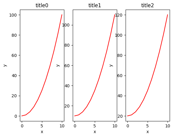
fig, axes = plt.subplots(nrows=1, ncols=3)
axes[0].plot(x,y,"r")
axes[1].plot(x,y,"g")
axes[2].plot(x,y,"b")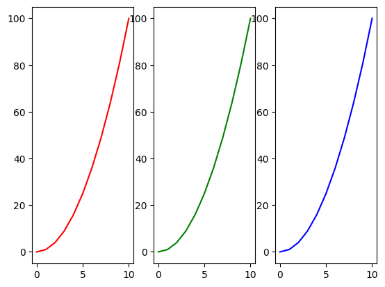
fig, axes = plt.subplots(nrows=2, ncols=3)
i=0
for ax1 in axes:
    for ax2 in ax1:
        ax2.plot(x, y+(i*10), 'r')
        ax2.set_xlabel('x')
        ax2.set_ylabel('y')
        ax2.set_title('title'+str(i))
        i = i+1
fig.tight_layout()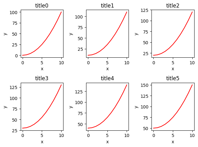
각 영역에 따른 지정
numpy의 index와 유사한 접근 방식
nrow=1이면 1차원, nrow>=2이면 2차원으로 처리
fig, axes = plt.subplots(nrows=2, ncols=2)
# axes : 2 by 2 = 4 => 2차원
axes[0][0].plot(x, x**2, x, x**2+100) #0-0
axes[0,1].plot(x,x**2) #0-1
axes[1,0].plot(x, x**3) #1-0
axes[1,0].set_xlim([2,4]) #x축 범위 지정
axes[1,0].set_ylim([10,40]) #y축 범위 지정
axes[1,1].plot(x, x**2, x, x**2+1000) #1-1
axes[1,1].set_yscale("log") #y축 log-scale 변경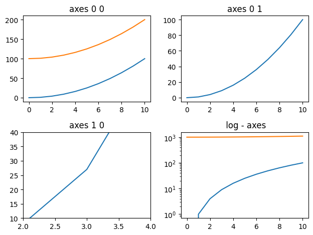
크기, 해상도 조절
- 해상도 : 1200 * 600 픽셀 생성
* dpi (dot per inch)
fig = plt.figure(figsize=(12,6), dpi=100) - 크기/비율 조절
fig, axes = plt.subplots(figsize=(20,6))
범례
ax.plot(x, x**2, label="y = x^2")
ax.plot(x, x**2 + 10, label="y = x^2+10")
# 범례 위치 옵션
# ax.legend(loc=0) # 알아서 자동적으로 최적 위치
# ax.legend(loc=1) # 오른쪽 상단
# ax.legend(loc=2) # 왼쪽 상단
# ax.legend(loc=3) # 왼쪽 하단
# ax.legend(loc=4) # 오른쪽 하단

ax.legend(loc=3) # 왼쪽 상단
ax.set_xlabel('x')
ax.set_ylabel('y')
ax.set_title('title');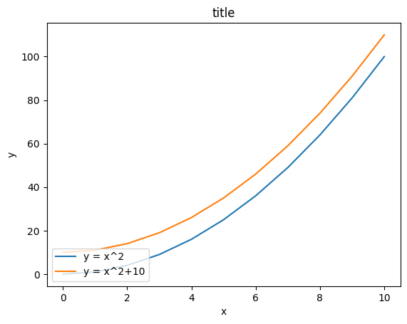
저장
경로, 파일이름, 파일형식 지정하여 저장.
outPath = "matOutPic.png"
기타 그래프
- 기본적인 scatter / step / bar / fill_between
fig, axes = plt.subplots(1, 4, figsize=(20,5))

axes[0].scatter(x, x + 0.25*np.random.randn(len(x)))
axes[0].set_title("scatter")

axes[1].step(n, n**2, lw=2)
axes[1].set_title("step")

axes[2].bar(n, n**2, align="center", width=0.3, alpha=0.1)
axes[2].set_title("bar")

axes[3].fill_between(x, x**2, x**2+10, color="blue", alpha=0.3);
axes[3].set_title("fill_between");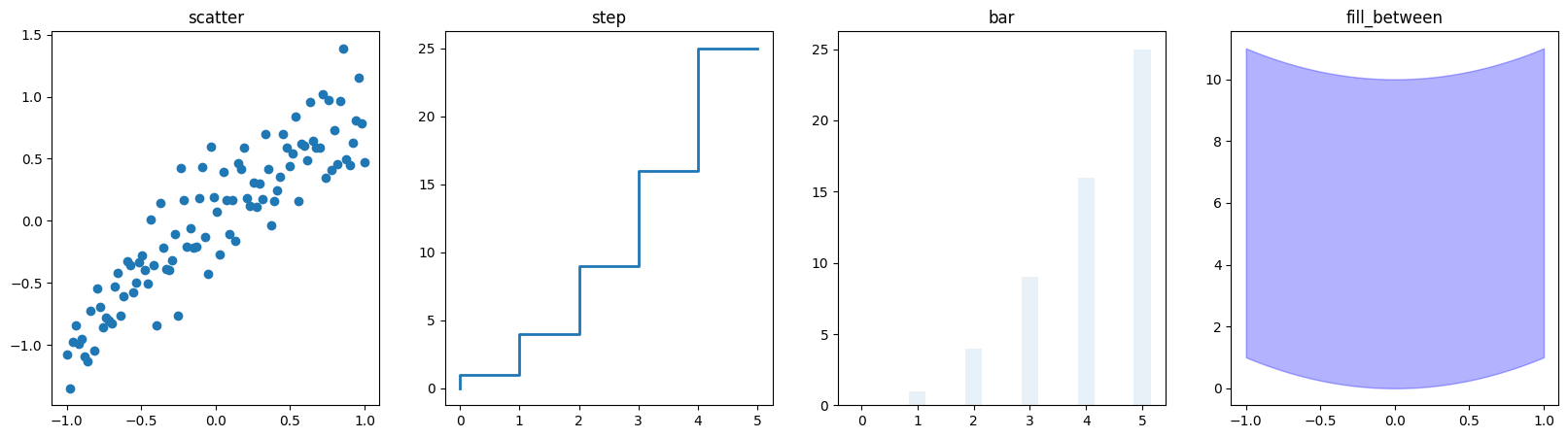
- 극 좌표 그래프
fig = plt.figure()
ax = fig.add_axes([0.0, 0.0, .6, .6], polar=True)
t = np.linspace(0, 2 * np.pi, 100)
ax.plot(t, t, color='blue')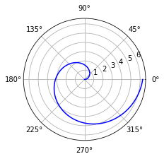
- 히스토그램
n = np.random.randn(100000)
fig, axes = plt.subplots(1, 2, figsize=(20,5))

axes[0].hist(n)
axes[0].set_title("Default")
axes[0].set_xlim((min(n), max(n)))

axes[1].hist(n, cumulative=True, bins=30)
axes[1].set_title("Cum")
axes[1].set_xlim((min(n), max(n)));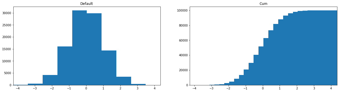
기타
색상, 점/선, 그리드, 폰트 크기, 투명도 등 모든 것이 조절 가능하다!
