
예시 데이터셋 : https://www.kaggle.com/davinwijaya/customer-retention
막대 그래프는 한 개의 범주형 변수와 두 개의 범주형 변수를 시각화하는 데 있어서 가장 효과적인 그래프 중 하나입니다.
ggplot2의 geom_bar() 함수를 사용하게 되면 막대 그래프를 사용할 수 있게 되는데, 여기서 각 그룹 별 막대 그래프가 차지하는 비율 또한 표시하고 싶다면 어떻게 해야 될까요?
1. 한 개의 범주형 변수인 경우
zip_code 변수는 3개의 level로 구성된 범주형 변수입니다.
zip_code 변수에 속한 3개의 level 비율을 한 번 표시해보겠습니다.
ab %>% group_by(zip_code) %>% summarise(count = n()) %>% mutate(prop = round(count/sum(count), 2)) %>%

  ggplot(aes(x=zip_code, y=count, fill = zip_code)) + geom_bar(stat = "identity") +

  geom_text(aes(label = paste(prop*100, "%")), size = 7, vjust = -0.2) + scale_fill_brewer(palette = "Oranges") + xlab("zip_code")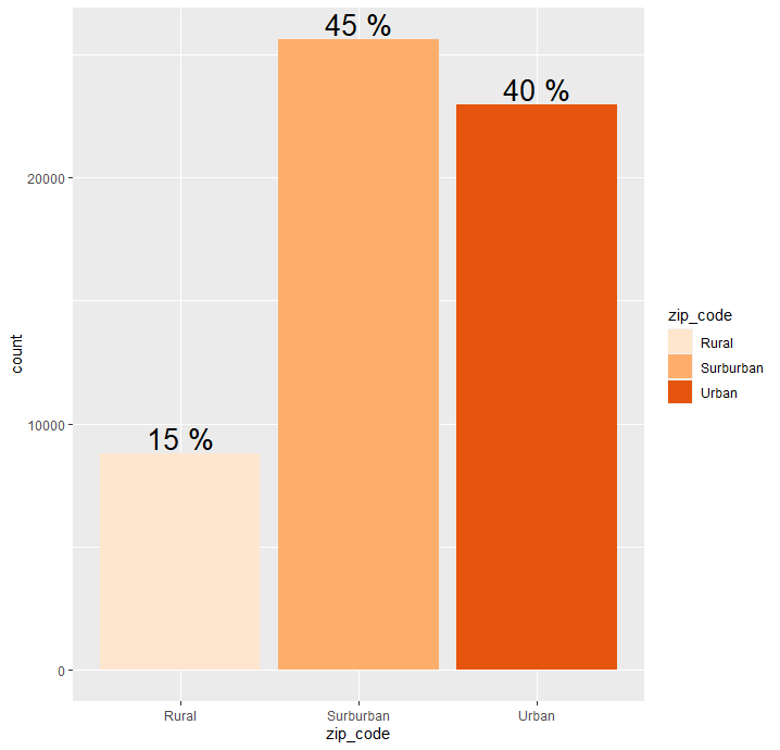
2. 두 개의 범주형 변수인 경우 (누적 막대 그래프)
zip_code는 3개의 level로 구성된 범주형 변수이며, channel 역시 3개의 level로 구성된 범주형 변수입니다.
이 때 zip_code의 3개의 그룹에 따른 channel 변수의 3개의 level 비율을 누적 막대 그래프 형태로 그려보겠습니다.
ab %>% group_by(zip_code, channel) %>% summarise(count = n()) %>% mutate(prop = round(count/sum(count), 3)) %>%

  ggplot(aes(x=zip_code, y = count, fill = channel)) + geom_bar(stat = "identity") +

  geom_text(aes(label = paste(prop*100, "%")), size = 5, position = position_stack(.5)) + scale_fill_brewer(palette = "Oranges") + xlab("zip_code")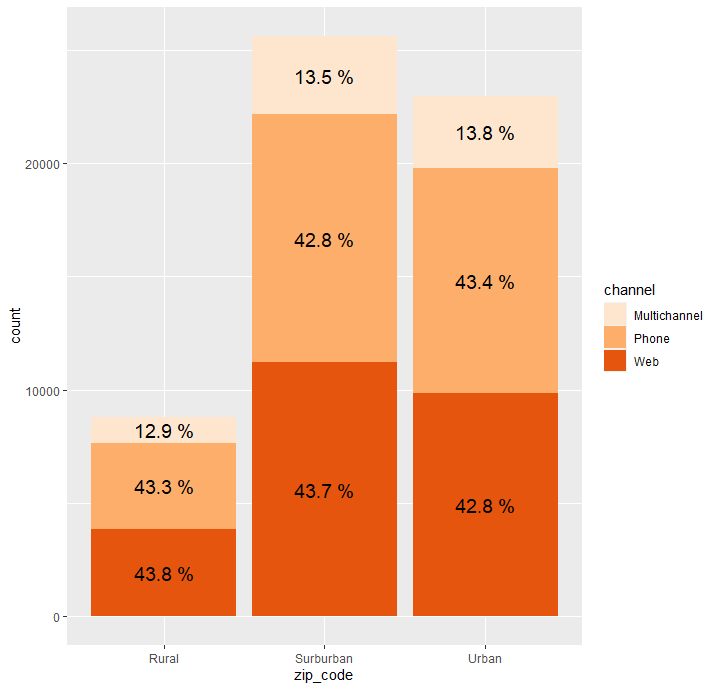
3. 두 개의 범주형 변수인 경우 (누적 막대 그래프 X)
2번과 똑같은 경우이지만 누적 막대 그래프의 형태가 아닌, channel 변수의 각 level을 따로 분리해서 표현한 경우를 그려보겠습니다.
ab %>% group_by(zip_code, channel) %>% summarise(count = n()) %>% mutate(prop = round(count/sum(count), 3)) %>%

  ggplot(aes(x=zip_code, y = count, fill = channel)) + geom_bar(stat = "identity", position = "dodge") +

  geom_text(aes(label = paste(prop*100, "%")), size = 5, position = position_dodge(.9), vjust = 1) + scale_fill_brewer(palette = "Oranges") + xlab("zip_code")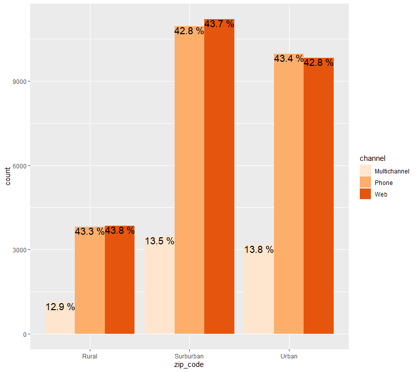

Data Analysis Log