
- install
타입스크립트 + 리액트에서는 style components를 다음과 같이 설치한다.
npm install styled-components
npm install --save-dev @types/styled-components
- styled.d.ts 파일 생성
https://styled-components.com/docs/api#typescript
🔼 document 참고
// import original module declarations
import "styled-components";

// and extend them!
declare module "styled-components" {
  export interface DefaultTheme {
     bgColor: string;
    textColor: string;
    btnColor: string;
    // 직접 입력하기.
  }
}
styled.d.ts 파일을 생성한뒤 DefaultTheme 괄호 안의 내용 입력
- theme.ts 파일 생성
import { DefaultTheme } from "styled-components";

export const lightTheme: DefaultTheme = {
  bgColor: "white",
  textColor: "black",
  btnColor: "tomato",
};

export const darkTheme: DefaultTheme = {
  bgColor: "black",
  textColor: "white",
  btnColor: "teal",
};
위의 예시를 참고해서 테마를 만들어준다! import 해준 DefaultTheme에서 type이 명시되어 있으므로 오타 등으로 인한 실수확률이 줄어든다! 😚
- index.tsx에서 Provider로 감싸기
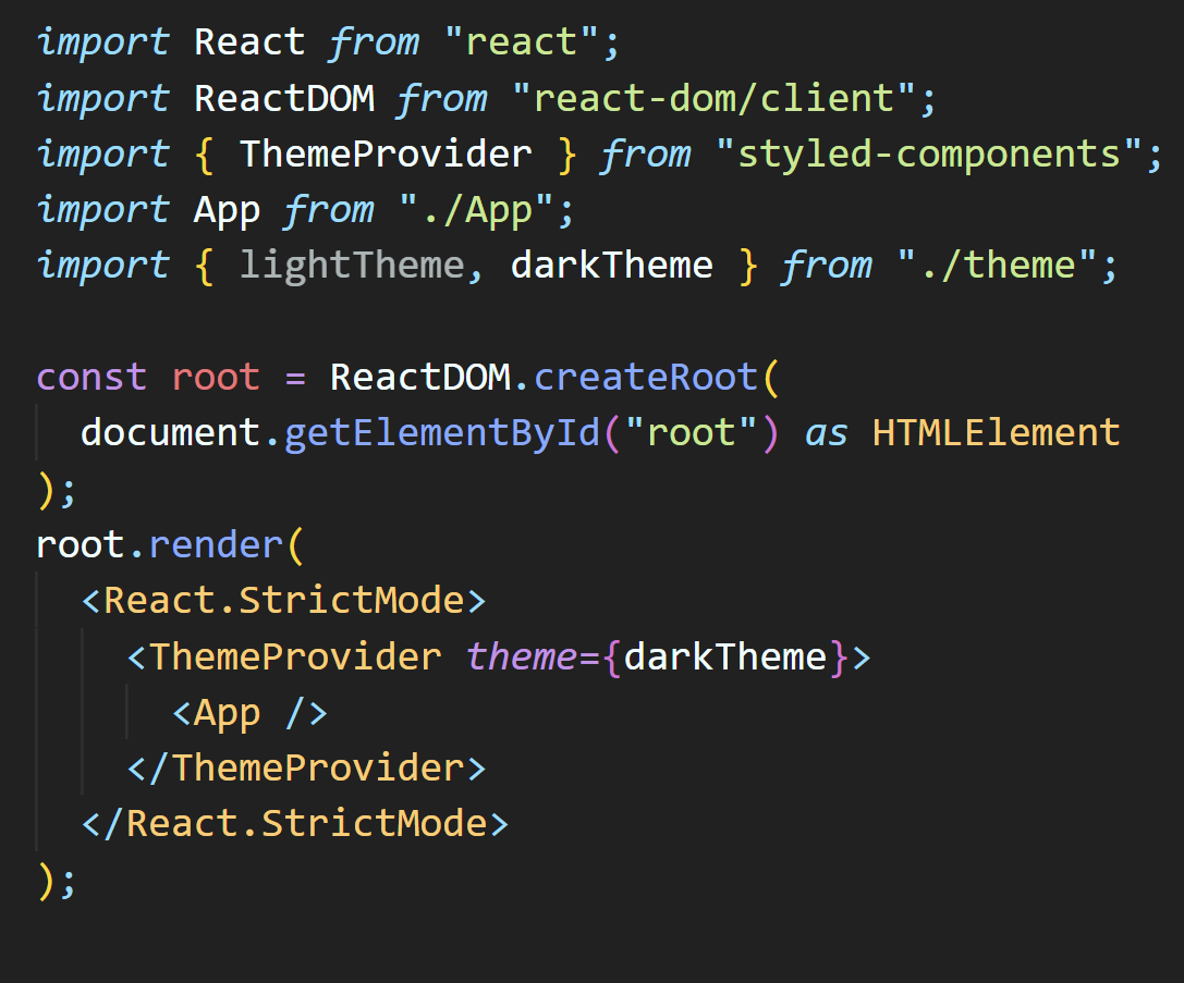
<App /> 을 <ThemeProvider>로 감싸준다!
이때 theme prop으로 만들어준 darkTheme(혹은 lightTheme)을 넣어주면 끝
- Styled-components에서 테마 가져다쓰기
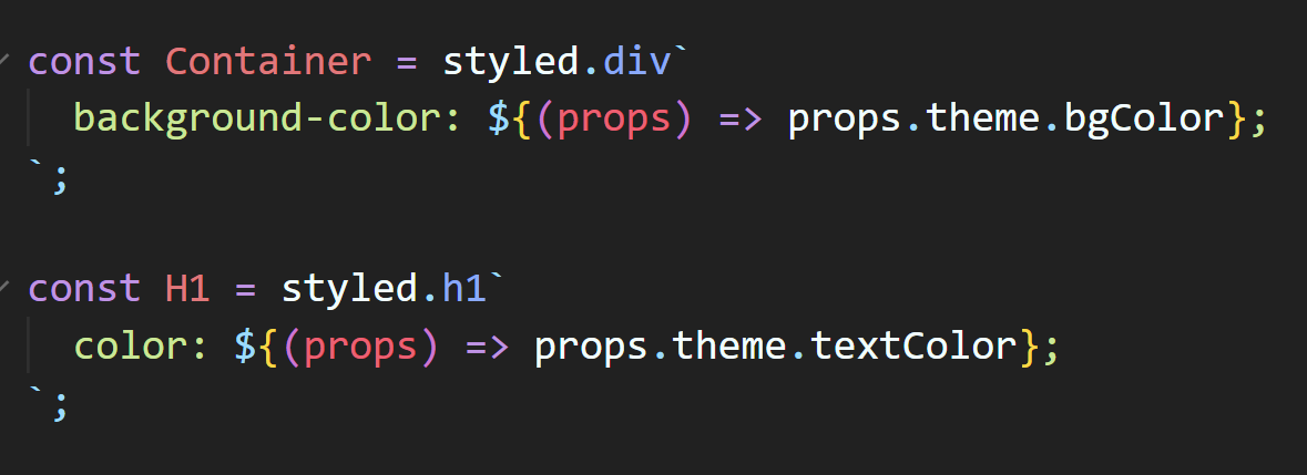
위와 같이 꺼내쓰면 진짜 끝 !! 🤩
props.theme.내가설정한속성
가령 bgColor => bColor로 쓰면 빨간줄로 에러가 발생한다!
TypeScript ..... 프론트에게 단비같은 존재다👀

암냠냠