
Goal
요약
- 인구대비 상대적으로 CCTV가 적은 구를 찾는 것
진행 순서
Python, Pandas
- 서울시 구별 CCTV 현황 데이터 확보
- 인구 현황 데이터 확보
- CCTV 데이터와 인구 현황 데이터 합치기
- 데이터 정리/정렬
Matplotlib
- 그래프 그릴 수 있는 능력
Regression using Numpy
- 전체적인 경향을 파악할 수 있는 능력
Insight and visualization
- 경향에서 벗어난 데이터를 강조하는 능력
📗 세부내용
Data
CCTV 데이터
- Google 검색
- 서울시 자치구 연도별 cctv 설치 현황 검색
서울시 자치구 년도별 CCTV 설치 현황
- 서울시 자치구 연도별 cctv 설치 현황 검색
인구데이터
- 서울 열린데이터 광장
열린데이터광장 메인- 공공데이터 ▶ 서울 구별 인구 통계 검색
## Preprocessing ---
ModuleLoad
import pandas as pd
import numpy as np
import matplotlib.pyplot as plt
from matplotlib import rc
rc('font', family='Arial Unicode MS')

url = "/Users/min/Documents/ds_study/제로-베이스---데이터-사이언스-스쿨---강의자료---part-01---05--230120-/Part 04. EDA & Part 05. SQL/"
CCTV
- DataLoad
CCTV_Seoul = pd.read_csv(url + 'Seoul_CCTV.csv', encoding='utf-8')
CCTV_Seoul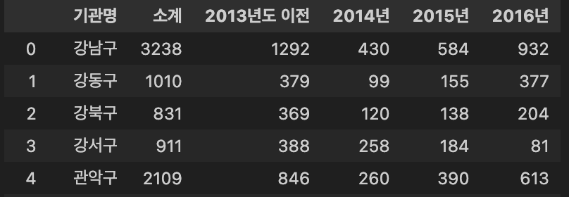
- columns명 변경
기관명>구별
CCTV_Seoul.rename(columns={CCTV_Seoul.columns[0]: '구별'}, inplace = True) # 컬럼 명 변경
CCTV_Seoul.head()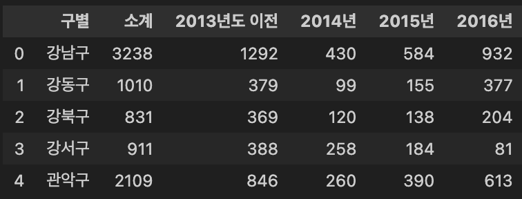
Population
- DataLoad
pop_Seoul = pd.read_excel(url + 'Seoul_Population.xls', header = 2, usecols = 'B, D, G, J, N')
pop_Seoul.head()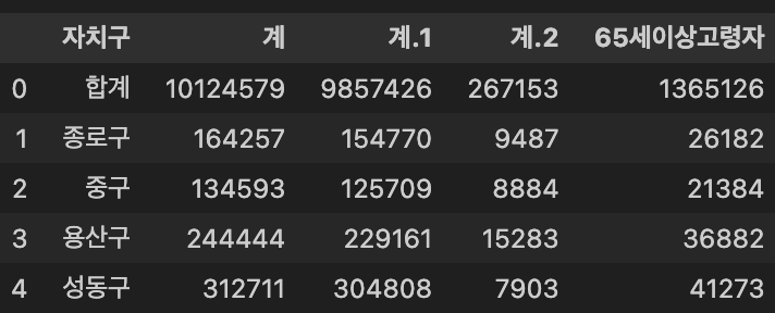
- columns명 변경
pop_Seoul.columns = ['구별', '인구수', '한국인', '외국인', '고령자']
pop_Seoul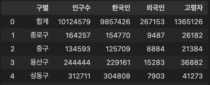
데이터 확인
CCTV
- CCTV를 가장 많이, 가장 적게 보유한 구 확인
- 가장 많은 구 :
강남구, 가장 적은 구 :도봉구
- 가장 많은 구 :
CCTV_Seoul.sort_values(by = "소계", ascending = False).head() # 가장 CCTV를 많이 보유한 구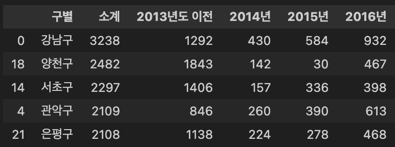
CCTV_Seoul.sort_values(by = "소계", ascending = True).head() # 가장 CCTV를 적게 보유한 구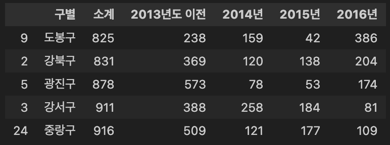
- CCTV 최근 증가율 확인
- 최근 증가율 기준 : 최근 3년간 그 이전 대비 비율
CCTV_Seoul['최근증가율'] = round((CCTV_Seoul['2016년'] + CCTV_Seoul['2015년'] + CCTV_Seoul['2014년']) / CCTV_Seoul['2013년도 이전'] * 100, 2) # 최근 3년 대비 증가율
CCTV_Seoul.sort_values(by = '최근증가율', ascending = False)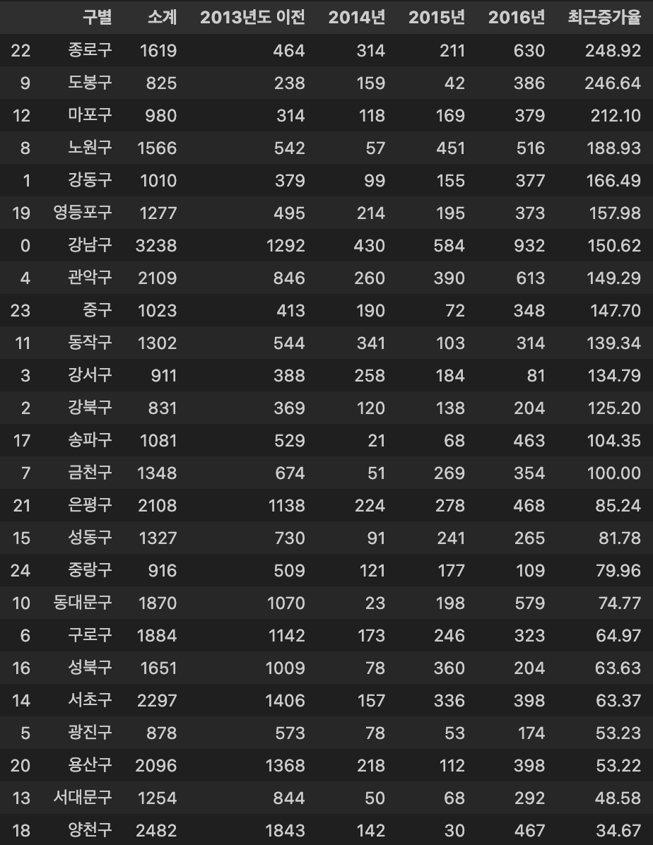
Population
- 데이터 확인
pop_Seoul.head()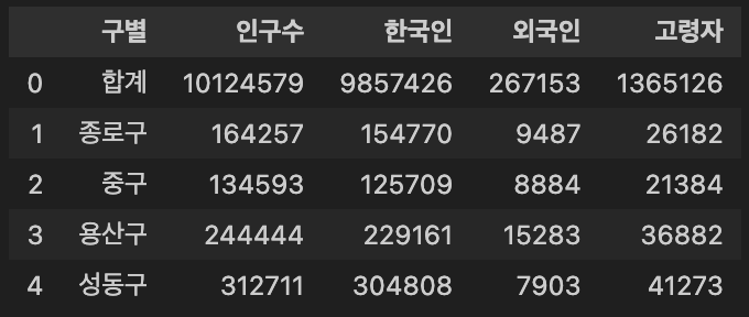
합계row 제거
pop_Seoul.drop([0], inplace = True)
pop_Seoul.head()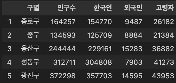
- 데이터 중복 여부 확인
pop_Seoul['구별'].unique() # 데이터 중복 확인Output :
array(['종로구', '중구', '용산구', '성동구', '광진구', '동대문구', '중랑구', '성북구', '강북구', '도봉구', '노원구', '은평구', '서대문구', '마포구', '양천구', '강서구', '구로구', '금천구','영등포구', '동작구', '관악구', '서초구', '강남구', '송파구', '강동구'], dtype=object)
- 인구비율을 보기 위해,
인구수대비외국인과고령자의 비율 확인
pop_Seoul['외국인비율'] = round(pop_Seoul['외국인'] / pop_Seoul['인구수'] * 100, 2)
pop_Seoul['고령자비율'] = round(pop_Seoul['고령자'] / pop_Seoul['인구수'] * 100, 2)
pop_Seoul.head()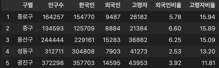
- 외국인 비율이 많은 구 : 영등포구
# 외국인 비율이 많은 구
pop_Seoul.sort_values(by = '외국인비율', ascending = False).head()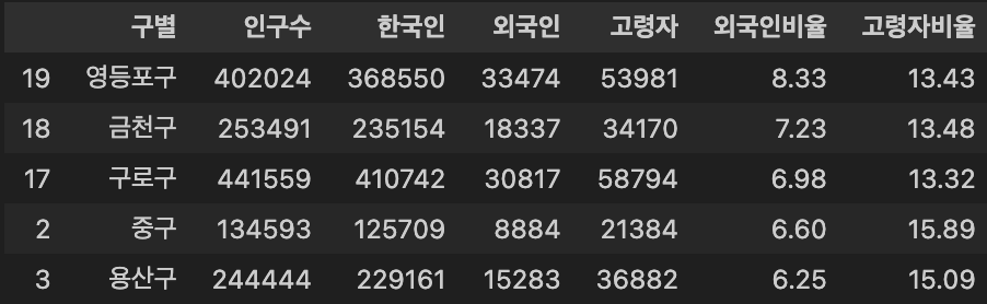
데이터 병합
- 서울의 CCTV 데이터와 Population 데이터를 병합
data_result = pd.merge(CCTV_Seoul, pop_Seoul, on = '구별')
data_result.head()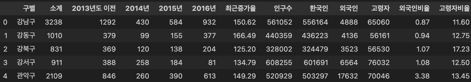
- 불필요 column 삭제
- 인구 대비 CCTV 설치 비율을 보는 것에 대해 불필요하다 판단
del data_result['2013년도 이전']
del data_result['2014년']
del data_result['2015년']
del data_result['2016년']
data_result.head()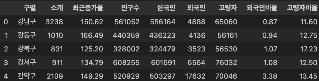
구별을 기준 index로 설정
※ 인덱스(Index)는 unique 해야 함
data_result.set_index('구별', inplace = True) # index는 unique 해야한다.
data_result.head()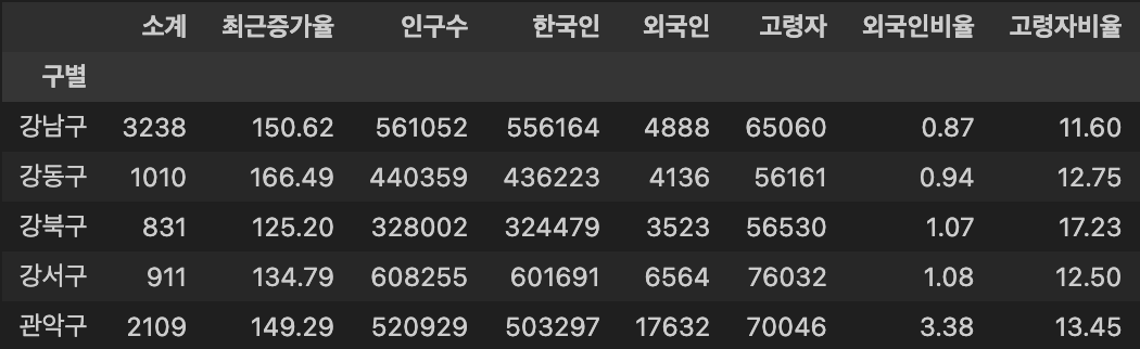
- 상관계수(Correlation) 파악
data_result.corr() # 상관계수를 조사해서 0.2 이상의 데이터를 비교하는 것은 의미가 있다?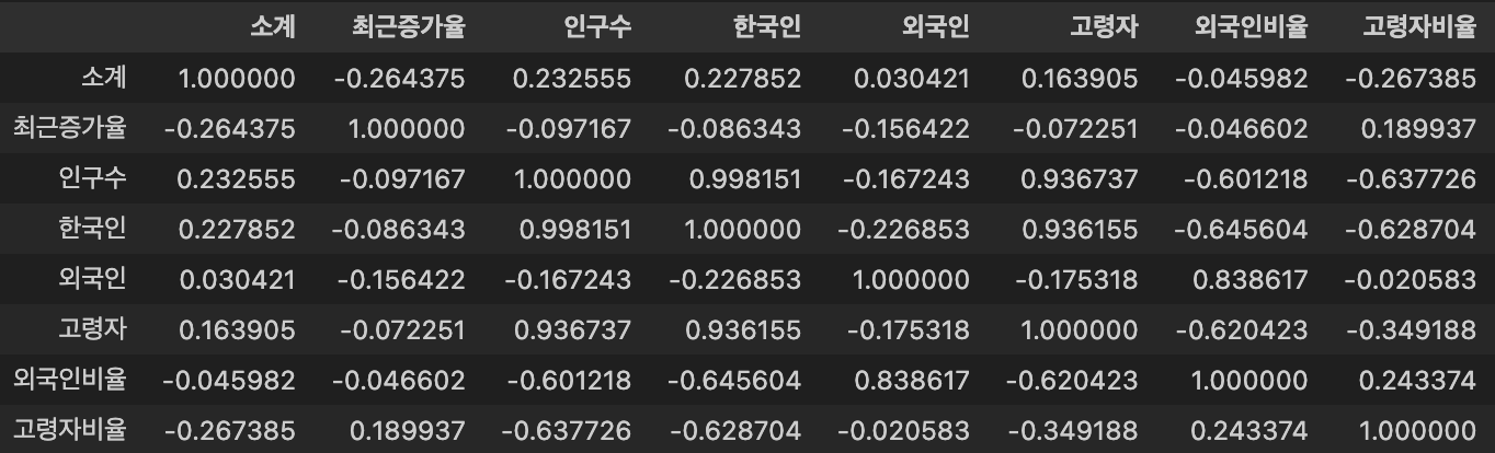
- 인구 대비 CCTV 설치 비율 확인
data_result['CCTV비율'] = round(data_result['소계'] / data_result['인구수'] * 100, 2)
data_result.sort_values(by = 'CCTV비율', ascending = True).head()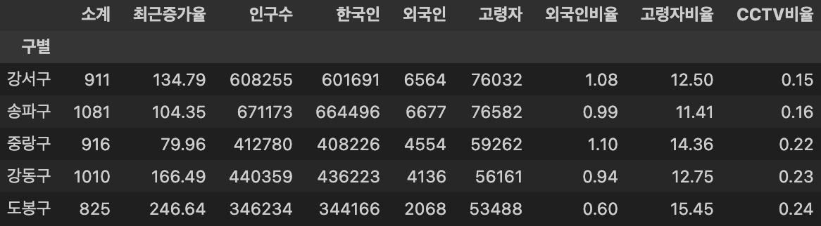
Visualization
- 구별 CCTV 설치 갯수를 내림차순 정렬 및 시각화
강남구,양천구,서초구순으로 가장 많은 CCTV 설치
def drawGraph():
    data_result['소계'].sort_values().plot(kind = 'barh', grid = True, title = "구별 CCTV 수", figsize = (10, 10));

drawGraph()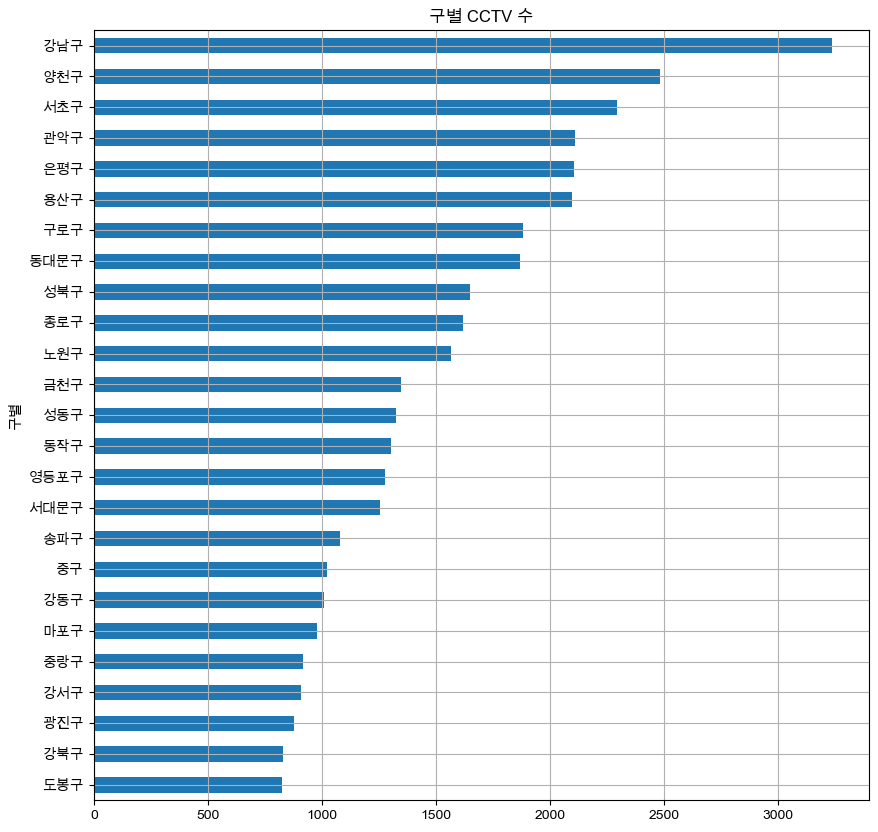
- 구별 인구대비 CCTV 설치 비율을 내림차순 정렬 및 시각화
종로구,용산구,중구가 인구대비 설치 비율이 확연히 높은 것으로 나타남
data_result['CCTV비율'].sort_values().plot(kind = 'barh', grid = True, title = "구별 CCTV비율", figsize = (10, 10));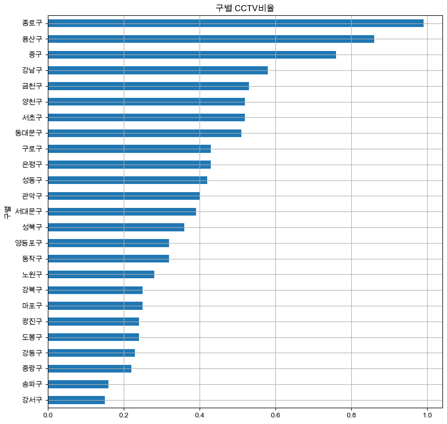
- 구별 인구수와 CCTV 갯수 분포를 확인하기 위해 scatter figure out
def drawGraph():
    plt.figure(figsize=(14, 10))
    plt.scatter(data_result['인구수'], data_result['소계'], s = 50)
    plt.xlabel('인구수')
    plt.ylabel('CCTV')
    plt.grid()
    plt.show()

drawGraph()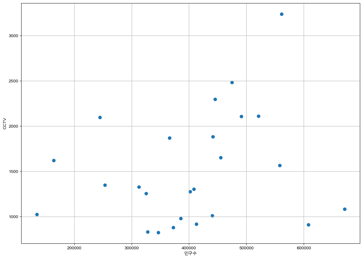
추세선
- 추세선 생성
- 1차 선형 방정식(1-dim linear equation) 생성
fp1 = np.polyfit(data_result['인구수'], data_result['소계'], 1)
f1 = np.poly1d(fp1)- 추세선 시각화
# 경향선 생성
fx = np.linspace(100000, 700000, 100)
def drawGraphWithTrend():
    plt.figure(figsize=(14, 10))
    plt.scatter(data_result['인구수'], data_result['소계'], s = 50)
    plt.plot(fx, f1(fx), ls = 'dashed', lw = 3, color = 'g')
    plt.xlabel('인구수')
    plt.ylabel('CCTV')
    plt.grid()
    plt.show()

drawGraphWithTrend()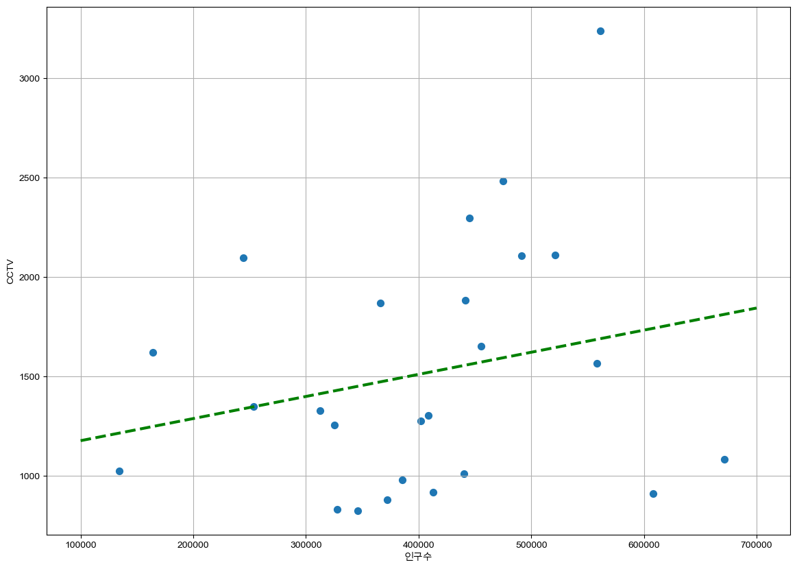
- 오차 계산
data_result['오차'] = round(data_result['소계'] - f1(data_result['인구수']), 2) # 오차 계산

data_sort_f = data_result.sort_values(by = '오차', ascending = True)
data_sort_t = data_result.sort_values(by = '오차', ascending = False)- 계산된 오차를 적용하여, 단계(Level)를 구분하여 시각화
- colormap 설정
from matplotlib.colors import ListedColormap
color_step = ['#e74c3c', '#2ecc71', '#95a5a6', '#2ecc71', '#3498db', '#3498db']
my_cmap = ListedColormap(color_step)- Figure out
- 인구수 대비 CCTV설치 갯수에 대한 오차를 기준으로, 상위/하위 5개 구역 Text 표시
def grawGraph():
    plt.figure(figsize=(20,10))
    plt.scatter(data_result['인구수'], data_result['소계'], c = data_result['오차'], cmap = my_cmap)
    plt.plot(fx, f1(fx), ls = 'dashed', lw = 3, color = 'grey')

    for n in range(5):
        plt.text(data_sort_f['인구수'][n] * 1.02, data_sort_f['소계'][n] * 0.98, data_sort_f.index[n], fontsize = 12)

        plt.text(data_sort_t['인구수'][n] * 1.02, data_sort_t['소계'][n] * 0.98, data_sort_t.index[n], fontsize = 12)

    plt.xlabel('인구수')
    plt.ylabel('CCTV')
    plt.colorbar()
    plt.grid()
    plt.show()

grawGraph()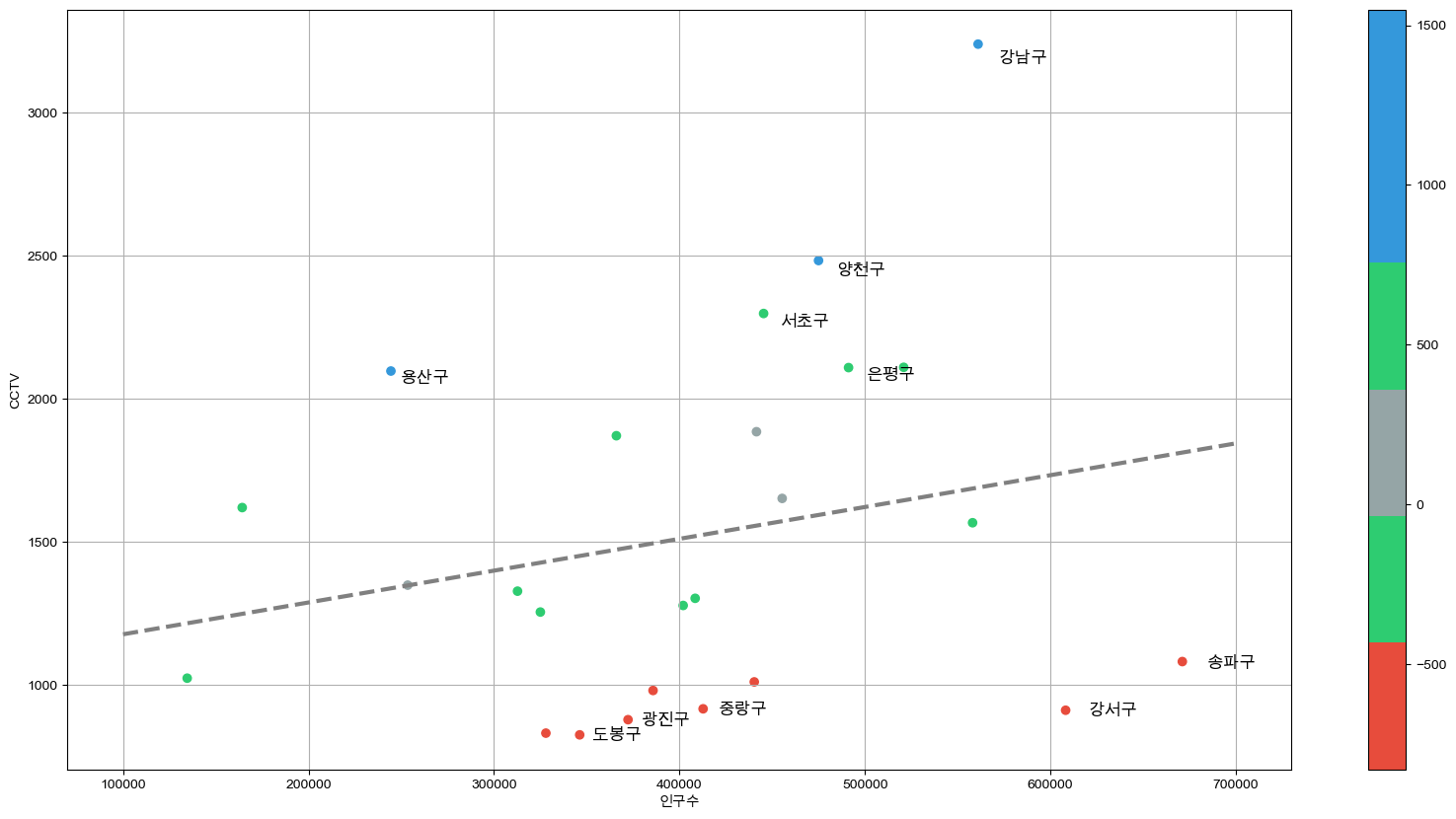
데이터 저장
- 데이터 결과 저장
data_result.to_csv(url + 'CCTV_result.csv', sep = ',', encoding = 'utf-8')결과
- CCTV
- CCTV 갯수가 가장 많은 구 :
강남구 - CCTV 갯수가 가장 적은 구 :
도봉구
- CCTV 갯수가 가장 많은 구 :
- 인구 비율
- 외국인 비율이 많은 구 : 영등포구
- 인구 대비 CCTV 설치
- 인구 대비 CCTV 설치가 많은 구 상위 5개 :
강남구,양천구,용산구,은평구,서초구 - 인구 대비 CCTV 설치가 적은 구 상위 5개 :
송파구,강서구,중랑구,광진구,도봉구
- 인구 대비 CCTV 설치가 많은 구 상위 5개 :

Start