■ 관련 내용 : (EDA) HW 02. 주유소 데이터 분석
Step 4. 데이터 분석
4-1. 데이터 Type 변경
data = pd.read_csv('Oil Price Analysis.csv', thousands = ',', encoding = 'utf-8', index_col = 0)
data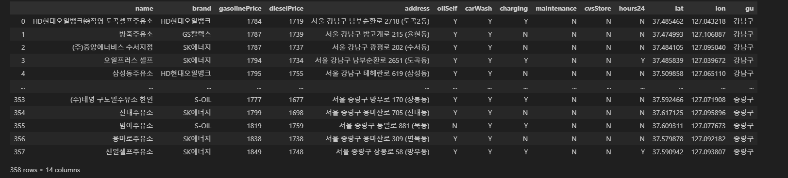
- 데이터 정보 확인
data.info()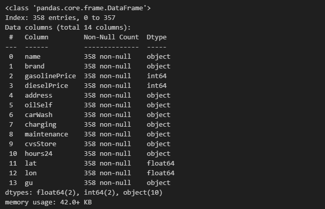
4-2. 주유 가격 별 주유소 확인
- 가격이 가장 비싼 가솔린 주유소
data.sort_values(by = "gasolinePrice", ascending = False).head(10)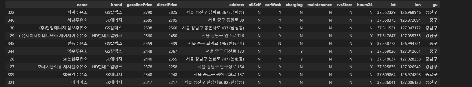
- 가격이 가장 싼 가솔린 주유소
data.sort_values(by = "gasolinePrice").head(10)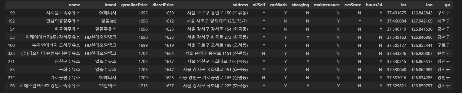
- 가격이 가장 비싼 디젤 주유소
data.sort_values(by = "dieselPrice", ascending = False).head(10)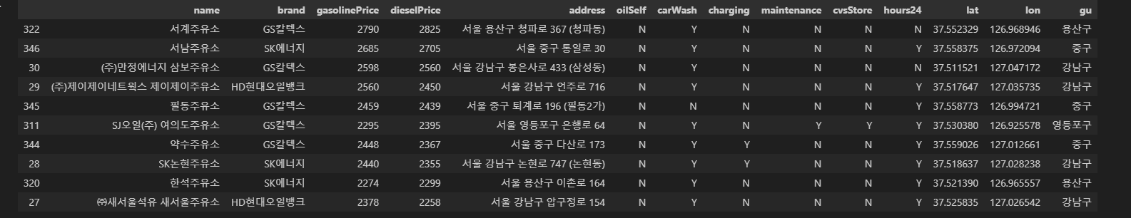
- 가격이 가장 싼 디젤 주유소
data.sort_values(by = "dieselPrice").head(10)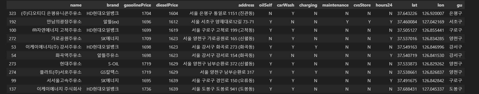
Step 5. Visualization
- ModuleLoad
- 한글 설정
# 한글 설정
import platform
import seaborn as sns
import matplotlib.pyplot as plt
from matplotlib import rc, font_manager

%matplotlib inline

path = "C:/Windows/Fonts/malgun.ttf"

if platform.system() == "Darwin":
    print("System On : MAC")
    rc("font", family = "Arial Unicode MS")
elif platform.system() == "Windows":
    font_name = font_manager.FontProperties(fname = path).get_name()
    print("System On : Windows")
    rc("font", family = font_name)
else:
    print("Unknown System")
5-1. 셀프 주유소 가격 비교
- 셀프 주유소의 휘발유 가격 비교
def ComparisonGasolinePrice():
    plt.figure(figsize=(6, 6))
    sns.boxplot(x = "oilSelf", y="gasolinePrice", data = data, palette = "Reds")
    plt.title('Comparison Gasoline Price by Self', size = 15)
    sns.despine()
    plt.tight_layout()
    plt.show()

ComparisonGasolinePrice()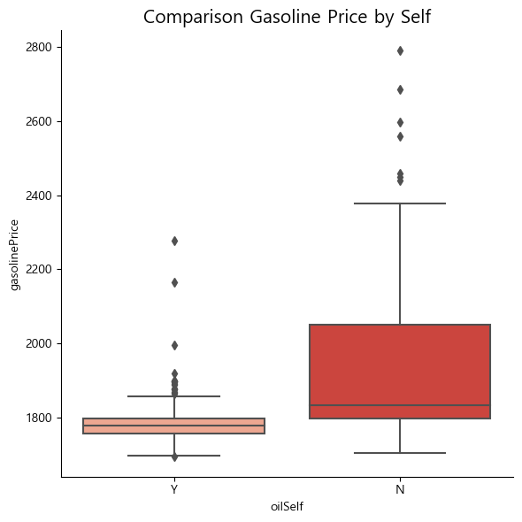
- 셀프 주유소의 경유 가격 비교
def ComparisonGasolinePrice():
    plt.figure(figsize=(6, 6))
    sns.boxplot(x = "oilSelf", y="dieselPrice", data = data, palette = "Blues")
    plt.title('Comparison Diesel Price by Self', size = 15)
    sns.despine()
    plt.tight_layout()
    plt.show()

ComparisonGasolinePrice()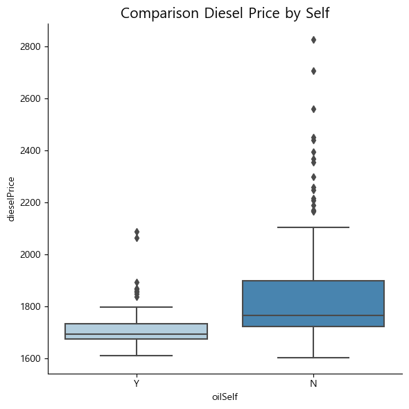
5-2. 브랜드별 가격 비교
- 브랜드별 휘발유 가격 비교
- 셀프 유/무 여부에 따라 boxplot
def ComparisonGasolinePriceWithBrand():
    plt.figure(figsize=(12, 8))
    sns.boxplot(x = "brand", y = "gasolinePrice", hue = "oilSelf", data = data, palette = "Reds")
    plt.title('Comparison Gasoline Price by Self', size = 15)
    sns.despine()
    plt.tight_layout()
    plt.show()

ComparisonGasolinePriceWithBrand()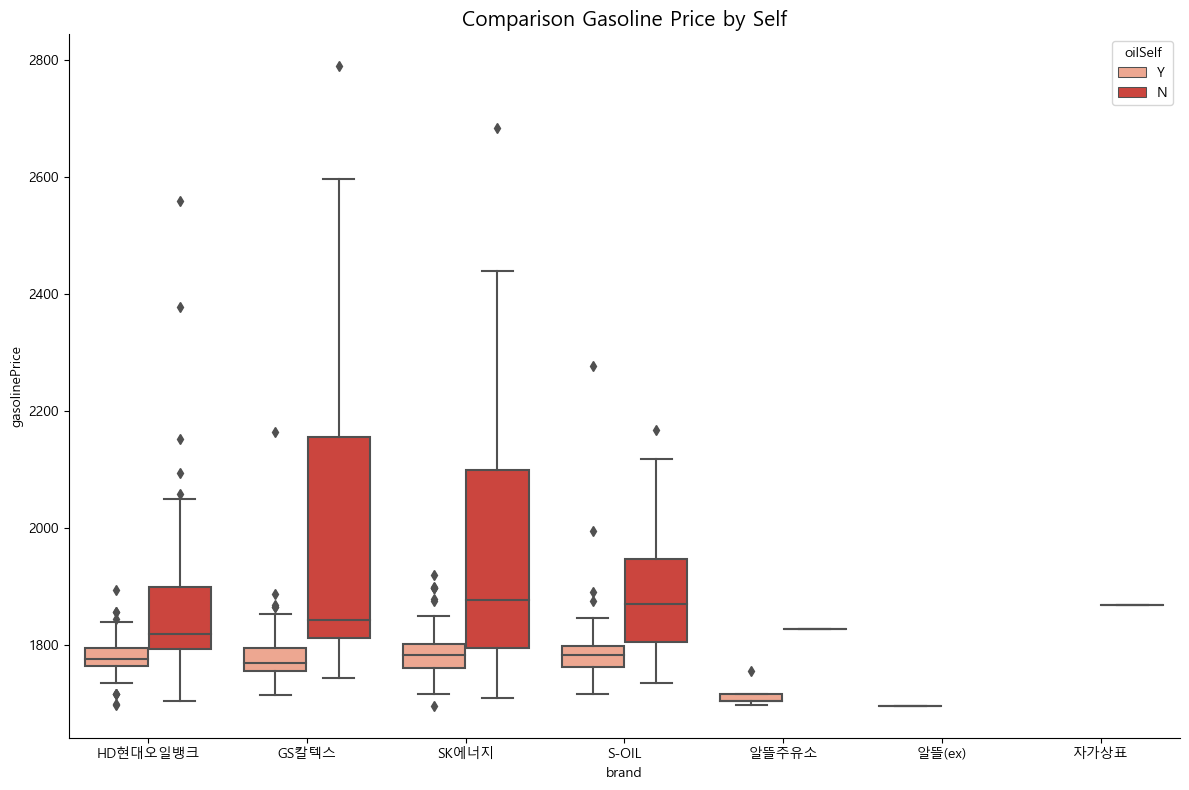
- 브랜드별 경유 가격 비교
- 셀프 유/무 여부에 따라 boxplot
def ComparisonDieselPriceWithBrand():


    plt.figure(figsize=(12, 8))
    sns.boxplot(x = "brand", y = "dieselPrice", hue = "oilSelf", data = data, palette = "Blues")
    plt.title('Comparison Diesel Price by Self', size = 15)
    sns.despine()
    plt.tight_layout()
    plt.show()

ComparisonDieselPriceWithBrand()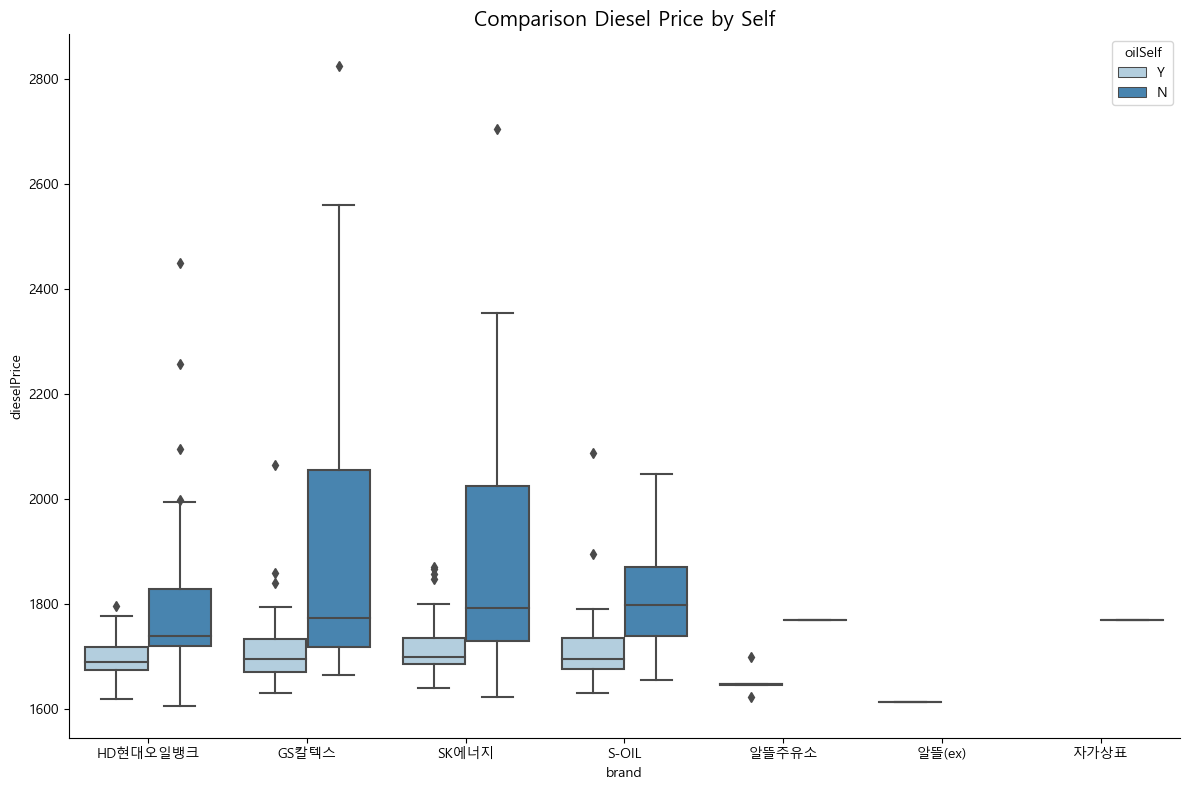
5-3. 브랜드별 유가 평균 비교
- PivotTable을 통해 브랜드별 유가 평균 가격 표시
brand_Pivot = pd.pivot_table(data,
                             index = ['brand', 'oilSelf'],
                             values = ['gasolinePrice', 'dieselPrice',],
                             aggfunc = np.mean)

brand_Pivot['gasolinePrice'] = round(brand_Pivot['gasolinePrice'], 2)
brand_Pivot['dieselPrice'] = round(brand_Pivot['dieselPrice'], 2)
brand_Pivot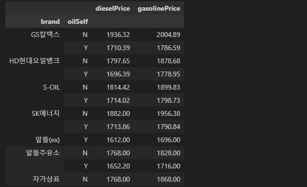
- 브랜드별 휘발유 평균 가격
- 셀프 유/무 여부에 따라 boxplot
def brandGasolineBasedSelf():
    plt.figure(figsize=(10, 6))
    sns.barplot(x = 'brand', y = 'gasolinePrice', data = data, hue = 'oilSelf', palette = 'Reds')
    plt.title('Each brand gasoline Price based on Self Service', size = 15)
    sns.despine()
    plt.tight_layout()
    plt.show()

brandGasolineBasedSelf()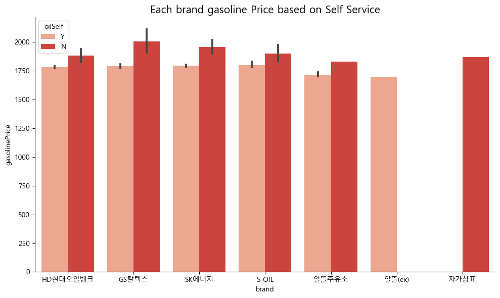
- 브랜드별 경유 평균 가격
- 셀프 유/무 여부에 따라 boxplot
def brandDieselBasedSelf():
    plt.figure(figsize=(10, 6))
    sns.barplot(x = 'brand', y = 'dieselPrice', data = data, hue = 'oilSelf', palette = 'Blues')
    plt.title('Each brand Diesel Price based on Self Service', size = 15)
    sns.despine()
    plt.tight_layout()
    plt.show()

brandDieselBasedSelf()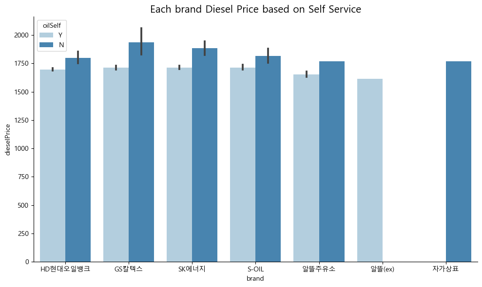
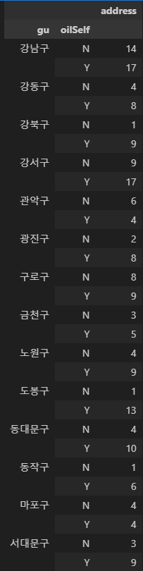
- 구별 셀프주유소 갯수 확인
pivotCnt = pd.pivot_table(data,
                             index = ['gu', 'oilSelf'],
                             values = ['address',],
                             aggfunc = 'count')

pivotCnt| Output | Output |
|---|---|
 |  |
5-4. 위/경도 이용 지도 시각화
- ModuleLoad
# Module & lat, lon in Seoul

import folium
import json

geo_path='../data/02. skorea_municipalities_geo_simple.json'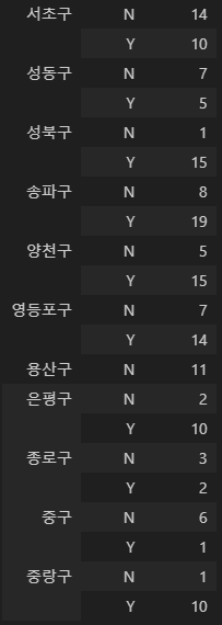
geo_str=json.load(open(geo_path,encoding='utf-8'))- 구별 평균 유가 피벗테이블 생성
gu_Pivot = pd.pivot_table(data,
                             index = ['gu'],
                             values = ['gasolinePrice', 'dieselPrice'],
                             aggfunc = np.mean)
gu_Pivot
셀프 유/무에 따른 지도 시각화
- 셀프주유가 가능할 경우 파란색(Blue)으로 표시
- 셀프주유가 불가할 경우 빨간색(Red)으로 표시
- 가솔린 평균 가격 시각화
# 가솔린 평균 가격 시각화
gasolineMap = folium.Map(location=[37.55, 126.98],
                    zoom_start = 12,
                    tiles="Stamen Toner"
                    )

folium.Choropleth(
        geo_data = geo_str,
        data = gu_Pivot,
        columns = [gu_Pivot.index, 'gasolinePrice'],
        key_on='feature.id',
        fill_color='PuRd',
        fill_opacity = 0.7,
        line_opacity = 0.2,
        #legend_name = legend
    ).add_to(gasolineMap)

for idx, rows in data.iterrows():
    if rows['oilSelf'] == 'Y':
            folium.CircleMarker(
                location = [rows['lat'], rows['lon']],
                radius = 12,
                fill = True,
                color ='Blue',
                fill_color ='Blue',
        ).add_to(gasolineMap)
    else:
        folium.CircleMarker(
            location = [rows['lat'], rows['lon']],
            radius = 12,
            fill= True,
            color ='Red',
            fill_color ='Red',
        ).add_to(gasolineMap)
gasolineMap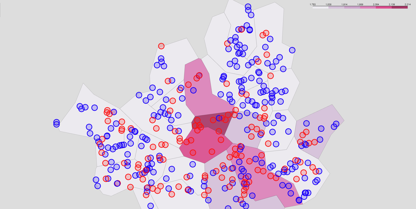
- 디젤 평균 가격 시각화
# 디젤 평균 가격 시각화
dieselMap = folium.Map(location=[37.55, 126.98],
                    zoom_start = 12,
                    tiles="Stamen Toner"
                    )

folium.Choropleth(
        geo_data = geo_str,
        data = gu_Pivot,
        columns = [gu_Pivot.index, 'dieselPrice'],
        key_on='feature.id',
        fill_color='YlGnBu',
        fill_opacity = 0.7,
        line_opacity = 0.2,
    ).add_to(dieselMap)

for idx, rows in data.iterrows():
    if rows['oilSelf'] == 'Y':
            folium.CircleMarker(
                location = [rows['lat'], rows['lon']],
                radius = 12,
                fill = True,
                color ='Blue',
                fill_color ='Blue',
        ).add_to(dieselMap)
    else:
        folium.CircleMarker(
            location = [rows['lat'], rows['lon']],
            radius = 12,
            fill= True,
            color ='Red',
            fill_color ='Red',
        ).add_to(dieselMap)
dieselMap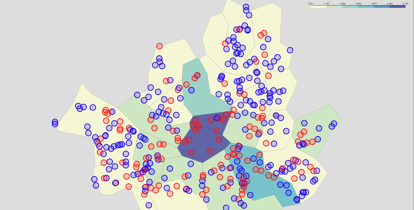
결과
주유소 가격 비교 : 셀프 유/무
- 셀프 주유소의 휘발유/경유의 가격이 더 저렴한 것을 확인할 수 있음
- 각 브랜드 별로 셀프 유/무에 따른 휘발유/경유 가격을 보았을 때, 전체적으로 셀프주유소가 가격이 더 저렴함
- 알뜰(ex), 자가상표는 비교 제외
브랜드 별 가격 비교
- 브랜드 별로 평균 주유가격을 비교했을 때 휘발유/경유 모두 알뜰주유소의 가격이 가장 낮은 것을 확인할 수 있음
서울시 구별 주유 가격 비교
- 상/하위 가격 비교
- 서울시에서 휘발유/경유 모두 주유 가격이 비싼 상위 10개의 주유소를 확인하였을 때, '용산구', '중구', '강남구' 등의 지역이 휘발유 가격이 높은 비중을 차지
- 서울시에서 휘발유/경유 모두 가격이 싼 주유소 상위 10개의 주유소를 확인해보면 '강서구', '양천구', '구로구' 등의 지역이 휘발유 가격이 낮은 비중을 차지
- 가격이 가장 비싼 주유소와 싼 주유소는 리터당 약 1,000원의 차이를 보임
- 셀프주유 가능/불가능 확인
- 가격이 비싼 주유소가 위치한 3개의 구(용산구, 중구, 강남구)를 보았을 때, '중구'의 경우 셀프 불가한 주유소 비중이 컸으나, '용산구'와 '강남구'는 큰 차이를 보이지 않음
- 가격이 싼 주유소가 위치한 3개의 구(강서구, 양천구, 구로구)를 보았을 때, 3개의 구 모두 셀프 가능한 주유소 비중이 큼
- 그러나, '중랑구', '은평구'와 같이 셀프주유가능 주유소가 많음에도 가격이 싼 순위권에 많이 들지 못하는 것으로 보아, 셀프주유가능과 주유가격 간의 관계는 Weak correlation으로 생각됨
- 그 외
- 평균적으로 가장 비싼 구는 '중구'
- 중구의 경우, 셀프 주유 가능이 1개로, 매우 적은 비중을 차지

Start