[The Killer Website Project] Section 5. The Killer Website Project 학습내용정리
#45 - 46 Building the how-it-works section
#45 Building the how-it-works section - Part 1
<div>로 column 만들기
[ HTML ]
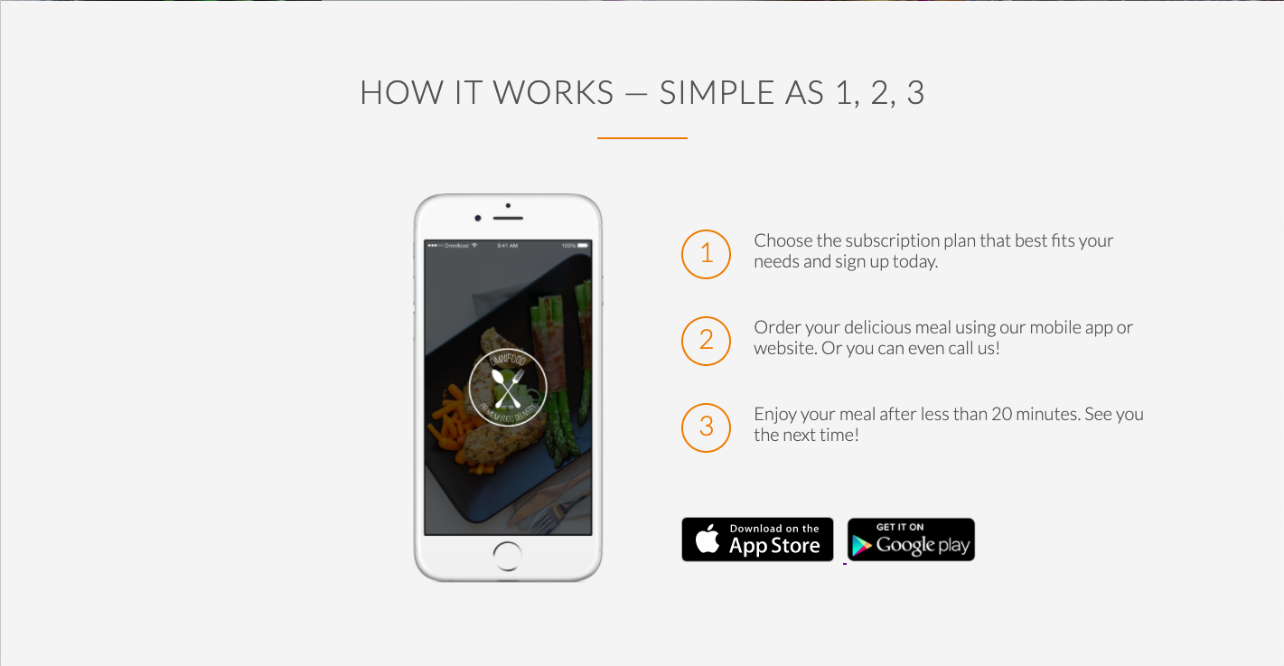
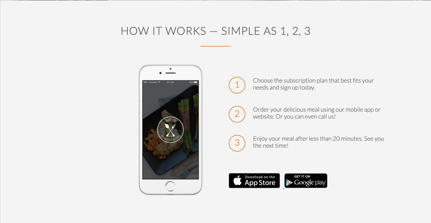
//syntax
  <div class="row">
    <div class="column-1">
      <img>...
    </div>
    <div class="column-2">
      <a></a>...
    </div>
  </div>
//Ex. /*html*/ <section class="section-steps"> <div class="row"> <h2>How it works — Simple as 1, 2, 3</h2> </div> <div class="row"> //글씨가 들어갈 컬럼1과 설명이 들어갈 컬럼2를 만든다 <div class="col span-1-of-2"> ⭐️⭐️⭐️ //left column:아이폰 이미지 <img src="resources/images/app-iPhone.png" alt="Omnifood app on iPhone" class="app-screen"/> </div> <div class="col span-1-of-2"> ⭐️⭐️⭐️ //right column:works-step <div class="works-step"> <div>1</div> <p>Choose the subscription plan that best fits your needs and sign up today.</p> </div> <div class="works-step"> <div>2</div> <p>Order your delicious meal using our mobile app or website. Or you can even call us!</p> </div> <div class="works-step"> <div>3</div> <p>Enjoy your meal after less than 20 minutes. See you the next time!</p> </div> //app store 버튼 <a href="#" class="btn-app"> <img src="resources/images/download-app.svg" alt="App Store Button"/> </a> <a href="#" class="btn-app"> <img src="resources/images/download-app-android.png" alt="Play Store Button"/> </a> </div> </div> </section>
output ⬇️ 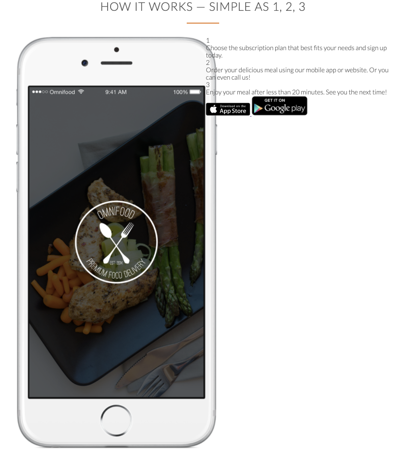
이미지에 링크 걸기
<a> 링크 태그는 <a href="링크될 주소"> html 태그 또는 텍스트 </a> 이다.
이미지에 링크를 걸기 위해서는 img 태그를 <a> </a>사이에 기재한다. 이대로 적용하면 이미지가 보이고 이미지를 클릭할 때 <a>태그에 링크된 주소로 이동을 하게 된다.
[ HTML ]
//syntax
<a href="웹사이트 링크">
  <img src="이미지 경로" alt="이미지가 보이지 않을 경우 나타나는 텍스트">
</a>
//Ex. /*html*/ <a href="#" class="btn-app"> <img src="resources/images/download-app.svg" alt="App Store Button"/> ⭐️⭐️⭐️ </a> <a href="#" class="btn-app"> <img src="resources/images/download-app-android.png" alt="Play Store Button"/> ⭐️⭐️⭐️ </a>
#46 Building the how-it-works section - Part 2
:first-child 와 :last-child 로 요소 선택하기
:first-child는 부모 요소의 첫 번째 자식개체를 선택.
:last-child는 부모 요소의 마지막 자식개체를 선택.
[ CSS ]
.부모요소클래스명:first-child {
}
.부모요소클래스명:last-child {
}//Ex. /*html*/ <div class="col span-1-of-2 steps-box"> //left column:아이폰 이미지 <img src="resources/images/app-iPhone.png" alt="Omnifood app on iPhone" class="app-screen"/> ⭐️⭐️⭐️ </div> <div class="col span-1-of-2 steps-box"> //right column:works-step <div class="works-step"> ⭐️⭐️⭐️ <div>1</div> <p> Choose the subscription plan that best fits your needs and sign up today. </p> </div> <div class="works-step"> ⭐️⭐️⭐️ <div>2</div> <p> Order your delicious meal using our mobile app or website. Or you can even call us! </p> </div> <div class="works-step"> ⭐️⭐️⭐️ <div>3</div> <p> Enjoy your meal after less than 20 minutes. See you the next time! </p> </div> /*css*/ .steps-box:first-child { ⭐️⭐️⭐️ /*.steps-box img와 동일; 아이폰 이미지 선택*/ text-align: right; /*실제로 "텍스트"는 없지만 텍스트에만 적용되는 것이 아니므로 사용가능하다.*/ padding-right: 3%; /*responsive design에 fluid한 프로퍼티가 되려면 %로 기재*/ } .steps-box:last-child { ⭐️⭐️⭐️ /*.steps-box > .works-step 과 동일; right box(steps) 선택*/ padding-left: 3%; }
위 예제에서 .steps-box:first-child는 .steps-box img로 선택하는 것과 같다.
또 .steps-box:last-child는 .steps-box > .works-step로 선택하는 것과 같다.
이처럼 특정 요소를 CSS에서 선택하는 방법은 다양하다.
output ⬇️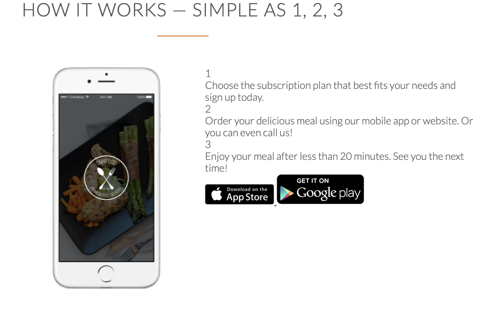
원숫자 만들기 (오직 CSS만 사용해서!)
[ CSS ]
//Ex.
/*html*/
<div class="works-step">
   <div>1</div> ⭐️⭐️⭐️
      <p>
        Choose the subscription plan that best fits your needs and sign up today.
      </p>
</div>
<div class="works-step">
   <div>2</div> ⭐️⭐️⭐️
      <p>
        Order your delicious meal using our mobile app or website. Or you can even call us!
      </p>
</div>
<div class="works-step">
   <div>3</div> ⭐️⭐️⭐️
      <p>
        Enjoy your meal after less than 20 minutes. See you the next time!
      </p>
</div>
/*css*/
.works-step div {
  color: #e67e22;
  border: 2px solid #e67e22;    /*숫자를 둘러싸는 border 만들기*/
  border-radius: 50%;    /*border를 원형으로 만들기*/
  height: 55px;    /*지름이 같게 하려면 높이와 넓이의 크기를 같게!*/
  width: 55px;
  display: inline-block;    /*text랑 side-by-side를 만들어주기 위해*/
  text-align: center;    /*숫자를 원의 가운데로 정렬하기*/
  padding: 5px;    /*원의 위쪽에 쏠려있는 숫자를 원 한 가운데로 내리기*/
  float: left;    /*넘버링을 text의 왼쪽에 넣기*/
  font-size: 150%;
  margin-right: 25px;
}
output ⬇️ 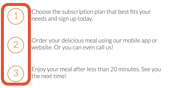
:last-of-type 사용하기
:last-of-type은 같은 유형의 가장 마지막 형제를 선택.
(+PLUS: :first-of-type은 같은 유형의 가장 첫번째 형제를 선택.)
[ CSS ]
.클래스명:last-of-type {
}//Ex. /*html*/ <div class="works-step"> <div>1</div> <p> Choose the subscription plan that best fits your needs and sign up today. </p> </div> <div class="works-step"> <div>2</div> <p> Order your delicious meal using our mobile app or website. Or you can even call us! </p> </div> <div class="works-step"> ⭐️⭐️⭐️ <div>3</div> <p> Enjoy your meal after less than 20 minutes. See you the next time! </p> </div> /*css*/ .works-step:last-of-type { ⭐️⭐️⭐️ margin-bottom: 80px; }
변경 전 ⬇️ 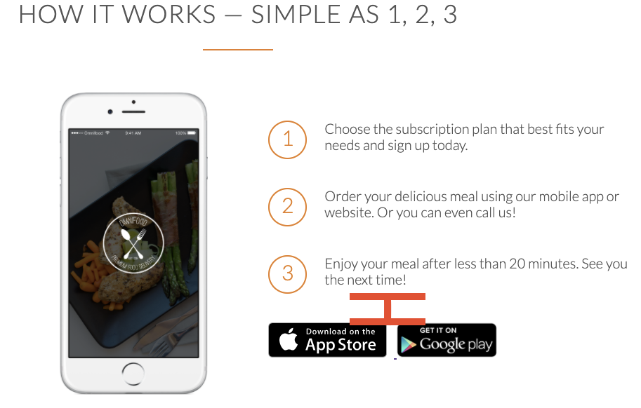
변경 후 ⬇️ 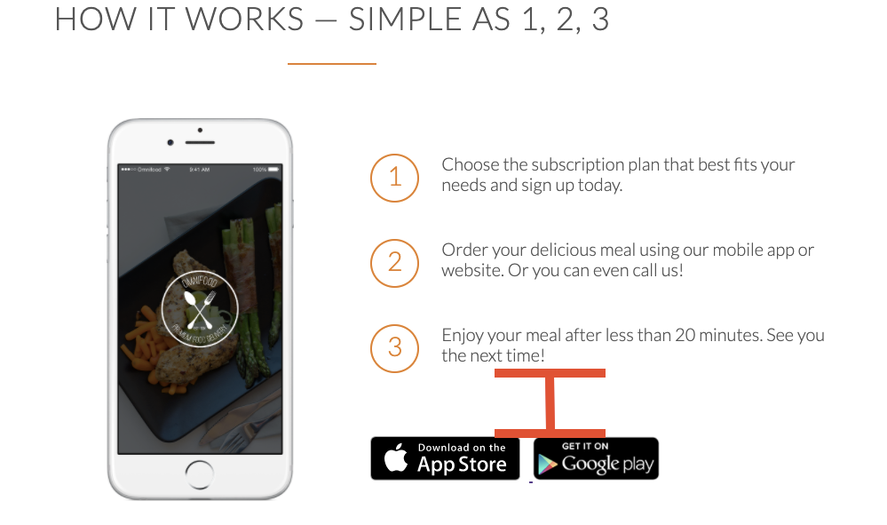
Clearfix 클래스 추가: floating 해제하기
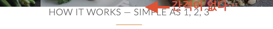
아래 화면을 보면 분명 section간 사이를 80px로 설정해두었음에도 불구하고 h2와 앞전 section간의 간격이 턱없이 부족하다 🤔
구글 개발자툴로 확인해보니 section-steps(아이폰 이미지가 추가된 구역)구역이 이상한 지점부터 시작되는 것이 보인다. 왜냐, float가 적용되어 레이아웃을 무너뜨렸기 때문!!!!
문제가 되는 구역 ⬇️ 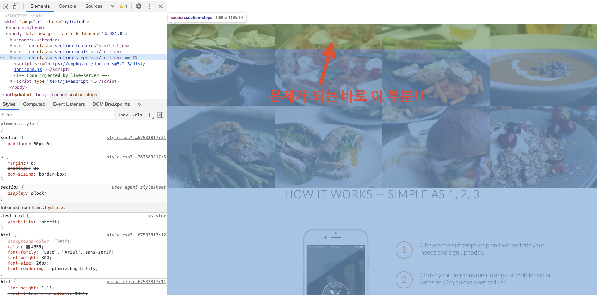
<clear - 플로팅 해제 기법>
플로팅한 요소는 문서의 흐름상에서 벗어난 상태이기 때문에 레이아웃을 무너뜨리게 되는 현상을 보게 될 것입니다.
이는 플롯을 사용하면 발생되는 현상이며 이러한 문제를 해결하기 위해서는 float 을 해제해 주어야 합니다.
여기서 "float 을 해제한다" 는 의미는 float 이 적용된 요소를 해제하는 것이 아니라 clear 속성을 적용해 float 의 영향을 받지 않도록 한다는 의미입니다.
플롯을 해제하는 방법 중에 전 세계적으로 통용되는 이름(관용적인 기법의 이름)으로clearfix라는 방법이 있습니다.
물론 clear 속성을 적용하기 보다 다른 방법으로도 플롯을 해제할 수는 있으나 float 을 사용해 레이아웃을 잡다보면 clear 가 필요해지기 때문에 가급적 플롯된 요소의 부모 요소에clearfix방법을 적용하는 것을 권장하고 있습니다.
다시 말해, float 이 적용된 자식 요소를 부모 요소가 감싸 안지 못하는 현상을 해결하기 위해서는 대략적으로 6가지 방법이 있는데 그 중 대표적으로 많이 사용 되는 방법이 clearfix 입니다.
즉, clearfix 방법은 무조건이라기 보다 필요에 의해서 사용하는 것입니다.
출처: https://webclub.tistory.com/606
[ HTML ][ CSS ]
//syntax
.clearfix {
    zoom: 1;
}
.clearfix:after {   //<---실제 float이 적용해제되어야 하는 요소들. clearfix 클래스를 가진 요소의 "다음 요소(하위 요소)"에 다음 프로퍼티들이 적용된다.
    content: ".";
    clear: both;
    display: block;
    height: 0;
    visibility: hidden;
}
//Ex. /*html*/ <ul class="meals-showcase clearfix"> ⭐️⭐️⭐️ //자식요소인 li가 float프로퍼티를 가지고 있으므로 부모요소인 ul에 clearfix 클래스를 추가해준다. ul밑에 있는 요소들은 float이 적용되지 않는다.--> <li> <figure class="meal-photo"> <img src="Resources/images/1.jpg" alt="Korean bibimbap with egg and vegetables"/> </figure> </li> <li> <figure class="meal-photo"> <img src="Resources/images/2.jpg" alt="Simple italian pizza with cherry tomatoes"/> </figure> </li> <li> <figure class="meal-photo"> <img src="Resources/images/3.jpg" alt="Chicken breast steak with vegetables"/> </figure> </li> <li> <figure class="meal-photo"> <img src="Resources/images/4.jpg" alt="Autumn pumpkin soup" /> </figure> </li> </ul> /*css*/ .clearfix { ⭐️⭐️⭐️ //ul태그 zoom: 1; } .clearfix:after { ⭐️⭐️⭐️ //li태그들 content: "."; clear: both; display: block; height: 0; visibility: hidden; }
.clearfix:after 추가 후 ⬇️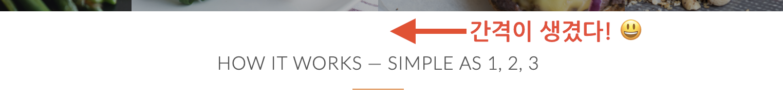
How-it-works Section 완성
Reference
*본 게시물은 Udemy의 'Build Responsive Real World Websites with HTML5 and CSS3'강좌 내용을 포함하고 있습니다.
https://www.udemy.com/course/design-and-develop-a-killer-website-with-html5-and-css3/
https://webclub.tistory.com/606