[The Killer Website Project] Section 5. The Killer Website Project 학습내용정리
#43 - 44 Building the favorite meals section
#43 Building the favorite meals section - Part 1
여러 개의 이미지 가로로 정렬하기(브라우저 width 100%사용)
[ HTML ][ CSS ]
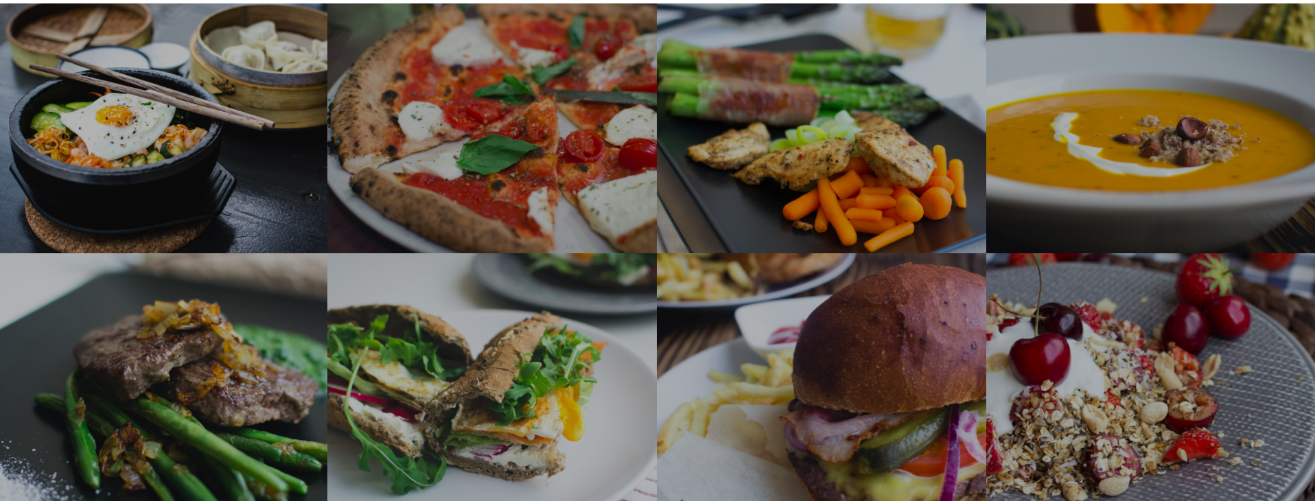
//syntax
/*html*/
<section>
  <ul>
    <li><figure><img/></figure></li>
    <li></li>
    <li></li>
    <li></li>
	.
	.
	.
  </ul>
</section>
/*css*/
.ul태그클래스명 {
  list-style: none; /*bullet point 없애기*/
  width: 100%;
}
.ul태그클래스명 li {
  display: block;
  float: left; /*side-by-side로 만들어주기*/
  width: (100 / 이미지 갯수)%; /*ex.이미지 4개: 25% (100/4=25)*/
}
.figure태그클래스명 {
  width: 100%; /*parent 태그인 li태그와 width를 완전히 똑같이 갖는다는 뜻이 된다.*/
  margin: 0;
}
//img태그
.figure태그클래스명 img {
  width: 100%; /*이미지의 넓이가 정확히 이미지를 담고있는 컨테이너와 똑같은 넓이가 되는 것*/
  height: auto;
}
//Ex. /*html*/ <section class="section-meals"> //<!--브라우저 넓이 100%를 차지하는 이미지 4개씩 2줄 만들기--> <ul class="meals-showcase"> <li> <figure class="meal-photo"> <img src="Resources/images/1.jpg" alt="Korean bibimbap with egg and vegetables" /> </figure> </li> <li> <figure class="meal-photo"> <img src="Resources/images/2.jpg" alt="Simple italian pizza with cherry tomatoes" /> </figure> </li> <li> <figure class="meal-photo"> <img src="Resources/images/3.jpg" alt="Chicken breast steak with vegetables" /> </figure> </li> <li> <figure class="meal-photo"> <img src="Resources/images/4.jpg" alt="Autumn pumpkin soup" /> </figure> </li> </ul> //-------------------------------이미지 줄바꿈--------------------------------- <ul class="meals-showcase"> <li> <figure class="meal-photo"> <img src="Resources/images/5.jpg" alt="Paleo beef steak with vegetables" /> </figure> </li> <li> <figure class="meal-photo"> <img src="Resources/images/6.jpg" alt="Healthy baguette with egg and vegetables" /> </figure> </li> <li> <figure class="meal-photo"> <img src="Resources/images/7.jpg" alt="Burger with cheddar and bacon" /> </figure> </li> <li> <figure class="meal-photo"> <img src="Resources/images/8.jpg" alt="Granola with cherries and strawberries" /> </figure> </li> </ul> </section> /*css*/ //ul태그 .meals-showcase { list-style: none; /*bullet point 없애기*/ width: 100%; ⭐️⭐️⭐️ /*브라우저의 full-width*/ } //li태그 .meals-showcase li { display: block; float: left; ⭐️⭐️⭐️/*side-by-side로 만들어주기*/ width: 25%; ⭐️⭐️⭐️/*엘리먼트가 4개이고 브라우저의 width가 100%이기 때문에*/ } //figure태그 .meal-photo { width: 100%; ⭐️⭐️⭐️/*parent 태그인 li태그와 width를 완전히 똑같이 갖는다.*/ margin: 0; } //img태그 .meal-photo img { width: 100%; ⭐️⭐️⭐️/*이미지의 넓이가 정확히 이미지를 담고있는 컨테이너(figure)와 똑같은 넓이가 되는 것*/ height: auto; }
output ⬇️
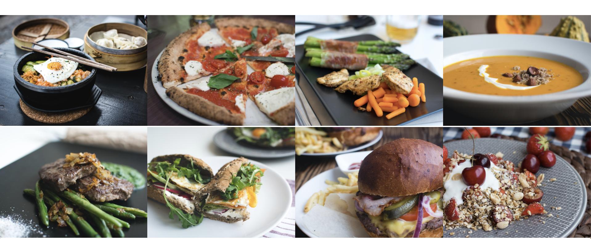
figure 태그 사용하기
<figure>태그는 이미지 혹은 이미지 캡션을 추가할 때 등 독립적인 컨텐츠를 표현할 때 사용한다.
[ HTML ]
<figure>이미지/이미지캡션</figure>//Ex. /*html*/ <figure> <img src="Resources/images/1.jpg" alt="Korean bibimbap with egg and vegetables"/> </figure>
#44 Building the favorite meals section - Part 2
애니메이션 트랜지션 추가: 마우스 hover시 zoom in & zoom out
[ CSS ]
.부모클래스명 {
overflow: hidden;
}
.해당클래스명 {
transform: scale ( n%/100 ); ⬅️ 스케일 1
transition: transform 시간단위(초)s;
}
.해당클래스명:hover {
transform: scale ( n%/100 ); ⬅️ 스케일 2
}
(✔️스케일 1과 스케일 2는 비율을 다르게 설정)//Ex. /*css*/ .meal-photo { width: 100%; margin: 0; overflow: hidden; ⭐️⭐️⭐️/*자식요소인 img태그가 부모요소 사이즈보다 커지는 걸 숨겨준다.*/ } .meal-photo img { width: 100%; height: auto; transform: scale(1.15); ⭐️⭐️⭐️/*이미지가 100%를 넘어 115%로 커지는 것*/ transition: transform 1s; ⭐️⭐️⭐️/* hover와 번갈아서 바뀌는 transform 효과가 0.5초에 걸쳐서 보다 부드럽게 나타나도록 해줌 */ } .meal-photo img:hover { transform: scale(1); ⭐️⭐️⭐️/*이미지의 크기를 다시 100%로 돌려줌*/ }
scale 1은 100%. .meal-photo img클래스의 scale을 1.15(즉, 115%)로 설정하면서 이미지의 컨테이너(부모요소)인 .meal-photo클래스 사이즈를 넘어가게 된다.
브라우저의 크기보다도 커지거나 부모요소의 크기보다 크게 보여지는 것을 방지하기 위해서 부모요소에 overflow: hidde n 프로퍼티를 추가해주어 UI에 컨테이너를 넘어서는 부분이 보여지지 않게 한다.
transition: transform 시간단위(초)s;는 CSS 트랜지션으로, 요소의 변화(transform 효과)가 지정된 시간 내에 점진적으로 일어날 수 있게 해준다.
애니메이션 트랜지션 추가: 마우스 hover시 이미지 darkening 하기
Opacity는 요소의 불투명도를 조절하는 속성으로, background-color를 지정해주지 않으면 기본적으로 흰색으로 불투명도가 생겨난다.
Opacity의 1도 역시 100%를 의미한다.
색상을 바꾸고 싶을 경우 부모요소에 background-color: #색상코드를 추가해 변경해줄 것!
[ CSS ]
.부모클래스명 {
background-color: #색상코드;
}
.해당클래스명 {
opacity: n%/100ex. 0.7
}//Ex. /*css*/ .meal-photo { background-color: #000; ⭐️⭐️⭐️/* black으로 불투명색 지정 */ } .meal-photo img { opacity: 0.7; ⭐️⭐️⭐️/* 불투명도:70% */ }
Opacity가 변화하는 애니메이션을 추가하는 방법은 위에서 설명한 transform: scale(n); 효과와 크게 다르지 않다.
이 효과 또한 마우스 hover 시 적용될 수 있게 할것이기 때문에 ,(콤마)와 함께 아래와 같이 프로퍼티를 추가해주면 된다(transition 값이 여럿일 때).
[ CSS ]
.해당클래스명 {
opacity: n%/100;
transition: opacity 시간단위(초)s; *다른 transition value가 공존할 경우,(콤마)사용해서 추가
}
.해당클래스명:hover {
opacity: n%/100;
}//Ex. /*css*/ .meal-photo img { opacity: 0.7; ⭐️⭐️⭐️/* 불투명도:70% */ width: 100%; height: auto; transform: scale(1.15); transition: transform 1s, opacity 0.5s; ⭐️⭐️⭐️/* hover와 번갈아서 바뀌는 transform 효과가 0.5초에 걸쳐서 보다 부드럽게 나타나도록 해줌 */ } .meal-photo img:hover { transform: scale(1.03); opacity: 1; ⭐️⭐️⭐️/* 불투명도를 다시 100%로 돌려줌. 선명한 이미지 back */ }
Favorite Meals Section 완성
마우스 hover했을 때 ⬇️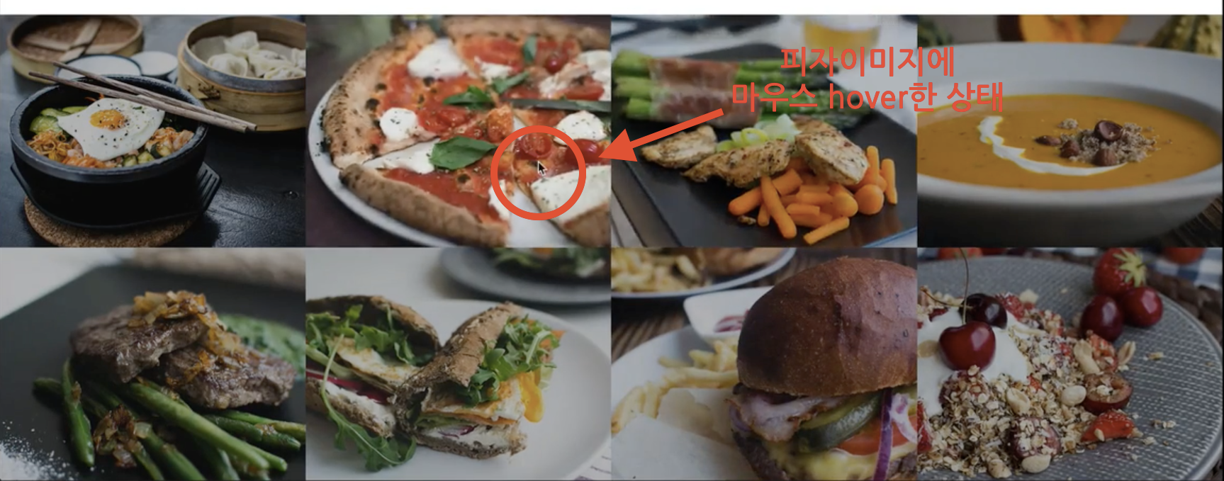
link(normal) 상태일 때 ⬇️
Reference
*본 게시물은 Udemy의 'Build Responsive Real World Websites with HTML5 and CSS3'강좌 내용을 포함하고 있습니다.
https://www.udemy.com/course/design-and-develop-a-killer-website-with-html5-and-css3/
https://developer.mozilla.org/ko/docs/Web/HTML/Element/figure