html
<div class="container">
  <div class="item">AB</div>
</div>
css
body {
padding: 100px;
}
.container {
width: 100px;
height: 100px;
background-color: royalblue;
}
.container .item {
width: 100px;
height: 100px;
background-color: orange;
transform: rotate(45deg) scale(1.3); ✅
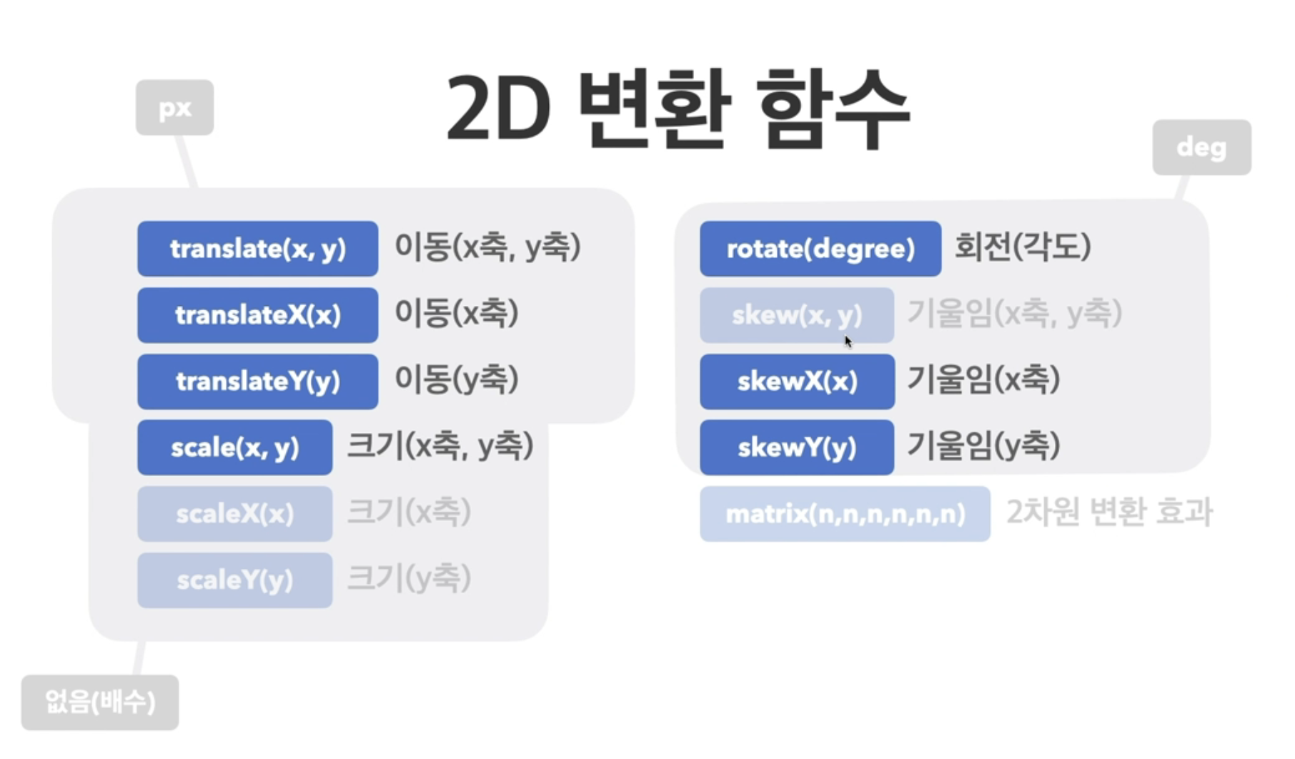
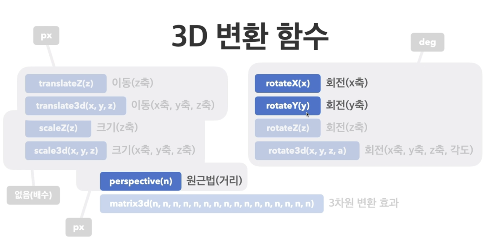
}사용 방법
transform: 변환함수1 변환함수2 변환함수3 ...;
transform: 원근법 이동 크기 회전 기울임;
속성
perspective
- 하위 요소를 관찰하는 원근 거리를 지정(px 등 단위로 지정)
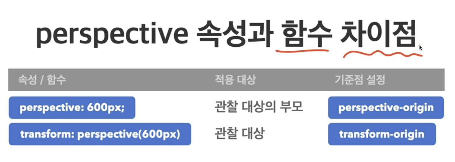
👀 perspective 함수보다는 perspective 속성 사용을 권장 !
backface-visibility
- 3D 변환으로 회전된 요소의 뒷면 숨김 여부
visible : 뒷면 보임
hidden : 뒷면 숨김

👈🏻 매일 꾸준히 성장하는 개발자 !