📈nivo Line Chart 사용법
nivo 라이브러리에서는 다양한 모양의 그래프를 제공한다.
나는 그중에서도 Line Chart를 선택했다.
코드가 되게 복잡한데.. 인터넷에 정보가 많이 없어서 직접 작성해봤다.
🩵설명
1. data 준비
// 기본 구조
Array<{
    id: string | number
    data: Array<{
        x: number | string | Date
        y: number | string | Date
    }>
}>


// 실제 코드
const Graph = () => {

  const data = [{
    id: 'line',
    data: fcstData.map((item) => ({
      x: formatTime(item.fcstDate, item.fcstTime),
      y: parseFloat(item.fcstValue) || 0
    }))
  }]

  ...
}
그래프에 이용할 data를 선언해줘야 한다.
한 컴포넌트에 여러개의 line(그래프)을 표시할 수 있는데, 이때 id로 각 line을 구별할 수 있다.
2. 그래프 컴포넌트 생성
...
return (
        <div className='h-full w-full mb-[50px]'>
            <ResponsiveLine
                colors={'LightSkyBlue'}
                data={data}
                margin={{ top: 10, right: 40, bottom: 50, left: 60 }}
                xFormat="time:%m월 %d일 %H:%M"
                xScale={{
                    type: "time",
                    format: "%m/%d%H:%m",
                    useUTC: false,
                    min: 'auto',
                    max: 'auto',
                }}
                yFormat=" >-.2f"
                yScale={{
                    type: "linear",
                    min: 'auto',
                    max: 'auto',
                    stacked: true,
                    reverse: false,
                }}
                axisBottom={{
                    format: '%m월%d일 %H:%M',
                    tickValues: 'every 1 hour',
                    tickSize: 5,
                    tickPadding: 5,
                    tickRotation: 0,
                    legendOffset: 36,
                    legendPosition: 'end',
                    truncateTickAt: 0
                }}
                axisLeft={{
                    tickSize: 5,
                    tickPadding: 5,
                    tickRotation: 0,
                    legendOffset: -40,
                    legendPosition: 'end',
                    truncateTickAt: 0
                }}
                curve='linear'
                axisTop={null}
                axisRight={null}
                enableGridX={false}
                pointSize={10}
                pointColor={{ theme: 'background' }}
                pointBorderWidth={2}
                pointBorderColor={{ from: 'serieColor' }}
                enablePointLabel={true}
                pointLabel="data.yFormatted"
                pointLabelYOffset={-12}
                enableArea={true}
                areaBaselineValue={minValue}
                enableCrosshair={false}
                enableTouchCrosshair={true}
                useMesh={true}
                legends={[]}
            />
        </div>
)
부모 컴포넌트에 높이를 지정해주지 않으면 그래프가 렌더링되지 않는다. 무조건 height값을 지정해줘야 한다!
속성 설명 1) colors, data, margin
colors={'LightSkyBlue'}
data={data}
margin={{ top: 10, right: 40, bottom: 50, left: 60 }}- colors: line의 색을 지정해준다.
- data: 앞에서 설정한 data를 등록해줘야 한다.
- margin: 컴포넌트 내에서 그래프의 위치를 설정해준다. 상위 컴포넌트에서 padding을 지정하면 안될 때가 있는데, 그때 이 margin으로 대신 변경해주면 된다.
속성 설명 2) xFormat, xScale
xFormat="time:%m월 %d일 %H:%M"

xScale={{
  type: "time",
  format: "%m/%d%H:%m",
  useUTC: false,
  min: 'auto',
  max: 'auto',
}}
- xFormat
데이터에 마우스를 올렸을 때 나오는 문구의 형식을 설정해준다.
시간 데이터라면 time: 을 작성해야 한다.
- xScale
x축 데이터의 범위와 타입을 설정해준다.
마찬가지로 시간 데이터라면 time을 작성해야 한다.
min, max는 그래프에 표시될 x축의 최대값과 최소값이다.
자동으로 설정하고 싶다면 'auto'를, 직접 값을 설정하고 싶다면 min: 0 이런식으로 작성하면 된다.
yFormat과 yScale도 이와 비슷하다.
속성 설명 3) axiosBottom
axisBottom={{
    format: '%m월%d일 %H:%M',
    tickValues: 'every 1 hour',
    tickSize: 5,
    tickPadding: 5,
    tickRotation: 0,
    legendOffset: 36,
    legend: 'time',
    legendPosition: 'end',
    truncateTickAt: 0
}}
axiosBottom은 x축에 대한 설정이다.
- format: x축에 표시될 데이터의 형식을 설정해준다.
- tickValues: tick은 x축에 표시되는 눈금을 의미한다. 이 tick의 간격을 설정해준다.
❗앞에서 'time:'으로 형식 설정을 안해줬다면 작동하지 않는다❗ - legend: x축에 표시될 문구이다.
- legendPosition: legend의 위치를 지정하는 값이다. 이 중 하나로 지정하면 된다.
https://nivo.rocks/guides/axes/ 에서 설명을 볼 수 있다.
axiosLeft도 이와 비슷하다.
속성 설명 4) enableArea, areaBaselineValue
enableArea={true}
areaBaselineValue={minValue}- enableArea: true로 지정하면 그래프의 영역을 채워줄 수 있다.
- areaBaselineValue: 채울 영역의 기준값을 설정해준다. 값을 직접 지정해도 되는데, 나는 yScale의 min값을 auto로 지정했기에 data에서 y의 최소값을 구해서 지정해줬다.
이 설정을 해줘야 그래프가 예쁘다..ㅎㅎ
속성 설명 5) 그 외
curve='linear'               // 선의 모양
enableGridX={false}          // 배경으로 보일 그리드 선 표시 여부
pointSize={10}               // 데이터 포인트의 크기
pointBorderWidth={2}         // 데이터 포인트의 테두리 두께
enablePointLabel={true}      // 포인트 label 표시 여부
pointLabel="data.yFormatted" // label을 뭐로 표시할 건지
pointLabelYOffset={-12}      // 포인트와 label 사이 간격 지정
enableCrosshair={false}      // 포인트에 마우스를 올렸을 때, 교차선의 표시 여부
useMesh={true}               // 포인트에 마우스를 올렸을 때, 상호작용 활성화
🤍전체 코드
import { ResponsiveLine } from '@nivo/line';
import { Fcst } from '../../util/interface';
interface Prop {
fcstData: Fcst[];
text: string;
style?: React.CSSProperties;
}
const formatTime = (d: string, t: string): string => {
const month = d.slice(4, 6);
const day = d.slice(6, 8);
const hours = t.slice(0, 2);
const minutes = t.slice(2, 4);
console.log(month);
return `${month}/${day}${hours}:${minutes}`;
}
const TempGraph: React.FC<Prop> = ({fcstData, text, style}) => {
const data = [{
id: 'line',
data: fcstData.map((item) => ({
x: formatTime(item.fcstDate, item.fcstTime),
y: parseFloat(item.fcstValue) || 0
}))
}]
const minValue = Math.min(...fcstData.map(item => parseFloat(item.fcstValue) || 0));
console.log(fcstData[0].fcstDate);
console.log(`graph ${text} data:`, data[0]);
return (
<div className='h-full w-full mb-[50px]' style={style}>
<p>{text}</p>
<ResponsiveLine
colors={'LightSkyBlue'}
data={data}
margin={{ top: 20, right: 40, bottom: 50, left: 60 }}
xFormat="time:%m월 %d일 %H:%M"
xScale={{
type: "time",
format: "%m/%d%H:%m",
useUTC: false,
min: 'auto',
max: 'auto',
}}
yScale={{
type: "linear",
min: 'auto',
max: 'auto',
stacked: true,
reverse: false,
}}
yFormat=" >-.2f"
curve='linear'
axisBottom={{
format: '%m월%d일 %H:%M',
tickValues: 'every 1 hour',
tickSize: 5,
tickPadding: 5,
tickRotation: 0,
legendOffset: 36,
truncateTickAt: 0
}}
axisLeft={{
tickSize: 5,
tickPadding: 5,
tickRotation: 0,
legendOffset: -40,
legendPosition: 'end',
truncateTickAt: 0
}}
enableGridX={true}
pointSize={10}
pointBorderWidth={1}
enablePointLabel={true}
pointLabel="data.yFormatted"
pointLabelYOffset={-12}
enableArea={true}
areaBaselineValue={minValue}
enableCrosshair={false}
useMesh={true}
/>
</div>
)
}
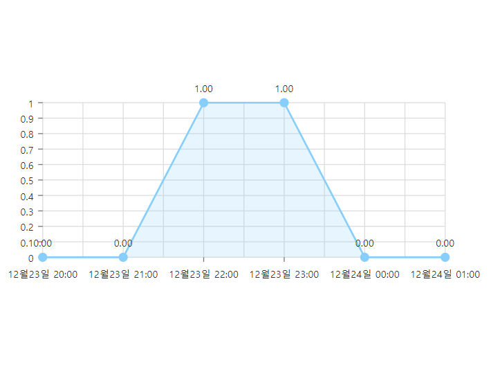
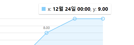
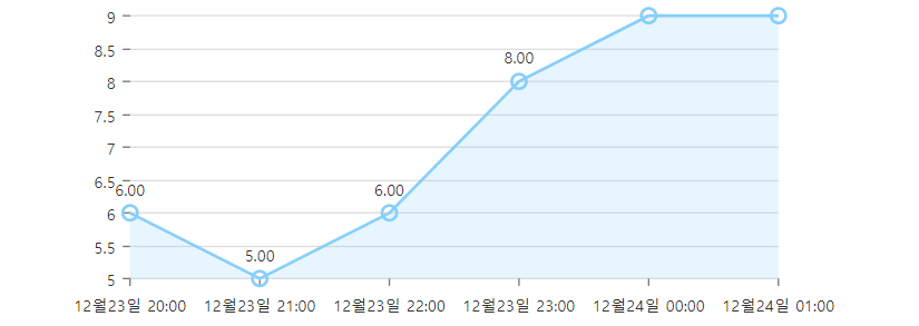
export default TempGraph결과화면

감씨의 프론트엔드 공부 '~'