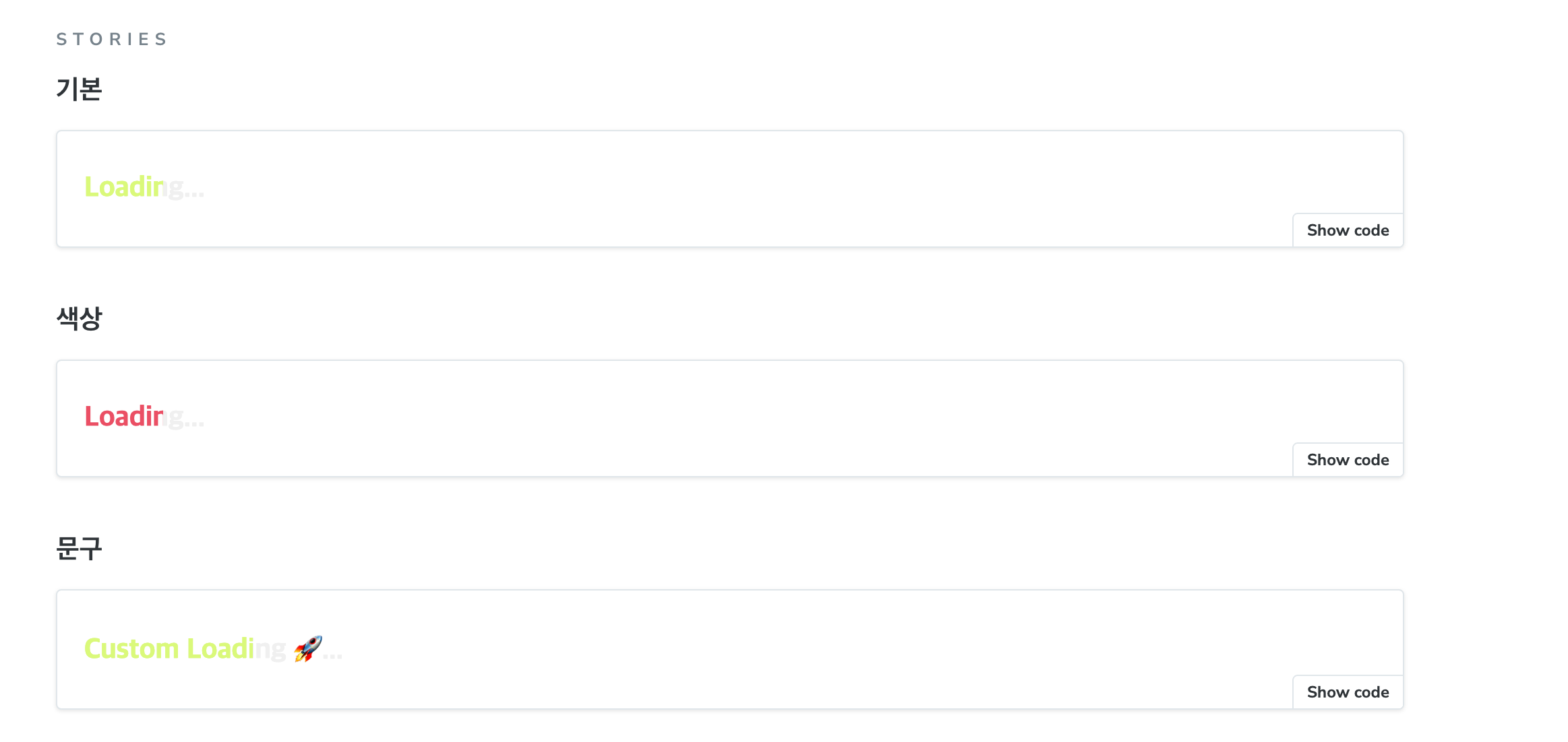
작업 결과물
LoadingText 구현기
//  LoadingText.tsx

import { CSSProperties } from "react";

import * as S from "./LoadingText.styles";

type LoadingTextProps = {
  text?: string;
  color?: string;
};
export function LoadingText({ text = "Loading...", color }: LoadingTextProps) {
  return (
    <S.Text
      style={{ "--loading-text-color": color } as CSSProperties}
      data-text={text}
    >
      {text}
    </S.Text>
  );
}
style={{ "--loading-text-color": color } as CSSProperties}을 통해 css 에서 사용할 수 있는 전역 변수를 설정한다.
해당 의미는 전역 변수로--loading-text-color를 color 값으로 지정하였다.- 또한 css 에서
attr()속성으로 데이터 값을 가져오기 위해data-text={text}로 설정하였다.
import styled from "@emotion/styled";

import { colors } from "../../styles/colors";

export const Text = styled.span`
  position: relative;
  display: inline-block;
  color: ${colors.gray200};
  font-weight: 900;
  font-size: 21px;

  &::after {
    content: attr(data-text);
    position: absolute;
    inset: 0;
    max-width: 0;
    overflow: hidden;
    white-space: nowrap;
    color: var(--loading-text-color, ${colors.primary});
    animation: 1.3s infinite loading;
  }

  @keyframes loading {
    to {
      max-width: 100%;
    }
  }
`;- 스타일 부분은 가상요소 와 animation 을 통해 1.3 초 마다 전달한 색상을 채움으로서 로딩중임을 나타내는 UI 를 구현하였다.
after 스타일을 보면
&::after {
    content: attr(data-text);
    position: absolute;
    inset: 0;
    max-width: 0;
    overflow: hidden;
    white-space: nowrap;
    color: var(--loading-text-color, ${colors.primary});
    animation: 1.3s infinite loading;
}attr(data-text);으로 jsx 에서 설정한 data-text 를 가져와서 content 를 나타냈다- absolute 로 위치를 정했기 때문에 기존 요소와 일치하기 위해
inset: 0으로 설정했다. - 커스텀하게 색상을 지정할 수 있도록
color: var(--loading-text-color, ${colors.primary})으로 jsx 에서 정의한--loading-text-color색상이 없으면 기본 색상을 적용하도록 하였다.
CSS, SCSS? 문법 위주로 작성했는데 해당 부분을 styled-component 에 props 방식을 사용하지 않는 이유
// jsx
export function LoadingText({ text = "Loading...", color }: LoadingTextProps) {
  return (
    <S.Text
      $text={text} // 💡 이런식으로 전달
      style={{ "--loading-text-color": color } as CSSProperties}
      data-text={text}
    >
      {text}
    </S.Text>
  );
}

// styled.
export const Text = styled.span<{ $text: string }>`
  // ...
  &::after {
    position: absolute;
    inset: 0;
    max-width: 0;
    overflow: hidden;
    white-space: nowrap;
    color: var(--loading-text-color, ${colors.primary});
    animation: 1.3s infinite loading;
	${({ $text }) => $text && `content: $text `}; // 💡 이와 같이 사용?
}- 위와 같이 사용할 수도 있지만, styled-components 의 props 는 스타일 변경? 따른 속성을 props 로 처리하는게 더 적합하지 않을까? 생각이 든다!
