Progress Linear 컴포넌트 구현기를 공유하고자 한다. 이와 비슷한 걸로 ProgressCircle 컴포넌트 구현한 내용도 있기에 참고해도 괜찮을거 같다. 실제적인 로직은 원형과 선형이기 때문에 로직적으로는 비슷하지 않겠지만, 설계는 비슷하게 하였다.
작업 결과물
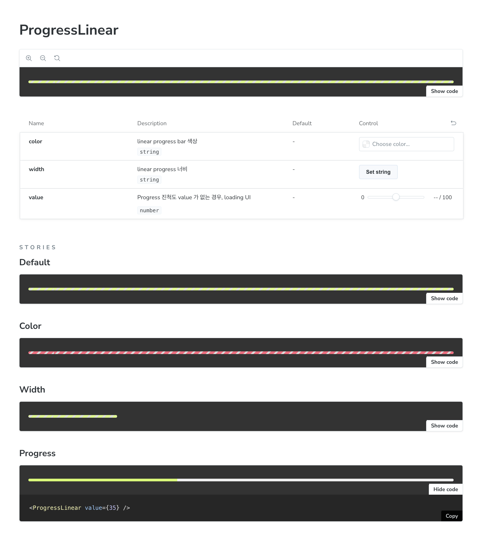
ProgressLinear 구현기
// ProgressLinear.tsx

import * as S from './ProgressLinear.styles';
import { CSSProperties } from 'react';
import { theme } from '@/styles/theme.ts';
import cns from 'classnames';

interface ProgressLinearProps {
  /** linear progress bar 색상 */
  color?: string;
  /** linear progress 너비 */
  width?: string;
  /** Progress 진척도
   * value 가 없는 경우, loading UI
   */
  value?: number;
}

export function ProgressLinear({
  color, //
  width,
  value,
}: ProgressLinearProps) {
  const MIN = 0;
  const MAX = 100;
  const style = {
    maxWidth: width,
    '--progress-value': value,
    '--progress-color': color || theme.color.primary,
  } as CSSProperties;

  return (
    <S.ProgressLinear
      role="progressbar" //
      aria-valuenow={value}
      aria-valuemin={MIN}
      aria-valuemax={MAX}
      style={style}
    >
      <S.Bar
        className={cns({
          loading: !value,
        })}
      />
    </S.ProgressLinear>
  );
}
// ProgressLinear.styles.tsx
import styled from '@emotion/styled';
import { theme } from '@/styles/theme.ts';
const { color } = theme;
export const ProgressLinear = styled.div`
position: relative;
z-index: 0;
width: 100%;
height: 6px;
overflow: hidden;
background-color: ${color.gray200};
border-radius: 9999px;
`;
export const Bar = styled.div`
  position: absolute;
  top: 0;
  left: 0;
  width: 100%;
  height: 100%;
  background-color: var(--progress-color);
  transform: translateX(calc(-100% + var(--progress-value) * 1%));
  transition: transform 0.1s;

  &.loading {
    background: repeating-linear-gradient(
      -45deg,
      rgba(0, 0, 0, 0.1),
      rgba(0, 0, 0, 0.1) 4px,
      var(--progress-color) 4px,
      var(--progress-color) 12px
    );
    transform: translateX(0);
    opacity: 0.8;
    animation: bar 0.8s linear infinite;
  }

  @keyframes bar {
    from {
      background-position-x: 0;
    }

    to {
      background-position-x: 100px;
    }
  }
`;
- width, color 와 같은 것은 스타일링을 적용했다.
- 해당 컴포넌트의 핵심은 S.Bar 로 스타일링을 하였다.
로딩 UI 를 어떻게 구상했을까?
export const Bar = styled.div`
position: absolute;
top: 0;
left: 0;
width: 100%;
height: 100%;
background-color: var(--progress-color);
transform: translateX(calc(-100% + var(--progress-value) * 1%));
transition: transform 0.1s;
&.loading {
background: repeating-linear-gradient(
-45deg,
rgba(0, 0, 0, 0.1),
rgba(0, 0, 0, 0.1) 4px,
var(--progress-color) 4px,
var(--progress-color) 12px
);
transform: translateX(0);
opacity: 0.8;
animation: bar 0.8s linear infinite;
}
@keyframes bar {
from {
background-position-x: 0;
}
to {
background-position-x: 100px;
}
}
`;
- 로딩인 경우 스타일링하여 UI 를 다르게 하기 위해
repeating-linear-gradient으로 반복되는 선형 그래디언트로 구현하였다.- 45도 형태로 오른쪽으로 그려지는 선형 UI 를 만들고
- rgba(0, 0, 0, 0.1) 로 시작생삭을 정하고 4px 까지 증가,
- 지정한
--progress-color색으로 4px 부터 12px 까지 그리는 것을 의미한다. repeating-linear-gradient로 반복되게 진행했다.
- 또한, 움직임을 계속 표시하기 위해
bar 애니메이션을 지정했다.
progress (진행척도) 는 어떻게 구현했을까?
// ...
export const Bar = styled.div`
  position: absolute;
  top: 0;
  left: 0;
  width: 100%;
  height: 100%;
  background-color: var(--progress-color);
  transform: translateX(calc(-100% + var(--progress-value) * 1%));
  transition: transform 0.1s;
  // ...
`- 진행 척도를 value 로 전달하여
translateX(calc(-100% + var(--progress-value) * 1%));로 진행 척도를 적용했다.
