Select 컴포넌트를 구현하면서 경험한 것을 공유하고자 한다.
HTML 의 select, option 을 제공하는데 스타일링 때문에 div 와 button 으로 해당 컴포넌트를 구현했으며 추후에 HTML 의 select, option 요소를 활용한 NativeSelect 컴포넌트를 구현하고자 한다.
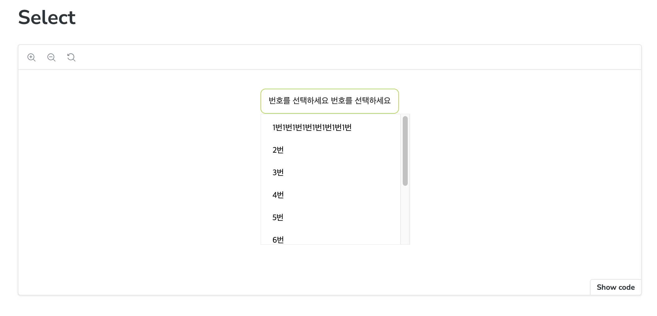
작업 결과물
사전 정보
Select 컴포넌트 구현할 때 Select 컴포넌트 외부를 선택한 경우 Select 의 옵션 창이 사라지게 하기 위해 특정 DOM 이 아닌 외부 요소를 선택시 특정 기능을 수행하는 useOutsideClick 이라는 Hook 을 구현하였다.
import { RefObject, useEffect } from 'react';

type UseOutsideClickProps = {
  ref: RefObject<HTMLElement>;
  handler: (event: MouseEvent) => void;
};

/**
 * @desc 전달 받은 DOM 과 연관없는 것을 클릭한 경우 인자의 handler 호출
 * @param ref 기준이 되는 DOM
 * @param handler 기준이 되는 되는 DOM 외의 요소를 클릭할 경우 호출할 함수
 * @link
 * - https://chakra-ui.com/docs/hooks/use-outside-click
 * -
 */
export function useOutsideClick({ ref, handler }: UseOutsideClickProps) {
  useEffect(() => {
    const listener = (event: MouseEvent) => {
      if (!ref.current || ref.current.contains(event.target as Node)) {
        return;
      }
      handler(event);
    };

    document.addEventListener('mousedown', listener);
    return () => {
      document.removeEventListener('mousedown', listener);
    };
  });
}
간단하게 이야기 하면
- 특정 DOM(ref 인자) 이 없거나 자손이 아닌 경우 (Node.contains) 아무런 동작을 하지 않고 그렇지 않으면 인자로 전달한 handler 를 수행한다.
- 외부 영역을 클릭했다는 것을 파악하기 위해
mousedown이벤트를 등록/제거 하였다.
Select Component 구현 내용
// Select.tsx
import { CSSProperties, useRef, useState } from 'react';
import cns from 'classnames';

import * as S from './Select.styles';
import { useOutsideClick } from '@/hooks/useOutsideClick.tsx';

type SelectOption = {
  label: string;
  value: string;
};

interface SelectProps {
  placeholder?: string;
  options?: SelectOption[];
  defaultValue?: SelectOption;
  disabled?: boolean;
  status?: 'error' | 'warning';
  width?: string;
  isFullWidth?: boolean;
}

export function Select({
  placeholder, //
  defaultValue,
  options,
  disabled = false,
  status,
  width,
  isFullWidth = false,
  ...props
}: SelectProps) {
  const [isOpen, setIsOpen] = useState(false);
  const [selectedValue, setSelectedValue] = useState(defaultValue);
  const ref = useRef<HTMLDivElement | null>(null);

  useOutsideClick({
    ref: ref,
    handler: () => setIsOpen(false),
  });

  const handleClickItem = (selectedValue: SelectOption) => {
    setSelectedValue(selectedValue);
    setIsOpen(false);
  };

  return (
    <S.SelectWrapper
      style={{ '--width': width } as CSSProperties}
      className={cns({
        ['full-width']: isFullWidth,
      })}
      ref={ref}
    >
      <S.Select
        onClick={() => setIsOpen((prev) => !prev)}
        disabled={disabled}
        className={cns({
          open: isOpen,
          error: status === 'error',
          warning: status === 'warning',
        })}
        {...props}
      >
        <S.SelectText>{selectedValue?.label || placeholder}</S.SelectText>
      </S.Select>
      {isOpen && (
        <S.OptionsList>
          {options?.map((option, index) => (
            <S.OptionItem
              key={index}
              onClick={() => handleClickItem(option)}
              className={cns({
                checked: option.label === selectedValue?.label,
              })}
            >
              <span>{option.label}</span>
            </S.OptionItem>
          ))}
        </S.OptionsList>
      )}
    </S.SelectWrapper>
  );
}
- 단일 값만 처리하기 때문에 아이템을 선택하면 selectedValue 로 상태를 업데이트 했다.
- ref 가 있는 이유는 Select 컴포넌트 외적인 요소를 클릭시 Select 의 옵션을 보여주지 않기 위한 작업이다.
- 그 외적으로 props 에 전달된 상태에 따라 스타일링하기 위한 작업들을 처리하였다.
// Select.styles.tsx
import styled from '@emotion/styled';

import { theme } from '@/styles/theme';

const { color } = theme;

export const SelectWrapper = styled.div`
  position: relative;
  display: inline-flex;
  flex-direction: column;
  vertical-align: middle;
  width: var(--width, atuo);

  &.full-width {
    //display: flex;
    width: 100%;
  }
`;

export const Select = styled.button`
  display: inline-flex;
  align-items: center;
  width: 100%;
  min-width: 100px;
  padding: 0 12px;
  color: ${color.gray900};
  text-align: left;
  background-color: ${color.white};
  border: 1px solid ${color.gray300};
  border-radius: 0.5rem;
  outline: none;
  transition: box-shadow 0.1s;
  min-height: 40px;

  &:disabled {
    color: ${color.gray500};
    background-color: ${color.gray100};
    border-color: ${color.gray300};
  }

  &.open {
    border-color: ${color.primaryActive};
  }
  &.error {
    border-color: ${color.red600};
  }
  &.warning {
    border-color: #ffd666;
  }
`;

export const SelectText = styled.div`
  flex: 1;
  overflow: hidden;
  line-height: initial;
  white-space: nowrap;
  text-overflow: ellipsis;
`;

export const OptionsList = styled.div`
  position: absolute;
  top: 100%;
  z-index: 1;
  width: 100%;
  max-height: 200px;
  padding: 4px 8px;
  overflow: auto;
  background-color: ${color.white};
  border: 1px solid ${color.gray200};
  min-width: 100px;
`;

export const OptionItem = styled.div`
  display: flex;
  align-items: center;
  min-height: 36px;
  padding: 0 10px;
  white-space: nowrap;
  text-align: left;
  background-color: ${color.white};
  border-radius: 0.25rem;
  outline: none;
  cursor: pointer;
  font-size: 13px;
  line-height: 1.4;

  & > span {
    flex: 1;
    overflow: hidden;
    line-height: initial;
    white-space: nowrap;
    text-overflow: ellipsis;
  }

  &.checked {
    background-color: ${color.yellow200};
    font-weight: bold;
  }
`;
앞으로!
- style 적인 처리를 위해 HTML 의 select, option 요소를 사용하지 않았다. 그래서 추후에 이를 활용한 NativeSelector 를 구현할 것이다.
- 여러 개를 선택할 수 있는 multiple 기능을 추가하고자 한다.
해당 기능을 추가하면 해당 포스팅에 업데이트할 예정이다.
