아이콘 컴포넌트 구현 방식은 정말 다양하게 있다.
아이콘 이미지를 cdn 에 올려서 이미지 주소를 받아서 처리하는 방식도 있지만, 다른 방법을 공유하고자 한다.
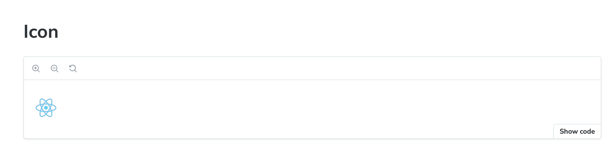
작업 결과물
TextField 구현기
Icon 컴포넌트
사전 설정 - 아이콘 관리
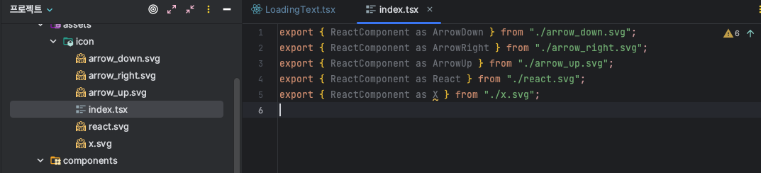
- 해당 컴포넌트를 설정하기 위해서는 svg 아이콘들을 등록하고
index.tsx파일에서 svg 파일들을ReactComponent로 export 해서 관리한다! - 저자의 경우
assets/icon에 svg 파일과 이를 ReactComponent 로 추출하는index.tsx파일로 관리하였다.
theme 설정 - color
저자의 경우 간단하게 하기 위해 color 만 따로 만들어서 정의하였는데 theme 를 사용한다면 해당 방식으로 관리하는 것을 추천한다.
// styles/colors.ts // theme.ts 로 관리하는 것을 권장
export const colors = {
  white: "#ffffff",
  black: "#333333",
  gray0: "#fcfcfc",
  gray100: "#f8f8f8",
  gray200: "#f0f0f0",
  // ...
  blue900: "#1864ab",
  primaryHover: "#e5ff8f", // colors.yellow300
  primary: "#d2fa64", // colors.yellow400
  primaryActive: "#aad44a", // colors.yellow500
  secondaryHover: "#ff667d",
  secondary: "#ff3d60",
  secondaryActive: "#d9294f",
} as const;

export type Colors = keyof typeof colors;
구현
/** @jsxImportSource @emotion/react */
import { css } from "@emotion/react";
import { SVGProps } from "react";

import * as icon from "../../assets/icon";
import { Colors, colors } from "../../styles/colors.ts";
export type IconNameType = keyof typeof icon;
const DEFAULT_SIZE = 24;
interface SVGIconProps extends SVGProps<SVGSVGElement> {
  /** 등록된 icon name */
  name: IconNameType;
  size?: number;
  width?: string;
  height?: string;
  /** 디자인 시스템 기반 컬러 Name */
  color?: Colors;
  fill?: Colors;
}

export const Icon = ({
  name,
  size = DEFAULT_SIZE,
  width,
  height,
  color = "secondary",
  fill,
  style,
  ...props
}: SVGIconProps) => {
  const SVGIcon = icon[name];
  const IconStyles = css`
    &,
    path {
      ${color ? `stroke: ${colors[color]} !important;` : ""}
      ${fill ? `fill: ${colors[fill]} !important;` : ""}
      width: ${width ?? `${size}px`};
      height: ${height ?? `${size}px`};
    }
  `;

  return <SVGIcon {...props} css={IconStyles} style={style} />;
};
import { css } from "@emotion/react";
import { SVGProps } from "react";
import * as icon from "../../assets/icon";
import { Colors, colors } from "../../styles/colors.ts";
export type IconNameType = keyof typeof icon;
const DEFAULT_SIZE = 24;
interface SVGIconProps extends SVGProps<SVGSVGElement> {
/** 등록된 icon name */
name: IconNameType;
size?: number;
width?: string;
height?: string;
/** 디자인 시스템 기반 컬러 Name */
color?: Colors;
fill?: Colors;
}import * as icon from "../../assets/icon";으로 icon 관리 파일을 가져오고import { Colors, colors } from "../../styles/colors.ts";에서 color 데이터와 컬러 타입을 가져온다.export type IconNameType = keyof typeof icon;은 icon 관리 파일에서 svg 이름을 설정한 정보들을 가져온다.interface SVGIconProps extends SVGProps<SVGSVGElement> {으로 기존의 SVGProps 뿐만 아니라 정의한 컴포넌트에 필요한 props 를 오버라이딩한다.
export const Icon = ({
  name,
  size = DEFAULT_SIZE,
  width,
  height,
  color = "secondary",
  fill,
  style,
  ...props
}: SVGIconProps) => {
  const SVGIcon = icon[name];
  const IconStyles = css`
    &,
    path {
      ${color ? `stroke: ${colors[color]} !important;` : ""}
      ${fill ? `fill: ${colors[fill]} !important;` : ""}
      width: ${width ?? `${size}px`};
      height: ${height ?? `${size}px`};
    }
  `;

  return <SVGIcon {...props} css={IconStyles} style={style} />;
};
const SVGIcon = icon[name];에서 name 에는 icon 관리 파일에서 svg 를 icon 으로 추출한 이름이 있기 때문에 icon[name] 을 통해 해당 SVG 파일을 조회할 수 있다.- props 로 전달 받은 스타일을 처리해주기 위해 IconStyles 를 정의해서
<SVGIcon {...props} css={IconStyles} style={style} />;와 같이 작업했다. - props 로 전달 받은 스타일 정보를 처리하기 위해
{...props}구문 뒤에css={IconStyles} style={style}를 정의했다.
svg 를 인식하기 위해 설정 필요!
- 해당 프로젝트는 vite 환경인데 vite 환경이든 webpack 환경이든 svg 를 리액트 컴포넌트로 인식하기 위해 설정을 해줘야한다!
-
"vite-plugin-svgr" 설치
npm install -D vite-plugin-svgr -
vite.config.ts 설정
import { defineConfig } from "vite";
import react from "@vitejs/plugin-react";
import svgr from "vite-plugin-svgr";
export default defineConfig({
  plugins: [react(), svgr()],
});- use
import { ReactComponent as ReactLogo } from './assets/react.svg'
<ReactLogo />