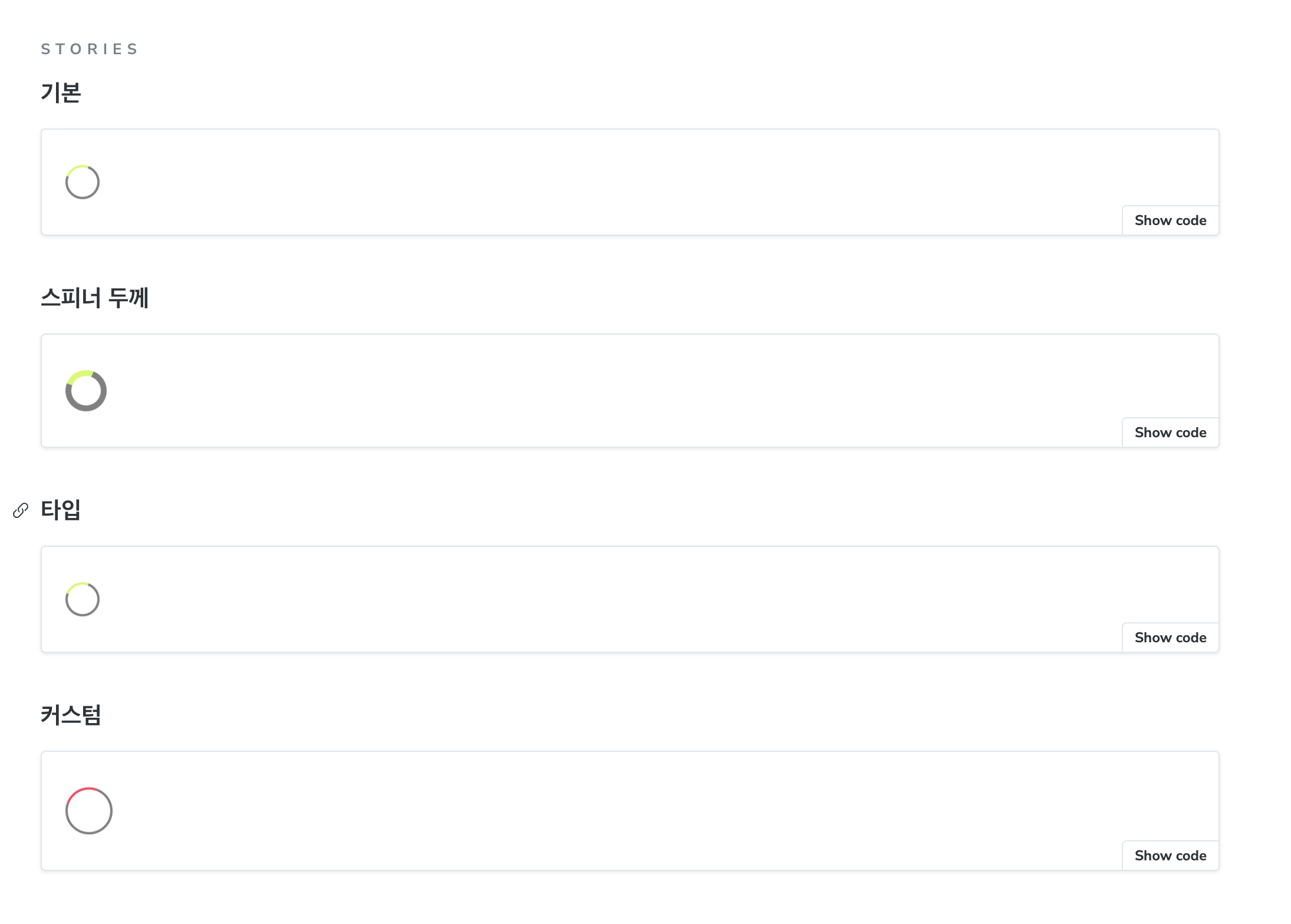
CSS 만 이용해서 아주 간단한 로딩스피너를 구현해봤다.
작업 결과물
// LoadingSpinner.tsx
import { theme } from '@/styles/theme';

import * as S from './LoadingSpinner.styles';

interface LoadingSpinnerProps {
  /**
   * hex값 string 또는 color string(red, blue, ...)
   */
  color?: string;
  /**
   * 기로 세로 크기
   */
  size?: number;
}
export function LoadingSpinner({ color = theme.color.primary, size = 50 }: LoadingSpinnerProps) {
  return <S.Spinner role="progressbar" $size={size} $color={color} />;
}
// LoadingSpinner.styles.tsx
import styled from '@emotion/styled';
export const Spinner = styled.div<{ $size: number; $color: string }>`
width: ${({ $size }) => `${$size}px`};
height: ${({ $size }) => `${$size}px`};
border: 5px solid gray;
border-top: 5px solid ${({ $color }) => $color};
border-radius: 50%;
animation: spinAnimation 1.3s linear infinite;
@keyframes spinAnimation {
from {
transform: rotate(0deg);
}
to {
transform: rotate(360deg);
}
}
`;핵심은 border 를 이용해서 spinner 영역을 만들고 border-top 을 지정함으로서 스피너의 색상을 지정한다.
그리고 animation 으로 360도 회전하면 스피너를 만들 수 있다.
개선 방향
css 속성만을 이용해서 구현했는데 확장성 및 제어가 쉽지 않다. 다른 것들 참고해보니깐, svg 와 애니메이션을 이용해서 좀 더 괜찮은 방법도 존재하기에 추후에 해당 내용도 구현해서 공유하고자 한다.
