🔹 bootstrap
- html, css, js을 합쳐놓은 프레임워크이다.
- html, css, js 기준으로 만들어진 컴포넌트를
(기능 (자바스크립트) + 화면(html, css)) 제공한다.- 부트스트랩으로 만들어진 웹사이트는 반응형 웹사이트이다. (비반응형도 가능하다)
✔ 반응형이란?
디바이스 크기(화면크기)에 따라 크기에 맞는 최적화된 화면으로 변환한다.
부트스트랩 다운로드
- bootstrap.min.js, bootstrap.min.css 파일이 필요하다.
- 테마 css (필수사항은 아니다)
- 버전에 따라 제이쿼리가 필요하다.
구조 및 준비
- html5, 뷰 포트 메타태그 (모바일 웹 구성시 필수정보), bootstrap.min.js, bootstrap.min.css
- 3버전, 4버전은 제이쿼리 필수이며 5버전은 제이쿼리가 없어도된다.
(필요에 의해 추가가 가능하다.)
컴포넌트
부트스트랩 기반으로 작성된 디자인요소를 컴포넌트라고 한다.
컴포넌트 html과 css의 구조가 있다.
css 구조
콤포넌트는 대표 클래스와 옵션 클래스로 구성되어 있다.
대표 클래스 : 전체적인 외형
옵션클래스 : 색상,여백 등
헬퍼 클래스 : 각 콤포넌트에 종속이 없으며 모든 곳에서 도움을 줄 수 있는 클래스
대표적인 옵션 클래스
- 크기 -> class="대표클래스 대표클래스-*"
- 크기 옵션 클래스 종류 : lg > md > sm > xs
예) class="대표클래스 대표클래스-lg"
- 색상 -> class="대표클래스 대표클래스-*"
- 색상 옵션 클래스 종류 : default, danger, warning, primary, success, info
예) class="대표클래스 대표클래스-danger"
	<h4>색상</h4>
	<button type="button" class="btn btn-default">btn-default</button>
	<button type="button" class="btn btn-danger">btn-danger</button>
	<button type="button" class="btn btn-warning">btn-warning</button>
	<button type="button" class="btn btn-primary">btn-primary</button>
	<button type="button" class="btn btn-success">btn-success</button>
	<button type="button" class="btn btn-info">btn-info</button>

	<h4>크기</h4>
	<button type="button" class="btn btn-default btn-lg">btn-lg</button>
	<button type="button" class="btn btn-default btn-md">btn-md</button>
	<button type="button" class="btn btn-default btn-sm">btn-sm</button>
	<button type="button" class="btn btn-default btn-xs">btn-xs</button>

	<input type="text" class="form-control">

	<input type="text" class="form-control input-lg">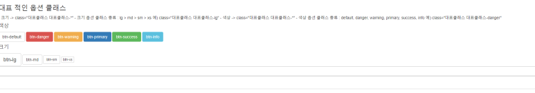
이벤트 메서드
각 콤포넌트들이 특정 행위가(이벤트)가 발동시 등록해놓은 콜백함수가 작동된다.
- data-toggle 속성 : 이벤트 종류(ex: 모달, 드롭다운, 케러셀 등)
- data-target 속성 : 이벤트 작동 대상
- data-dismiss 속성 : 이벤트 종료
그리드 시스템
- 1행을 부모 요소 기준의 크기로 12열 나눈다.
- col-* 접두사로 시작된다.
- 디바이스 크기의 옵션도 부여할수 있다. (디바이스 크기영역에 도달될 시 해당 클래스만 작동)
- col-lg- , com-md- , col-sm- , col-xs-
예) [col-lg-6 col-md-12][col-lg-6 col-md-12] - 1행을 초기화 하는 클래스는 row 클래스이다.(1행을 표현 하기전에 row 클래스로 감싼다.)
1행
- 설정된 디바이스 크기 미만으로 넘어갔을 경우 그 이하의 디바이스 크기 12로 강제 변환
- sm 영역 미만으로 사이즈 변경시 xs-12로 강제 변환
	<div class="row">
		<div class="col-sm-4">
			<div class="alert alert-danger"></div>
		</div>
		<div class="col-sm-4">
			<div class="alert alert-danger"></div>
		</div>
		<div class="col-sm-4">
			<div class="alert alert-danger"></div>
		</div>
	</div>
1행 디바이스 크기별 지정
- 해당 디바이스 크기에 관련된 그리드 시스템 클래스 적용
<div class="row">
		<div class="col-lg-3 col-md-6">
			<div class="alert alert-info"></div>
		</div>
		<div class="col-lg-3 col-md-6">
			<div class="alert alert-info"></div>
		</div>
		<div class="col-lg-3 col-md-6">
			<div class="alert alert-info"></div>
		</div>
		<div class="col-lg-3 col-md-6 ">
			<div class="alert alert-info"></div>
		</div>
	</div>
반응형 유틸
- 특정 디바이스 크기에서만 보이게하거나 감추게 할 수 있다.
- visible-(lg,md,sm,xs)-(inline,block,inline-block)
예시) class="visible-lg-block" -> lg 영역에서만 block 요소로 보인다. - hidden-*(lg,md,sm,xs)
예시) class="hidden-xs" xs 영역에서만 감춘다.
<div class="row">
		<div class="col-lg-3 col-md-6">
			<div class="alert alert-info"></div>
		</div>
		<div class="col-lg-3 col-md-6">
			<div class="alert alert-info"></div>
		</div>
		<div class="col-lg-3 col-md-6">
			<div class="alert alert-info"></div>
		</div>
		<div class="col-lg-3 col-md-6 hidden-xs hidden-sm">
			<div class="alert alert-info">최소 사이즈에서는 안보여야함</div>
		</div>
		<div class="col-xs-12 visible-xs-block">
			<div class="alert alert-warning">작은사이즈 컨텐츠</div>
		</div>
	</div>
빈 영역-> offset
offset이 지정된 대상 왼쪽으로 빈공간 할당
<div class="row">
		<div class="col-sm-3">
			<div class="alert alert-info"></div>
		</div>
		<div class="col-sm-3 col-sm-offset-6">
			<div class="alert alert-info"></div>
		</div>
	</div>

기록하는 삶