시작하기
Angular란?
- 확장 가능한 컴포넌트 구조로 웹 애플리케이션을 만드는 프레임 워크
- 라우팅, 폼 관리, 클라이언-서버 통신 등 웹 개발에 필요한 라이브러리를 조화롭게 통합한 모음집
- 애플리케이션 개발, 빌드, 테스트 수정에 필요한 개발자 도구를 제공
적은 노력으로 큰 생산성 향상 가능, 170만명 이상의 개발자, 컨턴츠 작성자가 Angular 생태계와 함께함
Angular 애플리케이션: 기초
컴포넌트 (Component)
컴포넌트는 애플리케이션을 구성하는 기본 단위이다. @Component() 데코레이터가 붙는 TypeScript 클래스, HTML 탬플릿, 스타일로 구성된다. @Component() 데코레이터는 아래와 같이 Angular에 필요한 정보를 지정하는 역할을 한다.
- 컴포넌트가 템플릿에 사용될 CSS 셀렉터를 지정한다. 템플릿에서 이 셀렉터에 해당되는 HTML 엘리먼트마다 컴포넌트 인스턴스가 생성됨
- Angular가 컴포넌트 내용으로 렌더링할 HTML 템플릿을 지정함
- 템플릿 HTML 엘리먼트의 모습을 지정해야 한다면 이 때 필요한 CSS 스타일을 지정함
import { Component } from '@angular/core';

@Component({
  selector: 'hello-world',
  template: `
    <h2>Hello World</h2>
    <p>This is my first component!</p>
  `
})
export class HelloWorldComponent {
  // 여기에는 컴포넌트의 동작을 정의하는 코드가 들어갑니다.
}
위 컴포넌트는 템플릿에 아래 코드를 추가하여 사용 가능하다.
<hello-world></hello-world>Angular가 컴포넌트를 렌더링하여 아래와 같은 DOM을 보여준다.
<hello-world>
    <h2>Hello World</h2>
    <p>This is my first component!</p>
</hello-world>
컴포넌트는 강력하게 캡슐화 되어있고 직관적이다. 이는 코드 가독성을 높이고 모듈화된 유닛 테스트를 용이하게 한다.
템플릿(Tempates)
컴포넌트가 어떻게 렌더링될지 정의하기 위해 HTML 탬플릿이 존재하며 인라인(template), 별도 파일(templateUrl)로 작성해서 불러올 수 있다.
템플릿은 HTML 문법을 기반으로 작성되며, 컴포넌트 값을 동적으로 반영하도록 구성한다. 컴포넌트의 상태가 변경되면 Angular가 자동으로 렌더링된 DOM을 갱신한다.
아래 코드는 문자열을 동적으로 렌더링하는 컴포넌트의 템플릿 코드이다.
// "./hello-world-interpolation.component.html"
<p>{{ message }}</p>
이 문자열은 컴포넌트 클래스에서 전달된다.
import { Component } from '@angular/core';

@Component ({
  selector: 'hello-world-interpolation',
  templateUrl: './hello-world-interpolation.component.html'
})
export class HelloWorldInterpolationComponent {
    message = 'Hello, World!';
}
템플릿에 이중 중괄호 {{ }}는 템플릿에 문자열을 바인딩하는 문법이다. (message 변수를 불러와서 렌더링 함)
문자열 외에도 Anguar는 HTML 엘리먼트의 프로퍼티, 어트리뷰트의 값을 할당하는 프로퍼티 바인딩(property binding) 문법도 제공한다.
<p
  [id]="sayHelloId"
  [style.color]="fontColor">
  You can set my color in the component!
</p>
아래 코드는 이벤트가 발생했을 때 실행될 메서드를 컴포넌트 클래스에 구현한 코드이다.
sayMessage() {
  alert(this.message);
}
Angular에서 문자열 바인딩과, 프로퍼티 바인딩, 이벤트 바인딩이 어떻게 사용되는지 확인할 수 있다.
// hello-world-bindings.component.ts

import { Component } from '@angular/core';

@Component ({
  selector: 'hello-world-bindings',
  templateUrl: './hello-world-bindings.component.html'
})
export class HelloWorldBindingsComponent {
  fontColor = 'blue';
  sayHelloId = 1;
  canClick = false;
  message = 'Hello, World';

  sayMessage() {
    alert(this.message);
  }

}
// hello-world-bindings.component.html

<button
  type="button"
  [disabled]="canClick"
  (click)="sayMessage()">
  Trigger alert message
</button>
<p
  [id]="sayHelloId"
  [style.color]="fontColor">
  You can set my color in the component!
</p>
<p>My color is {{ fontColor }}</p>
템플릿에 추가 기능을 구현하려면 디렉티브(directive를 사용해야 한다. 가장 많이 사용되는 디렉티브는 *ngIf와 *ngFor가 있다. 디렉티브를 이용하면 DOM 구조를 동적으로 변경하고 다양하게 사용할 수 있다. 아래 코드는 *ngIf 디렉티브를 사용하는 예제 코드이다.
// hello-world-ngif.component.ts

import { Component } from '@angular/core';

@Component({
  selector: 'hello-world-ngif',
  templateUrl: './hello-world-ngif.component.html'
})
export class HelloWorldNgIfComponent {
  message = "I'm read only!";
  canEdit = false;

  onEditClick() {
    this.canEdit = !this.canEdit;
    if (this.canEdit) {
      this.message = 'You can edit me!';
    } else {
      this.message = "I'm read only!";
    }
  }
}
<!-- hello-world-ngif.component.html -->
<h2>Hello World: ngIf!</h2>
<button type="button" (click)="onEditClick()">Make text editable!</button>
<div *ngIf="canEdit; else noEdit">
<p>You can edit the following paragraph.</p>
</div>
<ng-template #noEdit>
<p>The following paragraph is read only. Try clicking the button!</p>
</ng-template>
<p [contentEditable]="canEdit">{{ message }}</p>
Angular는 선언적 템플릿 문법을 사용하기 때문에 화면에 표시되는 단위로 애플리케이션 로직을 분리할 수 있다. 템플릿에는 표준 HTML 문법을 활용하기 때문에 구성하기 쉽고, 관리하고 쉬우며, 수정하기 쉽다. (유지보수성 용이)
의존성 주입(Dependency injection, DI)
Angular는 TypeScirpt 클래스를 활용하는 의존성 주입 시스템을 제공하기 때문에 컴포넌트에 필요한 객체의 인스턴스를 어떻게 생성하는지 직접 신경쓸 필요가 없다. (TypeScript로 작성된 코드를 Component에서 Import하고 constructor를 통해 인스턴스를 생성하는 과정) 의존성 주입을 반드시 알아야하는 것은 아니지만 모범 사례를 보면서 의존성 주입 시스템을 활용했을 때 얻는 장점이 무엇인지 알아보는것을 적극 권장한다.
의존성 시스템이 동작하는 방식을 간단한 예제로 확인해보자. logger.service.ts에는 Logger 클래스가 정의되있으며 이 클래스에는 인자로 받은 숫자를 콘솔에 출력하는 writeCount 함수가 정의되어 있다.
import { Injectable } from '@angular/core';

@Injectable({providedIn: 'root'})
export class Logger {
  writeCount(count: number) {
    console.warn(count);
  }
}
hello-world-di.component.ts 파일에는 Angular 컴포넌트가 정의되어 있다. 이 컴포넌트에는 버튼이 하나 있는데 이를 클릭하면 Logger 클래스에 있는 writeCount 함수를 실행하려고 한다. 그러면 HelloWorldDI 클래스 생성자에 private logger: Logger 코드를 추가해서 Logger 서비스가 의존성 객체로 주입되도록 요청할 수 있다.
import { Component } from '@angular/core';
import { Logger } from '../logger.service';

@Component({
  selector: 'hello-world-di',
  templateUrl: './hello-world-di.component.html'
})
export class HelloWorldDependencyInjectionComponent  {
  count = 0;

  constructor(private logger: Logger) { }

  onLogMe() {
    this.logger.writeCount(this.count);
    this.count++;
  }
}
Angualr CLI
Angular 애플리케이션을 가장 빠르고 쉽게 모범 사례로 개발하려면 Angular CLI를 사용하면 된다.
| 명령 | 설명 |
|---|---|
| ng build | Angular 앱을 컴파일한다. |
| ng serve | 애플리케이션을 빌드하고 개발서버로 서비스한다. 파일이 변경되면 바로 반영한다. |
| ng generate | 스키매틱에 정해진 대로 Angular 구성요소를 생성하거나 수정한다. |
| ng test | 유닉 테스트를 실행한다. |
| ng e2e | 애플리케이션을 빌드하고 개발 서버로 띄운 후에 엔드-투-엔드 테스트를 실행한다. |
Angular CLI에 대해 자세하게 알아보려면 CLI [문서]:(https://angular.kr/cli) 참고
Angular 이해하기
컴포넌트
개요
컴포넌트 기본 요소
- 화면을 렌더링하는 HTML 템플릿
- 동작을 정의하는 TypeScript 클래스
- 컴포넌트를 템플릿에 추가할 때 사용하는 CSS 셀렉터
- 추가로 컴포넌트가 표시되는 모습을 정의하는 CSS 스타일
컴포넌트 라이프싸이클
컴포넌트 인스턴스는 컴포넌트 클래스의 인스턴스를 생성한 시점부터 미리 정의된 라이프싸이클에 따라 동작하며 라이프싸이클 단계에 따라 화면에 렌더링되고 자식 컴포넌트를 화면에 추가한다. 컴포넌트가 동작하는 동안 프로퍼티로 바인딩된 데이터가 변경되었는지 감지하고, 값이 변경되면 화면과 컴포넌트 인스턴스에 있는 데이터를 갱신하기도 한다. 라이프싸이클은 Angular가 컴포넌트 인스턴스를 종료하고 DOM에 템플릿을 제거할 때까지 이어진다. 그리고 디렉티브도 컴포넌트와 비슷하게 Angular가 인스턴스를 생성하고 갱신하며 종료하는 라프싸이클을 따른다.
애플리케이션에서 라이프싸이클 후킹 메서드를 사용하면 컴포넌트나 디렉티브가 동작하는 라이프싸이클에 개입할 수 있으며 인스턴스가 생성되는 시점, 데이터 변화가 감지되는 시점, 데이터 변화가 감지된 이후 시점, 이스턴스가 종료되는 시점에 원하는 동작을 할 수 있다.
라이프싸이클 이벤트에 반응하기
라이프싸이클 이벤트 순서
애플리케이션이 컴포넌트나 디렉티브 클래스의 생성자를 실행하면서 인스턴스를 초기화하고 나면 정해진 시점에 라프싸이클 메서드가 실행된다.
Angular 라이프싸이클 후킹 메서드는 정해진 순서대로 실행한다. 그래서 원하는 용도에 맞게 절절히 사용하는 것이 중요하다.
| 후킹 메서드 | 용도 | 실행시점 |
|---|---|---|
ngOnChanges() | 바인딩된 입력 프로퍼티 값이 처음 설정되거나 변경될 때 실행된다. 이 메서드는 프로퍼티의 이전 값과 현재 값을 표현하는 SimpleChanges 객체를 인자로 받는다. 참고로 이 메서드는 매우 자주 사용되기 때문에 복잡한 로직을 작성하여 오버라이딩 할 경우 성능에 큰 영향을 줄 수 있다 | (컴포넌트에 입력 프로퍼티가 바인딩된 후)ngOnInit()이 실행되기 전에 한 번 실행되며 입력 프로퍼티로 바인딩된 값이 변경될 때마다 실행된다. |
| ngOnInit() | 디렉티브나 컴포넌트에 바인딩된 입력 프로퍼티 값이 처음 할당된 후에 실행된다. | ngOnChanges()가 처음 실행된 후에 한 번 실행된다. ngOnInit() 템플릿에 입력 프로퍼티가 연결되지 않아 ngOnChanges()가 실행되지 않아도 실행된다. |
| ngDoCheck() | Angular가 검출하지 못한 변화에 반응하거나, Angular가 변화를 감지하지 못하게할 때 사용한다. | ngOnInit()이 실행된 직후에 한 번 실행되며, 변화 감지 싸이클이 실행되면서 ngOnChanges()가 실행된 이후에 매번 실행된다. |
| ngAfterContentInit() | Angular가 외부 컨텐츠를 컴포넌트나 디렉티브 뷰에 프로젝션한 이후에 실행된다. | ngDoCheck()가 처음 실행된 이후 한 번 실행된다. |
| ngAfterContentChecked() | Angular가 디렉티브나 컴포넌트에 프로젝션된 컨텐츠를 검사하고 난 후에 실행된다. | ngAfterContentInit()이 실행된 후 ngDoCheck()가 실행된 이후마다 실행된다. |
| ngAfterViewInit() | Angular가 컴포넌트나 디렉티브 화면과 자식 컴포넌트 화면을 초기화한 후에 실행된다 | ngAfterContentChecked()가 처음 실행된 후에 한 번 실행된다. |
| ngAfterViewChecked() | Angular가 컴포넌트나 디렉티브 화면과 자식 화면을 검사한 후에 실행된다. | ngAfterViewInit()가 실행된 후, ngAfterContentChecked()가 실행된 이후마다 실행된다. |
| ngOnDestroy() | Angular가 디렉티브나 컴포넌트 인스턴스를 종료하기 전에 실행된다. 이 메서드는 옵저버블을 구독 해지하거나 이벤트 핸들러를 제거하는 등 메모리 누수를 방지하는 로직을 작성하는 용도로 사용한다. | Angular가 디렉티브나 컴포넌트 인스턴스를 종료하기 직전에 실행된다. |
라이프싸이클 활용 예제
예제 코드에서 최상위 컴포넌트 AppComponent안에 있는 컴포넌트들을 보면 라이프싸이클 후킹 함수를 어떻게 활용하는지 확인할 수 있다. 이 예제 프로젝트에서 AppComponent는 모든 자식 컴포넌트의 테스트 베드로 동작하며 자식 컴포넌트는 개별 라이프싸이클 후킹 메서드를 다룬다.
| 컴포넌트 | 설명 |
|---|---|
| Peek-a-boo | 전체 라이프싸이클 후킹 메서드가 어떻게 동작하는지 보여준다. 개별 후킹 메서드가 실행되는 것을 화면에서 확인할 수 있다 |
| Spy | 커스텀 디렉티브로 라이프싸이클 후킹 메서드를 활용하는 방법에 대해 다룬다. spyDriective에는 ngOnInit()과 ngonDestroy() 후킹 메서드가 정의되어 있으며, 이 디렉티브를 사용해서 엘리먼트가 화면에 추가되고 제거되는 것을 확인할 수 있다. |
| OnChanges | 컴포넌트의 입력 프로퍼티 값이 변경될 때 ngOnChanges()가 어떻게 실행되는지에 대해 다룬다. 후킹 메서드에 전달되는 changes 객체를 어떻게 활용할 수 있는지도 확인 가능하다. |
| ngDoCheck() | 메서드로 커스텀 변화감지 로직을 구현하는 방법에 대해 다룬다. ngDoCheck() 메서드가 얼마나 많이 실행되는지 확인 가능하다. |
| AfterView | Angular에서 의미하는 화면이 무엇인지에 대해 다룬다. ngAfterViewInit() 메서드와 ngAfterViewChecked() 메서드에 대해 다룬다. |
| AfterContent | 외부 커텐츠를 컴포넌트에 프로젝션하는 것에 대해 다룬다. 컴포넌트 자식 뷰와 프로젝션된 컨텐츠를 구분하는 방법도 설명하며 ngAfterContentInit() 메서드와 ngAfterContentChecked() 메서드에 대해 다룬다. |
| Counter | 컴포넌트와 디렉티브를 함께 사용할 때 라이프싸이클 후킹 함수를 각각 어떻게 적용하는지 알수 있다. |
컴포넌트, 디렉티브 초기화하기
ngOnInit() 메서드를 활용하면 다음과 같은 초기화 작업이 가능하다.
| 초기화 작업 | 설명 |
|---|---|
| 생성자 외부에서 초기화되는 복잡한 초기화 작업 | 일반적으로 컴포넌트는 가볍고 간단하게 생성해야 한다 (성능상). 로직이 복잡하거나 외부 데이터를 받아와야하는 상황이라면 초기화 로직을 ngOnInit()에 작성하는 것이 좋다. |
| 입력프로퍼티 값 할당 후 초기화 작업 | 생성자에는 지역 변수를 할당하는 것 외의 로직은 작성하지 않는게 좋다. 디렉티브에 바인딩되는 입력 프로퍼티 값은 생성자가 실행된 후 할당된다. 이 프로퍼티 값에 따라 디렉티브를 초기화해야 한다면 생성자가 아니라 ngOnInit()에서 해야한다. |
입력 프로퍼티에 데이터가 전달되는 것을 가장 먼저 확인할 수 있는 메서드는
ngOnChanges()메서드이다. 하지만ngOnChanges()는ngOnInit()이전뿐 아니라 그 이후에도 여러번 실행된다.ngOnInit()은 한번만 실행되기 때문에 초기화 로직은 이 메서드를 작성하는 것이 좋다.
인스턴스 종료하기
디렉티브나 컴포넌트를 종료하기 전에 실행되어야 하는 로직은 ngOnDestroy()에 작성한다. 해당 메서드는 컴포넌트나 디렉티브가 종료된가는 것을 애플리케이션 다른 영역으로 전달하는 용도로 사용할 수 있다.
ngOnDestory() 메서드를 활용하여 자동으로 정리되지 않는 메모리를 정리할 수 있다
- 옵저버블이나 DOM 이벤트 구독 해지
- 인터벌 타이머 중단
- 디렉티브가 전역이나 애플리케이션 서비스에 등록한 콜백 정리
활용 예제
예제 코드를 통해 라이프싸이클 이벤트를 알아보자
라이프싸이클 이벤트 발생 순서, 빈도
Angular가 라이프싸이클 후킹 메서드를 어떤 순서로 실행하는 지 확인하려면 PeekABootComponet를 확인하면 된다
실제 앱에서 이 컴포넌트처럼 모든 라이프싸이클 메서드를 정의할 일은 거의 없으며, 데모를 위해 구성한 것이다.
이 컴포넌트에서 Create 버튼을 누르고 Destory 버튼을 누르면 아래와 같은 로그가 화면에 표시된다.
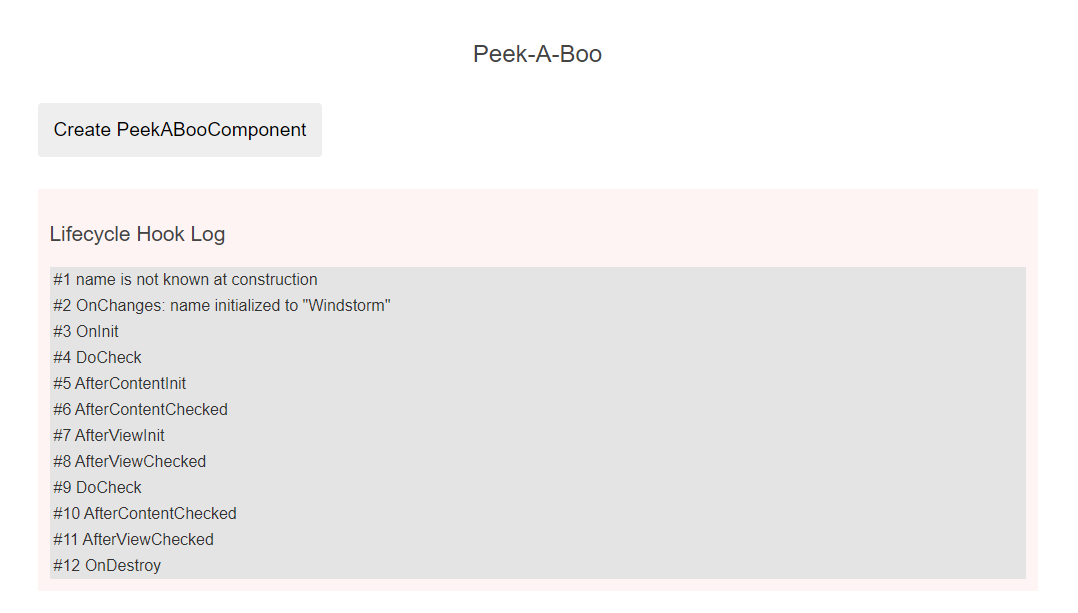
| 실행 순서 | 로그 메세지 |
|---|---|
| 1 | OnChanges |
| 2 | OnInit |
| 3 | DoCheck |
| 4 | AfterContentInit |
| 5 | AfterContentChecked |
| 6 | AfterViewInit |
| 7 | AfterViewChecked |
| 8 | OnDestroy |
입력 프로퍼티(예제의
name프로퍼티)의 값은 생성자가 실행되는 시점에 할당되지 않았다는 것에 주의해야 한다. 그래서 입력 프로퍼티를 활용해서 컴포넌트를 초기화하는 로직은onInit()메서드 안에 작성해야 한다.
그리고 Update Hero 버튼을 누르면 OnChanges 로그와 DoCheck, AfterContentChecked, AfterViewChecked 로그도 함께 출력된다. 이 인터페이스로 구현하는 라이프싸이클 후킹 메서드는 자주 실행되기 때문에 간단한 로직만 작성하는 것이 좋다.
DOM을 추적하는 디렉티브
Spy 예제를 보면 디렉티브에 라이프싸이클 메서드를 정의해서 컴포넌트처럼 사용하는 방법을 확인할 수 있다. SpyDirective에는 엘리먼트가 화면에 표시되는 시점을 확인하기 위해 ngOnInit(),ngOnDestroy() 메서드를 구현했다.
// src/app/spy.directive.ts

let nextId = 1;

// 엘리먼트에 스파이 디렉티브를 자유롭게 적용합니다.
// 사용방법: <div appSpy>...</div>
@Directive({selector: '[appSpy]'})
export class SpyDirective implements OnInit, OnDestroy {
  private id = nextId++;

  constructor(private logger: LoggerService) { }

  ngOnInit() {
    this.logger.log(`Spy #${this.id} onInit`);
  }

  ngOnDestroy() {
    this.logger.log(`Spy #${this.id} onDestroy`);
  }
}
이 스파이 디렉티브는 네이티브 엘리먼트(HTML)나 컴포넌트 엘리먼트에도 자유롭게 적용할 수 있고 동시에 여러 엘리먼트에 적용할 수도 있다.
// src/app/spy.component.html

<p *ngFor="let hero of heroes" appSpy>
  {{hero}}
</p>
Add Hero 버튼을 누르면 스파이 디렉티브에서 정의한 ngOnInit (바인딩된 입력값이 처음 입력될 때 실행)이 실행되며 로그를 기록한다. Reset 버튼을 누르면 히어로 엘리먼트를 모두 삭제하고 스파이 디렉티브에서 정의한 ngOnDestroy()가 실행되며 로그를 기록한다.
변화 감지 후킹 함수 활용하기
컴포넌트나 디렉티브에 바인딩된 입력 프로퍼티 값이 변경된 것을 감지하면 Angular가 ngOnChanges() 메서드를 실행한다. 해당 함수에서 값이 어떻게 변경되었는지 확인하려면 아래와 같이 작성하면 된다.
// on-Changes.component.ts (일부)

ngOnChanges(changes: SimpleChanges) {
  for (const propName in changes) {
    const chng = changes[propName];
    const cur  = JSON.stringify(chng.currentValue);
    const prev = JSON.stringify(chng.previousValue);
    this.changeLog.push(`${propName}: currentValue = ${cur}, previousValue = ${prev}`);
  }
}
ngOnChanges() 메서드는 SimpleChange 객체를 인자로 받는데 이 객체에는 개별 입력 포로퍼티가 객체의 프로퍼티 이름으로 선언되어 이전값과 현재값을 전달한다. 그래서 객체 프로퍼티를 순회하면 어떤 값이 변경되었는지 알 수 있다.
예제로 사용하는 OnChangesCompoent에는 입력 프로퍼티가 2개 존재한다.
// src/app/on-changes.component.ts

@Input() hero!: Hero;
@Input() power = '';
이 입력 프로퍼티들은 OnChangesParentComponent에서 이렇게 바인딩 된다.
// src/app/on-changes-parent.component.html

<on-changes [hero]="hero" [power]="power"></on-changes>
사용자가 입력프로퍼티 값을 변경할 때를 확인해보자
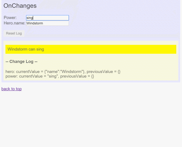
power 프로퍼티의 값이 변경될 때마다 로그가 출력된다. 하지만 hero.name 프로퍼티가 변경된 것은 감지하지 못하고 ngOnChanges() 메서드도 실행되지 않는다. Angular는 기본 상태에서 입력 프로퍼티 객체 자체가 변경된 것만 감지하지 때문에 hero와 같이 객체 자체가 아닌 객체 참조값인 경우 변경을 감지하지 못하는 것이다. (실제 값의 메모리 주소가 아닌 참조 값을 가지는 경우)
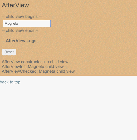
화면이 갱신될 때까지 기다리기
doSomeThing() 메서드는 히어로의 이름이 10글자를 넘어갔을 때 화면에 관련 메세지를 표시하는데 comment 프로퍼티를 갱신하기 전에 한 싸이클(tick) 기다린다.
// 동작을 확인하기 위해 `comment` 값을 변경해 봅니다.
private doSomething() {
  const c = this.viewChild.hero.length > 10 ? "That's a long name" : '';
  if (c !== this.comment) {
    // 컴포넌트의 뷰는 방금 검사를 마쳤기 때문에 한 싸이클 뒤에 실행합니다.
    this.logger.tick_then(() => this.comment = c);
  }
후킹 메서드 ngAfterViewInit()과 ngAfterViewChecked()는 모두 컴포넌트 뷰가 갱신된 후에 실행된다. 이따 컴포넌트에 바인딩되는 comment 프로퍼티 값을 즉시 변경하면 Angular가 에러를 발생 시키기 때문에 LoggerService.tick_then()을 사용하여 브라우저의 JavaScript 싸이클을 한 번 지연시킨 후 새로운 변화 감지 싸이클을 시작하는 방식으로 구현하는 것이 좋다.
성능 저하 주의
AfterView 예제를 실행해보면 별다른 변화가 없어도 AfterViewChecked() 메서드가 자주 실행되는 것을 확인할 수 있다. 이렇게 자주 실행되는 라이프싸이클 후킹 메서드는 복잡한 로직을 작성하지 않아야 성능 저하를 피할 수 있다.
외부 컨텐츠 변경사항 감지하기
컨텐츠 프로젝션(content projection)은 컴포넌트 밖에서 가져온 HTML 컨텐츠를 컴포넌트 템플릿 안에 표시하는 것을 의미한다. 템플릿에 사용된 컨텐츠 프로젝션은 이런 경우이다.
- 컴포넌트 엘리먼트 태그 안에 들어있는 HTML
- 컴포넌트 템플릿에서
<ng-content>가 사용된 부분
AfterContent 예제에서 다루는 AfterContentInit과 AfterContentChecked 후킹 함수는 Angular가 외부 컨텐츠를 컴포넌트 안에 프로젝션한 후 실행된다.
뷰 캡슐화
Angular에서는 컴포넌트에 적용된 CSS 스타일이 컴포넌트 뷰를 대상으로 캡슐화가 진행되어 애플리케이션에 존재하는 다른 컴포넌트에 영향을 주지 않는다.
이 캡슐화 정책은 컴포넌트마다 다르게 지정 가능하나 권장하지 않는다.
뷰 캡슐화 모드
섀도우 돔 설명 : https://ui.toast.com/posts/ko_20170721
| 모드 | 설명 |
|---|---|
ViewEncapsulation.ShadowDom | 브라우저 기본 섀도우 DOM을 활용하여 뷰를 캡슐화 한다. ShadowDom 모드는 브라우저가 섀도우 DOM을 지원할때만 정상 동작하므로 지원하는 브라우저 목록 확인이 필요하다 (Can I use 사이트 문서 참고). 섀도우 DOM은 아직 모든 환경에 사용할 수 없기 때문에 Emulated 모드가 기본값이다. |
ViewEncapsulation.Emulated | 컴포넌트 CSS 셀렉터를 조정해서 섀도우 DOM처럼 캠슐화한다. 상세 내용 |
ViewEncapsulation.None | 뷰 캠슐화를 하지 않는다. 지정한 스타일은 컴포넌트 뿐 아니라 전역 범위에 적용된다. 컴포넌트는 캡슐화되지 않고 HTML 문서에 직접 컴포넌트 스타일을 지정한 것과 같은 효과를 낸다. |
컴포넌트 통신
컴포넌트 상호작용
컴포넌트가 서로 데이터를 주고받는 방법을 다룬다.
부모 컴포넌트에서 자식 컴포넌트로 데이터 전달하기 : 입력 바인딩
@input 데코레이터를 사용하여 부모 컴포넌트에서 자식 컴포넌트로 데이터를 전달할 수 있다.
@Input데코레이터는 부모 - 자식 관계에서만 사용 가능하다.
// component-interaction/src/app/hero-child.component.ts

import { Component, Input } from '@angular/core';

import { Hero } from './hero';

@Component({
  selector: 'app-hero-child',
  template: `
    <h3>{{hero.name}} says:</h3>
    <p>I, {{hero.name}}, am at your service, {{masterName}}.</p>
  `
})
export class HeroChildComponent {
  @Input() hero!: Hero;
  @Input('master') masterName = '';
}
위 코드에서 @Input을 이용해서 masterName을 외부에서 바인딩 할 때 master라는 이름으로 사용하기 위한 선언이 추가된다.
HeroParentComponent는 *ngFor를 사용해서 HeroChildComponent를 만들고 각 컴포넌트마다 master 문자열 프로퍼티를 자식 컴포넌트의 master로 연결하여 반복되는 hero 인스턴스를 자식 컴포넌트의 hero 프로퍼티로 바인딩한다.
here! : Hero; 코드 해석
There will be a scenario when TypeScript believes that certain property, variable will be null or undefined. But if you are sure that this variable cannot be null, then you can use this operator known as Definite Assignment Assertion.
Consider the example:
let a = document.getElementById('hello');

if (a) {
    a.style.width = '100px';
}
TypeScript assumes that variable a may be null since there is no guarantee for this element to exists. So before you can access that variable, you have put in if guard. But if you know that your application is always going to have an HTML element with id #hello, then you can rewrite above code as:
const a = document.getElementById('hello');

a!.style.width = '100px';
// component-interaction/src/app/hero-parent.component.ts
import { Component } from '@angular/core';
import { HEROES } from './hero';
@Component({
selector: 'app-hero-parent',
template: `
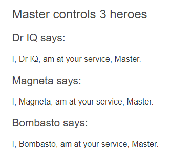
<h2>{{master}} controls {{heroes.length}} heroes</h2>
<app-hero-child
*ngFor="let hero of heroes"
[hero]="hero"
[master]="master">
</app-hero-child>
`
})
export class HeroParentComponent {
heroes = HEROES;
master = 'Master';
}이 앱을 실행하면 다음과 같이 세명의 히어로가 표기된다.
// component-interaction/src/app/app.component.html

<div id="parent-to-child">
  <app-hero-parent></app-hero-parent>
</div>
입력 프로퍼티를 세터(Setter)로 가로채기
부모 컴포넌트에서 값이 전달될 때 추가 로직을 실행하기 위해 입력 프로퍼티에 Setter를 사용해 보자
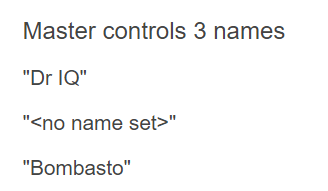
get, set 기능은 javascript 클래스의 고유 기능이다. 해당 기능을 사용해서 데이터를 get하거나 set할 수 있다. set을 수행하는 과정에서 name 프로퍼티가 존재할 경우 (name && name.trim()) 양쪽 끝단의 공백을 제거한 name 프로퍼티를 this_name 값으로 지정하고 name 프로퍼티 값이 존재하지 않는 경우 <no name set> 값을 지정한다.
// component-interaction/src/app/name-child.component.ts

import { Component, Input } from '@angular/core';

@Component({
  selector: 'app-name-child',
  template: '<h3>"{{name}}"</h3>'
})
export class NameChildComponent {
  @Input()
  get name(): string { return this._name; }
  set name(name: string) {
    this._name = (name && name.trim()) || '<no name set>';
  }
  private _name = '';
}
// component-interaction/src/app/name-parent.component.ts

import { Component } from '@angular/core';

@Component({
  selector: 'app-name-parent',
  template: `
    <h2>Master controls {{names.length}} names</h2>

    <app-name-child *ngFor="let name of names" [name]="name"></app-name-child>
  `
})
export class NameParentComponent {
  // 'Dr IQ', '<빈 값>', 'Bombasto'를 표시합니다.
  names = ['Dr IQ', '   ', '  Bombasto  '];
}
ngOnChanges()로 입력 프로퍼티 가로채기
위 방법외 OnChanges 라이프싸이클 후킹 인터페이스를 사용하는 ngOnChanges() 메소드로도 가로챌 수 있다.
가로채야 할 입력 프로퍼티가 여러개라면 해당 방법이 더 편할 수 있다.
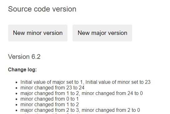
VersionChildCompoenet는 major와 minor 두 입력 프로퍼티 값이 변경되는 것을 감지하고 이 내용을 로그로 출력한다. 부모 컴포넌트에 전달하는 두개의 값 앞에는 @Input 애노테이션을 붙여준다. 값이 변경되면 감지하는 메소드인 ngOnChanges()를 사용해서 값이 변경될 때마다 로그를 기록하고 템플릿을 통해 출력하도록 한다.
// component-interaction/src/app/version-child.component.ts

import { Component, Input, OnChanges, SimpleChanges } from '@angular/core';

@Component({
  selector: 'app-version-child',
  template: `
    <h3>Version {{major}}.{{minor}}</h3>
    <h4>Change log:</h4>
    <ul>
      <li *ngFor="let change of changeLog">{{change}}</li>
    </ul>
  `
})
export class VersionChildComponent implements OnChanges {
  @Input() major = 0;
  @Input() minor = 0;
  changeLog: string[] = [];

  ngOnChanges(changes: SimpleChanges) {
    const log: string[] = [];
    for (const propName in changes) {
      const changedProp = changes[propName];
      const to = JSON.stringify(changedProp.currentValue);
      if (changedProp.isFirstChange()) {
        log.push(`Initial value of ${propName} set to ${to}`);
      } else {
        const from = JSON.stringify(changedProp.previousValue);
        log.push(`${propName} changed from ${from} to ${to}`);
      }
    }
    this.changeLog.push(log.join(', '));
  }
}
// component-interaction/src/app/version-parent.component.ts
content_copy
import { Component } from '@angular/core';

@Component({
  selector: 'app-version-parent',
  template: `
    <h2>Source code version</h2>
    <button type="button" (click)="newMinor()">New minor version</button>
    <button type="button" (click)="newMajor()">New major version</button>
    <app-version-child [major]="major" [minor]="minor"></app-version-child>
  `
})
export class VersionParentComponent {
  major = 1;
  minor = 23;

  newMinor() {
    this.minor++;
  }

  newMajor() {
    this.major++;
    this.minor = 0;
  }
}
자식 컴포넌트에서 보내는 이벤트 받기
자식 컴포넌트에서 외부로 이벤트를 보내려면 EventEmitter 타입으로 선언한 프로퍼티에 @Output() 데코레이터를 사용해서 출력 프로퍼티로 지정하면 된다.
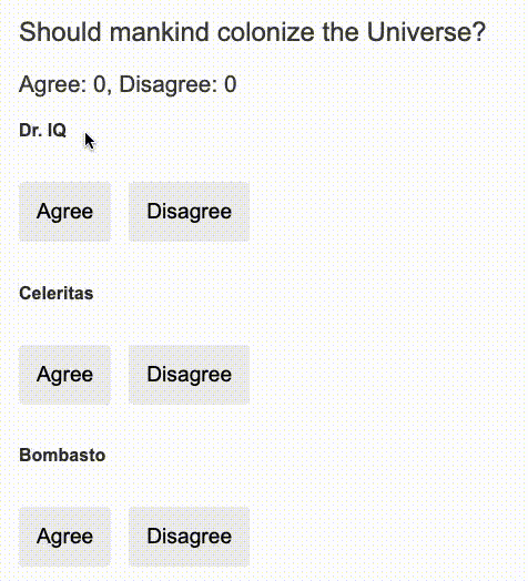
VoteComponent에서는 name 값을 부모 컴포넌트로부터 입력받고 voted 값을 부모 컴포넌트로 보낸다. voted 값은 VoteComponent 템플릿의 button을 클릭할 경우 Agree, Disagree 결과에 따라 boolean 값을 갖는다. 부모 컴포넌트인 VoteTrackerComponent는 해당 값을 $event라는 이름으로 받아서 onVoted() 메서드를 호출하고 해당 메서드는 결과에 따라 agreed, disagreed 값을 증가시키고 템플릿에 반영한다. 기존 컴포넌트 라이프싸이클에 의해서 값이 변경됨에 따라 템플릿 화면이 변경되는 것을 확인할 수 있다.
// component-interaction/src/app/voter.component.ts

content_copy
import { Component, EventEmitter, Input, Output } from '@angular/core';

@Component({
  selector: 'app-voter',
  template: `
    <h4>{{name}}</h4>
    <button type="button" (click)="vote(true)"  [disabled]="didVote">Agree</button>
    <button type="button" (click)="vote(false)" [disabled]="didVote">Disagree</button>
  `
})
export class VoterComponent {
  @Input()  name = '';
  @Output() voted = new EventEmitter<boolean>();
  didVote = false;

  vote(agreed: boolean) {
    this.voted.emit(agreed);
    this.didVote = true;
  }
}
// component-interaction/src/app/votetaker.component.ts
import { Component } from '@angular/core';
@Component({
selector: 'app-vote-taker',
template: `
<h2>Should mankind colonize the Universe?</h2>
<h3>Agree: {{agreed}}, Disagree: {{disagreed}}</h3>
<app-voter
*ngFor="let voter of voters"
[name]="voter"
(voted)="onVoted($event)">
</app-voter>
`
})
export class VoteTakerComponent {
agreed = 0;
disagreed = 0;
voters = ['Dr IQ', 'Celeritas', 'Bombasto'];
onVoted(agreed: boolean) {
if (agreed) {
this.agreed++;
} else {
this.disagreed++;
}
}
}
템플릿 지역 변수로 자식 컴포넌트에 접근하기
부모 컴포넌트에서 자식 컴포넌트의 프로퍼티나 메소드에 직접 접근이 불가능하다. 하지만 자식 컴포넌트의 탬플릿을 부모 컴포넌트의 지역 변수로 선언하면 자식 컴포넌트의 프로퍼티나 메소드에 직접 접근이 가능하다.
예제에서는 <countdown-titmer> 자식 템플릿을 부모 컴포넌트인 <app-counter-parent-lv>에서 지역 변수인 #timer로 지정하여 자식 컴포넌트의 프로퍼티(seconds) 나 메서드(start(), stop())에 접근 가능한 것을 확인할 수 있다.
// component-interaction/src/app/countdown-timer.component.ts

content_copy
import { Component, OnDestroy } from '@angular/core';

@Component({
  selector: 'app-countdown-timer',
  template: '<p>{{message}}</p>'
})
export class CountdownTimerComponent implements OnDestroy {

  intervalId = 0;
  message = '';
  seconds = 11;

  ngOnDestroy() { this.clearTimer(); }

  start() { this.countDown(); }
  stop()  {
    this.clearTimer();
    this.message = `Holding at T-${this.seconds} seconds`;
  }

  private clearTimer() { clearInterval(this.intervalId); }

  private countDown() {
    this.clearTimer();
    this.intervalId = window.setInterval(() => {
      this.seconds -= 1;
      if (this.seconds === 0) {
        this.message = 'Blast off!';
      } else {
        if (this.seconds < 0) { this.seconds = 10; } // reset
        this.message = `T-${this.seconds} seconds and counting`;
      }
    }, 1000);
  }
}
// component-interaction/src/app/countdown-parent.component.ts

content_copy
import { Component } from '@angular/core';
import { CountdownTimerComponent } from './countdown-timer.component';

@Component({
  selector: 'app-countdown-parent-lv',
  template: `
    <h3>Countdown to Liftoff (via local variable)</h3>
    <button type="button" (click)="timer.start()">Start</button>
    <button type="button" (click)="timer.stop()">Stop</button>
    <div class="seconds">{{timer.seconds}}</div>
    <app-countdown-timer #timer></app-countdown-timer>
  `,
  styleUrls: ['../assets/demo.css']
})
export class CountdownLocalVarParentComponent { }
@ViewChild()로 자식 컴포넌트 접근하기
템플릿 변수를 이용해 부모 컴포넌트에서 자식 컴포넌트의 프로퍼티, 메서드에 접근하는 방식은 간단하게 구현 가능하지만 부모 컴포넌트의 템플릿에서만 자식 컴포넌트에 접근할 수 있기 때문에 제한이 발생한다. 부모 컴포넌트의 클래스에서는 자식 컴포넌트에 접근이 불가능하기 때문이다.
컴포넌트의 부모-자식 관계는 컴포넌트가 완전히 생성된 이후(컴포넌트가 인스턴스화 된 이후) 구성되기 때문에 부모 컴포넌트의 클래스에서는 자식 컴포넌트의 프로퍼티를 읽거나 메소드를 실행할 수 없다.
부모 컴포넌트의 클래스에서 자식 컴포넌트에 접근하기 위해서는 ViewChild를 사용해서 부모 컴포넌트로 주입(injection) 해야 한다. (인스턴스화 이전에 자식 컴포넌트를 주입 받아 사용)
테플릿 지역 변수를 사용하는 방식과 ViewChild를 사용하는 방식은 거의 비슷하다. 사용 목적에 따라 구현 방식을 선택하면 된다.
component-interaction/src/app/countdown-parent.component.ts
content_copy
import { AfterViewInit, ViewChild } from '@angular/core';
import { Component } from '@angular/core';
import { CountdownTimerComponent } from './countdown-timer.component';

@Component({
  selector: 'app-countdown-parent-vc',
  template: `
    <h3>Countdown to Liftoff (via ViewChild)</h3>
    <button type="button" (click)="start()">Start</button>
    <button type="button" (click)="stop()">Stop</button>
    <div class="seconds">{{ seconds() }}</div>
    <app-countdown-timer></app-countdown-timer>
  `,
  styleUrls: ['../assets/demo.css']
})
export class CountdownViewChildParentComponent implements AfterViewInit {

  @ViewChild(CountdownTimerComponent)
  private timerComponent!: CountdownTimerComponent;

  seconds() { return 0; }

  ngAfterViewInit() {
    // `seconds()` 메소드는 `CountdownTimerComponent.seconds`에서 다시 구현합니다.
    // 이 때 개발 모드에서 출력하는 단방향 바인딩 검사 에러를 방지하기 위해
    // 한 싸이클 기다려야 합니다.
    setTimeout(() => this.seconds = () => this.timerComponent.seconds, 0);
  }

  start() { this.timerComponent.start(); }
  stop() { this.timerComponent.stop(); }
}
ViewChild 데코레이터와 AfterViewInit 라이프싸이클 후킹 인터페이스를 로드 한다.
이후 CountdownTimerComponent를 timerComponent 프로퍼티로 선언하면서 @ViewChild 데코레이터를 사용했다. (해당 코드는 부모 컴포넌트에서 자식 컴포넌트를 주입 받는 내용이다.)
지역 변수 #timer를 활용했을때와는 다르게 부모 컴포넌트 클래스에 구현되어 있는 seconds(), start(), stop() 함수를 직접 이용한다. 각각의 메서드는 자식 컴포넌트와 연결되도록 구현되어 있다.
이 때 ngAfterViewInit() 라이프싸이클 후킹 함수가 중요하다. 자식 컴포넌트인 CountdownTimerComponent는 Angular가 부모 컴포넌트의 뷰를 화면에 모두 표시한 이후 사용 가능하다. 그래서 뷰가 완전히 준비되기 전까지는 0을 표기한다.
부모 컴포넌트의 뷰가 준비되면 자식 컴포넌트에서 시간을 가져오기 위해 ngAfterViewInit() 라이프싸이클 후킹 함수를 실행하는데 Angular는 단방향 데이터 흐름을 권장하기 떄문에 부모 컴포넌트의 뷰를 같은 JavaScript 실행 싸이클 안에서 갱신하는 것을 금지한다.
그래서 ngAfterViewInit()에서 자식 컴포넌트의 시간을 가져와서 부모 컴포넌트 프로퍼티에 할당하는 것은 setTimeout()으로 한싸이클 늦추었다.
서비스를 사용해서 상호작용하기
부모 컴포넌트와 자식 컴포넌트가 동일한 서비스를 주입받는다면 이 서비스를 활용해서 양방향으로 데이터를 주고받을 수 있다.
컴포넌트에 주입되는 서비스는 그 컴포넌트에서 자유롭게 사용 가능하다. 이 때 주입되는 서비스의 인스턴스가 동일해야 하기 때문에 서비스 프로바이더를 별도로 지정하면 컴포넌트 통신에 활용할 수 없다.
MissionControlCompoenet, MissionService, AstronautComponent 참고
컴포넌트 스타일
Angular 애플리케이션의 스타일인 표준 CSS를 사용해서 지정한다. 추가로 개별 컴포넌트에 컴포넌트 스타일을 적용할 수 있고 CSS 스타일 외에 다른 스타일 도구도 활용 가능하다.
컴포넌트 스타일 사용하기
CSS를 사용하는 가장 간단한 방법은 styles 프로퍼티를 사용하는 것이다.
// src/app/hero-app.component.ts

@Component({
  selector: 'app-root',
  template: `
    <h1>Tour of Heroes</h1>
    <app-hero-main [hero]="hero"></app-hero-main>
  `,
  styles: ['h1 { font-weight: normal; }']
})
export class HeroAppComponent {
/* . . . */
}
컴포넌트 스타일 지정하기
컴포넌트에 스타일을 지정하려면 아래와 같은 방법이 존재한다.
- 컴포넌트 메타데이터에
style이나styleUrls사용하기 - 템플릿 HTML에 인라인으로 지정하기
- 외부 CSS 파일 불러오기
컴포넌트 메타데이터로 스타일 지정하기
@component 데코레이터에는 style 프로퍼티를 지정할 수 있는데 컴포넌트에 이정될 CSS 스타일을 문자열로 지정할 수 있다.
// src/app/hero-app.component.ts (CSS inline)

@Component({
  selector: 'app-root',
  template: `
    <h1>Tour of Heroes</h1>
    <app-hero-main [hero]="hero"></app-hero-main>
  `,
  styles: ['h1 { font-weight: normal; }']
})
export class HeroAppComponent {
/* . . . */
}
위 방법으로 지정하는 경우 해당 컴포넌트에만 적용되며 템플릿 안에 있는 자식 컴포넌트나 이 컴포넌트에 프로젝트되는 다른 컨텐츠에도 적용되지 않는다.
컴포넌트 메타데이터에 외부 스타일 파일 불러오기
컴포넌트의 @component 데코레이터에 styleUrls 프로퍼티를 사용하면 컴포넌트 외부에 있는 CSS 파일을 불러와서 컴포넌트에 적용할 수 있다.
// src/app/hero-app.component.ts (CSS in file)

@Component({
  selector: 'app-root',
  template: `
    <h1>Tour of Heroes</h1>
    <app-hero-main [hero]="hero"></app-hero-main>
  `,
  styleUrls: ['./hero-app.component.css']
})
export class HeroAppComponent {
/* . . . */
}
// src/app/hero-app.component.css

h1 {
  font-weight: normal;
}
위 방법도 컴포넌트에만 CSS가 적용된다.
styles나styleUrls프로퍼티에는 한번에 여러 스타일을 지정하거나 여러 파일을 지정할 수 있다.
템플릿 인라인 스타일
템플릿 자체에 <style> 태그를 이정해서 사용할 수도 있다.
// src/app/hero-controls.component.ts

@Component({
  selector: 'app-hero-controls',
  template: `
    <style>
      button {
        background-color: white;
        border: 1px solid #777;
      }
    </style>
    <h3>Controls</h3>
    <button type="button" (click)="activate()">Activate</button>
  `
})
템플릿 link 태그
컴포넌트 HTML 템플릿에는 <link> 태그를 사용할 수도 있다.
// src/app/hero-team.component.ts

@Component({
  selector: 'app-hero-team',
  template: `
    <!-- We must use a relative URL so that the AOT compiler can find the stylesheet -->
    <link rel="stylesheet" href="../assets/hero-team.component.css">
    <h3>Team</h3>
    <ul>
      <li *ngFor="let member of hero.team">
        {{member}}
      </li>
    </ul>`
})
Angular CLI가 애플리케이션을 빌드할 때
assets폴더에 링크로 연결된 스타일파일이 존재하는지 꼭 확인해야 한다.
전역 스타일 파일
Angular CLI로 애플리케이션의 빌드 설정 파일인 angular.json 파일은 빌드에 포함될 모든 외부 자원을 지정하는데 이 때 외부 스타일 파일을 지정할 수도 있다.
이 때 styles 파일을 활용하면 전역으로 지정될 스타일 파일을 지정할 수 있으며 CLI로 생성한 프로젝트라면 styles.css 파일이 초기값으로 지정된다.
부모, 자식 디렉티브/컴포넌트 끼리 데이터 공유하기
Angular에서는 부모 자식 컴포넌트가 데이터를 주고받는 패턴이 자주 사용되며 @Input, @Output 데코레이터로 구현한다.
<parent-component>
  <child-component></child-component>
</parent-component>
위 코드에서 <parent-component>는 <child-component>의 컨텍스트를 제공하는 역할을 한다.
이때 @Input() 데코레이터는 자식 컴포넌트가 부모 컴포넌트와 통신할 수 있게 해주고 @Output() 데코레이터는 부모 컴포넌트로 데티터를 전달할 때 사용한다.
자식 컴포넌트로 데이터 전달하기
@Input() 데코레이터는 자식 컴포넌트/디렉티브에 있는 특정 프로퍼티가 부모 컴포넌트/디렉티브에서 값을 받는다는 것을 지정하는 데코레이터이다.
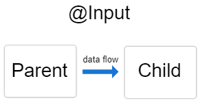
@Input() 데코레이터는 부모-자식 관계에서만 사용 가능하다.
자식 컴포넌트 설정하기
// src/app/item-detail/item-detail.component.ts

import { Component, Input } from '@angular/core'; // Input 심볼을 로드합니다.
export class ItemDetailComponent {
  @Input() item = ''; // 프로퍼티에 @Input() 데코레이터를 지정합니다.
}
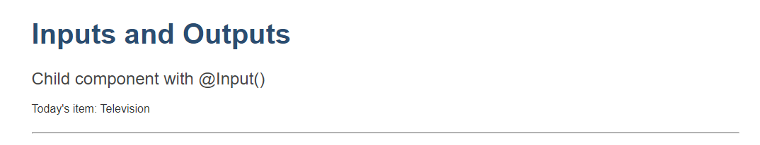
위 코드에서는 자식 컴포넌트 ItemDetailComponent에서 @Input() 데코레이터를 사용하여 string 타입의 item 프로퍼티를 지정한다. 이렇게 @Input() 데코레이터로 지정된 프로퍼티는 부모 컴포넌트에서 사용 사능하다.@Input() 프로퍼티에는 number, string, boolean, object 등 어떠한 타입이라도 자유롭게 전달 가능하다. item 프로퍼티에 맞는 타입으로 데이터를 전달(부모 -> 자식)하는 것은 부모 컴포넌트의 몫이다.
// src/app/item-detail/item-detail.component.html

<p>
  Today's item: {{item}}
</p>
위와 같이 자식 컴포넌트의 템플릿에 item 프로퍼티를 활용하는 코드를 작성한다.
부모 컴포넌트 설정하기
부모 컴포넌트의 템플릿 파일인 app.componenet.html에 아래 코드를 추가한다.
// src/app/app.component.html

<app-item-detail [item]="currentItem"></app-item-detail>
부모 컴포넌트 클래스에 crrentItem 값을 할당한다.
// src/app/app.component.ts

export class AppComponent {
  currentItem = 'Television';
}
@Input() 데코레이터를 사용하면 부모 컴포넌트의 currentItem 값이 자식 컴포넌트의 item 프로퍼티로 전달되기 때문에 자식 컴포넌트 템플릿에 정의된 대로 Television 이라는 값이 화면에 렌더링된다.
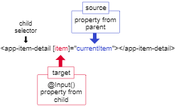
이때 프로퍼티 바인딩(부모 컴포넌트 템플릿에서 자식 컴포넌트 클래스 값을 할당하는 행위) 대상이 되는 프로퍼티는 부모 컴포넌트 템플릿에 대괄호([])로 감싼 프로퍼티이고 자식 컴포넌트 클래스 @Input() 데코레이터를 지정한 프로퍼티이기도 하다. 바인딩 하는 대상은 등호(=) 오른쪽에 있는 부모 컴포넌트 클래스 프로퍼티이다.
// src/app/app.component.ts


import { Component } from '@angular/core';

@Component({
  selector: 'app-root',
  templateUrl: './app.component.html',
  styleUrls: ['./app.component.css']
})

export class AppComponent {
  currentItem = 'Television';

  lastChanceItem = 'Beanbag';
  items = ['item1', 'item2', 'item3', 'item4'];
  wishlist = ['Drone', 'Computer'];


  addItem(newItem: string) {
    this.items.push(newItem);
  }


  crossOffItem(item: string) {
    console.warn(`Parent says: crossing off ${item}.`);
  }

  buyClearanceItem(item: string) {
    console.warn(`Parent says: buying ${item}.`);
  }

  saveForLater(item: string) {
    console.warn(`Parent says: saving ${item} for later.`);
  }

  addToWishList(wish: string) {
    console.warn(`Parent says: adding ${this.currentItem} to your wishlist.`);
    this.wishlist.push(wish);
    console.warn(this.wishlist);
  }
}
<app-item-detail [item]="currentItem"></app-item-detail>
@Input() 변화 감지하기
@Input() 프로퍼티로 전달되는 값이 변경되는 것을 감지하려면 ngOnChanges 라이프싸이클 후킹 함수를 사용하면 된다. OnChanges 섹션 참고
부모 컴포넌트로 데이터 전달하기
자식 컴포넌트/디렉티브에 @Output() 데코레이터를 사용하면 부모 컴포넌트/디렉티브로 데이터를 전달할 수 있다.
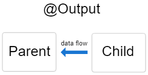
@Output() 데코레이터는 자식 컴포넌트 프로퍼티 중 부모 컴포넌트로 데이터를 보내는 프로퍼티를 지정하는 역할을 한다.
부모 컴포넌트로 데이터를 전달하기 위해 자식 컴포넌트에서 이벤트를 발생시키는데 이때 @Output() 데코레이터와 EventEmitter 타입을 프로퍼티에 선언하여야 한다. EventEmitter dlqpsxm zmffotmsms @angular/core 패키지에서 제공하는 클래스이다.
이번 예제에서는 자식 컴포넌트 템플릿에 있는 HTML <input> 엘리먼트에서 데이터를 받아 부모 컴포넌트로 전달하는 예제를 알아보자.
@Output() 데코레이터를 사용하려면 부모, 자식 컴포넌트 모두를 수정해야 한다.
자식 컴포넌트 설정하기
자식 컴포넌트 템플릿의 <input> 엘리먼트에 문자열을 입력 후 버튼을 클릭하면 이벤트가 발생되는 코드를 작성한다. 해당 이벤트는 EventEmitter를 사용해서 부모 컴포넌트로 전달된다.
- 자식 컴포넌트 클래스 파일에
Output,EventEmitter심볼을 로드한다.
// src/app/item-output/item-output.component.ts

import { Output, EventEmitter } from '@angular/core';
- 컴포넌트 클래스에서 프로퍼티에
@Output()데코레이터를 지정하고EevnetEmitter타입으로 선언된newItemEvent프로퍼티에@Output()데코레이터를 지정한다.
// src/app/item-output/item-output.component.ts

@Output() newItemEvent = new EventEmitter<string>();
| 선언부 | 설명 |
|---|---|
@Output() | 자식 컴포넌트에서 부모 컴포넌트로 데이터를 전달하는 프로퍼티를 지정한다. |
| newItemEvent | @Output() 데코레이터가 지정된 프로퍼티이다. |
EventEmitter<string> | @Output 데코레이터의 타입이다. |
new EventEmitter<string>() | 문자열 타입으로 이벤트를 전달하는 이벤트 이미터 인스턴스를 생성한다. |
- 자식 컴포넌트 클래스에
addNewItem()메서드를 추가한다.
// src/app/item-output/item-output.component.ts

export class ItemOutputComponent {

  @Output() newItemEvent = new EventEmitter<string>();

  addNewItem(value: string) {
    this.newItemEvent.emit(value);
  }
}
addNewItem() 함수는 @Output() 데코레이터가 지정된 newItemEvent를 활용해서 이벤트를 발생시키며 이 때 <input> 엘리먼트에 사용자가 입력한 값을 함께 전달한다.
자식 컴포넌트 템플릿 설정하기
자식 컴포넌트 템플릿에는 폼 컨트롤이 2개 존재한다. 하나는 사용자가 입력할 수 있는 <input> 엘리먼트이다. 해당 엘리먼트에서는 템플릿 참조 변수인 newItem이 지정되어 있으며 사용자가 <input> 엘리먼트에 입력한 값을 참조하려면 #newItem 변수의 value 프로퍼티를 참조하면 된다.
// src/app/item-output/item-output.component.html

<label for="item-input">Add an item:</label>
<input type="text" id="item-input" #newItem>
<button type="button" (click)="addNewItem(newItem.value)">Add to parent's list</button>
또 다른 엘리먼트는 click 이벤트가 바인딩된 <button> 엘리먼트이다. 이 엘리먼트의 (click) 이벤트는 자식 컴포넌트 클래스의 addNewItem() 메서드와 바인딩되어 있다. addNewItem() 메서드는 #newItem.value 값을 인자로 받는다. (newItem.value는 결국 input 엘리먼트에 입력된 값을 의미한다.)
(click) 이벤트가 발생되면 <input>의 입력값인 newItem.value 값이 addNewItem을 호출하고 해당 메서드는 newItemEvent 값을 이용하여 이벤트를 생성한다. 이렇게 생성된 이벤트는 부모 컴포넌트로 전달된다.
부모 컴포넌트 설정하기
// src/app/app.component.ts

export class AppComponent {
  items = ['item1', 'item2', 'item3', 'item4'];

  addItem(newItem: string) {
    this.items.push(newItem);
  }
}
부모 컴포넌트의 addItem() 메서드는 인자로 받은 문자열을 items 배열에 저장한다.
부모 컴포넌트 템플릿 설정하기
-
부모 컴포넌트 메서드와 자식 컴포넌트의 이벤트는 부모 컴포넌트 템플릿에서 바인딩 한다.
-
부모 컴포넌트 템플릿 파일
app.componenet.html에 자식 컴포넌트 셀렉터<app-item-output>를 추가한다.
// src/app/app.component.html

<app-item-output (newItemEvent)="addItem($event)"></app-item-output>
이벤트 바인딩 (newItemEvent)='addItem($event)'에 사용된 문법을 보면 자식 컴포넌트에서 newItemEvent 이벤트가 발생하면 부모 컴포넌트 메서드 addItem()을 실행하게 되어있다. $event 객체에는 자식 컴포넌트가 전달한 데이터가 담겨져 있다. 이 예제에서는 자식 컴포넌트의 <input>에 사용자가 입력한 값이 전달된다.
@Output() 데코레이터가 동작하는 것을 확인하기 위해 부모 컴포넌트에 이런 코드를 추가한다.
// src/app/app.component.html

<ul>
  <li *ngFor="let item of items">{{item}}</li>
</ul>
*ngFor는 items 배열을 순회하며 템플릿을 반복해서 렌더링 한다. 자식 컴포넌트 템플릿 <input>에서 값을 입력하고 버튼을 클릭하는 경우 자식 컴포넌트에서 이벤트가 발생하고 해당 이벤트와 바인딩된 부모 컴포넌트 addItem() 메서드가 실행되면서 items 배열에 새로운 항목이 추가되고 화면에 렌더링 된다. (이때 바인딩된 프로퍼티 변화 감지는 ngOnChanges 라이프싸이클 함수로 가능하다.)
@Input(), @Output() 함께 사용하기
@Input(), @Output() 데코레이터는 자식 컴포넌트에서 함께 사용 가능하다.
// src/app/app.component.html

<app-input-output
  [item]="currentItem"
  (deleteRequest)="crossOffItem($event)">
</app-input-output>
@Input() 데코레이터가 지정된 item 프로퍼티는 부모 컴포넌트 currentItem 프로퍼티에서 값을 받아온다. 이후 사용자가 삭제 버튼을 클릭하면 자식 컴포넌트에서 deleteRequest 이벤트가 발생하는데 이 이벤트를 부모 컴포넌트가 감지하고 있다가 crossOffItem() 메서드를 실행하고 console 메세지에 자식 컴포넌트에서 받아온 item 프로퍼티를 보여준다.
아래 그림을 보면 <app-input-output>에 사용된 @input() 데코레이터와 @Output() 데코레이터가 어떻게 연결되는지 확인 할 수 있다.
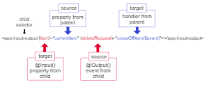
자식 컴포넌트에 item 프로퍼티와 deleteRequest 프로퍼티는 각각 @Input() 데코레이터와 @Output() 데코레이터가 지정되어 있다. 그리고 currentItem() 메서드는 부모 컴포넌트 클래스에 정의되어 있다.
프로퍼티 바인딩과 이벤트 바인딩을 결합한 상자안에 있는 바나나 ([()]) 문법에 대한 내용은 양방향 바인딩 문서를 참고하면 된다.
컨텐츠 프로젝션
컨텐츠 프로젝션은 어떤 내용을 다른 컴포넌트 안으로 넣는 개발 패턴이다. 이 팬턴을 활용하면 어떤 컴포넌트가 전달하는 컨텐츠를 Card 컴포넌트가 받아서 표시할 수 있다.
| 프로젝션 방식 | 설명 |
|---|---|
| 단일 슬롯 컨텐츠 프로젝션 | 컴포넌트 외부에서 컨텐츠를 하나만 받는다. |
| 다중 슬롯 컨텐츠 프로젝션 | 컴포넌트 외부에서 컨텐츠를 여러 개 받는다. |
| 조건별 컨텐츠 프로젝션 | 특정 조건에 맞는 컨텐츠만 프로젝션 해서 렌더링 한다. |
단일 슬롯 컨텐츠 프로젝션
컴포넌트 외부에서 컨텐츠를 하나만 받아 렌더링하는 방식이다.
- 컴포넌트 생성
- 컴포넌트 템플릿에
<ng-content>엘리먼트를 추가한다. 외부에서 받아온 컨텐츠는 이 엘리먼트 안에 렌더링된다.
<ng-content> 엘리먼트 안에 외부에서 받아온 메세지를 표시한다면 아래처럼 구현하면 된다.
// content-projection/src/app/zippy-basic/zippy-basic.component.ts

import { Component } from '@angular/core';

@Component({
  selector: 'app-zippy-basic',
  template: `
    <h2>Single-slot content projection</h2>
    <ng-content></ng-content>
  `
})
export class ZippyBasicComponent {}
<ng-content> 엘리먼트를 추가하고 나면 이 컴포넌트를 사용하면서 컴포넌트 안으로 전달할 메세지를 지정하면 된다.
// content-projection/src/app/app.component.html

<app-zippy-basic>
  <p>Is content projection cool?</p>
</app-zippy-basic>
<ng-content>엘리먼트는 컨텐츠가 표시될 위치만 지정하는 엘리먼트이고 DOM 트리에 실제로 생성되는 DOM 엘리먼트는 아니다.<ng-content>에 사용된 커스텀 어트리뷰트는 무시된다.
다중 슬롯 컨텐츠 프로젝션
컴포넌트에 슬롯을 여러개 둘 수도 있다. CSS 셀럭터를 통해 이것을 지정할 수 있다. 이러한 방식을 다중 슬롯 컨텐츠 프로젝션이라고 한다. <ng-content>에서 select 어트리뷰트를 지정하여 컨텐츠가 들어갈 위치를 정확히 지정 가능하다.
- 컴포넌트를 생성한다.
- 컴포넌트 템플릿에
<ng-content>엘리먼트를 추가한다. 외부에서 받아온 컨텐츠는 이 엘리먼트 안에 렌더링된다. <ng-content>에select어트리뷰트를 추가한다. Angular는 태그 이름, 어트리뷰트, CSS 클래스,:not과 같은 가상 클래스를 모두 셀렉터로 지원한다.
// content-projection/src/app/zippy-multislot/zippy-multislot.component.ts

import { Component } from '@angular/core';

@Component({
  selector: 'app-zippy-multislot',
  template: `
    <h2>Multi-slot content projection</h2>

    Default:
    <ng-content></ng-content>

    Question:
    <ng-content select="[question]"></ng-content>
  `
})
export class ZippyMultislotComponent {}
question 어트리뷰트가 지정된 컨텐츠가 렌더링되는 ng-content 엘리먼트는 select=[question] 어트리뷰트가 지정된 엘리먼트가 된다.
// content-projection/src/app/app.component.html

<app-zippy-multislot>
  <p question>
    Is content projection cool?
  </p>
  <p>Let's learn about content projection!</p>
</app-zippy-multislot>
ng-content에select가 지정되지 않으면 지정되지 않은 모든 컨텐츠가ng-content에 프로젝션된다. 이 예제에서는 두 번째ng-content엘리먼트에만select어트리뷰트가 선언되었기 때문에 첫 번째ng-content엘리먼트에는 렌더링될 위치가 지정되지 않은 컨텐츠가 모두 표시된 것이다.
// content-projection/src/app/app.component.html

<p>Let's learn about content projection!</p>
조건별 컨텐츠 프로젝션
컴포넌트가 조건에 따라 렌더링 해야하거나 한 컨텐츠를 여러번 렌더링해야할 경우 <ng-template> 엘리먼트를 사용해서 조건을 지정할 수 있다.
컨텐츠 프로젝션을 이런 용도로 사용하는 경우 <ng-content>를 권장하지 않는다. 왜냐하면 컨텐츠를 받아서 표시하는 컴포넌트 입장에서는 이 컨텐츠가 반드시 초기화가 끝난 상태여야 하는데 이런 제약은 <ng-content>에 *ngIf가 적용되었거나 *ngIf 구문 안쪽으로 <ng-content> 엘리먼트가 있는 경우에도 해당하기 떄문이다.
<ng-template> 엘리먼트를 사용하면 자유로운 조건으로 렌더링될 컨텐츠를 지정할 수 있고 한 컨텐츠를 여러 번 렌더링할 수도 있다. <ng-template> 안에 있는 컨텐츠는 실제로 렌더링되는 시점에 Angular가 초기화를 수행한다.
- 컴포넌트를 생성한다.
- 컴포넌트 탬플릿에
<ng-container>엘리먼트를 추가한다. 이 엘리먼트에는<ng-template>엘리먼트 내용이 표시된다.
// content-projection/src/app/example-zippy.template.html

<ng-container [ngTemplateOutlet]="content.templateRef"></ng-container>
위 내용에서 조건에 맞는 <ng-template> 엘리먼트를 선택하기 위해 ngTemplateOutlet 디렉티브를 사용했다. 디렉티브는 모든 엘리먼트에 사용할 수 있다. 이 예제에서는 실제 DOM 엘리먼트에 렌더링되지 않는 ng-container 엘리먼트에 사용했다.
<ngTemplateOutlet은 설정된 TemplateRef의 내장된 뷰형태를 제공하는 역할을 한다. (준비된 TemplateRef를 뷰에 실어줌)
<ng-container>엘리먼트를div와 같은 엘리먼트로 감싸고 이 엘리먼트에 조건을 지정한다.<ng-content></ng-content>코드에는<ng-template>로 지정한 컨텐츠가 입력된다.
// content-projection/src/app/example-zippy.template.html

<ng-content></ng-content>
<div *ngIf="expanded" [id]="contentId">
    <ng-container [ngTemplateOutlet]="content.templateRef"></ng-container>
</div>
- 이제 프로젝션될 컨텐츠는
<ng-template>안에 이렇게 구성하면 된다.
// content-projection/src/app/app.component.html

<ng-template appExampleZippyContent>
  It depends on what you do with it.
</ng-template>
<ng-template> 엘리먼트 내부에는 컴포넌트가 받아서 렌더링할 컨텐츠를 추가했다. 컴포넌트 <TemplateRef>나 @ContentChild, @ContentChildren 데코레이터를 사용해서 이 템플릿 컨텐츠를 참조할 수 있다. 이 예제에서는 템플릿을 참조하기 위해 appExampleZippyContent라는 커스텀 디렉티브를 사용했다. 이렇게 <ng-template>을 컴포넌트 클래스에서 TemplateRef 타입으로 참조하면 ngTemplateOutlet 디렉티브나 ViewContainerRef.createEmbeddedView를 사용해서 컨텐츠를 렌더링할 수 있다.
- 템플릿에 사용할 어트리뷰트 디렉티브를 생성한다. 이 디렉티브에는
TemplateRef인스턴스를 의존성으로 주입한다.
// content-projection/src/app/example-zippy.component.ts

@Directive({
  selector: '[appExampleZippyContent]'
})
export class ZippyContentDirective {
  constructor(public templateRef: TemplateRef<unknown>) {}
}
이전 단계에서 <ng-template> 엘리턴트에 커스텀 디렉티브 appExampleZippyDirective를 지정했다. 이 디렉티브 코드는 Angular가 커스텀 어트리뷰트로 템플릿을 참조하기 위해 정의한 것이다.
- 컨텐츠가 렌더링될 컴포넌트에서
@ContentChild를 사용해서 프로젝션될 컨텐츠 템플릿을 참조한다.
// content-projection/src/app/example-zippy.component.ts

@ContentChild(ZippyContentDirective) content!: ZippyContentDirective;
여기까지 진행하고 나면 컴포넌트는 특정 조건을 만족하는 템플릿에만 인스턴스를 생성한다. 그리고 대상이 되는 템플릿은 커스텀 디렉티브를 지정해두고 @ComponentChild 데코레이터를 사용해서 컴포넌트 클래스에 할당했다.
다중 슬롯 컨텐츠 프로젝션을 활용하는 경우
@ContentChildren는 프로젝션된 엘리먼트를 모은QueryList를 반환한다.
애플리케이션 동작 순서
1. 컴포넌트, 디렉티브 생성
// content-projection/src/app/example-zippy.component.ts

import { Component, Directive, Input, TemplateRef, ContentChild, HostBinding, HostListener } from '@angular/core';

@Directive({
  selector: 'button[appExampleZippyToggle]',
})
export class ZippyToggleDirective {
  @HostBinding('attr.aria-expanded') ariaExpanded = this.zippy.expanded;
  @HostBinding('attr.aria-controls') ariaControls = this.zippy.contentId;
  @HostListener('click') toggleZippy() {
    this.zippy.expanded = !this.zippy.expanded;
  }
  constructor(public zippy: ZippyComponent) {}
}

let nextId = 0;

@Directive({
  selector: '[appExampleZippyContent]'
})
export class ZippyContentDirective {
  constructor(public templateRef: TemplateRef<unknown>) {}
}

@Component({
  selector: 'app-example-zippy',
  templateUrl: 'example-zippy.template.html',
})
export class ZippyComponent {
  contentId = `zippy-${nextId++}`;
  @Input() expanded = false;
  @ContentChild(ZippyContentDirective) content!: ZippyContentDirective;
}
- Template 생성
// content-projection/src/app/example-zippy.template.html

<ng-content></ng-content>
<div *ngIf="expanded" [id]="contentId">
    <ng-container [ngTemplateOutlet]="content.templateRef"></ng-container>
</div>
app.component.html코드에 의해 디렉티브 내의 클래스가 인스턴스화 된다.
<app-example-zippy>
  <button type="button" appExampleZippyToggle>Is content project cool?</button>
  <ng-template appExampleZippyContent>
    It depends on what you do with it.
  </ng-template>
</app-example-zippy>
appExampleZippyToggle 클래스인 ZippyToggleDirective가 초기화되어 해당 클래스의 생성자인 ZippyComponent를 생성한다. ZippyComponent는 컴포넌트로 해당 클래스인 ZippyComponent를 초기화 하면서 @ContentChild 디렉티브를 이용하여 TemplateRef 형태의 ZippyContentDirective에 example-zippy.template.html의 ngTemplateOutlet이 가르키고 있는 content.templateRef를 지정한다. 이것은 div 태그에 적용된 ngIf 디렉티브에 의해 false일 경우 렌더링하지 않고 true일 경우 렌더링하는 구조이다.
ZippyContentDirective는ZippyComponent클래스에서 생성되고@ContentChild에 의해 지정되었다. 이때app.component.html의<ng-template>코드의 내용이ZippyContentDirective인스턴스 내용으로 지정되고 해당 인스턴스는example-zippy.template.html의<ng-content>에 프로젝션 되는데ngTemplateOutlet에 지정된content.templateRef에 의해ngIf조건에 따라 렌더링 여부가 결정된다.
# 디렉티브 사용 예제
# 어트리뷰트 디렉티브
# NgIf
# DOM 엘리먼트 추가 없이 디렉티브 적용하기
템플릿
사용자의 인터페이스를 구성한다. 템플릿은 HTML로 작성하며 여기에 Angular가 제공하는 문법을 적용해서 기능을 추가한다.
템플릿 실행문
템플릿 실행문은 HTML 템플릿 내부에서 메서드를 실행하거나 프로퍼티를 조작하는 로직을 의미한다. 템플릿 실행문을 활용하면 사용자의 이벤트에 맞춰서 컨텐츠를 동적으로 변경하거나 폼을 제출할 수 있다.
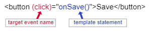
아래 예제에서 deleteHero()라고 작성된 것처럼 템플릿 실행문은 (이벤트)="실행문"이라는 형식으로 사용된다.
// src/app/app.component.html

<p>Component statement context ( (click)="onSave() )
<div class="context">
  <button type="button" (click)="deleteHero()">Delete hero</button>
</div>
Delete Hero 버튼을 클릭하면 deleteHero() 메서드가 실행된다.
deleteHero(hero?: Hero) {
	this.alert(`Delete ${hero ? hero.name : 'the hero'}.`);
  }
템플릿 실행문은 엘리먼트, 컴포넌트, 디렉티브에 모두 사용 가능하다.
실행문의 컨텍스트
템플릿 실행문은 애플리케이션의 특정 컨텍스트 안에서 동작한다. 일반적으로 템플릿 실행문의 컨텍스트(범위)는 컴포넌트 인스턴스와 같으며(컴포넌트 클래스) 템플릿 실행문은 실행문 컨텍스트 안에 있는 것만(컴포넌트 클래스) 참조할 수 있다.
템플릿 실행문의 컨텍스트 안에서 템플릿 컨텍스트에 있는 프로퍼티 참조 코드
<button type="button" (click)="onSave($event)">Save</button>
<button type="button" *ngFor="let hero of heroes" (click)="deleteHero(hero)">{{hero.name}}</button>
<form #heroForm (ngSubmit)="onSubmit(heroForm)"> ... </form>
바인딩
Angular 템플릿 안에서 바인딩을 활용하면 템플릿의 UI조각(DOM 엘리먼트, 디렉티브, 컴포넌트)와 모델(템플릿과 연결된 컴포넌트 인스턴스)을 연결할 수 있다. 모델과 화면을 동기적으로 연결하고, 화면에서 이벤트가 발생하면 모델에 알릴 수 있으며 그 반대 방향도 가능하다. 이 역할은 Angular가 제공하는 변화 감지 알고리즘이 담당한다.
바인딩 종류
- 문자열 바인딩
- 프로퍼티 바인딩
- 이벤트 바인딩
- 양방향 바인딩
바인딩은 바인딩된 값을 받을 대상(target)과 모델에서 값을 전달하는 템플릿 표현식으로 구성한다.
표현식의 컨텍스트
템플릿에 사용되는 표현식은 독립적인 컨텍스트를 갖는다. 이 컨텍스트는 컴포넌트의 인스턴스 범위이다.
recommended와 itemImageUrl2는 AppComponent 안에 있는 프로퍼티를 가르킨다.
// src/app/app.component.html

<h4>{{recommended}}</h4>
<img alt="item 2" [src]="itemImageUrl2">
표현식은 템플릿 안쪽 컨텍스트에 있는 템플릿 입력 변수나 템플릿 차조 변수를 참조할 수 있다.
아래 코드에서 customer는 템플릿 입력 변수이다.'
// src/app/app.component.html (템플릿 입력 변수)

<ul>
  <li *ngFor="let customer of customers">{{customer.name}}</li>
</ul>
아래 코드에서 #customerInput은 템플릿 참조 변수이다.
// src/app/app.component.html (템플릿 참조 변수)

<label>Type something:
  <input #customerInput>{{customerInput.value}}
</label>
문자열 바인딩
기본적으로 문자열 바인딩은 이중 중괄호({{, }})를 구분자로 사용한다.
Angular 컴포넌트 내부에 currentCustomer라는 프로퍼티가 있다고 가정하자.
currentCustomer = 'Maria';이 프로퍼티 값(애트리뷰트)을 템플릿에 표시하려면 이렇게 작성하면 된다.
<h3>Current customer: {{ currentCustomer }}</h3>이 예제에서 currentCustomer값은 Maria로 대체된다. 위와 동일하게 아래의 예제 코드도 작성되었다.
<p>{{title}}</p>
<div><img alt="item" src="{{itemImageUrl}}"></div>
프로퍼티 바인딩
프로퍼티 바인딩을 활용하면 HTML 엘리먼트나 디렉티브의 프로퍼티 값을 지정할 수 있으며 버튼을 비활성화 하거나 이동할 주소를 프로그램 로직으로 할당할 수 있고 컴포넌트 데이터를 전달할 수 있다.
데이터 흐름 이해하기
프로퍼티 바인딩에서 데이터는 컴포넌트 프로퍼티에서 대상 엘리먼트 프로퍼티로 한방향으로만 움직인다.
Component property -> Element property
프로퍼티에 바인딩 하기
엘리먼트 프로퍼티에 바인딩하려면 대상 프로퍼티를 대괄호로 감싸는 문법을 사용해야 한다. 이 때 대상 프로퍼티는 값을 지정하고자 하는 DOM 프로퍼티이다. 아래 예제에서 <img> 엘리먼트의 src 프로퍼티가 대상 프로퍼티가 된다.
// src/app/app.component.html

<img alt="item" [src]="itemImageUrl">
// src/app/app.component.ts
... 중략
export class AppComponent {
itemImageUrl = '../assets/phone.png';
...
위 예제에서 src는 <img> 엘리먼트의 프로퍼티이다. 대괄호가 사용되면 Angular는 프로퍼티 바인딩 표현식의 등호 오른쪽에이 있는 표현식을 평가하고 그렇지 않은 경우에는 등호 오른쪽에 있는 문자열을 단순한 문자열 리터럴로 인식하여 프로퍼티에 바인딘된다.
// src/app.component.html
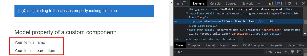
<app-item-detail childItem="parentItem"></app-item-detail>
위 예제에서 바인딩되는 값은 parentItem 프로퍼티 값이 아니라 parentItem이라는 문자열이다.
엘리먼트 프로퍼티 설정하기
<img> 엘리먼트의 src 프로퍼티를 컴포넌트 itemImageUrl 프로퍼티의 값으로 바인딩하려면 대괄호를 사용해서 아래와 같이 작성하면 된다.
// src/app/app.component.html

<img alt="item" [src]="itemImageUrl">
itemImageUrl 프로퍼티는 AppComponent에 정의되어 있다.
// src/app/app.component.ts

itemImageUrl = '../assets/phone.png';
colspan과 colSpan
colspan 어트리뷰트와 colSpan 프로퍼티는 다르다. 바인딩하는 대상이 같은 철자로 헷갈릴 수 있으니 주의하자
colSpan 프로퍼티 바인딩은 이렇게 사용한다.
<!-- colSpan 프로퍼티는 캐멀 케이스입니다. -->
<tr><td [colSpan]="1 + 1">Three-Four</td></tr>
// src/app/app.component.html
컴포넌트에 있는 isUnchanged 프로퍼티를 사용해서 버튼을 비활성화 시켜보자
//src/app/app.component.html

<!-- 버튼의 활성화 여부를 `isUnchanged` 프로퍼티와 바인딩합니다. -->
<button type="button" [disabled]="isUnchanged">Disabled Button</button>
디렉티브에 있는 프로퍼티 값을 설정하려면 아래와 같이 사용하면 된다.
// src/app/app.component.html

<p [ngClass]="classes">[ngClass] binding to the classes property making this blue</p>
// src/app/app.component.ts
classes = 'special';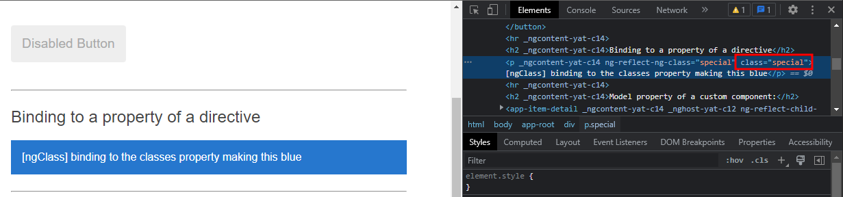
커스텀 컴포넌트의 값을 전달할 수도 있다. 부모/자식 컴포넌트끼리는 이렇게 데이터를 전달한다.
// src/app/app.component.html

<app-item-detail [childItem]="parentItem"></app-item-detail>
// src/app/app-item-detail.component.ts

import { Component, OnInit, Input } from '@angular/core';
// import { Item } from '../item';
// import { ITEMS } from '../mock-items';

@Component({
  selector: 'app-item-detail',
  templateUrl: './item-detail.component.html',
  styleUrls: ['./item-detail.component.css']
})
export class ItemDetailComponent implements OnInit {

  @Input() childItem = '';

  // items = ITEMS;


  currentItem = 'bananas in boxes';

  constructor() { }

  ngOnInit() {
  }

}
// src/app/app-item-detail.component.html

<p>Your item is: {{ childItem }} </p>
ItemDetailComponent 클래스의 childItem 프로퍼티를 부모 컴포넌트에 전달하고 부모 컴포넌트에서 해당 프로퍼티에 값에 parentItem을 지정하여 자식 템플릿 화면에 표기하고 있다.
버튼 비활성화하기
버튼을 비활성화하려면 불리언 값으로 DOM disabled 프로퍼티 값을 지정하면 된다.
// src/app/app.component.html

<!-- 버튼의 활성화 여부를 `isUnchanged` 프로퍼티와 바인딩합니다. -->
<button type="button" [disabled]="isUnchanged">Disabled Button</button>
// src/app/app.component.ts

isUnchanged = true;
어트리뷰트 바인딩
어트리뷰트 바인딩을 활용하면 엘리먼트 어트리뷰트의 값을 직접 지정할 수 있다. 이 문법을 활용하면 웹 접근성 향상, 애플리케이션 스타일 동적 조정, CSS 클래스 여러개와 CSS 스타일 여러개를 한 번에 적용 가능하다.
클래스, 스타일 바인딩
클래스 바인딩, 스타일 바인딩을 활용하면 엘리먼트의 class 어트리뷰트나 스타일을 동적으로 변경할 수 있다.
CSS Class 하나 바인딩하기
[class.sale]="oSale"
onSale이 참으로 평가될 때 sale 클래스를 엘리먼트에 추가하고 거짓일 경우 sale 클래스는 엘리먼트에서 제거한다.
CSS 클래스 여러개 바인딩하기
[class]="classExpression"
- 클래스 이름을 공백으로 구분하는 문자열 ("my-class-1 my-class-2..)
- 클래스 이름을 키로하고 참/거짓으로 평가되는 표현식을 값으로 하는 객체 ({my-class-1:true, my-class-2:false})
- 클래스 이름으로 구성된 배열 (
['my-calss-1', 'my-class-2'...])
클래스 바인딩 문법
| 바인딩 타입 | 문법 | 입력값 | 예제 |
|---|---|---|---|
| 클래스 하나 바인딩 | [class.sale]="onSale" | `boolean | undefined |
| 클래스 여러개 바인딩 | [class]="classExpression" | string | "my-class-1 my-class-2 my-class-3" |
| 클래스 여러개 바인딩 | [class]="classExpression" | Record<string, boolean | undefined |
| 클래스 여러개 바인딩 | [class]="classExpression" | Array<string> | ['foo', 'bar'] |
스타일 하나 바인딩하기
style.뒤에 원하는 css 스타일을 지정하면 된다.
[style.width]="width" width의 값은 일반적으로 문자열을 사용하지만 em이나 % 단위를 명시하면 숫자 타입을 사용할 수도 있다.
- 대시 케이스로는 이렇게 지정한다.
<nav [style.background-color]="expression"></nav>- 캐멀 케이스로는 이렇게 지정한다.
<nav [style.backgroundColor]="expression"></nav>스타일 여러개 바인딩하기
@Component({
  selector: 'app-nav-bar',
  template: `
<nav [style]='navStyle'>
  <a [style.text-decoration]="activeLinkStyle">Home Page</a>
  <a [style.text-decoration]="linkStyle">Login</a>
</nav>`
})
export class NavBarComponent {
  navStyle = 'font-size: 1.2rem; color: cornflowerblue;';
  linkStyle = 'underline';
  activeLinkStyle = 'overline';
  /* . . . */
}
- 문자열로 지정하는 방식 :
"width: 100px; height: 100px; background-color: cornflowerblue;" - 스타일 이름을 키로 하고 그 값을 객체의 값으로 하는 객체 :
{width: '100px', height: '100px', backgroundColor: 'cornflowerblue'}.
스타일 바인딩 문법
| 바인딩 타입 | 문법 | 입력 값 | 예제 |
|---|---|---|---|
| 스타일 하나 바인딩 | 하나 바인딩 [style.width]="width" | `string | undefined |
| 스타일 하나를 단위와 함께 바인딩 | [style.width.px]="width" | 100 | |
| 스타일 여러게 바인딩 | [style]="styleExpression" | string | "width: 100px; height: 100px" |
| 스타일 여러개 바인딩 | [style]="styleExpression" | `Record<string, string | undefined |
이벤트 바인딩(Event binding)
이벤트 바인딩 문법을 활용해서 키입력, 마우스 이동, 클릭, 터치 이벤트에 반응할 수 있다.
이벤트 바인딩하기
이벤트 바인딩 문법을 활용하면 마우스 이동, 클릭, 터치 이벤트에 반응 할 수 있다. 이벤트 바인딩 문법은((,)), 안에 대상이 되는 이벤트의 이름을 지정하고 등호(=)를 붙인 후 템플릿 실행문을 작성하면 된다.
<button (click)="onSave()">Save</button>이벤트 바인딩 문구 (click)에 따라서 클릭 이벤트가 발생하는지 감지하다가 이벤트가 발생했을 때 컴포넌트에 정의된 onSave() 메서드를 실행한다.
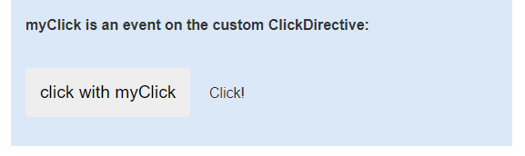
이벤트 대상 확인하기
이벤트 대상을 확인하기 위해 대상 이벤트 이름이 디렉티브의 이벤트 프로퍼티 이름과 같은지 검사한다. 아래 예제처럼 구현하면 myClick 이벤트가 ClickDirective에서 발생한 커스텀 이벤트라는 것을 확인할 수 있다.
// src/app/app.component.html

<h4>myClick is an event on the custom ClickDirective:</h4>
<button type="button" (myClick)="clickMessage=$event" clickable>click with myClick</button>
{{clickMessage}}
// src/app/click.directive.ts
import { Directive, ElementRef, EventEmitter, Output } from '@angular/core';
@Directive({selector: '[myClick]'})
export class ClickDirective {
@Output('myClick') clicks = new EventEmitter<string>(); // @Output(alias) propertyName = ...
toggle = false;
constructor(el: ElementRef) {
el.nativeElement
.addEventListener('click', (event: Event) => {
this.toggle = !this.toggle;
this.clicks.emit(this.toggle ? 'Click!' : '');
});
}
}엘리먼트 이벤트나 ClickDirective 프로퍼티에서 myClick을 찾지 못할경우 "unknown directive" 에러가 발생한다.
위 코드는 AppComponent의 템플릿에서 ClickDirective를 호출하고 이 과정에서 ClickDirective가 clicks 변수로 초기화된다. 초기화를 통해 Click!이라는 문자열이 EventEmitter<string>() 형태로 AppComponent의 템플릿으로 전달되며 전달된 값(Click!)은 AppComponent의 프로퍼티인 clickMessage=$event와 같이 저장되고 toggle 값(boolean)에 따라 화면에 표기되거나 사라진다.
양방향 바인딩
양방향 바인딩을 활용하면 컴포넌트끼리 데이터를 공유할 수 있다. 양방향 바인딩은 자식 컴포넌트에서 발생하는 이벤트를 감지하는 바인딩(Output()) 자식 컴포넌트에 데이터를 전달하는 프로퍼티 바인딩(Input())이 결합된 형태이다.
양방향 바인딩 추가하기
// src/app/app.component.html

<app-sizer [(size)]="fontSizePx"></app-sizer>
양방향 바인딩이 동작하는 과정
양방향 바인딩이 동작하려면 @Input() 데코레이터와 @Output() 데코레이터가 지정되어 있어야 한다. 해당 데코레이터는 각각 부모->자식, 자식->부모 방향으로 데이터를 전달한다. 예제 size 프로퍼티의 경우 @Input() 데코레이터가 지정되어 부모 컴포넌트의 템플릿 app.component.html로 전달되고 부모 컴포넌트 클래스 프로퍼티인 fontSIzePx 값으로 지정되면서 다시 자식 컴포넌트의 클래스에 전달됨과 동시에 자식 컴포넌트의 템플릿 sizer.component.html에 반영된다.
자식 컴포넌트 클래스에는 dec(), inc() 기능이 존재하는데 resize() 메서드가 실행되면서 변경된 size 값을 부모 컴포넌트 클래스에 전달하기 위해 sizeChange 프로퍼티에 @Output 데코레이터를 적용하였다. sizeChange 프로퍼티는 변경된 size 값이 입력되어 부모 컴포넌트 템플릿에 전달되는데 이 데이터를 받기 위해 아래와 같은 코드를 사용한다.
// src/app/app.component.html

<app-sizer [(size)]="fontSizePx"></app-sizer>
[size]의 경우 @Input()을 통해 부모 컴포넌트가 자식 컴포넌트로 데이터를 전달하기 위함이고 (size)의 경우 자식 컴포넌트의 데이터를 부모 텀포넌트로 전달히기 위함이다.
위 코드를 아래와 같이 작성할 수도 있다.
// src/app/app.component.html (expanded)

<app-sizer [size]="fontSizePx" (sizeChange)="fontSizePx=$event"></app-sizer>
자식 컴포넌트의 sizeChange 이벤트가 생성되면 해당 이벤트 값을 fontSizePx에 반영한다는 의미로 위 코드와 동일한 의미다.
파이프
파이프틑 템플릿 표현식에 사용하는 간단함 함수인데 입력값을 받아서 이 값을 변환한다. 파이프는 한번만 선언해두면 애플리케이션 전역에서 자유롭게 사용 가능하기 때문에 유용하다. 예를들면 날짜를 문자열 그대로 표현하는 대신 April 15, 1988과 같은 형식으로 변환 가능하다.
기본 파이프
DatePipe: 날짜를 원하는 형식으로 변환합니다.UpperCasePipe: 문자열을 대문자로 변경합니다.LowerCasePipe: 문자열을 소문자로 변경합니다.CurrencyPipe: 숫자를 지역에 맞는 통화단위로 변경합니다.DecimalPipe: 숫자를 지역에 맞는 숫자 표현으로 변경합니다.PercentPipe: 숫자를 지열에 맞는 퍼센트 문자열로 변경합니다.
템플릿에 파이프 사용하기
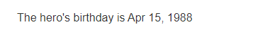
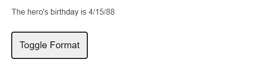
<p>The hero's birthday is {{ birthday | date }}</p>import { Component } from '@angular/core';
@Component({
selector: 'app-hero-birthday',
template: "<p>The hero's birthday is {{ birthday | date }}</p>"
})
export class HeroBirthdayComponent {
birthday = new Date(1988, 3, 15); // April 15, 1988 -- 월은 0부터 시작합니다.
}
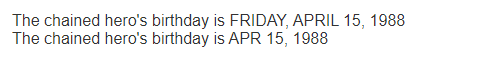
<div>
  The chained hero's birthday is
  {{  birthday | date:'fullDate' | uppercase}}
</div>

<div>
  The chained hero's birthday is
  {{ birthday | date | uppercase}}
</div>
 import { Component } from '@angular/core';

@Component({
  selector: 'app-root',
  templateUrl: './app.component.html',
  styleUrls: ['./app.component.css']
})
export class AppComponent {
  constructor() { }
  fontSizePx = 16;

  birthday = new Date(1988, 3, 15);
  toggle = true; // 기본 형식을 shortDate로 지정하기 위해 true 값을 할당합니다.

  get format()   { return this.toggle ? 'shortDate' : 'fullDate'; }
  toggleFormat() { this.toggle = !this.toggle; }
<p>The hero's birthday is {{ birthday | date:format }}</p>
<button type="button" (click)="toggleFormat()">Toggle Format</button>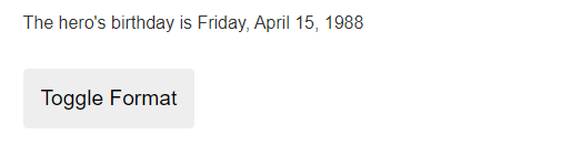
템플릿 변수 이해하기
템플릿 변수를 활용하면 템플릿 안에 다른 영역에 존재하는 데이터를 참조할 수 있다. 템플릿 변수는 사용자가 입력한 내용에 반응하는 동작을 구현하거나 애플리케이션 폼을 사용하기 좋게 튜닝할 때 주로 사용한다.
템플릿 변수는 이런 항목을 가리킬 수 있다.
- 템플릿 안에 있는 DOM 엘리먼트
- 디렉티브나 컴포넌트
- ng-template을 가리키는 TemplateRef (중요!)
- 웹 컴포넌트
문법
템플릿 내부에 해시 기호 #를 사용하면 템플릿 변수를 선언할 수 있다. 아래 코드처럼 #phone이라고 지정하면 <input> 엘리먼트에 phone 변수를 템플릿 변수로 선언한 것이다.
// src/app/app.component.html
<input #phone placeholder="phone number" />
템플릿 변수는 컴포넌트 템플릿 안에서 자유롭게 참조할 수 있고 아래 코드에서 <button>은 컴포넌트 메서드를 실행할 때 인자를 전달하기 위해 phone 변수를 참조했다.
// src/app/app.component.html

<input #phone placeholder="phone number" />

<!-- 다른 엘리먼트들 -->

<!-- input 엘리먼트는 이벤트 핸들러에 phone 엘리먼트의 `value`를 전달합니다. -->
<button type="button" (click)="callPhone(phone.value)">Call</button>
템플릿 변수에 할당되는 값은 어떻게 결정되는가?
Anguar에서 템플릿 변수를 선언하면 이 템플릿 변수가 선언된 위치에 따라 참조하는 인스턴스의 타입이 결정된다.
- 컴포넌트에 템플릿 변수를 선언하면 컴포넌트 인스턴스를 가리킵니다.
- 표준 HTML 태그에 템플릿 변수를 선언하면 엘리먼트를 가리킵니다.
<ng-template>엘리먼트에 템플릿 변수를 선언하면TemplateRef인스턴스를 가리킵니다.<ng-template>에 대해 자세하세 알아보려면 구조 디렉티브 문서의 Angular가 아스테리스크 *를 활용하는 방법을 참고하세요..
이름이 지정된 변수
#var="ngModel"와 같이 변수 오른쪽에 이름을 지정하면 이 변수는 엘리먼트에 지정된 디렉티브나 컴포넌트 중exportAs이름에 해당하는 것을 가르킨다.
NgForm에 템플릿 변수 사용하기
NgForm : You optionally export the directive into a local template variable using ngForm as the key (ex: #myForm="ngForm"). This is optional, but useful. Many properties from the underlying FormGroup instance are duplicated on the directive itself, so a reference to it gives you access to the aggregate value and validity status of the form, as well as user interaction properties like dirty and touched.
보통 템플릿 변수가 선언된 엘리먼트가 템플릿 변수의 값이 된다. (<form #itemForm="ngForm" (ngSubmit)="onSubmit(itemForm)">) 이전 예제에서도 템플릿 변수 phone은 전화번호가 입력되는 ``<input>`` 엘리먼트를 가르킨다. 그래서 버튼을 클릭하면 컴포넌트에 있는 callPhone()` 메서드를 실행하면서 <input> 엘리먼트의 값을 인자로 전달한다.
아래 코드는 NgForm 디렉티브를 직접 참조하기 위해 디렉티브에서 exportAs로 지정된 값을 템플릿 변수 값으로 할당받는 예제 코드이다. 이 코드에서 템플릿 변수 itemForm은 템플릿 안에서 세 번 사용된다. ngForm의 변수로 지정된 ItemForm은 Summit 과정에서 데이터를 담고있는 ItemForm으로 사용되고 데이터를 표시하기도 한다.
<form #itemForm="ngForm" (ngSubmit)="onSubmit(itemForm)">
  <label for="name">Name</label>
  <input type="text" id="name" class="form-control" name="name" ngModel required />
  <button type="submit">Submit</button>
</form>

<div [hidden]="!itemForm.form.valid">
  <p>{{ submitMessage }}</p>
</div>
해당 ngForm 어트리뷰트 값은 AppComponent 클래스의 onSubmit 메서드에서 해당 form 프로퍼티를 받아서 동작을 수행한다.
  get submitMessage() { return this._submitMessage; }
  private _submitMessage = '';

  onSubmit(form: NgForm) {
    this._submitMessage = 'Submitted. Form value is ' + JSON.stringify(form.value);
  }
ngForm 어트리뷰트 값을 사용하지 않으면 itemForm이 참조하는 객체는 HTMLFormElement, <form> 엘리먼트가 된다. 그리고 어트리뷰트 지정 없이 Angular 컴포넌트에 지정하면 컴포넌트 인스턴스 자체를 가르키게된다. 이 경우가 아니라면 엘리먼트에 지정된 디렉티브는 무시하고 DOM 엘리먼트를 가르킨다.
중첩된 템플릿 안에서 접근하기
<input #ref1 type="text" [(ngModel)]="firstExample" />
<span *ngIf="true">Value: {{ ref1.value }}</span>
위 코드의 ngModel을 사용하면 도메인 모델의 값이 변경되는 것을 실시간으로 감지할 수 있고 해당 값을 이용하여 {{ ref.value }}와 같이 문자열 바인딩을 통해 뷰에 표현할 수 있다. <input>의 값이 변경되면 <span> 값이 동시에 변경되는 것을 확인할 수 있는 두 엘리먼트가 부모 엘리먼트인 ref1에 연결되어 있기 때문이다.
위 코드에서 <span>에 있는 *ngIf는 새로운 템플릿 스코프를생성하는데, 이 스코프에서는 부모 스코프에 있는 ref1 변수에 접근 가능하다. 반면 부모 스코프에서 자식 스코프에 선언된 변수로 접근은 불가능하다.
템플릿 입력 변수 (Template input variable)
템플릿 입력 변수는 템플릿 인스턴스마다 값을 받는 변수이다.
작세한 내용은 구조 디렉티브 만들기 문서 참고
ngFor를 이용하여 <ng-template>을 사용해보자
<ul>
  <ng-template ngFor let-hero [ngForOf]="heroes">
    <li>{{hero.name}}
  </ng-template>
</ul>
ngFor 디렉티브는 heroes 배역에 있는 개별 히어로마다 <ng-template> 인스턴스를 생성하는데 이때 배열의 항목마다 hero 변수 값을 할당한다. 그리고 <ng-template> 인스턴스를 만들 때 템플릿 변수를 여러개 선언하면 여러 값을 동시에 전달할 수 있다. let- 문법을 사용하면 된다.
ngFor를 사용하여 index를 함께 전달하려면 이렇게 사용하면 된다.
<ul>
  <ng-template ngFor let-hero let-i="index" [ngForOf]="heroes">
    <li>Hero number {{i}}: {{hero.name}}
  </ng-template>
</ul>
디렉티브
기본 디렉티브
디렉티브는 Angular 애플리케이션 안에 있는 엘리먼트에 어떤 동작을 추가하는 클래스를 의미한다. Angular는 폼, 목록, 스타일 등에 적용할 수 있는 기본 디렉티브를 다양하게 제공한다.
디렉티브는 아래와 같은 종류가 있다.
| 디렉티브 종류 | 설명 |
|---|---|
| 컴포넌트 | 템플릿이 존재하는 디렉티브이다. 디렉티브 중 가장 많이 사용한다. |
| 어트리뷰트 디렉티브 | 엘리먼트, 컴포넌트, 디렉티브의 모습이나 동작을 변경하는 디렉티브이다. |
| 구조 디렉티브 | 조건에 따라 DOM 엘리먼트를 추가하거나 제거하는 디렉티브이다. |
기본 어트리뷰트 디렉티브
어트리뷰트 디렉티브는 HTML 엘리먼트, 어트리뷰트, 프로퍼티, 컴포넌트의 동작을 변경한다.
RouterModule이나 FormsModule과 같이 어트리뷰트 디렉티브를 제공하는 ngModule도 많이 존재한다. 이 중 자주 사용하는 어트리뷰트 디렉티브는 이런 것들이 있다.
| 디렉티브 | 설명 |
|---|---|
| NgClass | CSS 클래스를 추가하거나 제거한다. |
| NgStyle | HTML 스타일을 추가하거나 제거한다. |
| NgModel | HTML 폼 엘리먼트에 양방향 데이터 바인딩을 연결한다. |
NgClass로 클래스 추가/제거하기
ngClass를 사용하면 CSS 클래스 여러 개를 엘리먼트에 동시에 추가하거나 제거할 수 있다.
클래스를 하나만 추가, 제거 한다면
NgClass보다는 클래스 바인딩을 사용하는 것이 더 좋다.
NgClass에 표현식 사용하기
엘리먼트에 스타일을 지정하듯 엘리먼트에 [ngClass]를 추가하고 디렉티브 표현식을 추가할 수 있다. app.componenet.ts 파일에서 isSpecial 프로퍼티 값이 true로 지정되었다면 ngClass에 반영되면서 <div>의 special 클래스가 추가되며 뷰에 표현되고 반대로 프로퍼티 값이 false일 경우 표현되지 않는다.
// src/app/app.component.html

<!-- "special" 클래스는 프로퍼티 바인딩으로 켜고 끌 수 있습니다. -->
<div [ngClass]="isSpecial ? 'special' : ''">This div is special</div>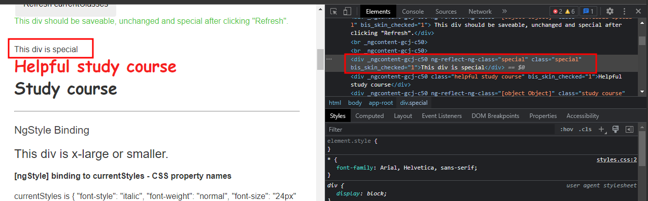
NgClass에 메서드 사용하기
NgClass에 메서드를 사용하려면 메서드를 컴포넌트 클래스에 정의해야 한다. 예제setCurrentClasses()메서드는 컴포넌트의 다른 프로퍼티 값을 참조해서 객체 형태로currentClasses프로퍼티 값을 할당 한다. 이 때 객체의 키는 CSS 클래스 이름이다. 키에 할당된 값이true이면ngClass가 해당 키를 클래스로 추가한다. 키에 할당된 값이false면ngClass가 해당 키를 클래스에서 제거한다.
// src/app/app.component.ts

currentClasses: Record<string, boolean> = {};
/* . . . */
setCurrentClasses() {
  // CSS 클래스는 컴포넌트 프로퍼티 값에 따라 추가되거나 제거됩니다.
  this.currentClasses =  {
    saveable: this.canSave,
    modified: !this.isUnchanged,
    special:  this.isSpecial
  };
}- 템플릿에서는 엘리먼트의
ngClass를currentClasses프로퍼티와 바인딩하면 된다.
// src/app/app.component.html

<hr><h2 id="ngClass">NgClass Binding</h2>

<p>currentClasses is {{currentClasses | json}}</p>
<div [ngClass]="currentClasses">This div is initially saveable, unchanged, and special.</div>
<ul>
  <li>
    <label for="saveable">saveable</label>
    <input type="checkbox" [(ngModel)]="canSave" id="saveable">
  </li>
  <li>
    <label for="modified">modified:</label>
    <input type="checkbox" [value]="!isUnchanged" (change)="isUnchanged=!isUnchanged" id="modified"></li>
  <li>
    <label for="special">special: <input type="checkbox" [(ngModel)]="isSpecial" id="special"></label>
</li>
</ul>
<button type="button" (click)="setCurrentClasses()">Refresh currentClasses</button>

<div [ngClass]="currentClasses">
  This div should be {{ canSave ? "": "not"}} saveable,
                  {{ isUnchanged ? "unchanged" : "modified" }} and
                  {{ isSpecial ? "": "not"}} special after clicking "Refresh".</div>
<br><br>
이렇게 구현하면 Angular는 변화를 감지할 때마다 엘리먼트에 적용되는 클래스를 계산하고 ngOnInit()이 실행될 때 setCurrentClasses()가 처음 실행되며 버튼을 클릭할 때마다 계속 실행된다. 이 동작은 ngClass가 유발하는 것이 아니다.
위 코드를 해석해보면 처음 appComponentClass를 통해 ngOnInit()이 실행되면서 setCurrentClassses()를 수행하며 currentClasses 배열에 saveable, modified, special 키와 값을 추가한다. currentClasses는 템플잇에 표기되어 json 형태로 표기된다. 아래 코드에서 <div> 태그를 통해 ngClass에 해당하는 값이 클래스로 표기된다.
<div [ngClass]="currentClasses">This div is initially saveable, unchanged, and special.</div>
메서드의 실행은 ngClass가 수행하지 않는다. NgOnInit을 통해 컴포넌트가 인스턴스화 되는 과정에서 1회 실행된다. 바인딩된 값이 변경될 때마다 NgOnChanges()를 통해 계속 실행된다. 템플릿에서 사용되는 canSave, isUnchanged, isSpecial의 값은 AppComponentClass의 스태틱 변수이고 currentClasses 배열의 값이 아니다. 그러므로 초기에 할당되는 값이 true, false, true가 아니라 true, true, ture 값이 된다.
NgStyle로 인라인 스타일 지정하기
NgStyle을 활용하면 컴포넌트 상태에 따라 달라지는 여러 인라인 스타일을 동시에 지정 가능하다.
NgStyle을 사용하기 위해 컴포넌트 클래스에 메서드를 추가한다. 아래 예제에서setCurruntStyles()는 컴포넌트의 다른 프로퍼티 값을 참조해서 객체 형태로currentStyles프로퍼티 값을 할당한다.
// src/app/app.component.ts

currentStyles: Record<string, string> = {};
/* . . . */
setCurrentStyles() {
  // CSS 스타일은 컴포넌트 프로퍼티 값에 따라 지정됩니다.
  this.currentStyles = {
    'font-style':  this.canSave      ? 'italic' : 'normal',
    'font-weight': !this.isUnchanged ? 'bold'   : 'normal',
    'font-size':   this.isSpecial    ? '24px'   : '12px'
  };
}- 엘리먼트 스타일을 지정하려면
ngStyle을currentStyle프로퍼티와 바인딩하면 된다.
// src/app/app.component.html

<div [ngStyle]="currentStyles">
  This div is initially italic, normal weight, and extra large (24px).
</div>
이렇게 구현하면 Angular는 변화를 감지할 때마다 엘리먼트에 적용되는 스타일을 계산하고 ngOnInit()을 통해 최초로 바인딩된 값이 할당될 때 1회 실행되며 이후 버튼을 클릭할때마다 계속 실행된다.
ngModel로 프로퍼티 값 표시하기, 변경된 값 반영하기
ngModel 디렉티브를 활용하면 데이터 프로퍼티의 값을 화면에 표기할 수 있고 사용자가 이 값을 변경했을 때 클래스 프로퍼티에 반영할 수 있다.
1. NgModule imports 모듈을 FormsModule를 불러와서 추가한다.
// src/app/app.module.ts (FormsModule 불러오기)

import { FormsModule } from '@angular/forms'; // <--- FormsModule 패키지 로드
/* . . . */
@NgModule({
  /* . . . */

  imports: [
    BrowserModule,
    FormsModule // <--- NgModule에 로드
  ],
  /* . . . */
})
export class AppModule { }
- HTML
<form>엘리먼트에[(ngModel)]바인딩 문법을 추가하고 이 바인딩 오른쪽에 프로퍼티를 할당한다. 이 예제에서는name을 지정했다.
// src/app/app.component.html (NgModel 예제)

<label for="example-ngModel">[(ngModel)]:</label>
<input [(ngModel)]="currentItem.name" id="example-ngModel">

  <p>
    <label for="example-uppercase">(ngModelChange)="setUppercaseName($event)"
      <input [ngModel]="currentItem.name" (ngModelChange)="setUppercaseName($event)" id="example-uppercase">
    </label>
  </p>
NgModel은 기본적으로 AppComponentClass의 자식 클래스로 동작한다. ngModel은 인풋 데코레이터와 같이 값을 부모 클래스인 AppComponent의 값을 자식 클래스의 NgModel의 ngModel로 전달(부모 -> 자식 관계)하고 값이 변경되는 경우 NgModel 클래스의 (ngModelChange) 이벤트가 발생되며 부모 클래스의 setUppercaseName($event)를 수행한다 (자식 -> 부모 관계)
  <p>
    <label for="example-uppercase">(ngModelChange)="setUppercaseName($event)"
      <input [ngModel]="currentItem.name" (ngModelChange)="setUppercaseName($event)" id="example-uppercase">
<!--      <input [(ngModel)]="currentItem.name" id="example-uppercase"> 제대로 실행되지 않음 -->
    </label>
  </p>
https://angular.io/api/forms/NgModel#description
애트리뷰트 바인딩과 프로퍼티 바인딩 차이
1. 애트리뷰트는 HTML 엘리먼트를 설명하는 역할을 한다.
2. 프로퍼티는 HTML DOM Tree에서 애트리뷰트를 가르키는 값이다.
앵귤러에서 보통 애트리뷰트를 지정할 때 프로퍼티 바인딩을 사용하기를 권고한다. 하지만 프로퍼티 바인딩을 지원하지 않는 애트리뷰트의 경우 애트리뷰트 바인딩을 수행한다. 아래 예시는 colSpan 애트리뷰트를 각각 애트리뷰트 바인딩과 프로퍼티 바인딩으로 수행하는 코드이다. 애트리뷰트 바인딩을 할 경우 getAttribute로 해당 값을 가져올 수 있고 정적인 HTML 문서에 값을 바인딩하는 결과를 가져온다. 프로퍼티 바인딩의 경우 getAttribute로 값을 가져올 수 없다. HTML DOM 프로퍼티에 값을 바인딩했기 때문이다. 이 경우 값이 변하는 성질이 있다. 앵귤러에서 되도록 프로퍼티 바인딩을 사용하라는 의미는 보통은 DOM 프로퍼티를 이용해 구현한다는 의미이고 특별한 경우를 제외하고는 프로퍼티 바인딩을 권하는 것이다. Aria 계열의 애트리뷰트는 프로퍼티 바인딩에서 제공하지 않기 때문에 애트리뷰트 바인딩을 사용한다. 아리아 계열 어트리뷰트 바인딩
<!--  애트리뷰트 바인딩 -->
<tr><td [attr.colspan]="1 + 1">One-Two</td></tr>

<!--  프로퍼티 바인딩 -->
<tr><td [colSpan]="1 + 1">Three-Four</td></tr>
애트리뷰트, 프로퍼티 바인딩 차이
https://dev.to/deerawan/dom-property-vs-html-attribute-in-property-binding-48e4
HTML DOM이란?
https://wit.nts-corp.com/2019/02/14/5522
DOM은 원본 HTML 문서의 객체 기반 표현 방식입니다. 둘은 서로 비슷하지만, DOM이 갖고 있는 근본적인 차이는 단순 텍스트로 구성된 HTML 문서의 내용과 구조가 객체 모델로 변환되어 다양한 프로그램에서 사용될 수 있다는 점입니다.
엘리먼트와 애트리뷰트
https://www.w3schools.com/html/html_elements.asp
https://www.w3schools.com/html/html_attributes.asp
브라우저가 동작하는 방식
https://d2.naver.com/helloworld/59361
기본 구조 디렉티브
구조 디렉티브는 HTML 모습을 조작한다. 조건에 맞는 엘리먼트를 DOM 트리에 추가하거나 제거, 조작하는 방식으로 DOM 구조를 변형한다.
가장 많이 사용되는 구조 디렉티브
| 기본 구조 디렉티브 | 설명 |
|---|---|
| NgIf | 조건에 따라 템플릿의 일부를 DOM 트리에 추가하거나 DOM 트리에서 제거함 |
| NgFor | 배열에 있는 항목마다 템플릿 일부를 반복함 |
| NgSwitch | 조건에 맞는 화면을 DOM 트리에 추가함 |
NgIf로 엘리먼트 추가/제거하기
NgIf에 할당되는 값이 True, False에 따라 DOM 트리에 추가되거나 삭제되어 불필요한 리소스 사용을 방지할 수 있다.
아래 예제처럼 isActive와 같은 조건 표현식(True, False)을 사용하여 ngIf 디렉티브를 사용할 수 있다.
<app-item-detail *ngIf="isActive" [item]="item"></app-item-detail>
export class AppComponent implements OnInit {

...

  isActive = true;
...
NgFor로 배열 항목 표시하기
NgFor 디렉티브를 활용하면 배열에 있는 항목을 화면에 표시할 수 있다.
- 개별 항목마다 반복할 HTML 템플릿 구성
- 배열을 순회하기 위해
ngFor를 적용하고 이 디렉티브 오른쪽에let item of items을 연결함
items는 AppComponentClass에서 ngOnInit 함수의 resetItems()에 따라 초기화된다.
item!: Item; // defined to demonstrate template context precedence
items: Item[] = [];

currentItem!: Item;

ngOnInit() {
    this.resetItems();
    this.setCurrentClasses();
    this.setCurrentStyles();
    this.itemsNoTrackByCount = 0;
  }

resetItems() {
    this.items = Item.items.map(item => item.clone()); // item값에 item.clone 리턴값을 입력 (화살표 의미 익명 함수에서 리턴값을 우측의 함수로 받겠다는 의미)
    this.currentItem = this.items[0]; // items 배열에 첫번째 값 입력
    this.item = this.currentItem; // items 배열의 첫번째 값 입력
  }
<div *ngFor="let item of items">{{item.name}}</div>
let item of items라는 문자열이 <ng-template>으로 변환되며 배열에 있는 항목마다 <ng-template>이 반복된다.
var, let, const 차이
https://www.freecodecamp.org/korean/news/var-let-constyi-caijeomeun/
컴포넌트 화면 반복하기
<app-item-detail *ngFor="let item of items" [item]="item"></app-item-detail>
예제 코드는 app-item-detail의 템플릿을 반복하여 보여준다. [item]은 자식 컴포넌트인 app-item-detail에 @input 디렉티브로 정의되어 있으며 let 구문에 따라 값이 적용되고 자식 컴포넌트의 템플릿이 수행되며 화면에 표기된다. class="box" css 내부에 표기
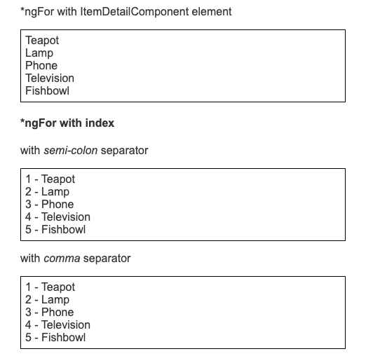
ngFor에서 Index 활용하기
<div *ngFor="let item of items; let i=index">{{i + 1}} - {{item.name}}</div>
; let i=index 초기값이 0인 index를 활용하여 1씩 증가하는 코드이다.
<div *ngFor="let item of items, let i=index">{{i + 1}} - {{item.name}}</div>
; 외에 , 콤마도 동일한 의미이다.
조건이 참일 때만 엘리먼트 반복하기
NgSwitch 활용하기
NgSwitch는 여러 엘리먼트 중 조건에 맞는 엘리먼트 하나를 DOM 트리에 추가하는 디렉티브이다.
NGSWITCH 디렉티브 | 설명 |
|---|---|
| NgSwitch | 관련 디렉티브의 동작을 조작하는 어트리뷰트 디렉티브 |
| NgSwitchCase | 조건에 맞으면 DOM 트리에 엘리먼트를 추가하고 조건에 맞지 않으면 DOM 트리에서 엘리먼트를 제거하는 구조 디렉티브 |
| NgSwitchDefault | NgSwitchCase 어디 경우에도 해당되지 않을 경우 DOM 트리에 엘리먼트를 추가하는 구조 디렉티브 |
어트리뷰트 디렉티브
어트리뷰트 디렉티브는 DOM 엘리먼트나 Angular 컴포넌트의 모습이나 동작을 변경할 수 있다.
어트리뷰 디렉티브 만들기
# src/app/highlight.directive.ts

import { Directive, ElementRef } from '@angular/core';

@Directive({
  selector: '[appHighlight]'
})
export class HighlightDirective {
    constructor(private el: ElementRef) {
       this.el.nativeElement.style.backgroundColor = 'yellow';
    }
}
- 셀렉터 명칭을 정한다.
appHighlight ElementRef의nativeElement프로퍼티를 사용하면 호스트 DOM 엘리먼트에 직접 접근할 수 있다.- 디렉티브
Constructor()에ElementRef를 추가해서 호스트 엘리머트를 의존성 주입한다.Constructor에서 지정하는 ElementRef 형의el에 하이라이트를 적용할 예정이다. HighlightDirective클래스에 배경을 노란색으로 변경하는 코드를 추가한다.
어트리뷰트 디렉티브 적용
// src/app/app.component.html

<p appHighlight>Highlight me!</p>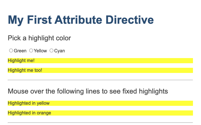
사용자 이벤트 처리하기
HostListener임포트하기
# src/app/highlight.directive.ts (심볼 로드하기)

import { Directive, ElementRef, HostListener } from '@angular/core';
- 마우스가 진입하고 벗어나는 이벤트 처리를 위한 핸들러 추가
# src/app/highlight.directive.ts (마우스 처리 메서드)

@HostListener('mouseenter') onMouseEnter() {
  this.highlight('yellow');
}

@HostListener('mouseleave') onMouseLeave() {
  this.highlight('');
}

private highlight(color: string) {
  this.el.nativeElement.style.backgroundColor = color;
}
어트리뷰트에 값 전달하기
input심볼 임포트 및@input데코레이터 추가
# src/app/highlight.directive.ts (심볼 로드하기)

import { Directive, ElementRef, HostListener, Input } from '@angular/core';

@Input() appHighlight = '';
AppComponent클래스에color프로퍼티 추가
# src/app/app.component.ts (클래스)

export class AppComponent {
  color = 'red';
}appHighlight디렉티브 셀릭터에 color를 지정 (프로퍼티 바인딩 부모(color)->자식(appHighlight))
// src/app/app.component.html (color)

<p [appHighlight]="color">Highlight me!</p>
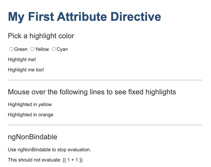
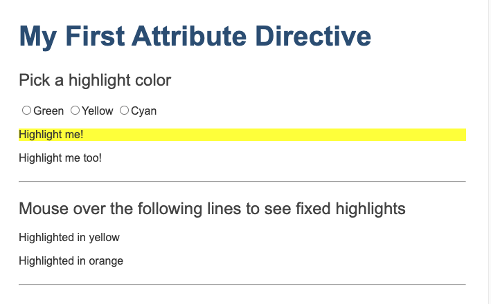
사용자가 직접 선택하는 방식
// src/app/app.component.html (v2)

<h2>Pick a highlight color</h2>
<div>
  <input type="radio" name="colors" (click)="color='lightgreen'">Green
  <input type="radio" name="colors" (click)="color='yellow'">Yellow
  <input type="radio" name="colors" (click)="color='cyan'">Cyan
</div>
라디오 버튼 클릭 시 자식 컴포넌트에 지정된 color의 값에 색상을 넣어주는 방식으로 구현
두번째 인자 바인딩
# src/app/highlight.directive.ts (마우스 진입 핸들러)

@HostListener('mouseenter') onMouseEnter() {
  this.highlight(this.appHighlight || this.defaultColor || 'red');
}
마우스 진입 HostListener에서 highlight 값에 appHighlight, defaultColor OR 조건으로 지정하여 둘중 값이 있는 경우 해당하는 색상을 보여주고 그렇지 않을 경우 red를 보여준다.
// src/app/app.component.html (defaultColor)

<p [appHighlight]="color" defaultColor="violet">
  Highlight me too!
</p>
ng-container와 ng-template 차이
https://medium.com/sjk5766/ng-template%EA%B3%BC-ng-container-fb913ff1984d
구조 디렉티브 문법
의존성 주입
Angular의 의존성 주입
의존성 주입은 애플리케이션이 필요한 기능을 어딘가에 생성하고 받아오는 디자인 패턴이다. Angular는 기본적으로 의존성 주입을 제공하며, 이 방식을 활용하면 애플리케이션을 모듈 단위로 관리하면서 유연하게 확장 할 수 있다.
Angular에서 의존성으로 주입되는 객체는 보통 서비스이지만 문자열과 같은 특정 값이나 함수가 될 수도있다. 의존성 주입을 관리하는 인젝터는 애플리케이션 부트스트랩 단계에서 자동 생성되며 의존성 객체를 요청받으면 이 객체의 인스턴스를 생성한다.
의존성 주입 이해하기
Angular 프레임워크가 제공하는 컴포넌트, 디렉티브, 파이프 의존성 주입 데코레이터를 사용하면 이 의존성 객체를 원하는 곳과 연결할 수 있다.
의존성 등록하기
의존성 주입 서비스 만들기
A component can delegate certain tasks to services, such as fetching data from the server, validating user input, or logging directly to the console. By defining such processing tasks in an injectable service class, you make those tasks available to any component. You can also make your application more adaptable by injecting different providers of the same kind of service, as appropriate in different circumstances.
Angular does not enforce these principles. Angular helps you follow these principles by making it easy to factor your application logic into services and make those services available to components through DI.
Injecting Service
To inject a service as a dependency into a component, you can use component's constructor() and supply a constructor argument with the dependency type. The following example specifies the HeroService in the HeroListComponent constructor. The type of the heroService is HeroService. Angular recognizes the HeroService as a dependency, since that class was previously annotated with the @Injectable decorator.
라우팅
라우팅 가능한 상태로 앱 생성하기
앱을 생성할 때 라우팅 옵션을 넣을 경우 아래와 같이 AppRoutingModule이 추가된다.
# app.module.ts

import { BrowserModule } from '@angular/platform-browser';
import { NgModule } from '@angular/core';
import { AppRoutingModule } from './app-routing.module'; // AppRoutingModule을 로드합니다.
import { AppComponent } from './app.component';

@NgModule({
  declarations: [
    AppComponent
  ],
  imports: [
    BrowserModule,
    AppRoutingModule // Angular CLI가 AppRoutingModule을 AppModule imports 배열에 자동으로 추가합니다.
  ],
  providers: [],
  bootstrap: [AppComponent]
})
export class AppModule { }
# app-routing.module.ts

import { NgModule } from '@angular/core';
import { Routes, RouterModule } from '@angular/router'; // 라우터 관련 심볼을 로드합니다.

const routes: Routes = []; // 라우팅 규칙은 이 배열에 등록합니다.

// NgModule의 imports, exports 배열에 RouterModule을 등록합니다.
@NgModule({
  imports: [RouterModule.forRoot(routes)],
  exports: [RouterModule]
})
export class AppRoutingModule { }
first, second 컴포넌트를 생성하고 app.module.ts의 declarations 배열에 추가한다. 컴포넌트 생성 시 --skip-import 옵션을 넣을 경우 위와 같이 declarations 배열에 추가하는 작업을 수행해야 한다.
first, second의 라우팅 설정은 app-routing.module.ts의 const route 부분에 추가해준다.
# app-routing.module.ts

const routes: Routes = [
  { path: 'first-component', component: FirstComponent },
  { path: 'second-component', component: SecondComponent },
  { path: '**', component: PageNotFoundComponent },  // 404 에러 화면을 표시하는 와일드카드 라우팅 규칙
];
app.component.html에 routerLink, router-outlet을 추가하여 원하는 컴포넌트에 라우팅 작업을 수행하도록 한다.
<h1>Angular Router App</h1>
<!-- 아래 링크를 클릭하면 AppRoutingModule에 등록된 라우팅 규칙에 따라 화면을 전환합니다. -->
<nav>
  <ul>
    <li><a routerLink="/first-component" routerLinkActive="active" ariaCurrentWhenActive="page">First Component</a></li>
    <li><a routerLink="/second-component" routerLinkActive="active" ariaCurrentWhenActive="page">Second Component</a></li>
  </ul>
</nav>
<!-- 라우팅된 화면은 <router-outlet> 위치에 표시됩니다. -->
<router-outlet></router-outlet>
중첩 라우팅
first 컴포넌트에 중첩된 child-a, child-b 컴포넌트를 라우팅하는 방법은 아래와 같다.
# app-routing.modules.ts

const routes: Routes = [
  { path: 'first-component',
    component: FirstComponent,
    children: [
      {
        path: 'child-a',
        title: resolvedChildATitle,
        component: ChildAComponent
      },{
        path: 'child-b',
        title: 'child!!!B',
        component: ChildBComponent
      }
    ]},
  { path: 'heroes', component: HeoresComponent },
  { path: 'second-component', component: SecondComponent },
  { path: '**', component: PageNotFoundComponent}
];
first-component 내부에 children으로 child-a, child-b를 추가한다.
<h2>First Component</h2>

<nav>
  <ul>
    <li><a routerLink="child-a">Child A</a></li>
    <li><a routerLink="child-b">Child B</a></li>
  </ul>
</nav>

<router-outlet></router-outlet>
이후 first.componenet.html에 아래의 코드를 추가한다.
<h2>First Component</h2>

<nav>
  <ul>
    <li><a routerLink="child-a">Child A</a></li>
    <li><a routerLink="child-b">Child B</a></li>
  </ul>
</nav>

<router-outlet></router-outlet>
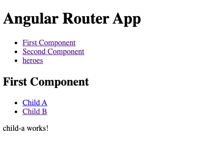
화면 타이틀 설정하기
상대주소 사용하기
링크 변수 배열
테스트를 위해 hero 인터페이스와 mock-heroes를 생성한다.
# hero.ts
export interface Hero {
  id: number;
  name: string;
  isSecret: boolean;
}
# mock.heroes.ts
import { Hero } from './hero';

export const HEROES: Hero[] = [
  { id: 12, isSecret: false, name: 'Dr. Nice' },
  { id: 13, isSecret: false, name: 'Bombasto' },
  { id: 14, isSecret: false, name: 'Celeritas' },
  { id: 15, isSecret: false, name: 'Magneta' },
  { id: 16, isSecret: false, name: 'RubberMan' },
  { id: 17, isSecret: false, name: 'Dynama' },
  { id: 18, isSecret: true,  name: 'Dr. IQ' },
  { id: 19, isSecret: true,  name: 'Magma' },
  { id: 20, isSecret: true,  name: 'Tornado' }
];
히어로를 로드하여 링크를 달아준다.
<!-- heroes.component.html --!>

<p>heores works!</p>

<div *ngFor="let hero of heroes">
  <a [routerLink]="['/hero', hero.id]" >
    <span class="badge">
      {{ hero.id }}
    </span>
    <span>
      {{ hero.name }}
    </span>
  </a>
</div>


<a [routerLink]="['/crisis-center', { foo: 'foo' }]">Crisis Center</a>
옵저버블
https://angular.kr/guide/comparing-observables
히어로들의 여행 (튜토리얼)
신규 프로젝트 생성 (웹스톰 옵션)