까이꺼 기냥 하능거지 모-
생각이 많아지면 행동으로 옮기기 어려워! 그러니까 생각은 최소한으로 하고 just do that!

1. matplotlib 공식문서
https://matplotlib.org/stable/gallery/index.html
2. matplotlib?
- 파이썬에서 사용하는 가장 기본적인 데이터를 시각화하는 툴
- 데이터를 차트나 플롯(그래프, 분포와 관계를 파악하는 도구)으로 시각화하는 패키지
- 데이터 분석 이전에,, 데이터 이해를 위한 시각화
- 데이터 분석 후에,, 결과를 시각화하기 위해서 사용
- 사용자 정의가 자유로움
- 세부적인 조정 가능 (축, 그리드, 색깔, 크기 등)
- 단점, 그래서 복잡한 그래프를 그리려면 많은 코드 필요 😱 커스텀에 한계가 있음
3. matplotlib의 alias 지정
import matplotlib.pyplot as plttip #1: 그래프 화장 좋게 만드는 법
%config InlineBackend.figure_format = "retina"
입력 후 실행 😁😁😁
tip #2: matplotlib은 기본적으로 한글을 지원하지 않지만, 한글 출력하는 방법은 있음
'!pip install koreanize_matplotlib'
입력 후 실행 😁😁😁
3.1. 선그래프(plot)
- 일단 랜덤하게 정수 10개가 있는 배열 데이터 생성
datas = np.random.randint(1, 11, size=10)# 1. 그림 그릴 도화지 설정!
plt.figure() # 도화지 크기 설정: plt.figure(figsize=(5, 5))
# 2. 그림 그릴 내용 설정
# plot(x축, y축)
plt.plot([1, 2, 3], [10, 20, 30]]
plt.title("matplotlib")
plt.xlabel("time")
plt.ylabel("python score")
# 3. 그림 보여줘!
plt.show() # 이 부분은 생략 가능!output: 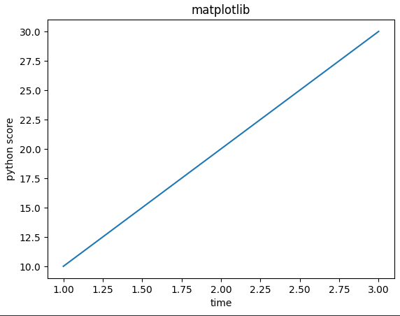
3.2. 막대그래프(bar)
- 범주형 데이터의 시각화
# 데이터 생성
categories = ["상의", "하의", "외투"]
price = [30000, 10000, 100000]plt.figure()
plt.bar(categories, price)
plt.show()output: 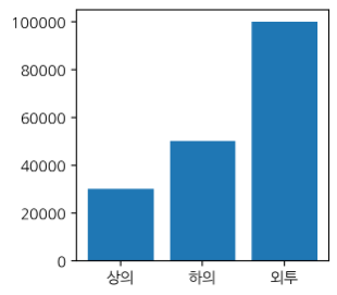
3.3. 히스토그램(hist)
- 데이터의 분포를 시각화
# 정규분포에서 랜덤한 값 1000개 생성
data = np.random.rand(1000)plt.figure()
plt.hist(data)
plt.show()output: 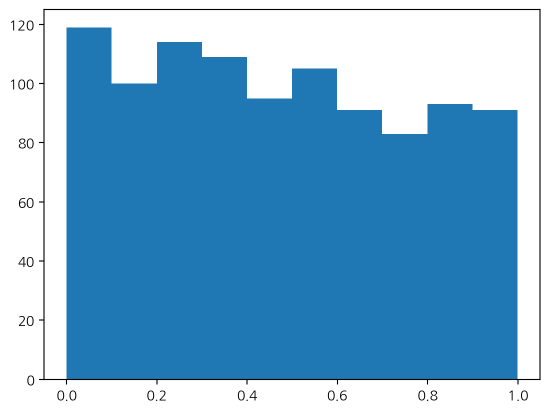
3.4. 산점도(scatter)
- x, y 모두 수치형 데이터일 때 사용 (ex. 키와 몸무게)
father = [170, 175, 178, 180, 183]
son = [165, 170, 180, 183, 185]plt.figure(figsize=(5, 5))
plt.scatter(father, son)
plt.title("부모와 자식 키의 상관관계")
plt.xlabel("부모의 키")
plt.ylabel("자식의 키")
plt.show()output: 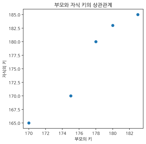
3.5. 파이차트(pie)
- 범주형 데이터의 "비율"을 시각화
labels = ["파이썬", "넘파이", "판다스", "태블로"]
level = [80, 23, 32, 10]
colors = ["gold", "yellow", "green", "blue"]plt.figure(gidsize=(3, 3))
# 그래프를 그린다 -> 데이터 필요 -> 숫자는 반드시 있어야 함
plt.pie(level, labels=labels, colors=colors)
plt.show()output: 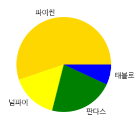
tip #3: 원하는 색상으로 차트를 작성하고 싶을 때 (구글에서 'colorpicker' 검색 -> hex값 복사)
plt.bar(months, sales, color="#34eb92")
이 형태로 작성하면 됨
by Heidi J. 꼬꼬마 데분가 💜

꼬꼬마 데분가😎