
주요 학습내용
1. merge
2. matplotlib
3. seaborn
I. 데이터 합치기(merge)
- Pandas에서 데이터 프레임을 병합하는 방법
1) pd.concat()
2) pd.merge(left, right)
3) pd.join()
1. left에 해당하는 DataFrame 생성
# 데이터 프레임 만드는 법(1)
# 딕셔너리 안 리스트 형(컬럼을 기준으로 열값데이터들 들어감)
# DataFrame([중괄호로 딕셔너리 형태으로 담아줌]])
left = pd.DataFrame({
    "key": ["K0", "K4", "K2", "K3"],
    "A": ["A0", "A1", "A2", "A3"],
    "B": ["B0", "B1", "B2", "B3"]
})
# key가 column으로 들어가 있고, 리스트 안 데이터들이 데이터값으로 들어가 있음
left
2. right에 해당하는 DataFrame 생성
# 데이터 프레임 만드는 법(2)
# 리스트 안의 딕셔너리 형태(행값 기준 들어감)
right = pd.DataFrame([
    {"key":"K0", "C":"C0", "D":"D0"},
    {"key":"K1", "C":"C1", "D":"D1"},
    {"key":"K2", "C":"C2", "D":"D2"},
    {"key":"K3", "C":"C3", "D":"D3"}
])
right
- 딕셔너리 안에 리스트 형태 : 열값 기준 데이터 입력
- 리스트 안에 딕셔너리 형태 : 행 기준 데이터 입력됨
3. pd.merge()이용하여 합치기
- pd.merge(left, right, how, on)
- 두 데이터 프레임에서 컬럼이나 인덱스를 기준으로 잡고 병합하는 방법
- 기준이 되는 커럼이나 인덱스를 키값이라고 함
- on = 기준 키값 입력
- 기준이 되는 키값은 두 데이터 프레임에 모두 포함되어 있어야 함
- how = inner/outer/left/right
- 디폴트 값 : inner(교집합)
1) inner
pd.merge(left, right, how="inner", on="key")
# how = "inner" : 디폴트 값(교집합)
2) left
pd.merge(left, right, how="left", on="key")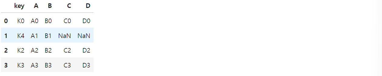
3) right
pd.merge(left, right, how="right", on="key")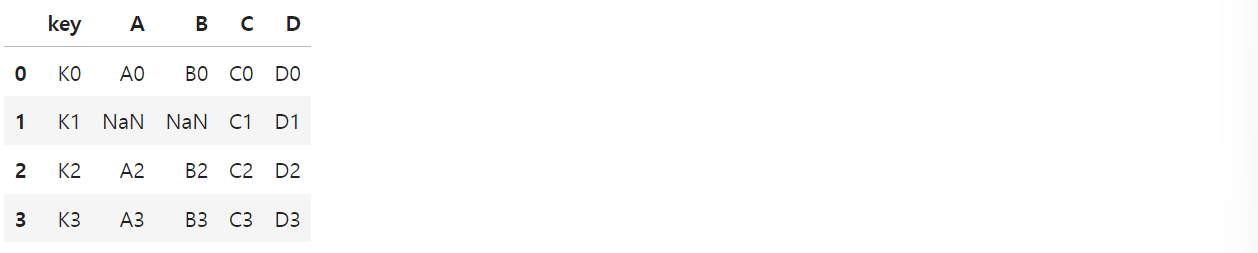
4) outer
pd.merge(left, right, how="outer", on="key")
# how="outer" : 합집합
# NaN값을 어떻게 활용할 지 고민해봐야 함
II. matplotlib를 통한 데이터 시각화
- import matplotlib.pyplot as plt
- from matplotlib import rc
를 사용하여 먼저 import 필요
1. 삼각함수 그리기
- np.arange(a, b, s): a부터 b까지 s의 간격
import numpy as np
t = np.arange(0, 12, 0.01)
y = np.sin(t)

plt.figure(figsize=(10, 6))
plt.plot(t, np.sin(t))
plt.plot(t, np.cos(t))
plt.show()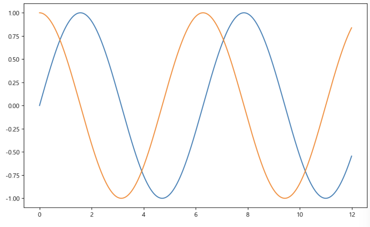
- 격자무늬 추가(grid)
- 그래프 제목 추가(title)
- x축, y축 제목 추가(xlabel, ylabel)
- 주황색, 파란색 선 데이터의미 구분(범례, legend)
def drawGraph():
    plt.figure(figsize=(10, 6))
    plt.plot(t, np.sin(t))
    plt.plot(t, np.cos(t))
    # 1) 격자무늬 추가 grid
    plt.grid(True)
    # 2) 제목 추가, x축, y축 제목
    plt.title("Example of sinewave")
    plt.xlabel("time")
    plt.ylabel("Amplitude")  # 진폭
    # 3) 선의 의미(범례)
    plt.legend(loc="upper right", labels=["sin", "cos"])
    # plt.plt(t, np.sin(t), label="sin")적어줬을 경우, label추가 정의 x, 없으면 적어줌)
    plt.show()

drawGraph()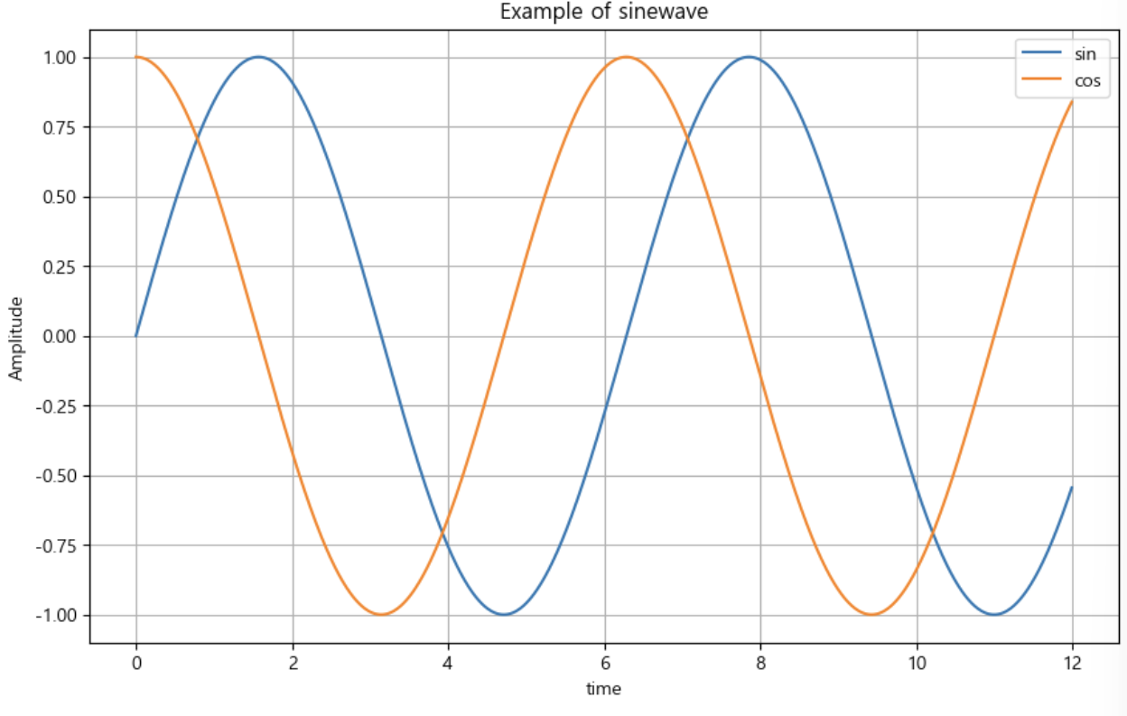
2. 그래프 커스텀
- 색 설정
- 도형 방향 설정
- 선 모양 설정
t = np.arange(0, 5, 0.5)
t

plt.figure(figsize=(10, 6))
plt.plot(t, t, "r--")  # red ---
plt.plot(t, t**2, "bs")  # blue square
plt.plot(t, t**3, "g^")  # green 화살표 방향
plt.show()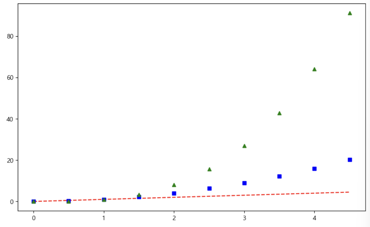
# t = [0, 1, 2, 3, 4, 5, 6]
t = list(range(0, 7))
y = [1, 4, 5, 8, 9, 5, 3]

def drawGraph():
    plt.figure(figsize=(10, 6))
    plt.plot(
        t,
        y,
        color = "green",
        linestyle = "dashed",  # -- 점선, -실선, dashed 점
        marker= "o",
        markerfacecolor = "blue",
        markersize = 15,
    )
    plt.grid(True)
    plt.xlim([-0.5, 6.5])
    plt.ylim([0.5, 9.5])
    plt.show()
drawGraph()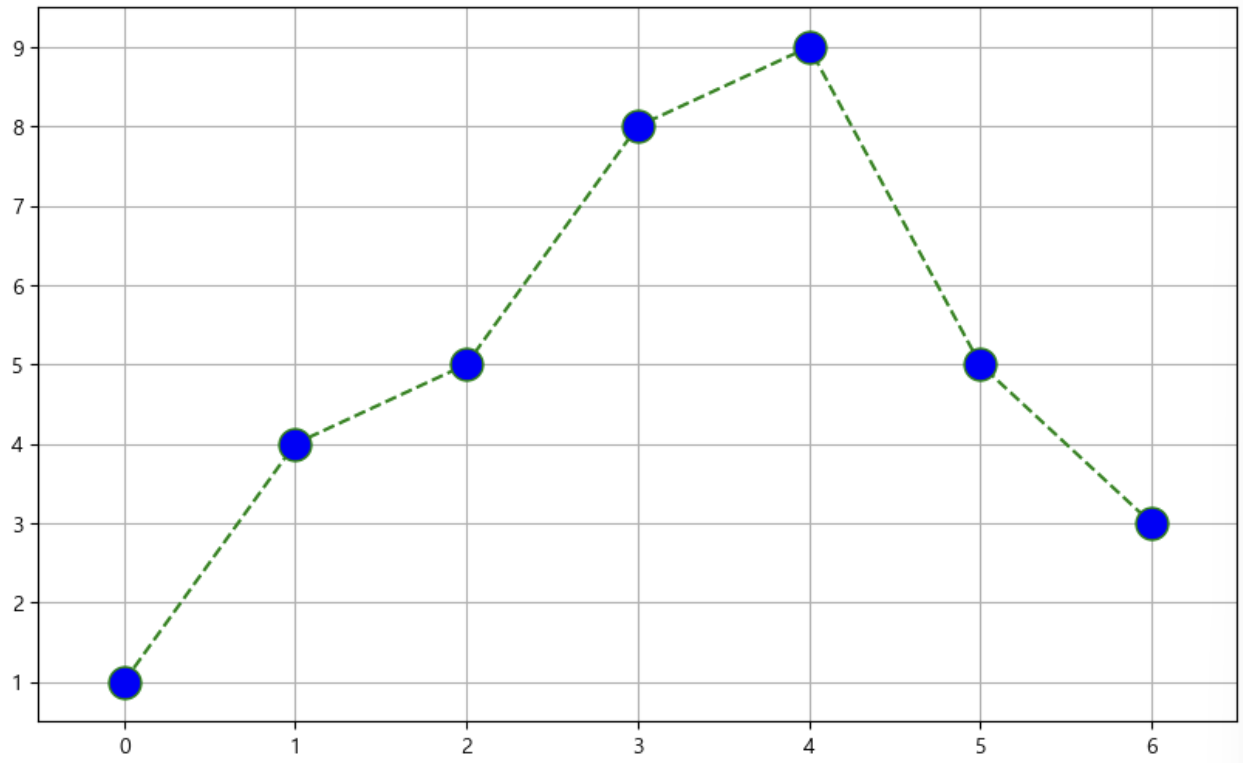
3. scatter plot
t = np.array(range(0, 10))
y = np.array([9, 8, 7, 9, 8, 3, 2, 4, 3, 4])

def drawGraph():
    plt.figure(figsize=(20, 6))
    plt.scatter(t, y)
    plt.grid(True)
    plt.show()
drawGraph()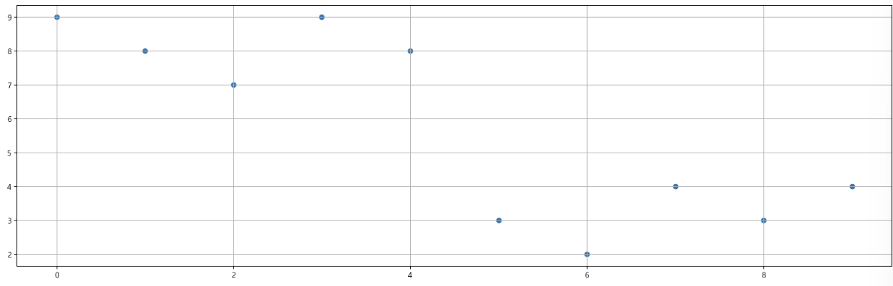
- 그래프 커스텀
colormap = t

def drawGraph():
    plt.figure(figsize=(20, 6))
    plt.scatter(t, y, s=200, c=colormap, marker=">")
    plt.grid(True)
    plt.show()

drawGraph()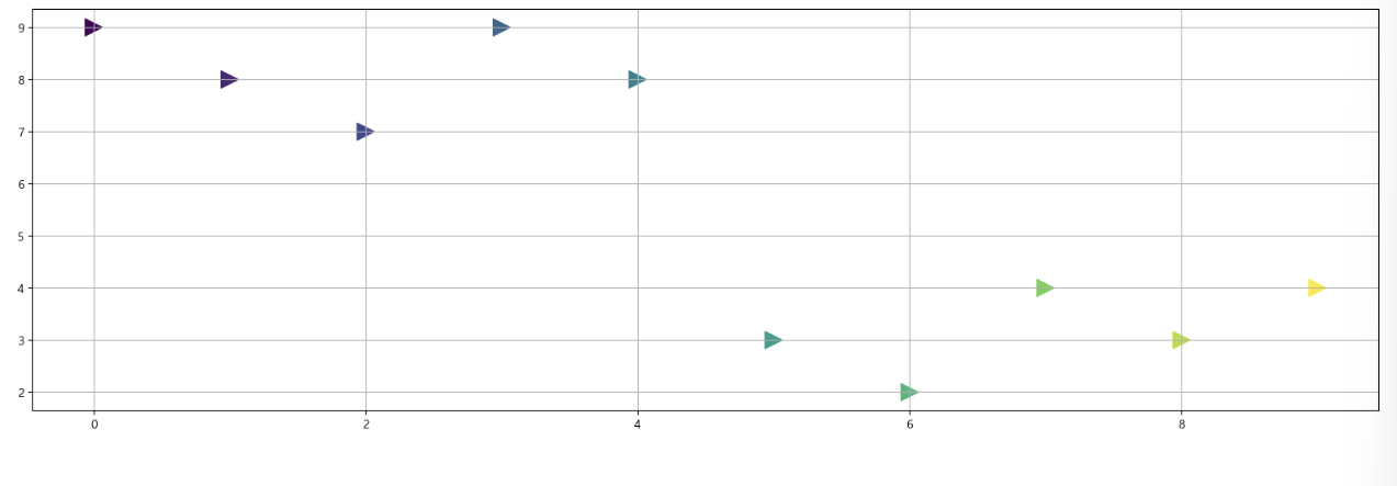
III. seaborn
-
설치 안되어 있는 경우, 아래와 같이 설치 먼저 진행
!conda install -y seaborn -
가끔씩, 마이너스 부호 때문에 한글이 깨지는 경우가 있는데 아래 코드 적어주면 해결 가능
plt.rcParams["axes.unicode_minus"] = False

# 마이너스 부호 때문에 한글이 깨지는 경우를 위해 사용

rc("font", family="Malgun Gothic")
1. seaborn 기초
예제 1) 그래프 커스텀
np.linspace(0, 14, 100) # 0부터 14까지 100개의 데이터
x = np.linspace(0, 14, 100)
y1 = np.sin(x)
y2 = 2* np.sin(x)
y3 = 3 * np.sin(x)
y4 = 4 * np.sin(x)
#1 번
plt.figure(figsize=(10, 6))
plt.plot(x, y1, x, y2, x, y3, x, y4)
# 쌍으로 넣어줘야 함
plt.show()
# 2번
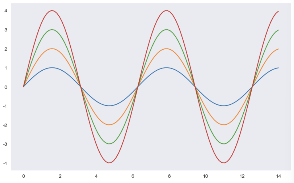
# sns.set_style()
# white, whitegrid, dark, darkgrid,
sns.set_style("dark")
plt.figure(figsize=(10, 6))
plt.plot(x, y1, x, y2, x, y3, x, y4)
plt.show()
# 3번
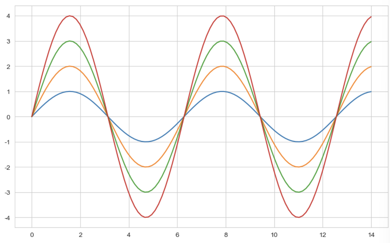
sns.set_style("whitegrid")
plt.figure(figsize=(10, 6))
plt.plot(x, y1, x, y2, x, y3, x, y4)
plt.show()
# 4번
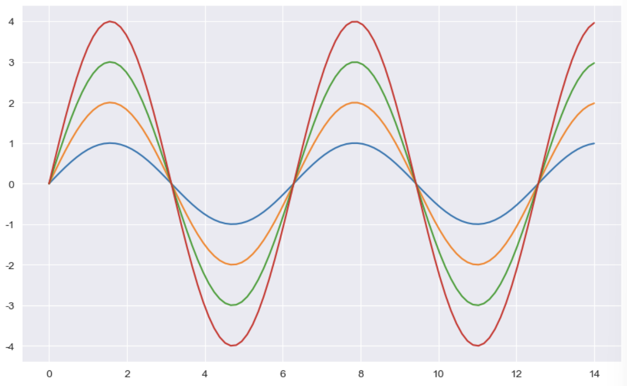
sns.set_style("darkgrid")
plt.figure(figsize=(10, 6))
plt.plot(x, y1, x, y2, x, y3, x, y4)
plt.show()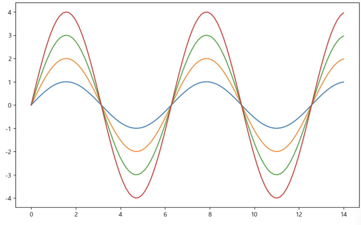
예제 2) seaborn tips data
- boxplot
- swarmplot
- lmplot
tips = sns.load_dataset("tips")
tips
① boxplot
sns.boxplot(x = tips["total_bill"])
plt.show()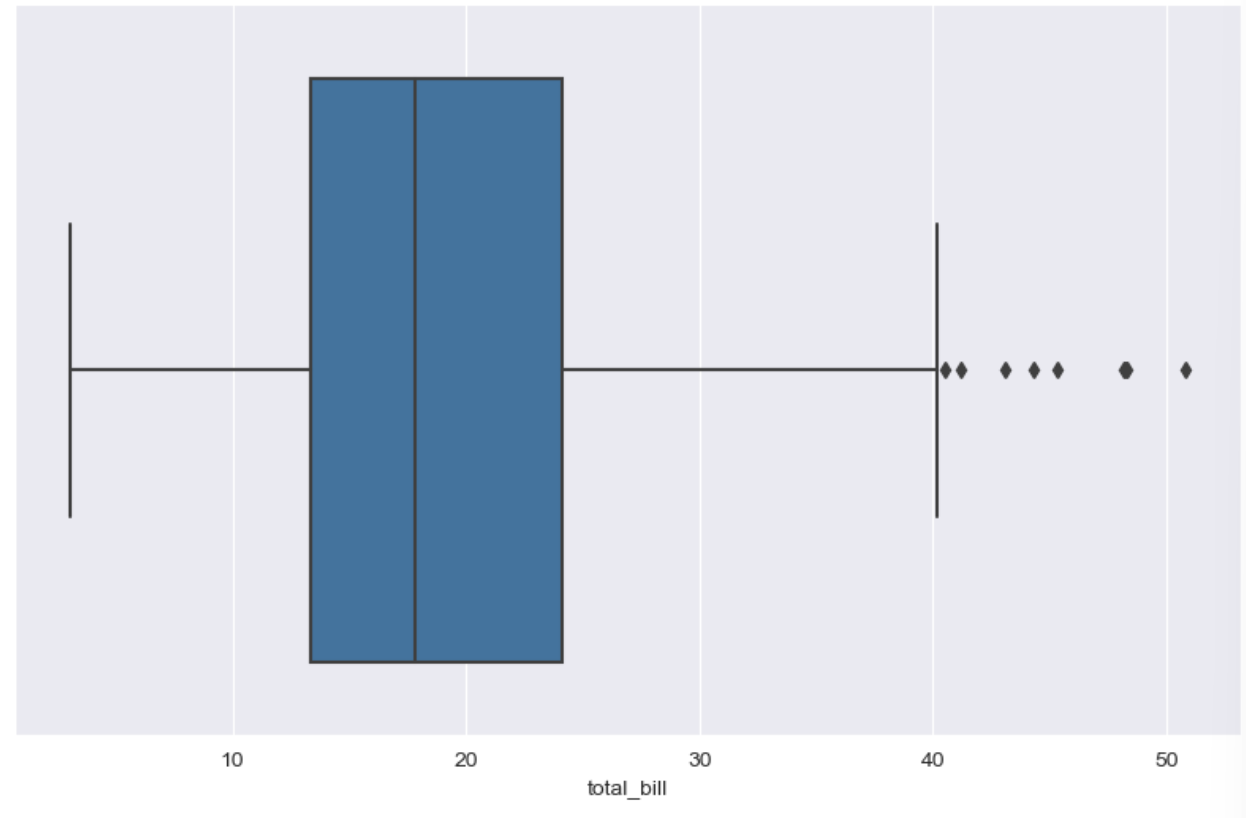
- .unique()사용하여 중복값 제외한 데이터 확인 가능
tips["day"].unique()
# ['Sun', 'Sat', 'Thur', 'Fri']
# Categories (4, object): ['Thur', 'Fri', 'Sat', 'Sun']


plt.figure(figsize=(10, 6))
sns.boxplot(x = "day" , y = "total_bill", data = tips)
plt.show()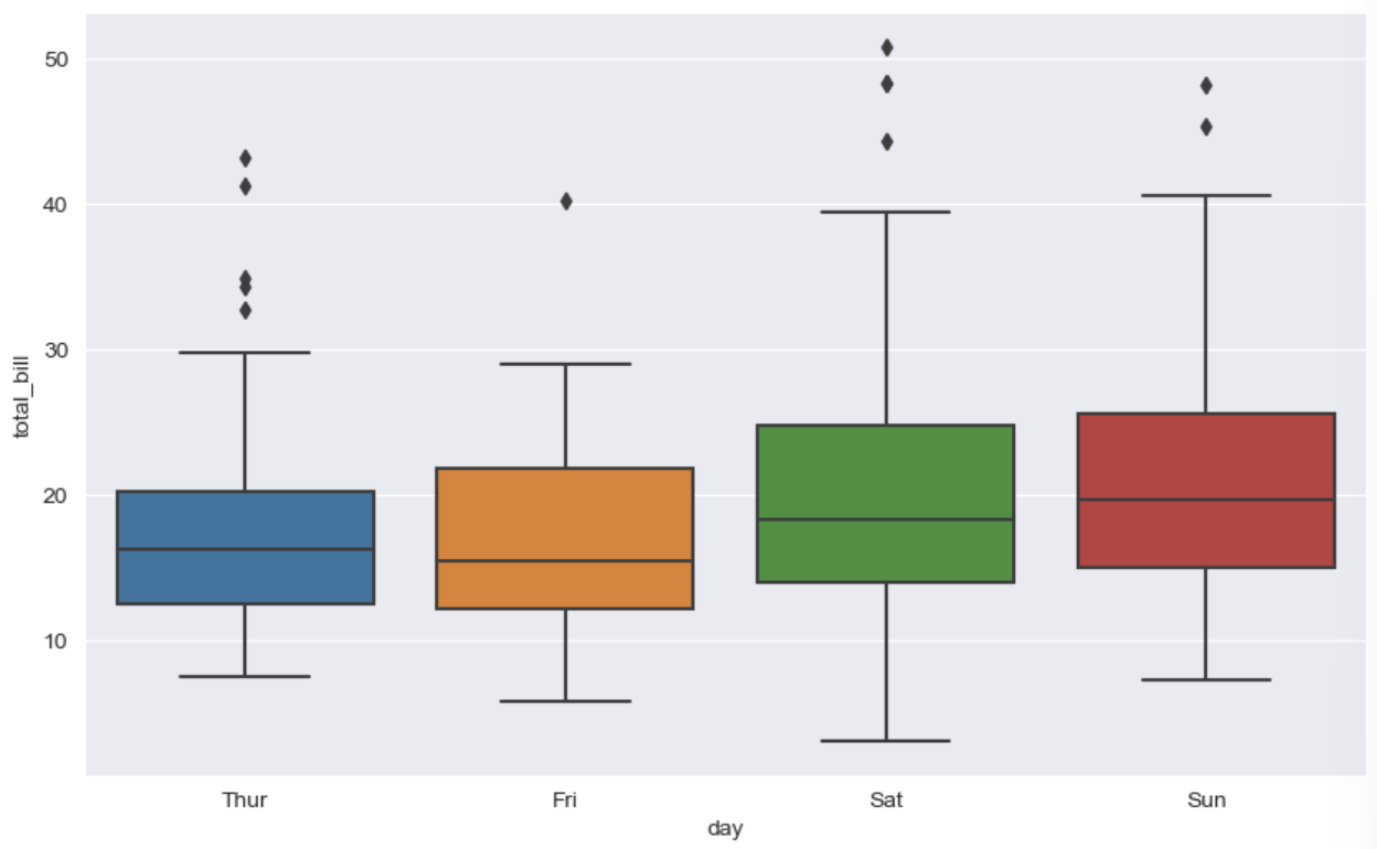
- hue = category 데이터를 표현하는 option
plt.figure(figsize=(10, 6))
sns.boxplot(x="day", y = "total_bill", data=tips, hue= "smoker", palette="Set1")
# palette = set1~3까지 있음
# hue = category 데이터를 표현하는 option
plt.show()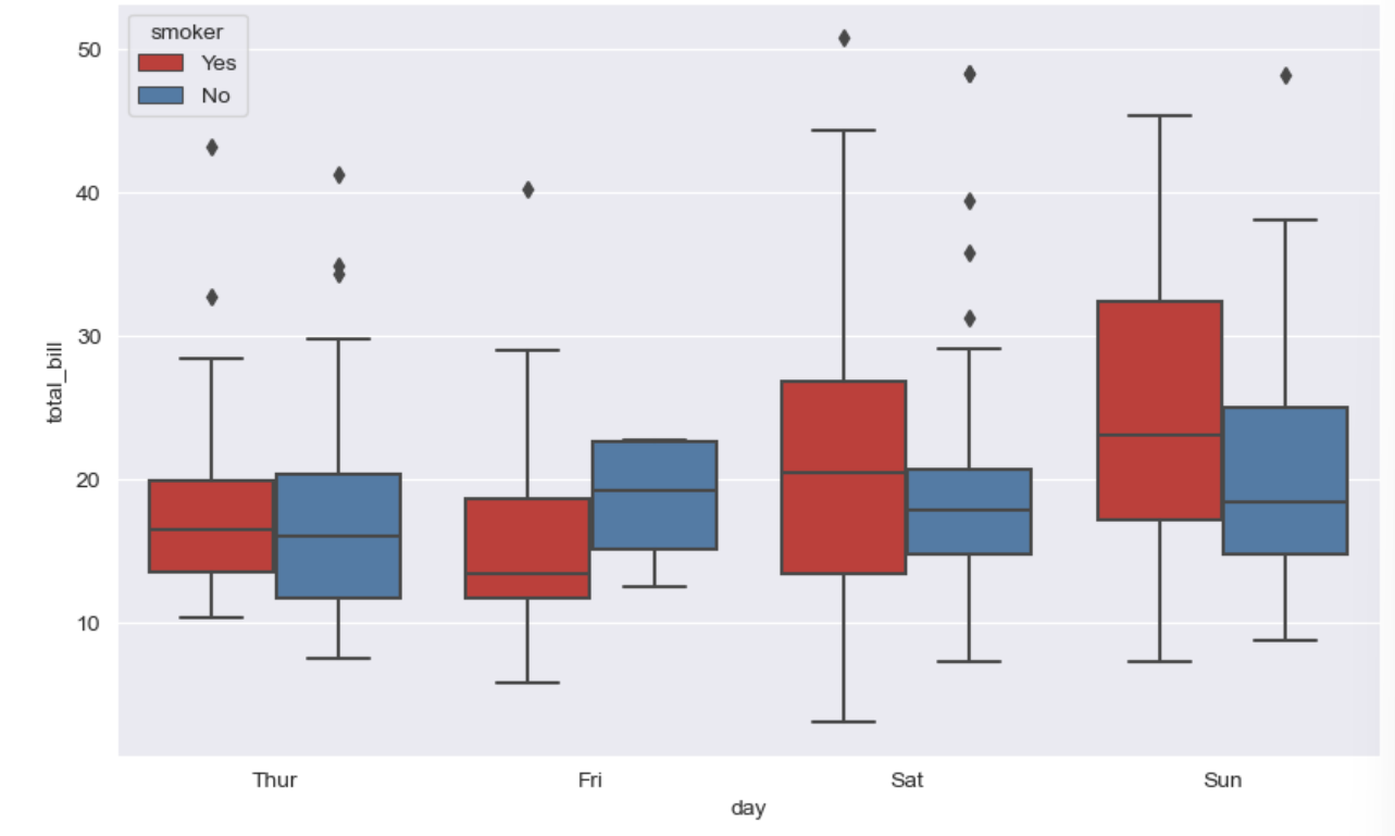
② swarmplot
- color : 0 ~ 1 사이 검은색부터 흰색 사이 값을 조정
plt.figure(figsize = (8, 6))
sns.swarmplot(x="day", y ="total_bill", data = tips, color = "0.5")  # 검은색 ~ 흰색까지(0~1)
plt.show()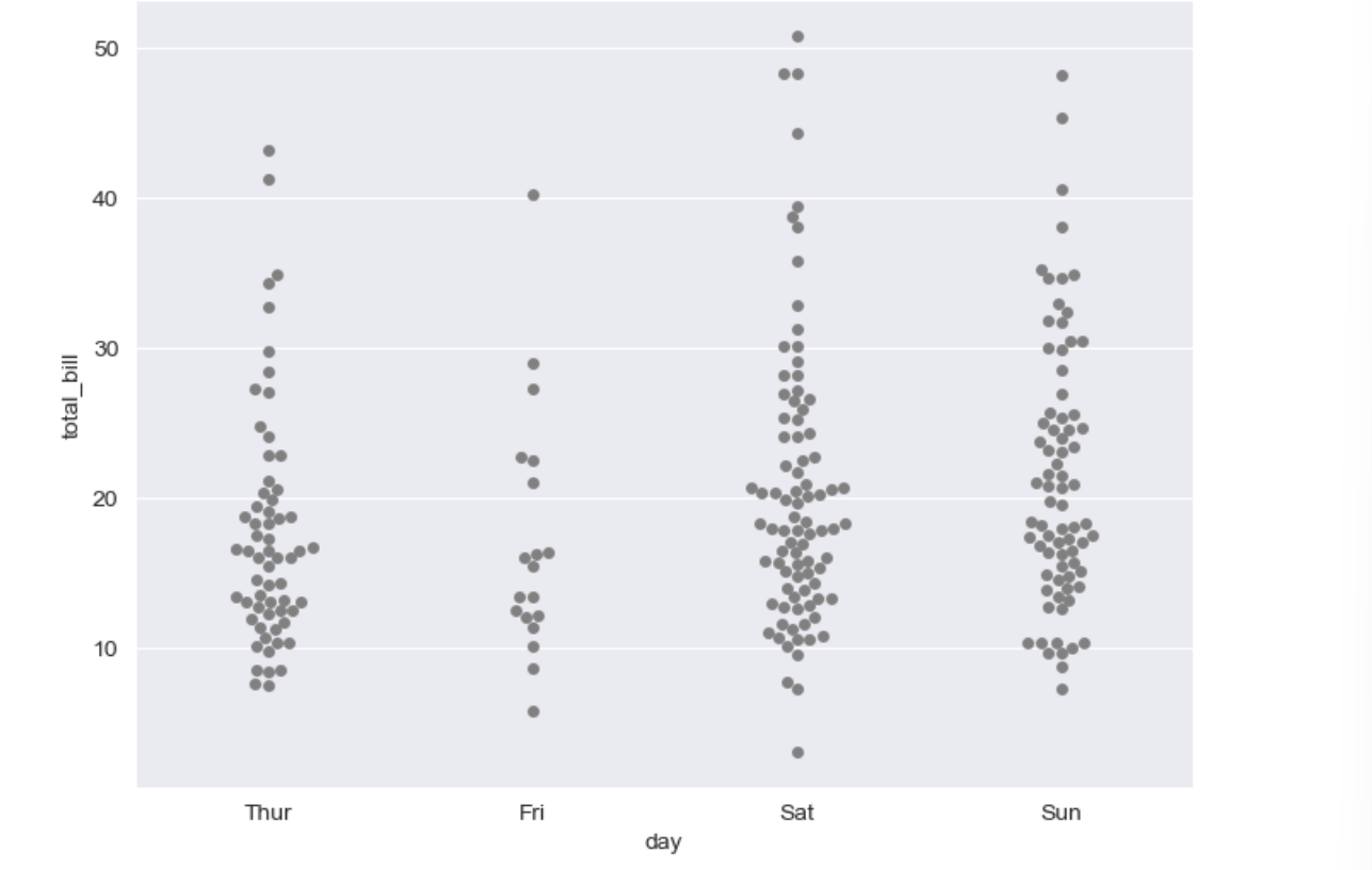
③ boxplot with swarmplot
plt.figure(figsize=(8, 6))
sns.boxplot(x="day", y="total_bill", data=tips)
sns.swarmplot(x="day", y="total_bill", data=tips, color = "0.5")
plt.show()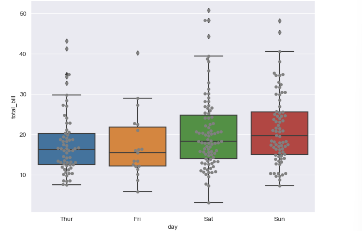
④ lmplot
# lmplot: total_bill과 tip 사이 관계 파악
sns.set_style("darkgrid")
sns.lmplot(x="total_bill", y="tip", data=tips, height=10) # height = figsize와 동일한 기능
plt.show()
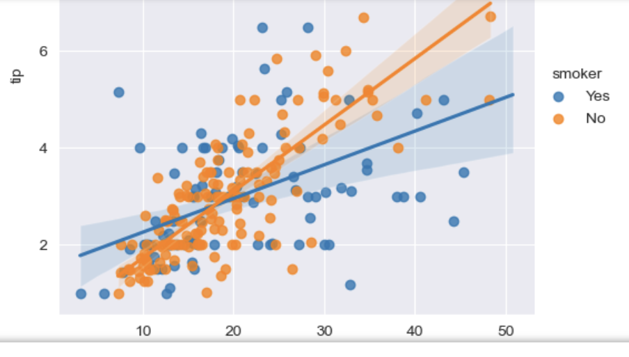
# hue option 주기
sns.set_style("darkgrid")
sns.lmplot(x="total_bill", y="tip", data=tips, hue="smoker")
plt.show()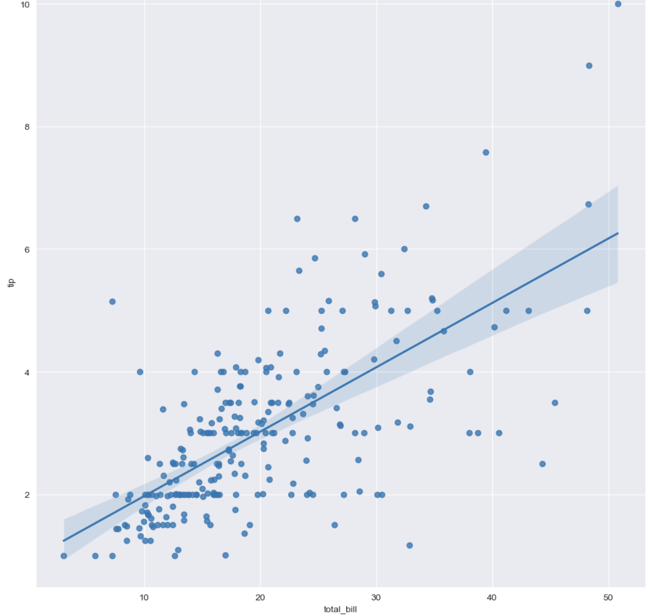
예제 3) flight data(heatmap 사용)
flights = sns.load_dataset("flights")
flights.head()
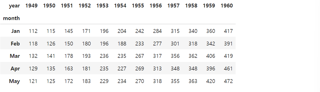
# pivot
# index, columns, values
flights = flights.pivot(index="month", columns="year", values="passengers")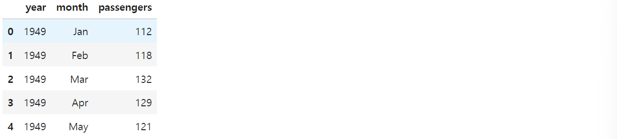
plt.figure(figsize=(10, 8))
sns.heatmap(data=flights, annot=True, fmt="d")
# annot = True(숫자 표현), False(숫자 제거)
# fmt = d = 정수형, f = 실수형
plt.show()
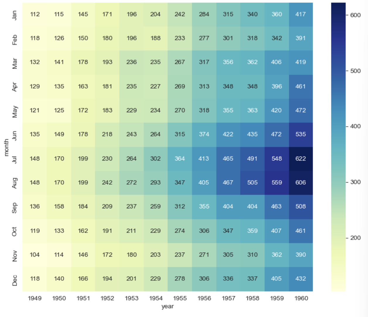
# colormap
plt.figure(figsize=(10, 8))
sns.heatmap(flights, annot=True, fmt="d", cmap="YlGnBu")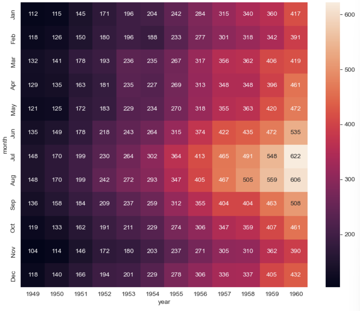
예제 4) Iris data(pairplot)
iris = sns.load_dataset("iris")
iris.tail()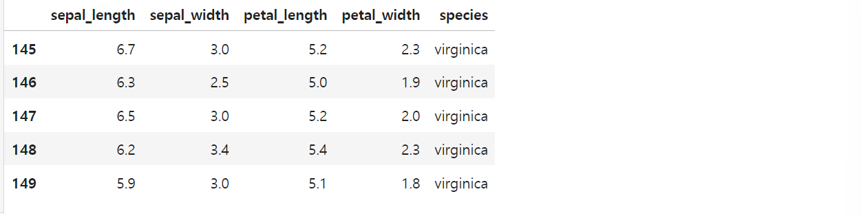
# pairplot
# sns.set_style("ticks")
sns.pairplot(iris)
plt.show()
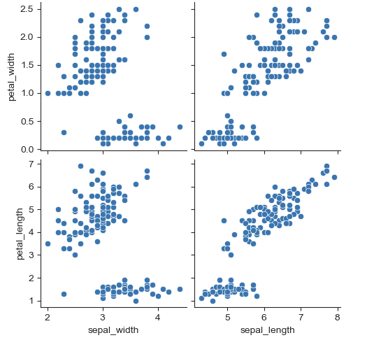
# 원하는 컬럼만 pairplot
sns.pairplot(iris,
x_vars=["sepal_width", "sepal_length"],
y_vars=["petal_width", "petal_length"])
plt.show()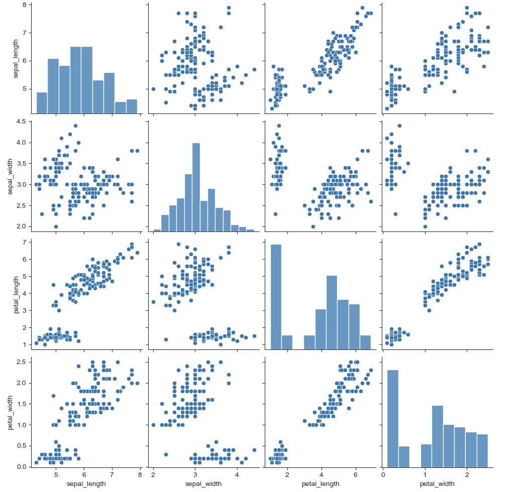
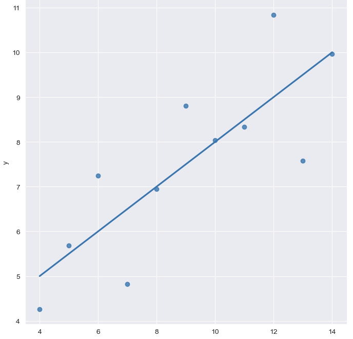
예제 5) anscombe data(lmplot)
anscombe = sns.load_dataset("anscombe")
anscombe.tail()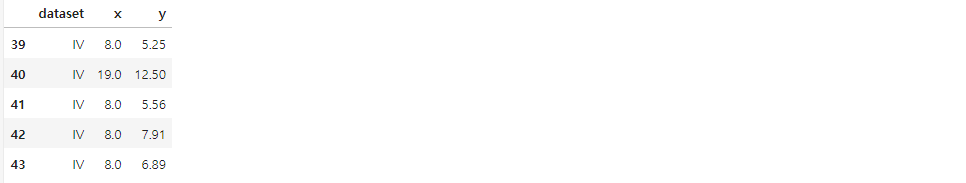
sns.set_style("darkgrid")
sns.lmplot(x="x", y = "y", data = anscombe.query("dataset == 'I'"), ci=None, height=7)
# ci = 신뢰구간 선택
plt.show()
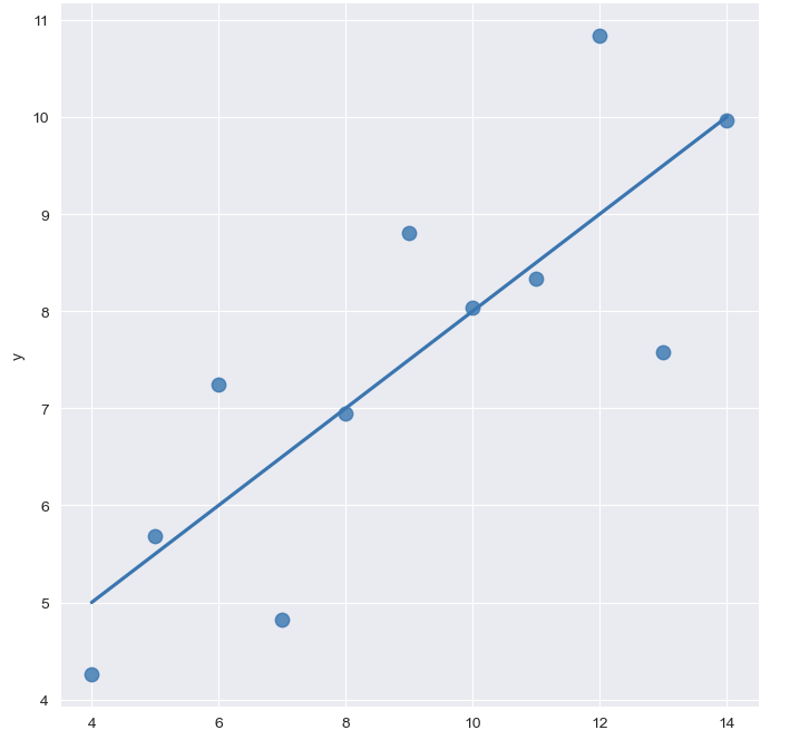
# 원 크기 키우기
sns.set_style("darkgrid")
sns.lmplot(x="x", y = "y", data = anscombe.query("dataset == 'I'"), ci=None, height=7, scatter_kws={"s":80})
# ci = 신뢰구간 선택
plt.show()
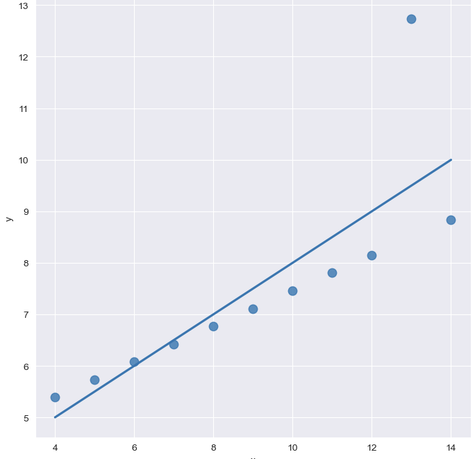
- outlier 있는 경우
# outlier
sns.set_style("darkgrid")
sns.lmplot(
x="x",
y = "y",
data = anscombe.query("dataset == 'III'"),
ci=None,
height=7,
scatter_kws={"s":80}) # ci = 신뢰구간 선택
plt.show()
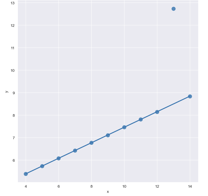
# outlier(robust = True추가)
sns.set_style("darkgrid")
sns.lmplot(
x="x",
y = "y",
data = anscombe.query("dataset == 'III'"),
robust = True,
ci=None,
height=7,
scatter_kws={"s":80}) # ci = 신뢰구간 선택
plt.show()

할 거면 제대로 하자