인사
안녕하세요. 이번에는 nextjs 13 version으로 dark mode를 개인 blog에 적용하는 방법에 대해 알아보도록 하겠습니다.
1. next-theme
next-theme는 nextjs에서 dark mode를 적용하기 위해서 사용할 라이브러리 입니다.
이번 blog 글은 next-theme github에 나와있는 공식 적용 방식을 저의 글로 해석한 것임을 알려드립니다.
참고 : https://github.com/pacocoursey/next-themes
2. Providers.tsx
'use client'
import { ThemeProvider } from 'next-themes';
interface ThemePropsInterface {
children?: JSX.Element | Array<JSX.Element> | React.ReactNode;
}
export default function Providers(props:ThemePropsInterface) {
const {children} = props;
return (
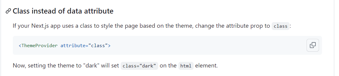
<ThemeProvider attribute='class'>{children}</ThemeProvider>
)
}- use client
import한 ThemeProvider를 사용하기 위해선 client component임을 선언해야함.
- 소스코드 내용
next-theme에 작성되어 있는 code를 가져왔고, 해당 소스 코드에 대한 official 설명은 다음과 같다.Adding dark mode support takes 2 lines of code:
=> 해석 : 그냥 따라하면 된다.
typescript를 독학 중이라 해당 소스 코드에 대한 피드백은 환영입니다!
3. tailwind.config.js
/** @type {import('tailwindcss').Config} */
module.exports = {
  content: [
    './pages/**/*.{js,ts,jsx,tsx,mdx}',
    './components/**/*.{js,ts,jsx,tsx,mdx}',
    './app/**/*.{js,ts,jsx,tsx,mdx}',
  ],
  darkMode : 'class',
  theme: {
    extend: {
      backgroundImage: {
        'gradient-radial': 'radial-gradient(var(--tw-gradient-stops))',
        'gradient-conic':
          'conic-gradient(from 180deg at 50% 50%, var(--tw-gradient-stops))',
      },
      fontFamily: {
        play: ['var(--font-play)'],
      },
    },
  },
  plugins: [
    require('@tailwindcss/typography'),
  ],
}
중간에 보시면 darkMode : 'class'라고 보이실 겁니다.
해당 부분을 tailwind.config.js에서 저처럼 추가해주시면 됩니다.
저 부분을 추가해주는 이유는 Providers.tsx에서 ThemeProvider tag의 attribute와 연결되는 것입니다.
Q. ThemeProviders에 attribute로 'class' ??
이후에 살펴볼 theme이라는 변수에 대해 theme이 light or dark값을 가질 때,
attribute="class"에서 class가 light or dark값을 가지고 그것을 바탕으로 light mode, dark mode를 적용한다는 학계의 전설.
참고 : next-theme github
4. layout.tsx
  return (
    <html lang="en">
      <body>
      <Providers>
          <Header/>
          {children}
          <Footer/>
      </Providers>
      </body>
    </html>
  )
body내부 가장 바깥에 Providers tag로 감싸줍니다.
저는 개인적으로 header와 footer component가 있는 것이므로 무시 바랍니다.
5. ThemeButton.tsx
export default function ThemeButton() {
    const {theme, setTheme} = useTheme();

    return (
        <>
            <button onClick={()=>{
                setTheme(theme === 'dark' ? 'light' : 'dark');
            }}>
                {
                    theme === 'dark' ? (
                        <FontAwesomeIcon icon={faSun}/>
                    ) : (
                        <FontAwesomeIcon icon={faMoon}/>
                    )
                }
            </button>
        </>
    )
}-
useTheme
이전에 잠시 언급한 Theme 변수에 대해 'light' or 'dark'값을 가지게함. -
button
저는 현재 button을 누르면 light -> dark 또는 dark -> light로 변경하는 것을 원합니다.
theme은 현재 적용중인 모드가 light인지 dark인지를 나타냅니다.
따라서 버튼을 누를때 만약 theme이 dark(다크모드)라면 light로 set하여 light모드로 바꾸는 것이고, theme이 light라면 dark로 set하여 dark모드로 바꾸는 것입니다.
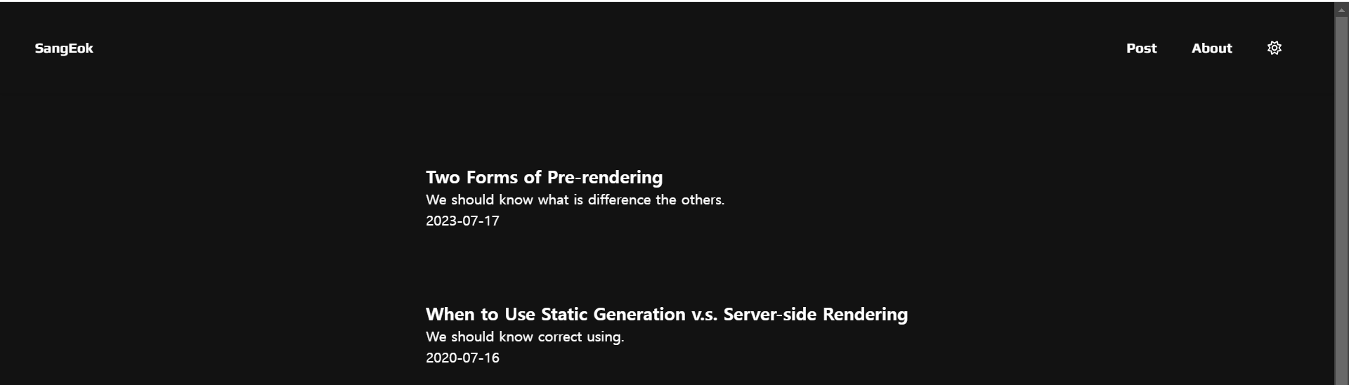
6. Result
-
light mode
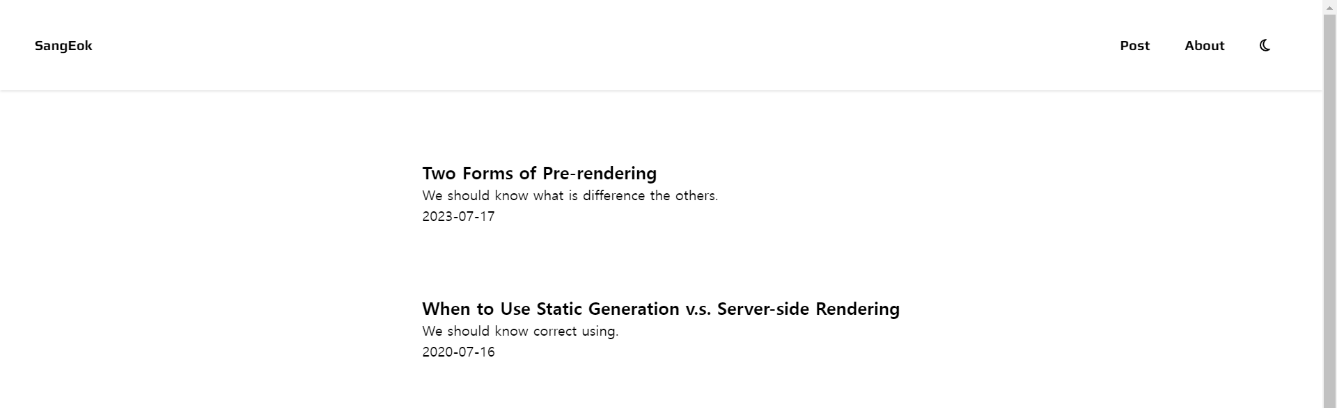
-
dark mode